This service is created to evaluate websites based on different factors, including design, usability, content quality, and the creativity of their authors. It reflects the best web design trends. Awwwards has been working since 2009, and its jury has proven to be highly professional. Recognition from this service means that developers have managed to stand out from the crowd and create something unique. Award-winning website designers are then greatly valuable on the market. This is why companies and designers are interested in how to win Awwwards.
How do they evaluate?
Websites are evaluated based on:
- design (40%);
- convenience of use or usability (30%);
- creativity (20%);
- quality of design elements (10%).
The percentage signifies the weight of each parameter in the final grade and given awards. Websites can get the following titles:
- Mobile Excellence – an evaluation method based on Google’s criteria for mobile website versions. The award is given to all websites getting more than 70 out of 100.
- Mobile Site of the Week – a website must receive the Honorable Mention award and lead voting for the previous three months. In this case, it will be displayed on the main page of Awwwards;
- Honorable Mention – granted to websites with the jury and trusted Awwwards user score no lower than 6.5%.
- Site of the Day – given to websites with maximum scores.
- Developer Award – if a website receives the site of the Day title, it is evaluated by a separate jury of developers. For the Developer Award, the developer jury score must be higher than 7.0.
- Site of the Month – the jury re-examines the websites with the highest scores at the end of each month. As you may have already guessed, they choose the best website. User scores are also taken into account.
- Site of the Year – this title is a dream of all the site of the Month winners + Awwwards favorites.
How do they give scores? After a website submits a request and receives confirmation, the website is forwarded to the jury. During the 5-day voting process, Awwwards users can vote for different websites.
After this, the jury discards two results (the lowest and the highest) and calculates the average rate based on the remaining scores. The user voting in Awwwards is designed to eliminate the possibility of fraud.
Lusion – May 2020

Special features: audio visualization, real-time particles effect, user motion visualization, and a combination of different styles.
It is the best Awwwards web design winner. Edan Kwan launched the website in 2017. He claimed his goal was to bridge the gap between an abstract image concept and its practical implementation with the help of modern technologies. The Awwwards singled out the overall creativity and website design. The website has uncommon scrolling and interactive elements that respond to user actions.
Dogstudio – April 2020
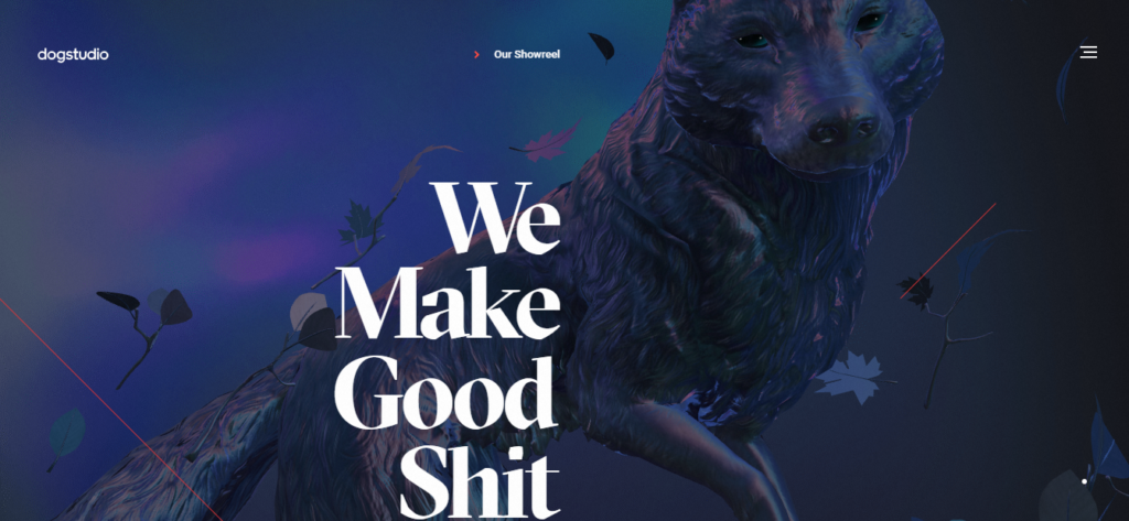
Dogstudio has been a creative studio uniting art, technology, and design since 2016.
Their offices are located in Belgium and Chicago, USA. On Awwwards, the website of Dogstudio received the maximum score for creativity. The jury was particularly pleased with the original scrolling and website navigation. Dogstudio has exciting award-winning website design.
2018: Year in Review – March 2020
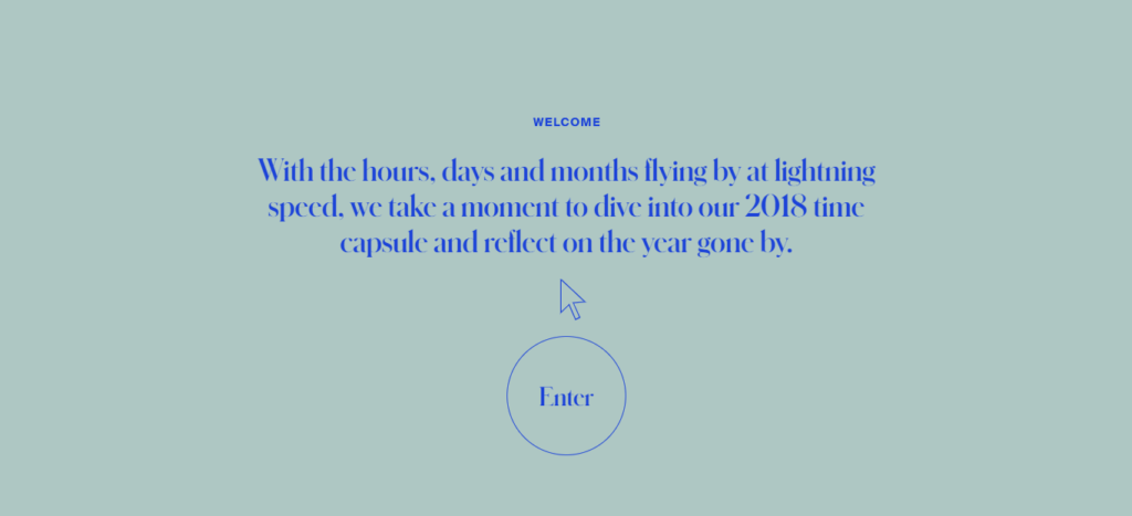
This website lets you reflect on the most prominent events and moments that happened on the web over the past year.
It is similar to a database of interesting projects. The Awwwards jury praised the design and creative look of the website. Moreover, the developer score is also high. At the same time, we want to highlight interesting cursor animation and scroll-based menu navigation.
Nomadic Tribe – makemepulse, February 2020
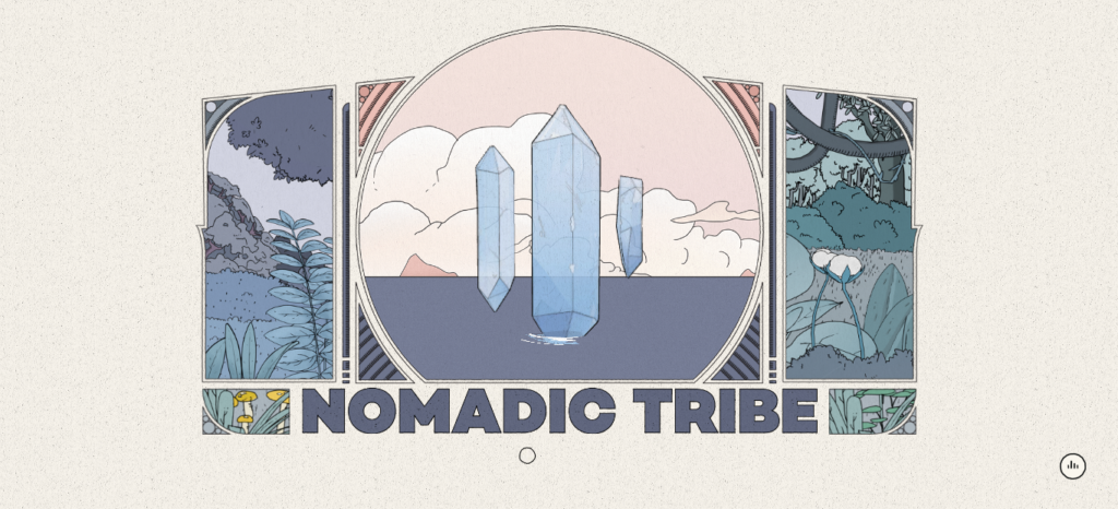
The website tells an interactive tale of nomadic tribes.
In addition to high scores for the creativity of developers and content quality, the website is well-optimized for mobile devices. As a result, it was awarded the Mobile Excellence title. The tale ensures seamless interaction with the audience, which greatly benefits the storytelling. The viewer feels engaged in the story.
Everest – January 2020
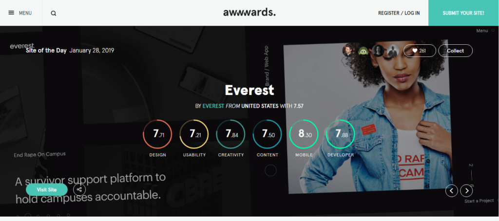
Everest can help you to launch and promote your brand. Their portfolio includes marketing campaigns for such companies as Walmart, GEICO, Capital One, and Hilton. Their team created a great mobile version, and the developer jury also highly evaluated the website. The ripple effect activated during the navigation between different website elements is great. Scrolling animation, design, and creativity deserve particular attention.
imabandi. to – December 2018
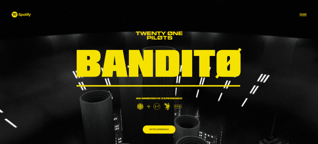
This website is dedicated to music. You can listen to the songs of Twenty One Pilots, enjoying an immersive experience. The website owners also cared about the storytelling part.
The listeners are asked to participate in a real adventure. They can escape from Dema (a fictional organization managed by nine bishops) and uncover the meaning of several symbols. The musical duo and Spotify created the project. The Awwwards jury underscored gamification and background effects. The mobile website version is well-optimized.
Orano – November 2018

The project is dedicated to the peaceful atom. In particular, it talks about ensuring the security of nuclear energy facilities.
The website has flawless navigation and a great transition from the grid to the full image. Its creators paid attention to both desktop and mobile versions. Orano received a high score from the developer jury, whereas the highest marks were given for its design and content quality.
Google Cloud Infrastructure – October 2018

Here is a new website by Google. It demonstrates the global Google infrastructure’s power and capabilities in data analysis and encryption.
Awwwards praises clear and easy presentation of complex processes. In particular, the animation shows how Google Cloud works and the interactive map with all the main locations of Google. In addition, the maximum scores were given for creativity and design.
Robin Mastromarino – Portfolio, September 2018

Robin Mastromarino is a designer residing in Paris. This site is his portfolio.
The website has cool transition effects and intuitive navigation. There are no complicated menus or unclear elements. Just left-click and move right or left to navigate. The jury liked the quality of the content, its bright photos, and its colors. The developer jury gave this website 7.71. A great score, isn’t it?
Beyond Beauty – August 2018

This website is dedicated to 4 female celebrities. It offers you to learn more about the life of these women and see them from an unusual perspective.
The page has a lot of interesting solutions, but the distortion and mask transition effects deserved the special attention of the jury. Timeline-based navigation also looks very innovative. Moreover, the developers created a nice mobile version.
Foosball World Cup 18 – July 2018

Foosball is table football. Have you known that? The website was created in honor of the World Cup 2018 and allows playing several matches. Foosball is rightfully among award-winning sites. The Awwwards jury pointed out the general futuristic design of the game and the original team selection menu. In addition, there is a version optimized for mobile devices.
Oat the Goat – June 2018
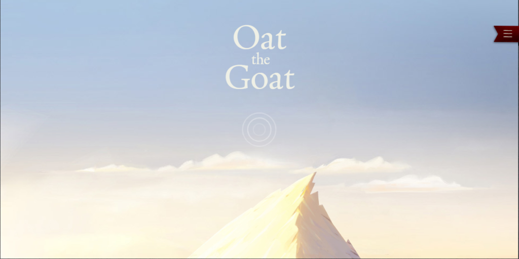
The New Zealand Ministry of Education initiated the website to promote the ideas of humanism. This is an interactive animated storybook.
The reader directly participates in the story, selects actions and replies to the dialogues. The jury called interactivity one of the key strengths of this website. The design and content quality are also great.
Nike Reactor – May 2018
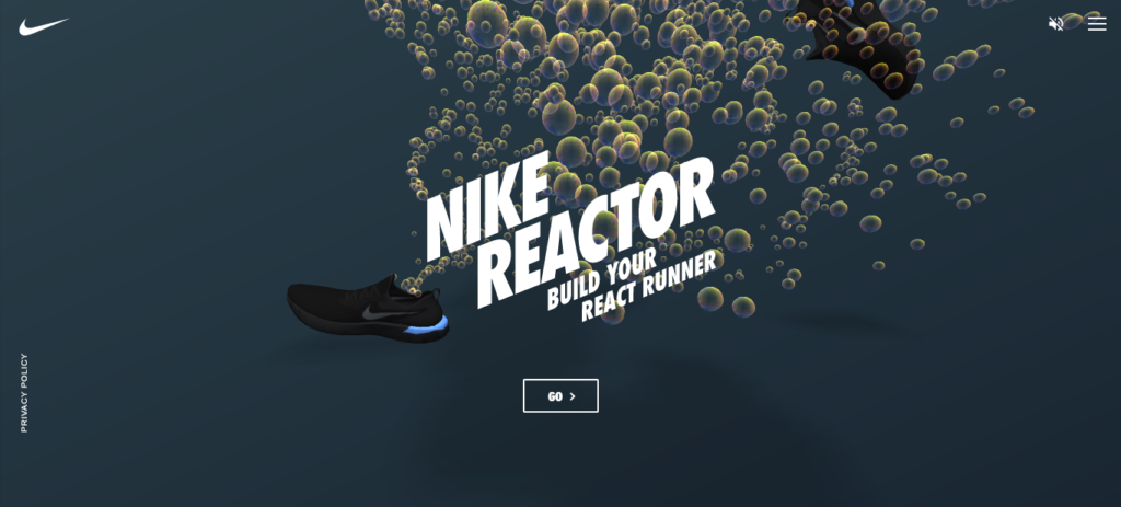
The primary idea behind the website is to show potential buyers how a person feels in new Nike sneakers.
The page displays a certain runner wearing sneakers based on the selected Nikes. Users can examine the runner or create their 3D runner. The Awwwards jury highly evaluated such a creative approach during the assessment. They also appreciated the mobile version of the website.
Design Canada – April 2018
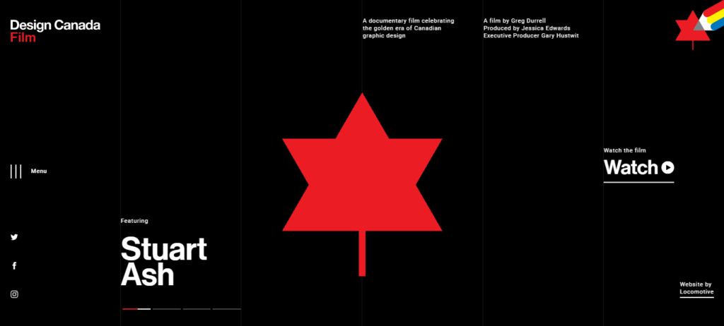
This website tells the Canadian history of graphic design. It shows how Canada has turned from a colonial outpost into a dynamically developing multicultural society.
Of all evaluation criteria, its unique design received the highest score. The original navigation and pop-up sidebars make this design memorable. Design Canada also has an award for its mobile version.
Gallery of emerging species – March 2018
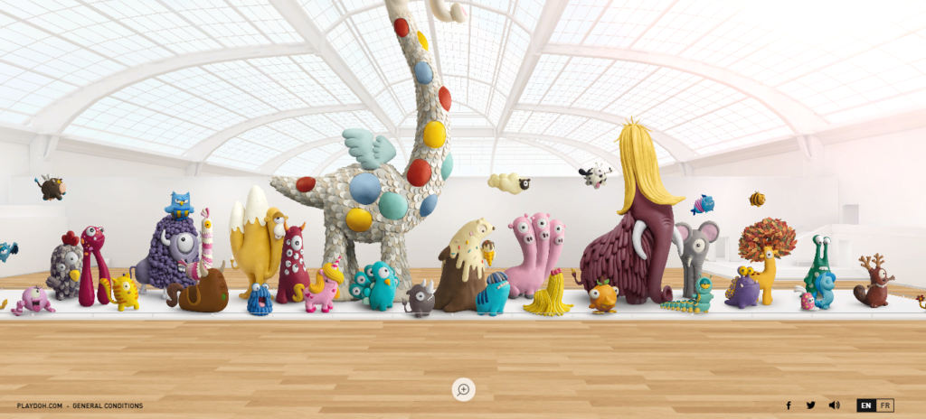
This website was created to attract attention to endangered species. They provide brief information about each animal.
The jury liked the creativity of website developers. They also pointed out the horizontal scrolling navigation (left-click the mouse, hold it, and go where you need it). Another advantage – the website isn’t overloaded with unnecessary information.
Couro Azul – February 2018
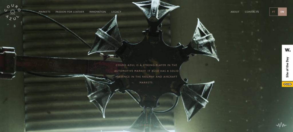
Couro Azul is a prominent player in the automotive, plane, and railway markets. They work with leather. The website tells about the innovative technologies used by the company and shares its story.
It was complimented on its design. In particular, the jury admired background videos and the overall color selection for the background. As a result, the developer jury gave Couro Azul 7.1.
Active Theory v4 – January 2018
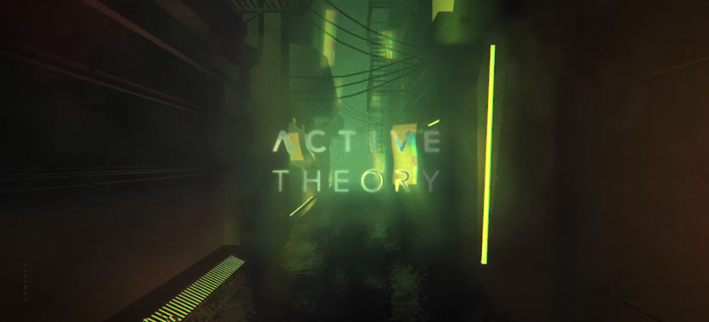
This is a portfolio of a team that develops VR and AR applications. In addition to the case studies, it also lists the used technologies.
The Awwwards jury complimented the menu solution and interactive home page, which immediately set the right mood. Other scores are mostly at the same level. Generally, creativity and design were appreciated the most.
TAO Tajima Filmmaker – December 2017
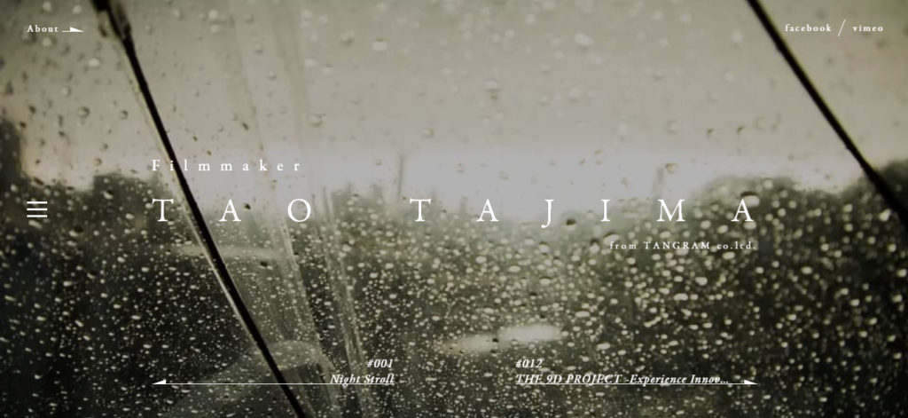
The website belongs to a filmmaker from Tokyo working for the Tangram design studio. This is a portfolio.
It has original transitions between elements and a beautiful wave effect. The maximum score was given for creativity. The website was also evaluated by the developer jury and received 7,12. Moreover, at the end of 2017, this website won the annual award thanks to the great visuals that made it stand out from the competitors.
The New Mobile Workforce – November 2017

Visit this page to learn how Citrix’s team helps Red Bull to customize and maintain their racing cars.
The Awwwards jury liked the menu design inspired by Formula 1. The “high-speed” transition between the website pages perfectly complements the overall look. You can examine a racing car to learn more about its maintenance. The developer jury awarded the website for its flawless mobile version.
In My World – October 2017
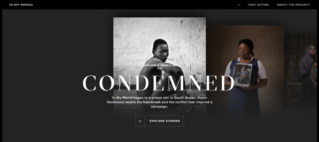
This website is great for those who love discovering other people’s lives. It shows how war, poverty, and other disasters affect our mental health.
The project is a result of the cooperation with the photographer Robin Hammond. The website attracts with its social message and highly expressive photos. Every image shows a tragic fate that you can dig into. The stories with photos create a much stronger impression than plain text.
Gleek Chat – August 2017

Visit this page to learn how secure chats, calls, and video calls work. These services are offered to both individual and corporate users.
Assessing the website, the Awwwards jury highlighted point-to-point navigation and original transitions between website elements. The design is memorable and stands out from the competitors. The developer jury also awarded it.
OUIGO Let’s play – June 2017

Want to play for a while? The game promotes a branch of SNCF (French National Railway Company). This is an analog of a classic browser game with a colorful design and an emphasis on railways. The experts appreciated the design, usability, and creativity of the developers. The developer jury was also generous with an award.
We The Fans – May 2017
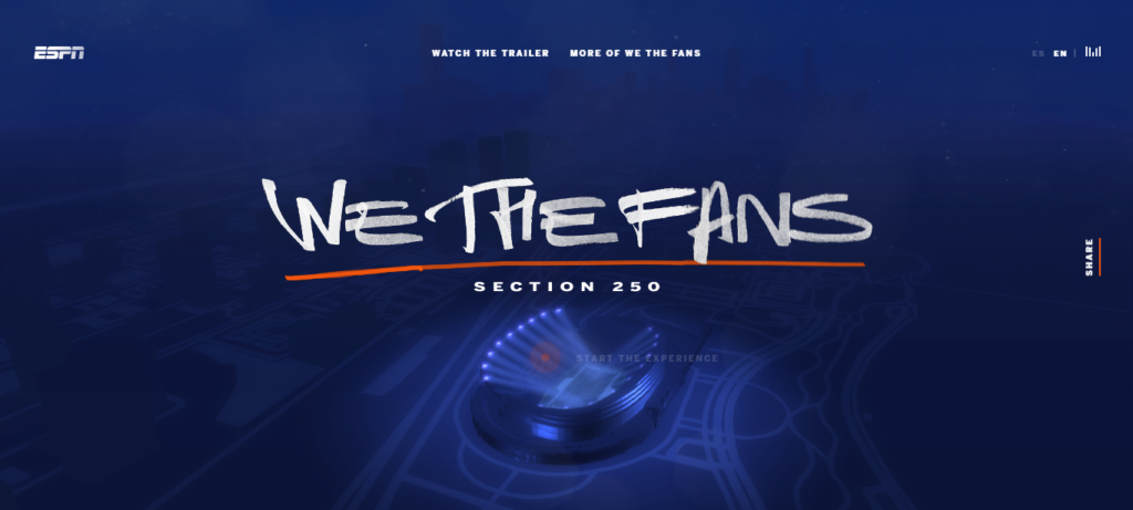
This website is dedicated to the Chicago Bears fans (an American football team). It tells about their life and love for their favorite team.
The scores prove that the Awwwards experts enjoyed implementing navigation on different platforms. The menu also looks nice. The developers focused on visual elements. For example, users can make a virtual visit to stands and see the usual places of renowned fans.
Mendo – April 2017

Mendo is a store for book lovers with the main location in Amsterdam. The website promotes the products available in the store.
The usability and design of this website are well-developed. Awwwards complimented the technical part (especially the cart) and website search with numerous filters and intuitive functionality. The developer jury awarded this website with a 7,09 score.
A World With No Heroes – March 2017
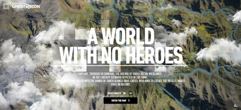
Here you can explore Bolivia in a version of Tom Clancy’s Ghost Recon Wildlands. The country is controlled by the drug cartel Santa Blanca. Fifty cameras show users the details of this story.
The jury was particularly fond of an exciting interactive video game with ultra-realistic landscapes. The content also boasts great quality and creativity, which allowed the website to become the best website of March 2017.
For Honor Scars – February 2017
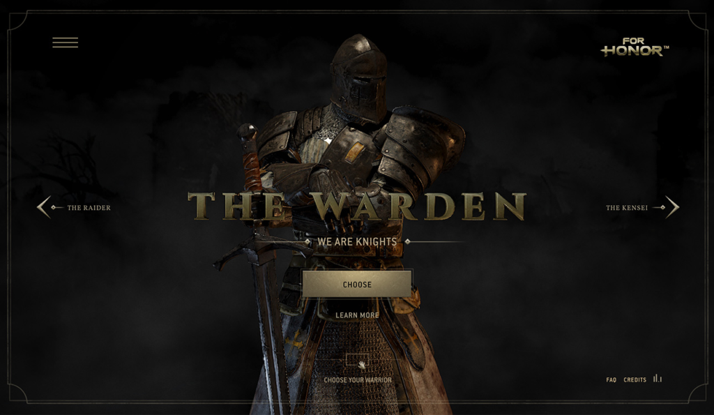
Take a look at another gaming website. Inspired by For Honor, this website details the stories of its heroes.
The user interaction is just perfect. You can view the 3D models of the heroes from any angle – they change their position as you browse the pages. While navigating, you can also watch a real battle.
Rainforest Wood Experience – January 2017

This website offers you to recall your connection with nature and realize the benefits of pollution-free products. They have a store selling barley sprouts and other similar products.
The website has impressive navigation and changing backgrounds. Users can feel like they see everything from a bird’s eye view. The jury also singled out the product selection menu, which differs from menus in standard online stores.
Residente – December 2016
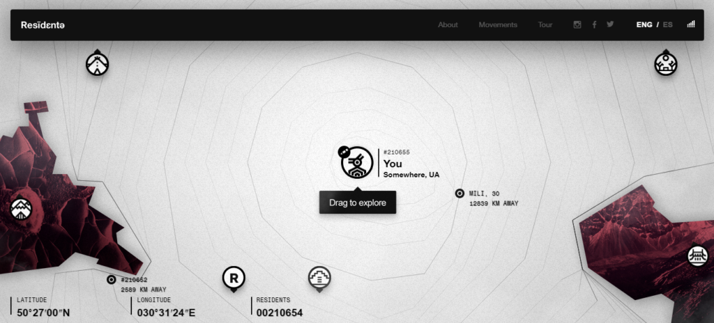
The website documents the travels of Residente (Rene Huan Perez Joglar). He is a musician who decided to discover the world.
The website received a high general score from the jury. They particularly liked a dot menu and website navigation. The developers placed a bet on interactivity and won. The website automatically detects your location to display interesting places visited by Residente on the map.
Paper Planes – November 2016

Here you can make a single action – throw a paper plane. At the same time, pop-ups will show the location of other paper planes on the globe.
To throw paper planes, you will need to use your smartphone. This website shows how a simple but professionally implemented idea can be highly successful. The jury appreciated the creativity and design, whereas the developers gave a very high score for the technical part – 8.67.
Discover Your Patronus – October 2016
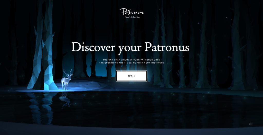
This website is a pure treasure for Pottermans. After passing a simple test, every website visitor will know their Patronus.
The fans of Joanne Rowling’s creativity will recognize famous movie scenes. It is worth noting that this test is highly interactive, thanks to a set of tips. You don’t just fill in the information; this is a mini-game. Such an approach resulted in a Site of the Month Awwwards and recognition from the developer jury.
Conclusion
After a brief analysis of the TOP websites according to Awwwards, we can make several general conclusions:
- Developers shouldn’t be afraid to challenge design standards
- Interactivity and user interaction matter
- The website design should be recognizable
- More than 50% of the site of the Month websites have a high-quality mobile version
- Visualization is important. The jury likes original menus and navigation. Of course, this shouldn’t harm usability.
The websites that have received the monthly award from Awwwards may serve as a guideline and the source of ideas. Awwwards logo was also worth your attention. If you learn from the best and adapt their practices, this can help to promote your website.
