The easiest road towards corporate success is provided by customer service. Customers could always have questions that demand quick attention even if you create the ideal application or website. For this reason, firms really must provide excellent customer service.
The most often used resource consumers turn to for their questions is customer support tools. According to a Vanilla survey, 84% of consumers attempt to fix support problems on their own before calling customer care. You thus have to make sure the support tool is made to provide improved UX.
A/B testing lets companies know what appeals to consumers and what does not, therefore removing the guesswork from the UX design. It raises user involvement and conversion rates, which finally results in company expansion.
This post will walk you through doing A/B testing for improved UX on the customer support page. It will act as a checklist covering what to do and how to accomplish the greatest outcomes. Stay reading to find more.
A/B Testing with Plerdy: A Guide to Optimization Excellence
A/B testing is pillar when it comes to maximizing for the greatest client experience. This becomes a simple journey with Plerdy. Under one roof negotiate the waters of testing, analysis, and strategy changes.
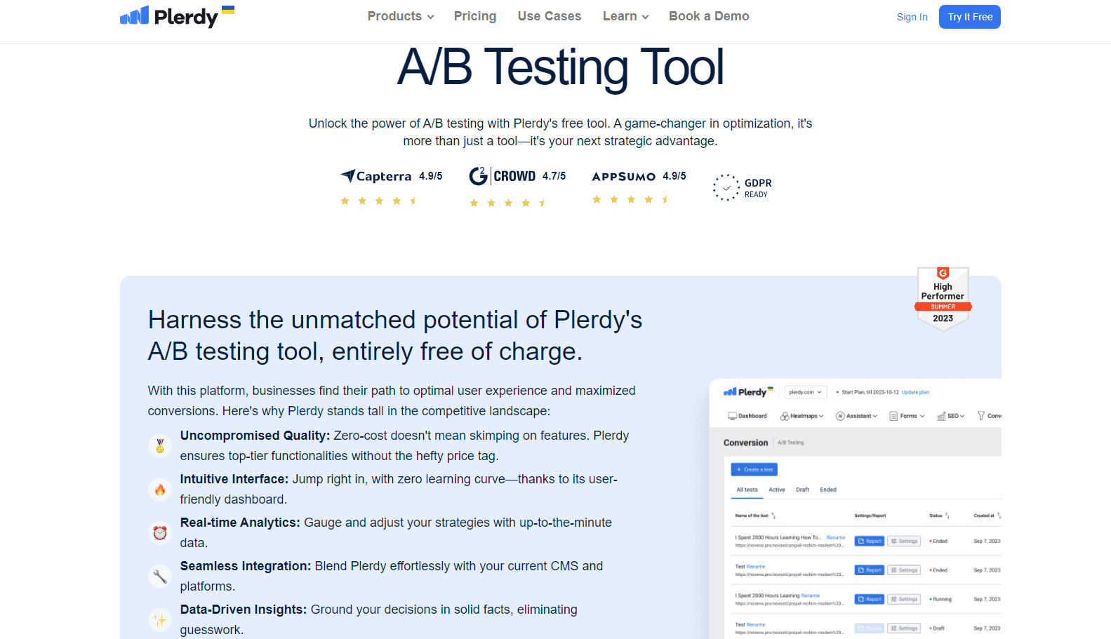
Here’s how to roll out A/B testing with Plerdy:
- Dive Right In: Join Plerdy, grab the easy dashboard, and get ready to write your first test.
- Perfectify Information: specifics Name the page you want to test. Whether it’s changing the color, font size, or HTML and CSS margins, a dynamic dashboard shows up allowing you to make adjustments on-demand.
- Establish specific objectives: Your intended use is what? Clearly identify the measurement you wish to do. Perhaps it relates to the customer’s path to a “Thank You” page or interacts with a certain function.
- Track continuously in real-time. Plerdy provides real-time insights while your A/B test runs. Explore information showing user preferences, participation rates, and more.
- Think about and change: Get your observations after the test. What successful was it? What was absent? Use this gold mine of knowledge to hone next tests and plans of action.
Particularly e-commerce, specific niches can be quite profitable. An online clothing business might, for example, test button colors and find unexpected results: perhaps consumers in their 30s like a tranquil blue “Add to Cart” button over a hot red one.
Plerdy essentially helps companies find a simplified way to improve the experience of their customers by demystifying the labyrinth of A/B testing. Explore Plerdy’s universe and carefully and elegantly guide your tactics.
Enhancing UX: How to Do A/B Testing for Customer Support Pages?
A/B testing on several aspects of customer support websites is possible. To raise your user experience and conversions, I will walk you through a detailed approach on running these tests.
How to Do A/B Testing to Improve Navigation Experience on Customer Support Pages?
How may A/B testing help to enhance customer service page navigation experience?
- A flawless user experience depends on page navigation in great part. It enables consumers to easily access the knowledge they are seeking for. Therefore, the navigation ought to be user-friendly, well ordered, and transparent.
Try other page locations for the search bar. To enable users to rapidly locate the required information, top the page with the search bar.
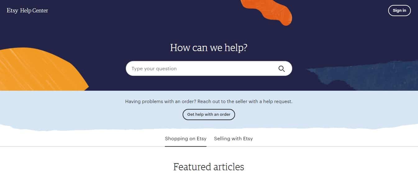
- See how Etsy has set up their help center with a search bar at the top of the page to provide users easier access.
Sort the lessons, assistance pieces, and queries based on their categories. Sort the material according to its assistance in starting, configuring, debugging, and more. You can play about with several category names, content kinds, and more.
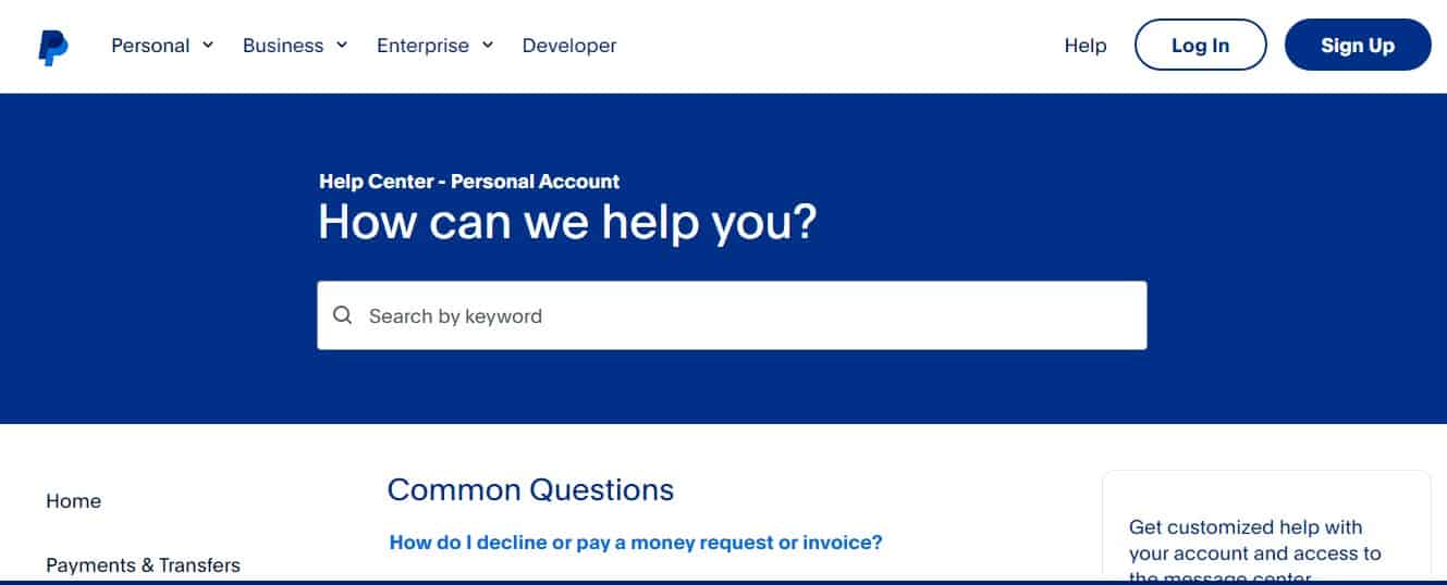
- PayPal’s support site, for instance, has a separate section for typical queries, assistance guides, and account-related inquiries.
- Change the page flow on the support tool. A client searching for video tutorials would not want to search other categories. Presenting these tutorials on a new page will thus help to improve UX.
Put a breadcrumb widget on the page to guarantee the clients have flawless navigation.
A/B testing lets you examine customer navigation of your tool and enhance important user flows. Start by playing about with item placement and then work on changing the navigation experience.
How to Do A/B Testing to Ensure Customers Get Quick Access to the Support Team?
Not all customers can find a solution to their queries with a self-service customer support tool. Hence, adding a medium through which they can do so will boost the tool’s UX.
To contact customer support, provide customers with an option, such as live chat, call scheduling, email support, or social media messengers.
- Install a live chat widget to receive queries and requests. You can count on customer support software to manage and respond to customer queries directly from Gmail inboxes in no time.
- Add a ‘Book a Call’ button with a link to the support agents’ calendar to schedule a call or provide customers with your support email address to receive queries on your email.
- Leverage social media integration to allow customers to post queries on your social pages.
Twitter’s help center provides customers quick access to the support team by placing the “Contact Us” button in the header menu.
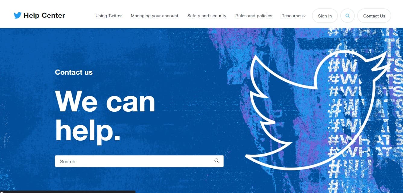
Provide better support to the customers and strengthen customer connections. You can deliver a frictionless experience and superior customer service by giving customers direct access to customer support professionals. It offers you a competitive advantage and helps your brand stand out.
How to Do A/B Testing to Offer Engaging Website Copy?
The golden rule of quality content is to keep the copy concise. You can test the following types of copy on the customer support page:
- Headlines and sub-headlines
- Body
- CTA button content
Here is a short guide to help you A/B test website copy for better customer engagement:
- Start with testing the headlines. It is wise to keep the headlines and subtitles crisp. To create a perfect headline that shares the right message with the customers, experiment with the tone, choice of words, etc. and find out which performs the best.
- Focus on offering value to the customers through the copy in the body sections. Test out different variations of the copy, format, style, readability, tone, and more. With the help of A/B testing, you can find out what the audience responds better to:
- Short text vs. long-form content
- Formal vs. informal tone
- Paragraphs vs. bulleted lists
- Write multiple variations for the CTA text to determine which drives the maximum conversions. For instance, adding the word ‘free’ in the CTA button text can increase the number of clicks and form submissions.
Remember, good copy motivates, convinces, and encourages your customers to engage with your business. A/B testing on your support tool offers you the chance to experiment with your content and find out the one that stands out to get into the mind and hearts of your customers.
How to Do A/B Testing on Customer Support Page Design and Layout?
The design and layout of the customer support page also play a significant role in improving the UX. The page presentation determines how long the customers will stay on the page.
Conduct an A/B test on the entire page design and layout in the following ways:
- Consider moving or deleting some elements on the page. For example, remove the unnecessary CTAs asking customers to subscribe to the company blog.
- Test with different designs and color schemes. Experiment with button colors, page design, font type and size, background color, and more.
- Change the page layout and appearance by adding images, illustrations, or other creatives that resonate with your offerings.
For example, Figma is creative in its customer support software design. With colorful illustrations, Figma manages to capture the attention of the customers.
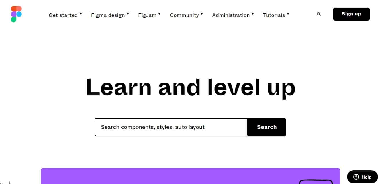
A/B testing the support tool design gives you insights into how you can make your tool easily accessible and navigable for your customers. Good design and layout help you create powerful first impressions and make your customers feel more welcome on your page.
How to Do A/B Testing on Media Elements to Help Them Find What They Are Looking for?
Adding images, icons, and video introduces engagement elements to the customer support page. Ensure the media elements are of high quality and provide a clear understanding of the offerings. Each of these elements can be A/B tested for optimization.
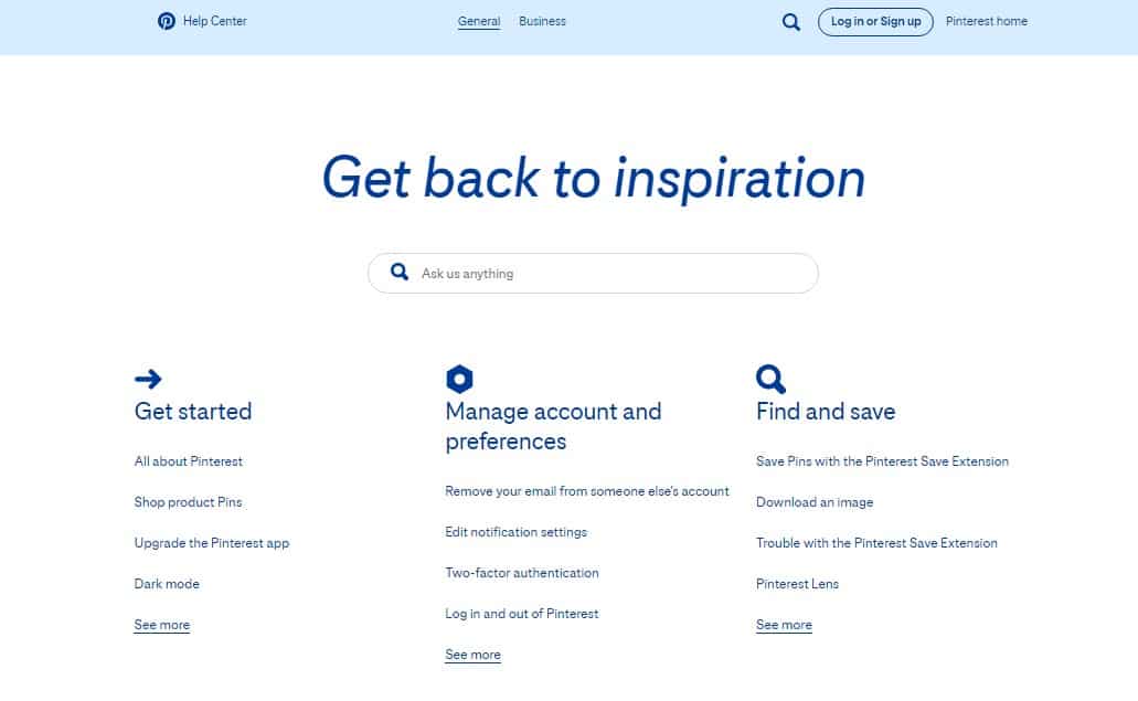
- Check if the icons send the customers the right message. For example, Pinterest has rightly placed the magnifying glass icon for the ‘Find and save’ article category.
- Test the icon theme, color palettes, icon size, line weight, and more, to find the perfect match.
- Next, add or remove images on the page based on the context. For instance, adding the customer’s image would be beneficial if you had testimonials on the support pages.
Some basic tests for images would be:
-
- Black and white vs. colored image
- Person vs. product screenshot
- One image vs. multiple images
Experiment with the number of images, their placement, image themes, and more for image optimization and to improve your on-page customer experience.
- Determine how videos are impacting the performance of the page. You can conduct an A/B test on videos for the following scenarios:
- Press play vs autoplay
- A thumbnail of the videos
- CTA in video content
- Length of video
- Number of videos on the pages
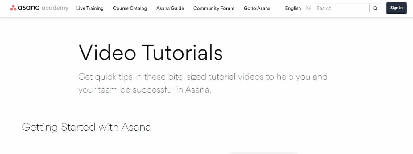
For example, Asana’s customer service tool has a dedicated page for video tutorials. Did you notice how Asana informs the customers about what to expect in the video?
How to Do A/B Testing to Build a User-Friendly Website Form?
Forms are essential for capturing data from visitors on the customer support tool. Let us understand various ways you can test the forms for optimal conversions.
- Design of the form. Experiment with the form design to determine the best one that attracts the maximum eyeballs. Use different fonts to ensure seamless reading, utilize various fonts to improve readability, add images, GIFs, or videos to capture attention, and more.
- Form fields and the relevance of these fields with the page. Boost form conversions by determining the ideal length for the opt-in forms. Add or remove form fields to optimize the form length.
- Position of the form on the tool. Determine the ideal position for placing your opt-in forms on the pages. The forms must be placed in ideal positions and be optimized for viewing on mobile devices.
- Pay attention to the form copy. For example, the heading or the CTA.
- Add social proof. Include trust indicators, such as awards, certifications, client testimonials, and more to the forms.
- Form layout. Ensure the form offers a responsive design for mobile devices.
A/B testing forms on the customer support tool help you optimize them for your target customers. It helps you identify the ideal form design and improve the conversion rates of your forms.
These were important conditions to consider when conducting A/B testing on your customer support page. Follow the steps mentioned above diligently to optimize your support page and improve your tool’s conversion rates.
Wrapping up
A/B testing helps you identify what type of content and its presentation your customers prefer. It helps you provide better experiences to the customers with the help of thoughtful experimentation. I’m sure this guide will help you start A/B testing today or revamp your existing A/B testing campaigns to deliver excellent customer experiences.
