Step into the digital foyer of elegance and functionality with our roundup of the 12 best hotel website designs of 2024. From cozy boutique hotels to sprawling luxury resorts, the power of a well-crafted website resonates through its ability to captivate and engage potential guests. These examples showcase a blend of aesthetic appeal and user-centric design, making each site a virtual front desk that’s both inviting and informative.
- The Minimalist Luxury Retreat focuses on serene visuals and sleek navigation.
- The Urban Explorer Hub combines vivid photography with city guides.
- The Eco-Conscious Haven uses earth tones and sustainability highlights.
In an industry where first impressions are paramount, the design of your hotel’s website can direct guest traffic right to your booking engine. To truly harness your site’s full potential, consider using Plerdy’s analytical tools. They are designed to optimize user experience and increase conversion rates by providing deep insights into visitor behavior and interaction patterns. Enhance your site’s usability and keep guests returning with strategic adjustments driven by real data.
List of 12 Brilliant Hotel Website Design Examples
Diving into the “12 Best Hotel Website Designs Examples in 2024” feels like embarking on a grand tour of digital innovation. Each entry serves as a masterclass on how hotels can harness design to craft visually stunning, highly functional, and intuitive sites. These exemplars set the bar for blending aesthetic finesse with seamless user experiences, turning every click into a worthwhile journey.
Hotel Sonne
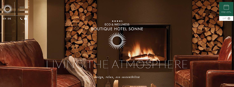
The Hotel Sonne website is a paragon of hospitality web design, blending luxury and nature in its visual storytelling. From the moment you land on the homepage, it’s clear this hotel knows how to invite visitors into its warm, rustic embrace.
Key elements of the website include:
- Lush Visuals: The design uses rich, textured images that showcase the hotel’s interiors and stunning alpine surroundings, drawing users into the Hotel Sonne experience.
- Elegant Typography: Clean and sophisticated fonts communicate elegance and ease, ensuring that information is attractive and readable.
- Intuitive Navigation: The website’s layout guides visitors fluidly from one section to another, making it easy to access information and book a stay.
This design improves beauty and utility by integrating them:
- High-resolution images depict the hotel’s luxurious yet cozy ambiance.
- The site’s navigation is user-friendly, offering quick access to booking and hotel information.
- Design elements are consistent with the hotel’s branding, emphasizing elegance and comfort.
The Hotel Sonne website exemplifies how a hotel can communicate its unique offerings and ambiance through smart design choices. Its immersive imagery, elegant typography, and user-friendly layout create a welcoming online environment that mirrors the exceptional experience guests can expect at the hotel itself. This careful attention to design detail elevates the hotel’s online presence and sets a high standard for hospitality websites aiming to attract discerning travelers.
Once In A Lifetime Hotels
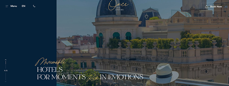
Dive into the essence of luxury travel with the Once In A Lifetime Hotels website, a digital gateway that invites travelers to explore extraordinary hotel destinations. This website exemplifies how design and functionality can merge to create an immersive user experience that stands out in the competitive hotel industry.
What distinguishes Once In A Lifetime Hotels’ website:
- Visual Storytelling: The website captures the essence of each hotel with striking images of iconic locations, allowing visitors to envision their stay.
- User-Centric Design: Navigation is crafted for ease, making information about each hotel accessible within a few clicks.
- Interactive Elements: Maps and clickable galleries enhance interaction, encouraging users to explore further.
The design elements of this website are meticulously chosen to evoke emotions and a sense of wanderlust:
- The homepage features a captivating hero image with a serene view, setting the tone for a luxurious browsing experience.
- Elegant typography and a clean layout reflect the sophistication of the hotels featured.
- Subtle animations and a cohesive color scheme enhance the aesthetic appeal without overwhelming the user.
This hotel website offers a tour of the world’s most beautiful destinations, not merely a booking portal. It balances elegance and usefulness, making it a wonderful example of how hotel websites could meet modern guests’ high expectations. Visitors can simply select their perfect destination and explore each hotel’s distinctive offerings thanks to the straightforward design. Once In A Lifetime Hotels’ website embodies luxury travel in every pixel.
Hotel Zola
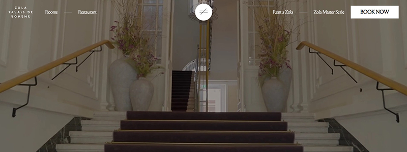
Step into the refined elegance of Zola Palais De Boheme, where design meets sophistication in the heart of Vienna. The hotel’s website perfectly reflects its commitment to luxury and exclusivity, capturing the essence of an upscale retreat.
The website is precisely designed to reflect the hotel’s modern yet historic vibe:
- Minimalist Navigation: Effortlessly guiding users through its offerings, from rooms to dining experiences.
- Elegant Imagery: Displays the hotel’s exquisite interiors and tranquil exteriors, captivating visitors from the first click.
- Sophisticated Palette: Uses a neutral color scheme that complements the stately ambiance of the hotel.
Here’s what makes the Hotel Zola website a standout:
- The homepage displays a captivating calligraphy quote encouraging visitors to live out loud, setting an inspirational tone.
- Every element on the website is designed with the user in mind, making information accessible with minimal navigation.
- Interactive elements like the booking interface are seamlessly integrated, offering a straightforward user experience without sacrificing style.
This hotel website balances aesthetic appeal with user functionality, creating an online presence as inviting as the hotel itself. Hotel Zola promotes its rooms and services and extends an invitation to experience the luxury and beauty of Vienna through a well-designed digital portal.
K11 ARTUS
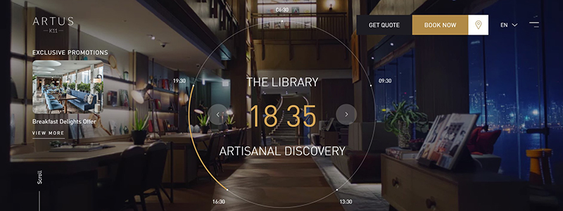
The K11 ARTUS hotel’s website is a testament to the power of modern design, seamlessly blending art with the elegance of a luxury residence. This website isn’t just a portal; it’s an experience, echoing the hotel’s “Artisanal Living” ethos in every pixel.
Key highlights of the design include:
- Visual Harmony: The website uses a cohesive color palette that reflects sophistication and calm, aligning with the hotel’s aesthetic.
- Dynamic Content: Interactive elements like a rotating gallery capture the vibrant life within the hotel, providing glimpses of the breathtaking views from “The Balcony” at different times.
- Artistic Touches: Brush strokes and art-inspired backdrops are strategically placed, emphasizing the hotel’s connection to craftsmanship and creativity.
Here’s what sets the K11 ARTUS website apart:
- The hotel’s opulent decor and waterfront vistas are captured in gorgeous photos.
- Thoughtful testimonials from guests offer personal insights, enhancing credibility.
- The easy navigation lets visitors browse accommodations and eateries.
The website is one of 2024’s greatest hotel website designs since it blends practicality and aesthetics. The K11 ARTUS proves that a hotel website can be as much a work of art as the property it represents. This design approach elevates the user’s experience and cements the hotel’s status as a pinnacle of modern comfort and artistic living.
My Arbor Hotels
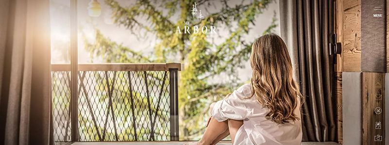
Welcome to the Forest Sanctuary of My Arbor Hotel: A Tranquil Escape Amid Nature
My Arbor Hotel has effectively harnessed the essence of tranquility and serene beauty in its website design. As a jewel in the forest, the hotel’s digital front mirrors its physical charm, making it a perfect contender for our list of the “Best 12 Hotel Website Designs Examples in 2024.”
What sets the My Arbor website apart?
- Captivating Imagery: The homepage is adorned with soothing visuals of forest views and elegant interiors, drawing visitors into the peaceful world of My Arbor.
- Smooth User Experience: The website’s design makes it easy to browse rooms, facilities, and packages.
- Consistent Theme: The earthy color palette and natural textures reflect the hotel’s commitment to harmony with nature.
Key design highlights include:
- Elegant, minimalistic layouts that emphasize content and visuals allow the hotel’s beauty and surroundings to shine.
- Quick access menus that lead to detailed pages on suites, experiences, and the hotel team contribute to a comprehensive understanding of what My Arbor offers.
- Inspirational quotes and testimonials are integrated into the design, enhancing the personal touch and connecting emotionally with potential guests.
With its thoughtful design and harmonious integration of elements, the My Arbor hotel website showcases its accommodations and invites users to experience a slice of this unique sanctuary. This website stands as a testament to how design can amplify the allure and ethos of a hotel, ensuring guests feel the call of nature and luxury from the first click.
Ultima Collection
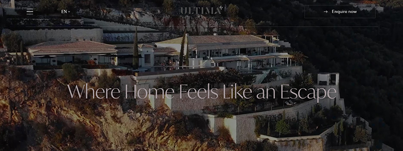
The Ultima Collection website elegantly transports visitors into a world where luxury meets the serenity of nature, setting a new standard for hotel web design in 2024. This site highlights the uniqueness of each property and seamlessly blends sophisticated functionality with breathtaking visuals.
Here’s what makes the Ultima Collection’s website a pinnacle of hotel web design:
- Stunning Visuals: Each page offers high-quality photographs of the hotels’ private atmosphere and stunning settings.
- Intuitive Layout: Navigation is streamlined and user-friendly, encouraging exploration of the hotel’s extensive amenities and services.
- Consistent Branding: The website maintains a luxurious aesthetic throughout, reinforcing the Ultima brand’s identity of exclusivity and elegance.
Key features include:
- A captivating homepage slider that showcases the snowy retreats and lush settings of their properties.
- Direct booking capabilities that are both easy to find and use enhance the user experience.
- Engaging articles about the hotel’s history, sustainability, and distinctive guest experiences.
This design approach not only captivates potential guests but also ensures they have a seamless experience from browsing to booking:
- Sophisticated Color Scheme: Utilizes a palette that complements the luxury of the hotel settings.
- Detailed Descriptions: Each section of the website offers detailed insights into the hotel’s offerings, from bespoke services to exclusive experiences.
The Ultima Collection’s website serves as a beacon for what modern hotel websites should aspire to, providing an impeccable balance of beauty, functionality, and detailed content.
Praia Art Resort
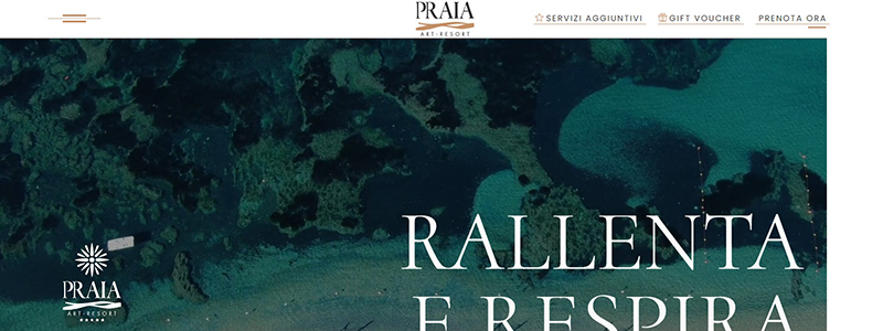
Step into the serene world of Praia Art Resort, where the website transports you to a tranquil escape along the Ionian coast. Our 2024 list of the greatest hotel website designs includes this hotel’s, which perfectly conveys the resort’s opulence and serenity.
Here’s what sets the Praia Art Resort’s website apart:
- Visual Appeal: Stunning imagery that spans the serene beachfront and elegantly appointed rooms invites you into a visually rich experience.
- Intuitive Layout: The website’s easy navigation lets visitors explore the hotel’s offers.
- Cohesive Aesthetic: Every page has a consistent theme of calm and luxury, reinforcing the hotel’s brand.
Key elements of the design include:
- High-quality photos that showcase the breathtaking views and exquisite hotel interiors.
- A minimalist menu that enhances the website’s spacious and uncluttered feel.
- Subtle animations that bring the visuals to life without overwhelming the user.
This method improves website operation and aesthetics:
- Ease of Booking: Direct booking options are visible, encouraging immediate action.
- Engaging Content: The hotel’s tale is told in intriguing descriptions of each room and eating area on the website.
Praia Art Resort’s website is more than just a portal to book a stay—it’s an invitation to immerse oneself in a luxurious lifestyle, reflected through every detail of its design. This shows how hotel websites may enhance the hospitality experience from the start.
Gage Hotel
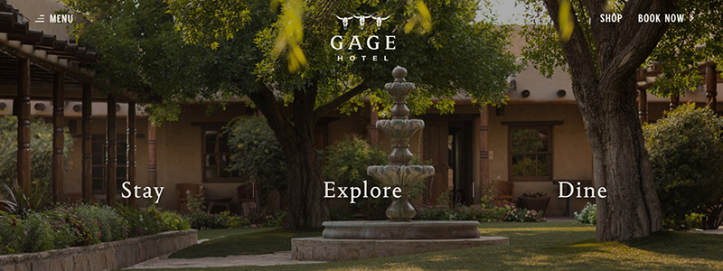
Welcome to the historic Gage Hotel, where the website is a gateway to the grandeur of Big Bend Country. Recognized for its rich tradition and impeccable service, the Gage Hotel’s website design complements its renowned hospitality with classic charm and modern usability.
Key aspects of the Gage Hotel’s website include:
- Elegant Imagery: Each photograph exudes warmth, showcasing the hotel’s cozy rooms and picturesque settings.
- User-Friendly Navigation: Easily accessible menus guide visitors through options to stay, explore, and dine, making planning a visit seamless.
- Responsive Design: Optimization for all platforms ensures guests can use the website smoothly on desktop and mobile.
Highlights of the website’s design:
- A homepage that invites interaction with sliders that feature beautiful views of the hotel’s exteriors and lush surroundings.
- Content that richly describes the hotel’s amenities and unique historical background.
- Direct links to booking, emphasizing convenience and encouraging longer stays.
This thoughtful website design not only highlights the beauty and legacy of the Gage Hotel but also enhances the user experience through:
- Clarity and Simplicity: This makes it easy for users to find information about accommodations and dining.
- Visually Rich Elements: Keeping potential guests engaged and eager to explore the hotel’s offerings.
The Gage Hotel’s website is a perfect example of how a well-designed hotel can extend a warm invitation to visitors, mirroring the exceptional experience that awaits at the hotel.
Rose Hotel
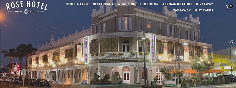
The Rose Hotel’s website is a vibrant showcase of what makes this iconic establishment a beloved destination. The website is a great example of 2024 hotel web design, capturing the excitement and charm of its location.
Here’s why the Rose Hotel website captures attention:
- Dynamic Visuals: The homepage is a collage of compelling photographs that illustrate the hotel’s lively atmosphere and inviting spaces.
- Engaging Layout: The design uses bold, colorful promotions to highlight daily specials and events, ensuring they immediately catch the visitor’s eye.
- User-Friendly Interface: Clear, easy-to-navigate menus make it easy to find information about the hotel’s dining, accommodation, and special offers.
Key features of the website include:
- A vibrant, animated header that rotates images of the hotel’s facade at different times of the day, reflecting its round-the-clock appeal.
- Special promotions are displayed with vibrant, easy-to-read graphics that detail menu specials and happy hours.
- Quick links to booking accommodations or reserving a spot at various events and functions hosted by the hotel.
This website does more than inform; it engages visitors by:
- Highlighting Weekly Events: With a dedicated section for what’s on, including sports broadcasts and meal deals.
- Promoting Community Connection: Displaying a gallery of social media snapshots that share customer experiences and build community.
Overall, the Rose Hotel’s website reflects its commitment to providing a welcoming, fun, and memorable experience, which is expertly translated through its thoughtful web design. This makes it a worthy inclusion in our list of the best hotel website designs for 2024.
Joyà Zanzibar
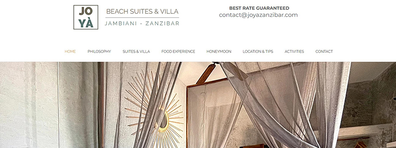
Nestled on the pristine shores of Zanzibar, the Joyà Zanzibar Beach Suites & Villa encapsulates an ethno-chic retreat through its captivating website design. This standout hotel website invites visitors to immerse themselves in an environment combining luxury and local culture. It is a deserving contender for our “12 Top Hotel Website Designs Examples in 2024.”
Website Highlights:
- Rich Visuals: The homepage immediately greets visitors with vibrant, full-screen images depicting the suites and villas’ breathtaking views and intricate details.
- Intuitive Navigation: Well-placed menu selections for lodging, dining, and local activities make exploring the hotel easy.
- Consistent Aesthetic: The website maintains a cohesive color scheme that reflects Zanzibar’s natural beauty and cultural richness.
Core Elements of the Design:
- A clean, modern layout that focuses on user experience by providing seamless interactions.
- Dynamic content areas showcase the hotel’s philosophy, suites, services, and testimonials, allowing visitors to understand Joyà’s comprehensive offerings.
- Detailed descriptions and imagery that effectively communicate the unique features of each accommodation option.
The design of the Joyà Zanzibar website ensures a memorable first impression:
- Engaging User Interface: Elegant and user-friendly, allowing anyone to explore the site.
- Strategic Placement of Booking Options: Encourages visitors to explore booking possibilities without overwhelming them with promotional content.
This thoughtfully designed website reflects the serene and luxurious atmosphere of Joyà Zanzibar. It gives guests a tempting preview of their stay, boosting the hotel’s web presence and appeal.
The Palmwood
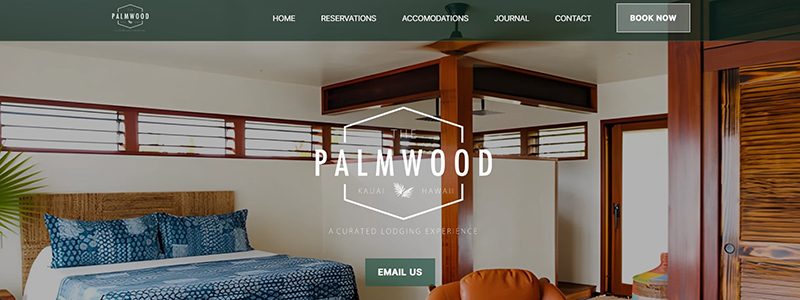
To escape to a quiet mountaintop retreat inspired by Japanese Ryokans on Kauai’s beautiful North Shore, visit The Palmwood. This hotel’s website stands out as a masterpiece of design, seamlessly integrating the tranquil beauty of its surroundings with an easy-to-navigate interface, making it one of the top picks for our “12 Brilliant Hotel Website Designs Examples in 2024.”
Why The Palmwood’s Website Shines:
- Stunning Visuals: High-resolution images showcase the property’s serene landscapes and elegantly appointed interiors.
- Streamlined Navigation: The website’s layout is intuitive, allowing guests to easily access information on accommodations, availability, and local attractions.
- Cohesive Aesthetic: The design uses natural textures and a calm color palette that reflect the peacefulness of the hotel’s environment.
Key Features of the Website:
- The engaging homepage highlights the hotel’s unique architecture and inviting spaces.
- Clear, concise content that tells the story of The Palmwood’s philosophy and its dedication to providing a memorable guest experience.
- Responsive design makes the website look and work great on mobile devices.
This hotel’s website delivers in terms of design and functionality, ensuring every potential guest enjoys a seamless online experience. The Palmwood does more than showcase a destination; it invites you into a world of relaxation and charm, setting the standard for hotel website design in 2024.
The Hollywood Hotel
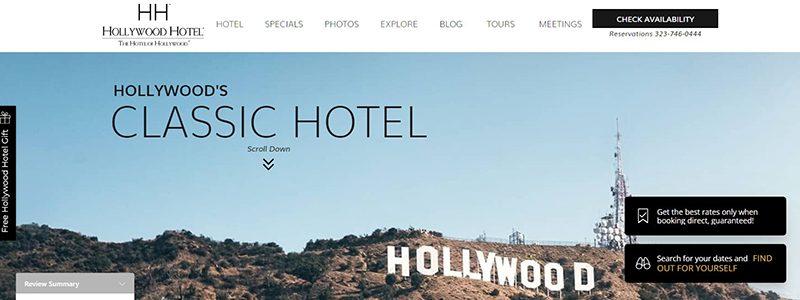
Immerse yourself in the glamour of Tinseltown at The Hollywood Hotel, where the website design mirrors the allure and excitement of its iconic location. Its smart blend of utility and design captures Hollywood with every scroll, making it one of our “Brilliant 12 Hotel Website Designs Examples in 2024”.
Key Highlights of the Website Design:
- Stunning Visuals: The homepage dazzles with images of the Hollywood sign and the hotel’s plush interiors, setting a luxurious tone right from the start.
- User-Friendly Interface: Navigation is a breeze, with clearly marked tabs for rooms, dining options, and special offers, ensuring a seamless user experience.
- Engaging Content: The site features dynamic sections like “Breakfast,” “Concessions,” and “You Can’t Refuse These Offers,” each creatively displaying the hotel’s offerings.
Distinctive Features Include:
- A captivating hero image of the Hollywood sign immediately associates the hotel with the fame and history of its surroundings.
- This is a concise yet informative section on hotel amenities that highlights their premium offerings, from pet-friendly policies to on-site dining.
- Interactive elements like customer testimonials and special promotions engage users and encourage bookings.
The Hollywood Hotel’s website excels in:
- Design Consistency: Maintaining a consistent theme that reflects Hollywood’s chic and entertainment-rich environment.
- Attention to Detail: Every aspect of the site, from typography to layout, is thoughtfully crafted to enhance visual appeal and user engagement.
This hotel’s website does more than sell a place to stay; it invites guests into the Hollywood lifestyle, making it a beacon of hospitality web design in 2024.
Conclusion
As we wrap up our showcase of the “12 Best Hotel Website Designs Examples in 2024,” it’s clear that the fusion of compelling design, robust functionality, and thoughtful user experience is the cornerstone of successful hotel websites. These curated examples highlight the aesthetic value and underscore the strategic importance of effective design in the hospitality industry. Here’s what sets these websites apart:
- Efficient Use of Visuals: Each site uses high-quality photographs to convey the hotel’s personality and interact with viewers.
- Intuitive Navigation: Menus and layout are streamlined, ensuring potential guests find what they need without hassle.
- Responsive Design: These websites are optimized for desktops and mobile phones for a seamless experience.
This focus on top-notch design, strategic functionality, and user-centric features should inspire any hotel looking to enhance its online presence. Don’t just take our word for it—check out these stellar websites and see how they leverage design to transform casual browsing into booked stays. Ready to elevate your hotel’s website? Tap into these insights and consider integrating them with robust tools like Plerdy to analyze and optimize your website’s performance.
