Ever landed on a webpage and felt like you’d just walked into the wrong party? Not ideal. Your landing page is your brand’s digital handshake — first impressions count. In our roundup of the “20 best landing page examples,” we’ll guide you through making that first impression memorable. From sleek designs to masterful calls to action, these examples are more than just pretty faces; they’re conversion machines. So buckle up, and let’s dive into the world of landing pages that aren’t just good — they’re showstoppers.

What is the purpose of a landing page?
A landing page acts as the welcoming committee and lead singer for your online presence—setting the stage and delivering the opening number that captures an audience’s attention. It’s where potential becomes kinetic, transforming visitors into active participants in your brand’s story.
- A catalyst for customer action, a landing page ushers users towards a clear goal, be it sign-ups, sales, or subscriptions.
- With laser-focused content, it eliminates distractions, honing in on one compelling offer.
- The handshake offers value, grabbing attention with a deal or insight in exchange for precious contact details.
- Tailored to specific campaigns, a good landing page example delivers relevance, resonating with the targeted audience’s interests and needs.
From e-commerce to B2B services, each landing page example has its spotlight moment, showcasing the best a brand offers while guiding the visitor with unwavering purpose towards a singular call to action.
List of Best 20 Landing Page Examples Of 2023
Diving into the “Best 20 landing page examples” is like hitting the jackpot for marketers — each page is a masterclass in user engagement. These exemplars are not just about striking looks; they’re a treasure trove of conversion gold, showing how a landing page can be both a showstopper and a workhorse. Reviewing these pages, you’ll see how each serves up a feast of innovation, turning the casual browser into a bona fide lead with finesse.
Netflix’s Landing Page: Balancing Simplicity and Choice

A beautifully designed landing page is what you’ll find on Netflix’s website. The design philosophy hinges on simplicity, making the initial interaction as straightforward as possible. The page is dominated by a clear value proposition: “Unlimited movies, TV shows, and more.” A no-strings-attached call to action follows this: “Watch anywhere. Cancel anytime.”
Including a straightforward input box for an email address underlines their single-step sign-up process, encouraging visitors to begin their subscription journey easily. Additionally, a promotional hook is placed right below the sign-up field, offering a tempting price point for new subscribers.
Key Features of Netflix’s Landing Page:
- Clear headline with value proposition
- Simple, one-field sign-up process
- Prominent pricing and plan information
- Visuals showcasing diverse content offerings
- Sections for different user needs (e.g., kids’ profiles, offline viewing)
- Easy navigation to frequently asked questions
The layout is intentionally minimalistic, avoiding overwhelming new visitors. By providing a glimpse of the content variety through enticing visuals, Netflix balances the simplicity of sign-up with the richness of choice available post-membership. This design approach caters well to their target audience, who value ease of access and a clear pathway to entertainment.
GitHub’s Landing Page: A Hub for Developer Collaboration
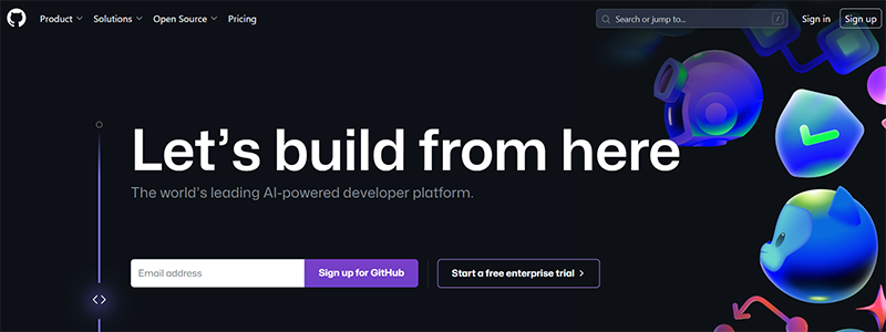
As the go-to place for more than 100 million developers, GitHub’s homepage proves it. The design mirrors the platform’s functionality: a space where code meets collaboration. The page’s dark theme complements the vibrant, technologically-themed visuals, signifying a modern, sophisticated environment for development work.
The landing page efficiently communicates GitHub’s primary value through concise messaging: “Our AI-powered platform increases the pace of software development.” It underscores the tool’s potency in accelerating project timelines and enhancing code quality. Key metrics are highlighted to provide tangible proof of the platform’s impact, such as a “22% increase in development speed.”
Essential Elements of GitHub’s Landing Page:
- Bold headline emphasizing community and AI integration
- Visual code examples showcasing platform use
- Statistics highlighting efficiency gains
- Testimonials from reputable companies
- Clear call to action for sign-up or product tour
Every component is strategically placed to guide potential users through the features and benefits of GitHub, ensuring a clear understanding of the platform’s capabilities. The landing page is an entry point and design example of effective communication.
Blue Apron’s Landing Page: A Recipe for Culinary Delight
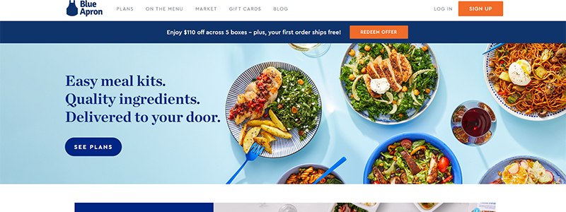
Blue Apron’s landing page effectively showcases the ease and convenience of creating delicious home-cooked meals. With a welcoming tagline, “Easy meal kits. Quality ingredients. Delivered to your door,” the page instantly communicates the core benefits of the service. High-resolution images of tantalizing dishes set the stage, inviting visitors to explore their meal options.
The layout is clean and user-friendly, featuring various meal categories catering to different dietary preferences and lifestyles. From comfort classics to global flavors, the page presents over 80+ weekly options, allowing users to tailor their culinary journey.
Key Highlights of Blue Apron’s Landing Page:
- Vibrant food photography capturing the freshness of meals
- Direct links to varied meal plans
- Customer ratings, reinforcing trust and quality
- A milestone section celebrating over 530 million meals shipped
- Testimonials that personalize the experience
Each element on the page is strategically positioned to guide potential customers through the offerings and lead them to a clear call to action: “See Plans.” Blue Apron’s landing page is an excellent example of enticing visitors with simplicity, choice, and visual appeal.
Mailchimp’s Landing Page: Simplifying Email Marketing
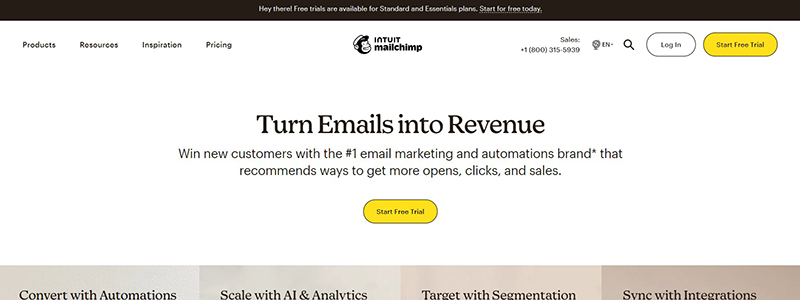
Mailchimp’s landing page is an example of clear, concise messaging aimed at transforming email marketing into a revenue-generating tool. The page leads with a powerful headline: “Turn Emails into Revenue,” instantly resonating with businesses looking to leverage their email lists.
The design is intuitive, with a seamless flow that guides visitors through Mailchimp’s services. An interactive tour prompts users to explore features while customer success stories build credibility.
Key Aspects of Mailchimp’s Landing Page:
- Prominent value proposition headlining the page
- Engaging visuals that depict the platform’s ease of use
- Highlighted key benefits and features
- Trust signals from customer logos
- Clear calls to action for pricing plans
The main page for MailChimp showcases the platform’s features that enable customers write, deliver, and track emails easily, effectively communicating the platform’s capacity to cater to diverse business sizes. Email marketers can learn a lot from this landing page because of its user-centric design.
Monday.com’s Landing Page: Tailoring Workflows with Ease
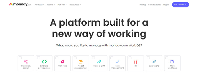
A lively demonstration of Monday.com’s capacity to adjust to the changing demands of contemporary workplaces is on display on the homepage. “A platform built for a new way of working,” the headline affirms the site’s commitment to providing flexible workflow solutions. The page is a patchwork of colorful interfaces, demonstrating the product’s diverse applications, from project tracking to CRM.
Features are displayed through crisp visuals and concise bullet points, making the information digestible. User testimonials and brand logos add credibility, assuring new visitors of the platform’s established trust.
Key Elements of Monday.com’s Landing Page:
- An engaging headline that speaks to modern work challenges
- Visual demonstrations of the platform’s features
- Social proof through testimonials and recognizable client logos
- Clear navigation to detailed product explanations
- Direct call-to-action buttons for sign-ups or further information
Monday.com’s landing page excels in communicating its value proposition to prospective customers, utilizing a mix of interactivity, testimonials, and clear, concise copy to create an inviting and informative experience.
STEEZY’s Landing Page: Dancing to the Beat of the Internet
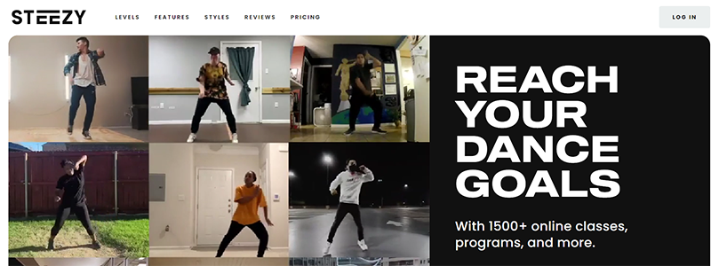
STEEZY’s landing page is an energetic invitation to the world of online dance. It’s designed to motivate visitors to “Reach Your Dance Goals” with over 1500 online classes. The page uses dynamic visuals of dancers in action, reinforcing the energy and passion that STEEZY embodies.
The page is divided into sections that cater to every skill level, from “Brand New” to “Advanced,” ensuring that every visitor feels addressed. It highlights the variety of dance styles taught, from Hip Hop to Ballet, making it clear that there’s something for everyone.
Key Features of STEEZY’s Landing Page:
- High-energy visuals of diverse dance styles
- Breakdown of offerings by skill level
- User ratings and testimonials for social proof
- Transparent pricing plans with a free trial option
- Special discount mentioned for students
STEEZY’s landing page captures the brand’s essence – accessible, inclusive, and fun dance education. It’s a stellar page example that pairs compelling content with a strong call to action, beckoning visitors to start learning immediately.
Dropbox’s Landing Page: Your Workspace, Unbound by Location
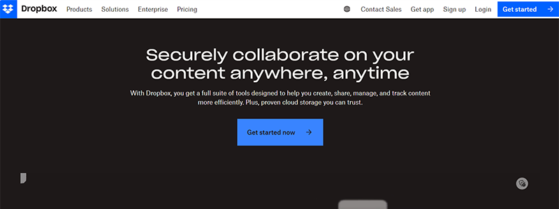
Dropbox’s landing page encapsulates the essence of seamless collaboration and secure file management. The tagline, “Securely collaborate on your content anywhere, anytime,” promises a solution for the modern need for flexibility and mobility in work. The page is neatly segmented to highlight the platform’s key features, such as file storage, content control, and team collaboration, catering to individual and business needs.
The design is clean, focusing on functionality and featuring intuitive and informative icons. Testimonials and statistics lend authority, assuring users of Dropbox’s reliability and widespread adoption.
Elements of Dropbox’s Landing Page:
- Direct and reassuring headline about security and collaboration
- Visual icons representing the platform’s features
- Evidence of widespread use and trust in the service
- Calls to action tailored to different user scenarios
- Success stories provide real-world context
Dropbox’s landing page is an exemplary model, using clarity and conciseness to demonstrate the platform’s capabilities. It is an ideal reference for a landing page that balances information with user engagement.
Apple Arcade’s Landing Page: A New Era of Gaming
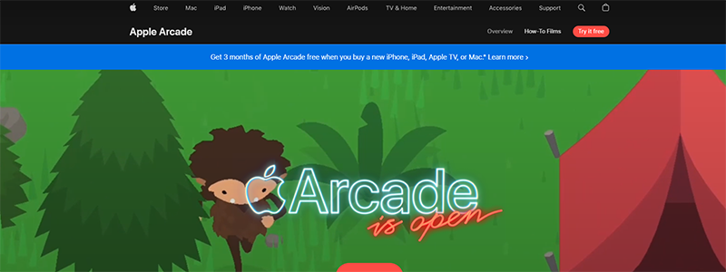
Apple Arcade’s landing page presents a captivating portal into their gaming service, promising an ever-expanding collection of over 200 games. The vibrant graphics and smooth animations reflect the engaging and diverse gaming experiences. Without commercials or in-app purchases, all Apple devices offer uninterrupted entertainment.
The user journey on the page is intuitive, showcasing the variety of games with scrollable gameplay previews. The subscription model is emphasized as family-friendly, with the ability to share across five people, enhancing its appeal.
Key Points of Apple Arcade’s Landing Page:
- Colorful and immersive visuals of game selection
- Straightforward presentation of the subscription benefits
- An easy navigation structure leading to various game categories
- Clear pricing information with a call to action for a free trial
- Compatibility details for cross-device play
Apple Arcade’s landing page effectively communicates its value proposition, making it an outstanding example of attracting and retaining interest in a digital service platform.
ēdn’s Landing Page: Cultivating Growth Indoors
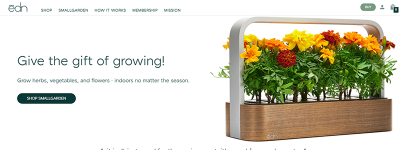
ēdn’s landing page is an ode to the green-thumbed enthusiast looking to bring the outdoors in. It greets visitors with a proposition to “Give the gift of growing,” showcasing sleek, modern indoor garden designs. This page is a testament to the brand’s mission of integrating the benefits of nature into everyday indoor spaces, making it possible to grow herbs, vegetables, and flowers year-round.
The site’s design is fresh and clean, emphasizing the ease and beauty of indoor gardening. It features endorsements from top publications, adding a layer of credibility.
Key Highlights of ēdn’s Landing Page:
- Visually appealing product imagery
- Endorsements from reputable sources
- A detailed explanation of the product’s technology
- Testimonials from satisfied customers
- Simple navigation to shop or learn more
ēdn’s landing page effectively communicates the simplicity and joy of indoor gardening. It focuses on the product’s smart features, like app integration and automatic lighting, making it an exemplary landing page for home gardening solutions.
Ahref’s Landing Page: Navigating SEO with Precision
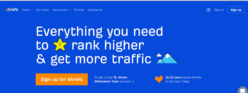
Ahrefs’ landing page is a beacon for digital marketers, succinctly delivering the message: “Everything you need to rank higher & get more traffic.” This page confidently presents their all-in-one SEO toolset with a clean, engaging design that communicates the software’s robust capabilities, from keyword research to site audits.
The landing page cleverly uses a blend of high-contrast visuals, user testimonials, and clear, informative sections highlighting the tool’s features and benefits. It also reassures users of its unique data reliability by noting their private search engine.
Essential Features of Ahrefs’ Landing Page:
- Bold headline with a strong value proposition
- Interactive display of toolset features
- Social proof through industry expert endorsements
- Easy-to-navigate pricing options
- Access to educational resources for users
Since it gives visitors an easy method to learn about and use the platform’s functions, the Ahrefs landing page is well-designed, informative, and optimized for conversions.
Fitbit’s Landing Page: A Journey to Wellness
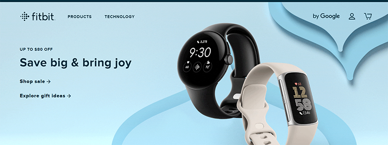
Fitbit’s landing page is a digital gateway to health and wellness, capturing the essence of the brand’s commitment to fitness. With a clean design and motivational imagery, the page spotlights its range of products, emphasizing the ease with which users can “Save big & bring joy” to their health routines.
The page is structured to guide visitors through Fitbit’s diverse offerings, from advanced smartwatches to essential fitness trackers. The interactive element of a gift-finder quiz engages users personally, making the shopping experience both fun and tailored.
Key Features of Fitbit’s Landing Page:
- Bold sale announcements and product highlights
- Interactive quiz to personalize user experience
- Detailed insights into the new Fitbit app’s benefits
- Testimonials that underscore the brand’s impact
- Clear information about Fitbit’s integration with Google
Fitbit’s landing page is an outstanding example of merging product promotion with user engagement, creating a seamless and inviting online experience that encourages visitors to embark on their fitness journey.
Google Workspace’s Landing Page: The Hub of Modern Teamwork
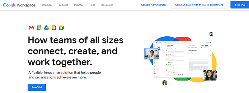
The homepage of Google Workspace exemplifies the platform’s dedication to revolutionizing team communication, content creation, and collaboration. With its clean, airy design and easy navigation, the landing page immediately conveys a sense of simplicity and efficiency – core attributes of the Google Workspace experience.
The page strategically showcases key productivity tools, reinforcing the suite’s comprehensive nature. It communicates the flexibility of Google Workspace, offering solutions for various business sizes and needs. The interactive components, like FAQs and product comparisons, empower visitors to make informed decisions.
Highlights of Google Workspace’s Landing Page:
- Clear, concise headline about teamwork and productivity
- Visual breakdown of the integrated applications
- Accessible learning resources and support links
- A strong call to action for newsletter sign-up
- Emphasis on the platform’s scalability and security
Google Workspace’s landing page effectively mirrors the suite’s ethos of streamlined productivity, making it a prime example of an effective landing page that aligns with the brand’s message of innovation and accessibility.
Problogger’s Landing Page: Crafting a Blogging Career
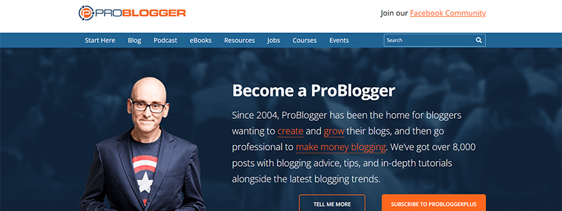
Problogger’s landing page is a gateway for aspiring and established bloggers to hone their craft. The site greets visitors with the bold proclamation, “Become a ProBlogger,” setting the stage for a journey of blog creation, growth, and monetization. It’s an educational hub offering an array of resources, from essential blogging advice to in-depth tutorials.
The landing page design is user-centric, with clear navigation to various sections like starting a blog, creating content, and finding readers. It strategically showcases recent blog posts and podcasts, enticing visitors with valuable insights.
Key Elements of Problogger’s Landing Page:
- Compelling headline encouraging blog creation and growth
- Featured blog posts and podcasts for immediate engagement
- Icons leading to targeted blogging challenges
- A call-to-action for joining the community
- Testimonials to build credibility and trust
Landing pages that educate and convert visitors into community members are invaluable, and Problogger’s website does a great job of communicating the brand’s depth of tools and community strength.
Medium’s Landing Page: The Canvas of Diverse Voices
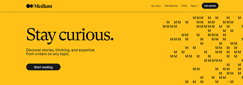
Medium’s landing page is a celebration of diverse voices and stories. It’s a place where curiosity leads to discovery, designed to instantly draw readers into a world of insightful articles across many topics. The page is a catalog of human experiences and expertise, offering a snapshot of the most popular and recent stories that spark conversation and thought.
The design of Medium’s landing page is clean and reader-friendly, with a simple layout that puts content at the forefront. It’s an inviting space for readers to dive into articles that interest them and for writers to find a platform for their words.
Key Points of Medium’s Landing Page:
- A tagline that invites exploration and continuous learning
- A curated selection of articles for personalized reading
- Easy navigation to find topics of interest
- Clear call to action for joining the Medium community
- Testimonials from writers and readers
Medium’s landing page stands out as an exemplary example in the digital publishing space, encouraging visitors to stay curious and engage with its wealth of knowledge and perspectives.
Wix’s Landing Page: Unleashing Creative Freedom
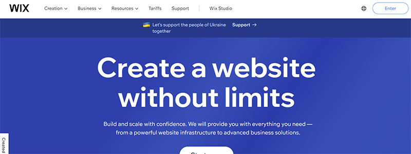
Wix’s landing page is a vibrant invitation to “Create a website without limits,” showcasing the platform’s vast potential for users to craft their online presence. The page is a colorful display of possibilities, from business websites to personal portfolios, emphasizing the ease and flexibility of the site builder.
The landing page is intelligently structured, clearly demonstrating the platform’s key features and benefits, interwoven with user testimonials and examples of real-life websites built with Wix.
Key Highlights of Wix’s Landing Page:
- Engaging, bold headline with a clear call to action
- Interactive previews of website templates
- Sections highlighting different website functionalities
- Reviews from satisfied users for social proof
- Direct links to start building for free or choose a premium plan
Wix’s landing page inspires and empowers users to start their website construction journey.
Plerdy’s Landing Page: Streamlining UX and SEO
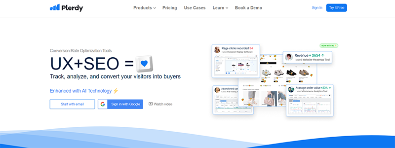
Plerdy’s landing page is a dynamic showcase of their UX and SEO services, inviting visitors to “Track, analyze, and convert your visitors into buyers.” The sleek and professional design features a clean layout, highlighting the platform’s comprehensive tools for website analysis, heatmaps, and conversion rate optimization.
The landing page effectively communicates Plerdy’s ability to cater to various businesses, from small startups to global enterprises, as evidenced by the endorsements from prominent brands.
Key Elements of Plerdy’s Landing Page:
- Compelling tagline that combines UX and SEO
- Visuals of analytics dashboards that demonstrate the platform’s capabilities
- Testimonials from high-profile clients for credibility
- Detailed breakdown of conversion rate optimization tools
- FAQ section to address potential customer inquiries
Plerdy’s landing page is a perfect illustration of how a landing page can combine design and functionality to entice visitors to begin utilizing the platform and make the most of its features.
PayPal’s Landing Page: Simplifying Digital Payments
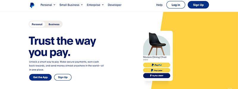
PayPal’s landing page stands as a beacon of trust in digital transactions, inviting users with the promise, “Trust the way you pay.” This landing page is a testament to PayPal’s commitment to secure and versatile payment solutions. The design is crisp, clean, and focused on user experience, highlighting key features such as PayPal Rewards and the flexibility to “Shop at the moment, pay over time.”
The page’s layout is structured to guide users through PayPal’s services, reassuring them of security, convenience, and rewards. Clear calls to action, such as “Get the App” and “Sign Up,” are strategically placed for easy navigation.
Key Highlights of PayPal’s Landing Page:
- Trustworthy and inviting tagline
- Detailed presentation of payment features and benefits
- Visuals of the PayPal app in use for real-world context
- Direct access to customer support and FAQs
- Insights into PayPal’s loyalty programs and offers
An outstanding example of a landing page that successfully invites customers to embrace digital payments with convenience and security is PayPal’s page.
Click & Grow’s Landing Page: Green Thumbs for Digital Age
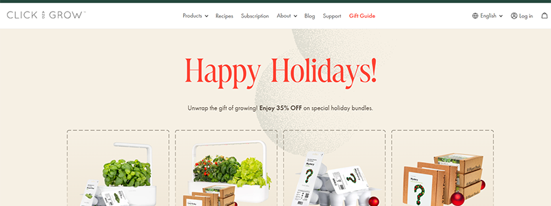
Click & Grow’s landing page invites visitors into the world of smart gardening with a festive and engaging design. It leads with a holiday-themed promotion, instantly catching the eye and setting a seasonal tone. The page is a harmonious blend of product showcases, educational content, and customer testimonials, all revolving around the ease of growing fresh produce at home.
The landing page is intuitive, allowing visitors to seamlessly navigate through the different smart garden models and plant pods available. It emphasizes the technology behind the brand, including the innovative Smart Soil, and reinforces the message with social proof from a strong community of indoor gardeners.
Key Features of Click & Grow’s Landing Page:
- Seasonal promotions front and center
- Clear product categories for easy shopping
- Descriptive sections about the technology and benefits
- Reviews and trust signals from a large community
- Educational insights on the value of fresh, homegrown food
Click & Grow’s landing page is a model of usability; it invites visitors to learn more about the company’s products while also providing them with useful information and opportunities to join a community.
Codeable’s Landing Page: Connecting with Top WordPress Talent
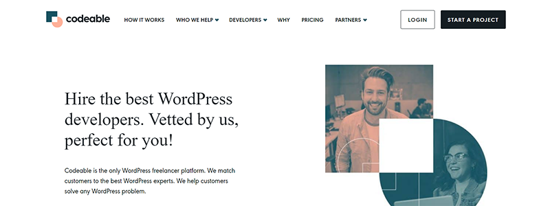
Codeable’s landing page is a hub for businesses seeking skilled WordPress developers. It communicates trust and quality with the tagline, “Hire the best WordPress developers,” backed by a straightforward process for finding and hiring experts. The design is professional and user-friendly, with sections clearly outlining how clients can get matched with the right developer for their projects.
To reinforce credibility, the landing page employs a clean layout, testimonials, and trust badges from renowned WordPress companies. It also concisely explains the vetting process Codeable uses to qualify developers.
Key Highlights of Codeable’s Landing Page:
- Prominent value proposition for hiring vetted developers
- Step-by-step guide to the hiring process
- Showcase of featured developers with real photos and bios
- Client testimonials and brand endorsements
- Clear FAQ section addressing common concerns
Codeable’s landing page is a perfect illustration of how to swiftly and openly link professional service providers with prospective clients because it is a model of clarity and self-assurance.
Your Online Life Coach’s Landing Page: A Portal to Personal Growth
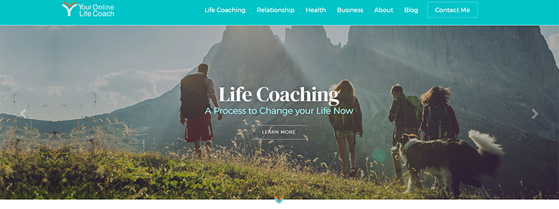
When people visit Your Online Life Coach, they are met with an inspiring vision of self-improvement and complete health. The tranquil color scheme and peaceful images lay the groundwork for an inner transformation. The page introduces Shelly, the coach behind the brand, and outlines her approach to life coaching, emphasizing empowerment and actionable change.
The landing page is well-structured, featuring client testimonials, the coaching methodology, and an invitation to schedule a discovery call. It effectively communicates the value proposition of life coaching and the transformative potential it holds for clients.
Landing Page Elements for Your Online Life Coach:
- Inspirational headline emphasizing holistic health
- A personal introduction to the life coach with a compelling bio
- Step-by-step explanation of the coaching process
- Client testimonials for social proof
- Clear call-to-action for a free discovery call
You can see a great example of how to provide personal coaching services in an interesting and reassuring way on the landing page of Your Online Life Coach. It encourages visitors to take the initial step toward personal improvement.
Conclusion
In the digital cosmos, where first impressions are pivotal, landing pages are the launchpads for customer journeys. A landing page, essentially a standalone web page, is designed with a singular focus – to captivate and convert. It’s the front line where potential becomes actual, where visitors transform into customers.
- Purposeful Design: Each landing page is a targeted pitch to your audience.
- Conversion-Centric: It’s crafted to turn interest into action – be it a sale, sign-up, or download.
- Engagement-Driven: With compelling content, it holds visitors, guiding them down the conversion funnel.
Remember, the best landing pages are more than pretty interfaces; they are meticulously engineered to convert passing interest into enduring engagement.
