Explore the colorful mosaic of the best 2025 Wix websites. Wix keeps giving creative design freedom and functionality with anything from elegant e-commerce platforms to gorgeous portfolios. Standout websites from a variety of fields are pushing the boundaries of online design this year.
- Learn how leading companies utilize Wix to elegantly present their items in the fashion and beauty industries.
- See slick, contemporary designs that attract and convert in tech and startups.
- Art & Photography: Look through story-telling, aesthetically striking portfolios.
These excellent websites are the epitome of usability and creativity combined to perfection. Willing to improve the performance of your website? Utilise the Plerdy tool to improve usability, increase conversion rates, and analyse user behaviour. Accept the potential of perceptive statistics to make your website a strong candidate for the list of the best websites of the next year.
Wix Website Bests Examples List
Discover the top 10 Wix websites of 2024; every design demonstrates unmatched originality and usefulness. These websites show off Wix’s design possibilities, from creative layouts to smooth user experiences. Explore this well chosen selection to learn what makes these digital works of art unique.
The Tea Story: Stylish Wix Website Creation for Tea Lovers
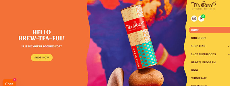
Explore the lively example of excellent Wix design, “The Tea Story” website. Visitors are invited to investigate more by the vibrant display of tea goods on the homepage. Utilizing Wix’s design skills, this Singapore-based website produces an interesting and aesthetically pleasing user experience.
Playful combinations of strong colors and sophisticated typefaces make up the simple and user-friendly design. Because of the well considered design, each part flows naturally into the next. The primary navigation is simple and gives quick access to their business, stories, and health advantages of tea.
“The Tea Story” website highlights:
- Visual Appeal: One is drawn in by the cheerful, friendly design right away.
- Easy Navigation: Clear categories in a simplified design.
- Interesting Content: Users are kept fascinated by vivid pictures and writing.
- Product Display: Superior images of tea goods showcasing their qualities and advantages.
The design serves purposes beyond only aesthetics. Whatever they need—a particular tea blend or details about the company’s philosophy—can be found fast by visitors. Press features and client endorsements are other elements of the website that increase credibility and trust.
Using the many features of Wix, “The Tea Story” demonstrates how good web design can improve user experience and increase interaction. This website exemplifies how Wix makes professional, user-focused, and creative designs possible.
Mikaela Reuben: Gorgeous Wix Website Highlighting Creative Cooking
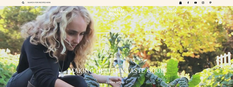
Mikaela Reuben’s website is a prime example of excellent Wix design, fusing elegance and simplicity. The calm backdrop picture on the homepage draws your eye right away and encourages a healthy lifestyle. Her appealing world of holistic health and mouthwatering meals is drew in by the simple style.
The design is simple and moves visitors through the several sections with ease. Vibrant photos of key services emphasize Mikaela’s knowledge of nutrition and wellbeing. The website feels new and uncluttered because of the superb usage of white space in the design.
Website of Mikaela Reuben’s Key Features:
- Beautiful background pictures and colorful visuals are the visual appeal.
- Simple, understandable design makes navigation easy.
- Rich images combined with educational writing make for engaging content.
- Testimonials: Showing prominent client recommendations.
The website is designed to be useful as well as beautiful. Service, recipe, video, and press mention areas are all included. Excellent photos of Mikaela in her element make the services section extremely engaging. The grid arrangement of the recipes part facilitates browsing and choosing of fascinating foods. Press articles and videos give veracity and substance.
With Wix, Mikaela Reuben has produced a stunning and useful website. It demonstrates how well done site design may improve user interaction and experience. This website is proof positive that Wix can produce polished, aesthetically pleasing, and easily navigable websites.
See an excellent example of Wix design done right by visiting Mikaela Reuben‘s website.
Ivy Chen: Visual Portfolio Wix Website Design with Artistic Elements
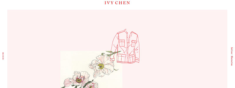
Ivy Chen uses Wix’s adaptability to the maximum in her website, which stands out for its distinctive fusion of fashion and artistic design. With its simple design emphasizing fine drawings and crisp lines, the homepage welcomes visitors. By giving the website depth and dynamism, parallax scrolling improves the user experience.
Every part of the well-considered design flows naturally into the next. A tranquil setting is created by the delicate pink background, which also draws attention to the intricate designs of clothing and flower motifs. Ivy Chen is a talented fashion designer and illustrator, and her website skillfully highlights her skills with a nice harmony of text and images.
Main Elements of the Website of Ivy Chen:
- A minimalist design is one that is simple and uncluttered with a gentle colour scheme.
- Depth-adding visual effect called parallax scrolling gives the website more dimension.
- Superior Images: Lovely sketches of clothes and illustrations.
- Easy Navigation: A natural design leads users easily through the material.
Both aesthetically pleasing and useful is the website’s design. Giving visitors an inside glimpse at Ivy Chen’s creative process, it showcases her design process from first sketches to completed goods. Wix’s design tools are clearly used in the site’s clean, businesslike look.
The website of Ivy Chen is a perfect illustration of how good web design may highlight creative ability and increase user interaction. This website exemplifies how well and professionally Wix can be used to create portfolios.
See how elegantly design and functionality combine with Wix by visiting Ivy Chen‘s website.
Designer of Contemporary Wix Websites for Lifestyle Influencers Cami Ferreol
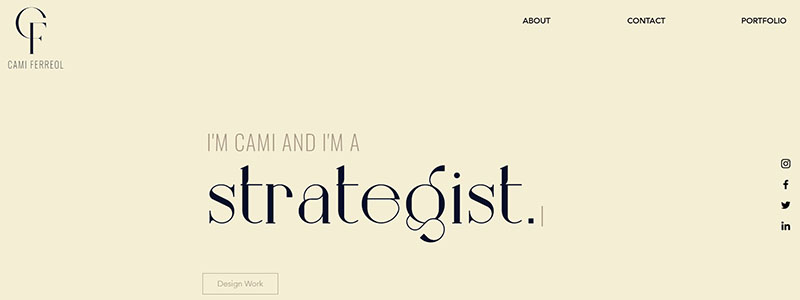
The clean and sophisticated design of Cami Ferreol’s website showcases her skill as a strategist in the ideal fusion of originality and refinement. A serene and professional pastel color scheme greets visitors to the homepage.
There is enough of white space in the tidy and well-organized design to let the information to breathe. The hero section’s big, striking typeface draws attention right away and successfully conveys Cami’s branding and experience. Making use of Wix’s design features, this website provides a smooth user experience.
Highlights of the website of Cami Ferreol
- Elegant Design: Calm, pastel-colored minimalist design.
- Easily navigable layout that leads guests with ease.
- Highlights of the projects and excellent photos are the work showcase.
- Profession Touch: Social proof and endorsements raise believability.
Not only is the website aesthetically beautiful, but it also works incredibly well. There are portions of it that present her portfolio, with brief words and gorgeous images highlighting each project. A human touch, the “About” section lets readers relate to Cami’s career path.
This design shows how a sophisticated, businesslike website can be made with Wix that is also aesthetically pleasing and easy to use. Expert handling of the integration of many design components, including typography and images, makes the website a noteworthy example.
See how Wix combines usefulness and design by visiting Cami Ferreol‘s website.
Chico Santos: Multipurpose Wix Website for a Fitness Expert
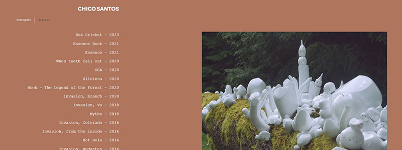
The minimalist masterwork that is Chico Santos’s website elegantly and clearly presents his creative portfolio. Warm brown backdrop on the minimalist design of the homepage welcomes users and offers a straightforward yet elegant canvas that highlights the content.
Wix is used in the design to produce an easy-to-use and interesting user interface. With a list of works prominently displayed on the left side of the screen, navigation is simple. To enable visitors to peruse his vast body of work, each project is categorized by name and year. Chico’s distinctive sculptures and installations are visually previewed in a huge photograph on the right side of the website, which showcases a few chosen pieces.
Website of Chico Santos: Key Features
- Minimalist Design: Emphasizing content, the layout is straightforward.
- Simple Navigation: A well arranged and unambiguous collection of works.
- Large picture display for chosen projects is a visual highlight.
- English and Portuguese bilingual options are offered.
The website is quite practical as well as beautiful. Visitors may quickly locate and peruse his work thanks to the well-organized layout, and a responsive and seamless experience is guaranteed by the use of Wix’s design tools. Chico Santos can be easily contacted by visitors thanks to the bottom-placed social networking icons and contact details.
This website is a prime example of how good design may improve an artist’s internet profile. Chico Santos has produced a polished and friendly online portfolio with Wix.
See Chico Santos‘s fascinating artistic path by going to his website.
Ellen Von Wiegand: Modern Artists Need Minimalist Wix Website Design
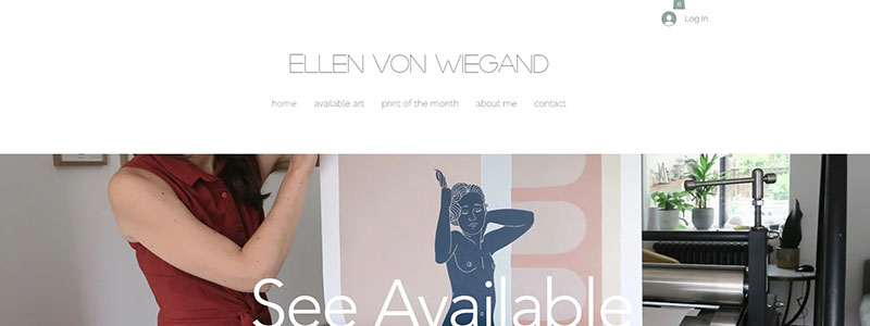
The website of Ellen Von Wiegand offers a flawless user experience that highlights her artistic ability by skillfully fusing creativity with utility. The homepage shows how well Wix can create visually appealing websites with its crisp design and excellent photos.
Massive, enthralling images are the main focus of the simple design. Sections of the homepage that emphasize many facets of Ellen’s work include original paintings, her monthly print club, and linocuts that are currently available. Bold text overlays that are both fashionable and useful encourage readers to investigate further in each area.
Highlights of the webpage of Ellen Von Wiegand:
- Gorgeous Visuals: Beautifully showcasing artwork are high-resolution photos.
- Clear portions with a minimalist design.
- User-Friendly Navigation: Easy-to-follow design that leads guests about.
- Interesting Calls to Action: Noteworthy buttons promote investigation.
Simple and elegant design of the website facilitates user navigation and interaction with the content. Wix’s design tools are clearly used in the site’s clean, businesslike look. Every part is purposefully created to highlight Ellen’s work without overpowering the visitor.
Keeping fans informed is made simple for them by the mailing list sign-up at the bottom of the website. Social networking icons are quietly included so that guests can interact with Ellen on several channels.
One of the best illustrations of how to utilize Wix to build a polished and interesting online presence is Ellen Von Wiegand’s website. Artists love this site because it blends usefulness and visual appeal.
See how good web design may improve artistic presentation and follow Ellen Von Wiegand‘s creative path by going to her website.
Professional Wix Website Design for Neighborhood Organizations by Next Door Alliance

The website of Next Door Alliance is a shining illustration of how to utilize Wix to build effectively; it skillfully combines user-friendly navigation with polished appearance. A professional tone is established by the visually arresting high-resolution cityscape on the homepage. Together with the corporate logo and an obvious call-to-action button, this background captivates visitors right away.
Excellent use of the available space is made by the tidy and well-organized design. Sections of the site highlight the staff, vision, and services of the business. The design guarantees that every part is simple to read and operate, which improves the user experience in general.
Important elements of the website of Next Door Alliance:
- Professional Design: Crisp display and excellent images.
- Easily navigable structure with well defined sections.
- Detailed service and company vision statements are examples of informative content.
- Highlighted buttons for getting quotations and getting in touch are engaging call-to-actions.
Utilising Wix’s features, the website design produces a professional and unified online presence. Especially nicely designed is the “Our Services” section, which effectively communicates information using icons and succinct descriptions. Through the revealing of the company’s background and goals, the “About Us” section creates trust.
Furthermore improving usability is the contact form at the bottom of the page, which makes it simple for prospective customers to get in touch. Making it a thorough portal for all stakeholders, the website also has a section showcasing employment prospects.
See how Wix’s design talents can produce a polished and interesting online experience by visiting the Next Door Alliance website.
Creative Wix Website Design for Real Estate Staging by Afford2Stage
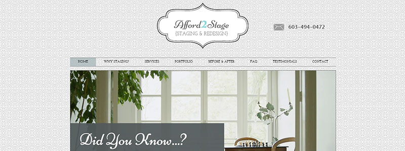
The website of Afford2Stage is a prime example of how good web design can improve interaction and presentation of entrepreneurship. Wix was used to create the user-friendly, professional, and tidy design. The homepage greets users with a strong call to action and a well-designed layout including excellent photos.
The sleek yet understated design concentrates on the important components that communicate the value offer of the company. Using both text and images to draw in visitors, the homepage emphasizes the value of staging in real estate.
Website of Afford2Stage: Key Features
- Beautiful Design: Excellent graphics in a simple layout.
- Easy to Use Navigation: Easy to understand organization.
- Presenting the advantages of staging in an understandable manner.
- Detailed service explanations are found in the informative sections.
The design of the website is really practical. Key information is readily available, with sections outlining the advantages of home staging and including before-and-after photos. Why Staging?’ section works especially well; it emphasizes important ideas with a combination of icons and succinct descriptions.
Advantages of Staging
- Homes that are staged sell more quickly.
- Draws in More Prospects: Assists purchasers in seeing the possibilities of the property.
- Professional staged shots are a competitive advantage.
The website of Afford2Stage shows how powerful Wix can be for excellent design. It builds confidence and trust by clearly articulating the company’s experience and offerings. Potential customers can easily get in touch with the firm because the contact details are clearly visible.
See how a company’s online presence can be enhanced by clear communication and good design by visiting the Afford2Stage website.
Laurie Wotus: Individualised Coaching Services Wix Website Design
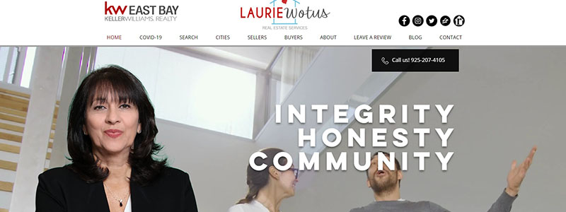
Wix professional web design is beautifully demonstrated on Laurie Wotus’s website. Laurie’s knowledge and dedication to real estate are evident on the friendly and educational webpage. Elegant and simple in design, the layout moves visitors easily between the several sections.
Because Laurie’s professional photograph is clearly shown in the hero area, credibility and confidence are established right away. Setting the tone for the website, clear, strong typography emphasizes important principles like community and ethics.
Key Elements of the Website of Laurie Wotus:
- Expert Design: Bold writing and polished photos in a tidy style.
- Easy Navigation: Well defined parts and an intuitive design.
- High focus on Laurie’s goals and offerings makes the content interesting.
- Community Focus: Emphasizing services and places in the area.
The design skillfully uses Wix’s features to produce a professional, interesting experience. The “Mission” portion makes it very evident how committed Laurie is to providing excellent customer service, while the “Communities We Love” section adds a personal touch by showcasing various places Laurie serves through excellent photos.
Advantages of Using Real Estate Services from Laurie Wotus
- Honesty and Integrity: Devoted to deliver first-rate client service.
- Local Experience: Thorough understanding of the neighbourhoods.
- All-Inclusive Services: Assistance with investing, selling, buying.
For added convenience, the website includes an interactive map and contact form. Testimonials, which present favourable comments from happy customers, lend credibility and authenticity.
The website of Laurie Wotus is an excellent example of how to use Wix to build a polished, easy-to-use internet presence. See how good design can improve real estate services by going to Laurie Wotus‘s website.
Chic Wix Website Design for Writers and Authors by Anne Mahon
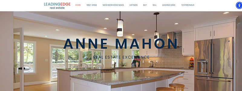
One very good illustration of expert Wix web design is Anne Mahon’s website. With a big, friendly picture of a tastefully set kitchen, the homepage draws in visitors right away. To great advantage, the simple style of the clean, attractive design makes sure that users can easily explore the website.
The “Meet Anne” section opens with a warm photo of Anne Mahon and a synopsis of her long history and close connections to the Belmont neighborhood. Establishing personal connection and trust with prospective clients depends heavily on this part.
Highlights of the webpage of Anne Mahon:
- Large, excellent pictures combined with a simple, uncluttered design create an inviting design.
- Easily navigable structure with well-defined sections.
- A personal touch is the extensive biography and the warm pictures.
- Strong focus on community service and customer service makes the content interesting.
Wix’s features are well used in the design to produce a smooth user experience. Users may look for properties straight from the homepage using the property search feature in the “Find Your Dream Home” area. Positive client endorsements give Anne credibility and highlight her experience in the testimonials area.
Advantages of Real Estate Services from Anne Mahon:
- Individualised Service: Extensive community involvement.
- Extensive experience and local knowledge in real estate.
- Client Concentrated: Dedication to providing top-notch client service.
The website of Anne Mahon is a great illustration of how good functionality and design can produce a polished and interesting online presence. See how Wix might improve your real estate company by going to Anne Mahon‘s website.
Final Thought
As we conclude our tour of the top 10 Wix websites of 2024, it is evident that these websites stand out for their outstanding design and functionality. Every website uses Wix to create distinctive digital experiences that draw in and convert visitors.
- E-commerce excellence includes beautiful product displays and easy checkout procedures.
- Creative Portfolios: Photographers and artists presenting their work in visually arresting format.
- Corporate Giants are expertly designed websites that convey authority for the company.
When gifted designers use Wix, as these examples show, it can be incredibly flexible and potent. Utilising Wix’s wealth of design capabilities, these websites offer an easy-to-use user interface in addition to being visually striking. Accept these observations to motivate your next Wix website design endeavor and produce a work of digital art all your own.
