WordPress websites in 2025 will be pushing the envelope in terms of both originality and functionality. These examples highlight the best of WordPress, from innovative e-commerce platforms to gorgeous portfolios.
- E-commerce Excellence: Sleekly designed online shops with smooth user interfaces.
- Creative portfolios are professionally and stylishly presenting the work of artists and designers.
- Corporate websites: Credible and trustworthy designs.
- Blogs: Interesting, well-organized material that keeps people coming back.
- Websites of nonprofit organizations: Clear, educational websites emphasizing goals and effects.
See how these WordPress websites use cutting-edge themes and plugins to produce visually arresting and intuitive experiences. Plerdy’s tool is a great option for examining user activity and refining your website whether you want to increase conversion rates, enhance usability, or dig into SEO statistics. Get ideas and improve your website with these excellent examples.
Top WordPress Website Examples List
Explore the “20 WordPress Website Examples for 2024” we have carefully selected and observe how these websites skillfully combine style and usefulness. This collection demonstrates how adaptable WordPress can be, serving a range of markets from IT to fashion. Prepare to get motivated and to take away concepts to improve your own website.
Build Stunning Landing Pages with the SeedProd WordPress Website
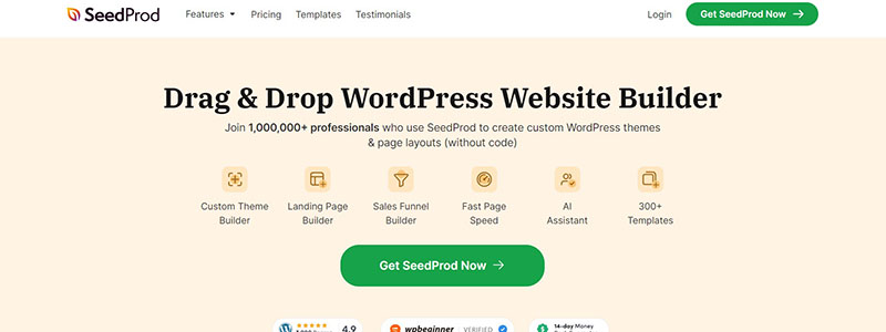
The home page of SeedProd is a fantastic example of a WordPress website that successfully combines usefulness and aesthetics. With its eye-catching headline, “Drag & Drop WordPress Website Builder,” the top part draws attention right out. It emphasises an intuitive interface and how simple it is to build websites without knowing any coding.
“Get SeedProd Now” is the site’s obvious call-to-action button, which promotes quick interaction. An area below lists the main advantages of the plugin, demonstrating:
- Simple drag & drop
- Not a design degree needed
- High speed operation
- ready-made designs
As one scrolls down the page, a stylish design section with a variety of website designs appropriate for local companies, internet retailers, and blogs visually enthralls. There are excellent photos and a succinct explanation for every theme.
Reasons why over a million people trust SeedProd are then listed on the page:
- Individualised landing pages
- Combining with well-known email marketing providers
- Mobile-friendly and reactive designs
- Quick data loading
The part with client endorsements lends even more credence. An FAQ section addresses often asked questions and offers useful information on the operation of the device.
Finally, the footer provides further connections to the help, documentation, and blog. A perfect example for 2024, this WordPress website is a masterwork of usability and design.
SeedProd turns creating websites into a smooth and pleasurable process using WordPress. It is a model WordPress website with strong features and a user-friendly design.
Create Seamless Forms with the WPForms WordPress Website
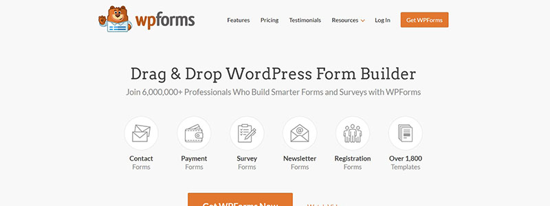
Among the best instances of a WordPress website created with effectiveness and simplicity is WPForms. Starting with the heading “Drag & Drop WordPress Form Builder,” the main page effectively emphasizes its primary features. Users are invited to create better forms with WPForms alongside over 6 million experts.
There is clear display of important elements, highlighting:
- Request forms
- Forms for payments
- Samples of surveys
- Newspaper templates
- Request forms
A “Get WPForms Now,” call-to-action button, promotes quick interaction. An illustration of the form-building procedure below highlights its simplicity of use.
The website goes on to explain why WPForms is a potent WordPress plugin further down:
- Build using Drag & Drop
- Free Form Templates
- Responsible Architecture
- Immediately Notified
- Admission Control
- Integrated Payments
- easy embedding
- Protecting Spam
Positive user reviews lend legitimacy and emphasize the dependability of WPForms. Further advantages, such quick online form generation, a wealth of field options, and customisation options, are broken down in a section called “Top 4 Reasons Why People Love WPForms”.
A FAQ part provides clear answers to often asked questions together with useful information. Users are guaranteed all they need to succeed with the footer’s links to support, documentation, and resources.
WPForms makes the difficult process of creating forms easy and effective for people of all skill levels. This website shows how WordPress might support strong and intuitive websites in 2024.
Fashion Forward: The Sartorialist WordPress Website
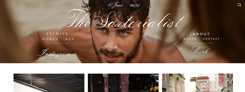
The main page of The Sartorialist’s WordPress website elegantly and minimalistically encapsulates street fashion. High-resolution photos displaying various street fashions from throughout the world welcome you to the website. Text is not as important on the homepage as visual stuff.
The title of the website, “The Sartorialist,” is prominently displayed in the header, together with a date and links to several sections including “Archive,” “Women,” “Men,” “Instagram,” “About,” “Books,” “Contact,” and “Work.” Users may easily navigate the website by using this simple navigation.
Presenting a grid of chic photos, the primary content area is a visual feast. Every picture catches distinctive street style and emphasizes personal flair. A smooth browsing experience is guaranteed by the order of the photos.
Principal elements of the WordPress website of The Sartorialist consist of:
- Superior, expertly shot images
- Pure, understated style emphasizing visual narrative
- Simple navigation including obvious connections to key areas
- Mobile device responsive design
Users may engage with the brand on all platforms by clicking on links in the footer to additional information and social media accounts. One great illustration of how strong images combined with straightforward design can produce an interesting user experience is this WordPress website.
The Sartorialist uses WordPress to elevate street fashion photos to the level of art, providing a motivational model of a well-designed website for 2024.
Health & Wellness Tips on the MyFitnessPal WordPress Website
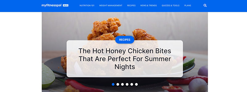
One excellent example of how to build a useful and interesting WordPress website is the MyFitnessPal Blog. The most recent health and nutrition articles are highlighted in a striking header graphic on the homepage. Like “Read More” and “Explore,” prominent call-to-action buttons direct readers to in-depth material.
Navigation is made simple by the orderly and tidy layout. Important portions comprise:
- News & Trends: With pieces on subjects including healthy eating and dietary comparisons, this section offers the most recent in food and nutrition.
- Expert Guides: Here customers can get thorough instructions on reaching particular fitness objectives including weight loss, muscular development, and diet planning.
- Dining Out: Provides advice so readers can stick to their diet even when dining out at fast-casual eateries.
- Meals: This area offers meal ideas that suit fitness goals and is full of high-protein meals.
- Community: Encourages people to participate and share their accomplishments by highlighting health and wellness-related social media material.
Along with meal preparation tips and a visually stunning gallery of food photos, the blog offers. Improving user experience, the footer offers fast access to resources, corporate information, and social media links.
With WordPress, MyFitnessPal Blog skillfully blends style and utility to produce an easy-to-use website that promotes healthy living. This site shows how WordPress might be used to create a visually stunning and educational website in 2024.
Thought-Provoking Content on Mark Manson’s WordPress Website
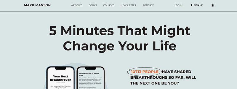
One excellent illustration of how to use WordPress for a personal brand is the website of Mark Manson. Starting with a gripping headline, “5 Minutes That Might Change Your Life,” the visually arresting and well-organized homepage draws in visitors right away and encourages them to sign up for his newsletter.
Mark’s own introduction on the website highlights his reputation as a best-selling book and his direct, no-nonsense approach to life counsel. Emphasizing content, the design is simple and uncluttered. Important parts comprise:
- Latest Podcasts: Comprising current episodes on interesting subjects.
- The most current newsletters are highlighted to entice readers to sign up.
- Popular Articles: Compilation of well-known articles providing perspectives on a range of life issues.
- Popular Courses: Features classes meant to enhance customers’ quality of life.
Site strengths are highlighted in bullet points:
- Oblique, interesting call-to-action buttons
- Superior, varied material presentation
- Navigation made easy
- All-over consistent branding
For simple navigation, the footer includes fast access to books, courses, articles, and contact details. Perfectly fusing form and function, this WordPress website is a shining example for 2024. Mark Manson’s website uses WordPress to give excellent material in an easy-to-use format.
See how to build a powerful personal brand using WordPress by going to Mark Manson’s website.
News Delivered Right: The New York Times WordPress Website
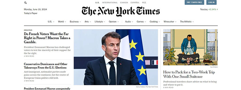
A model usage of WordPress to provide news and information is the New York Times website. Clean and well-organized, the homepage is designed to offer a smooth user experience. Easy access to several areas including World, U.S., Politics, and Business is provided by a large navigation bar at the top.
Breaking news, popular stories, and editorials are mixed together in the main content area. Big, striking headlines draw attention, and excellent photos strengthen the overall visual appeal. The way articles are arranged in several columns facilitates easy topic browsing.
Among the main elements of the WordPress website of The New York Times are
- Instantaneously visible, the breaking news section keeps users informed about the most recent developments.
- Featured Articles: Draw in readers with pictures and succinct descriptions.
- Editorials and opinion pieces have their own section to encourage a variety of points of view.
- Video and photo galleries are integrated with multimedia content to enhance the storytelling experience.
Further navigation choices, connections to well-liked articles, and subscription prompts are all available in the sidebar. Social networking, contact details, and other resources are linked in the footer.
With WordPress, The New York Times produces a strong and intuitive website that effectively arranges a large volume of material. This website is a great illustration of how WordPress might be used in 2024 to build a lively and interesting news platform.
Visit The New York Times to explore this exemplary WordPress website.
Experience Music Like Never Before on Sony Music’s WordPress Website
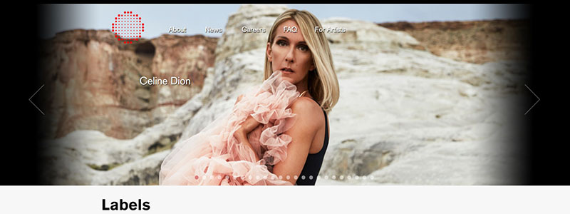
A great illustration of how to use WordPress for a visually striking and captivating website is the home page of Sony Music. With its big, dynamic slider presenting featured artists and their most recent creations, the homepage draws attention right away. This fully immersing experience is educational and aesthetically pleasing.
Among the main components of the WordPress website for Sony Music are
- Labels Section: Offers an overview of Sony’s extensive portfolio by prominently displaying the logos of its many record labels, including Columbia, RCA, and Epic.
- Top musicians from Sony have their most recent music videos shown in a special section. Multimedia material is intended to captivate visitors to this area.
- News Section: Provides the most recent information and announcements about new releases and corporate news from Sony Music. Every news story includes a synopsis together with a “Read More” link for more information.
The site is laid out simply to make navigation simple and to easily point visitors to important sections. Users may readily access further information thanks to the footer’s vital connections to business information, social media profiles, and royalty information.
Sony Music has created a website with WordPress that strikes a mix of style and usefulness. This website is an excellent example of how WordPress might be utilized in 2024 to give a large company a polished, interesting online presence.
Visit Sony Music to explore this exemplary WordPress website.
Fashion Elegance on the Rino & Pelle WordPress Website
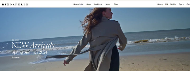
The website of Rino-Pelle is a model of how fashion companies may use WordPress to build an opulent and eye-catching online presence. With a full-screen video banner showcasing the newest Spring/Summer collection, the homepage grabs attention right away.
Important features of the WordPress website for Rino-Pelle consist of:
- Visual Appeal: The homepage is dominated by excellent photos and videos that dynamically and attractively present a range of outfits.
- Easy Access to categories such “New Arrivals,” “Bestsellers,” and “Sale” is made possible by the top navigation bar, which guarantees consumers can discover what they’re looking for fast.
- Product Highlights: The page’s well chosen sections include chic photos of the newest collections together with succinct descriptions and links to purchase.
- Elegant but simple, the website makes extensive use of white space to highlight the products. This sums up the opulent and modern appeal of the brand.
- Social Media Integration: A section at the bottom invites readers to follow Rino-Pelle on Instagram in order to increase community involvement and brand exposure.
- Footer Information: To guarantee consumers receive thorough assistance, the footer links to vital information including shipping, refunds, and contact information.
With WordPress, Rino-Pelle’s website skillfully strikes a balance between style and utility to offer a smooth buying experience that captures the brand’s upscale image.
See how WordPress runs this chic fashion website by going to Rino-Pelle.
Revolutionizing Fitness with the Tonal WordPress Website
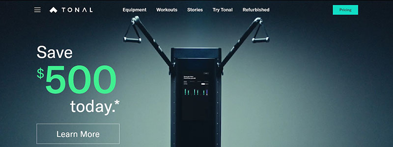
The home page of Tonal is a perfect example of how a fitness company may use WordPress to build an engaging and easy-to-use website. A powerful image of their product in use and a marketing message like “Save $500 today” draw visitors in right away and promote interaction.
Principal components of the Tonal WordPress website consist of:
- High-Impact Graphics: Highlighting the Tonal gadget’s elegant form and adaptability, the homepage includes dynamic photos and videos of the device in different environments.
- Easy Access to areas like “Explore Refurbished,” “Progress Tracking,” and “Motivating Metrics” is made possible by the simple and user-friendly design.
- Comprehensive Information: Users can rapidly become familiar with the features of the product, which include customized plans, individualized workouts, and strength evaluations.
- Interesting Content: User endorsements, which include those from celebrities like LeBron James, lend authority and intrigue.
- Detailed Support: To allay possible client worries, the website lists expert installation, a 30-day home trial, and a 2-year limited guarantee.
To let consumers try Tonal before making a purchase, the website now advertises both virtual and in-person demos. Important information, customer service, and social media accounts are all linked from a well-organized footer.
With WordPress, Tonal has produced a very useful and aesthetically pleasing website that successfully conveys the advantages of its cutting-edge exercise equipment. This website is a great illustration of how usability and design may coexist in 2024.
See this amazing WordPress website by going to Tonal.
Sweet Stories from the Asheville Bee Charmer WordPress Website
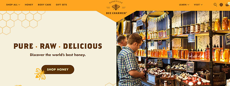
The home page of Asheville Bee Charmer is a lively example of how WordPress may produce a website that is both visually pleasing and interesting. Warm and inviting, the webpage highlights their tagline, “Pure, Raw, Delicious,” and is easy to explore through their many product offers.
Among the main features of the WordPress website for Asheville Bee Charmer are
- Visual Appeal: A tempting visual experience is created by the page’s dominance of excellent photos of honey items and the business itself.
- Product Categories: Vibrant photos and succinct descriptions of each of the several honey categories—Pure Honey, Infused Honey, Limited Release, and Yummies—are provided.
- Featured Products: Showcases well-liked products with direct links to purchase, such as fireweed, tulle and sourwood honey.
- Interesting Content: The website deepens the user experience with sections on the advantages of honey, the background of the business, and community involvement.
Condensed highlights of the website’s advantages:
- Very good, interesting images
- Easy to use navigation
- Specific product details
- Content geared toward the community
Important information such social media connections, contact information, and other resources are included in the footer to guarantee consumers receive all-encompassing support. With WordPress, Asheville Bee Charmer has created a useful and aesthetically pleasing website that aptly captures their company and offerings.
Go check out this excellent WordPress website at Asheville Bee Charmer.
Ultimate Pilates Guide on the Pilatesology WordPress Website
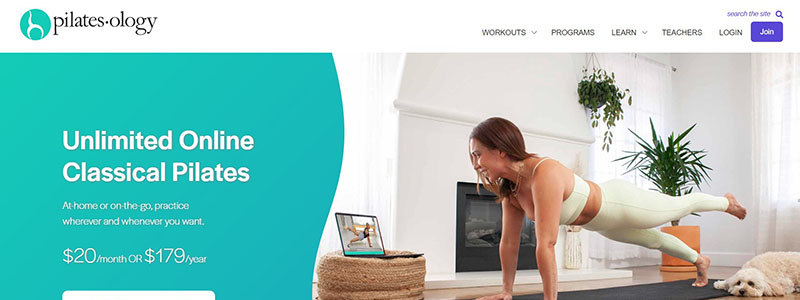
Pilatesology is an excellent WordPress website with a simple, contemporary style that successfully highlights its services. With its eye-catching slogan, “Unlimited Online Classical Pilates,” the webpage draws in visitors right away. With a big call-to-action button for launching a free trial, it emphasizes how flexible their service is.
Among the main features of the WordPress website for Pilatesology are
- Clear Visuals: Beginning to intermediate Pilates practitioners can find a variety of exercises demonstrated in high-quality photos and videos.
- Easy to Use Navigation: There are separate sections on the website for programs, workouts, and instructor materials.
- Comprehensive Information: Visitors can peruse more than 2,300 videos, downloadable courses, workshops, and tutorials. Use of bullet points makes this very evident.
- Testimonials: Satisfied user testimonials are included as social proof to lend legitimacy and entice new users to register.
Strengths of the website are highlighted in bullet points:
- Unrestricted availability of a huge Pilates video library
- Downloadable instruction for use offline
- Classes taught by top teachers
- programs tailored to specific requirements
Further links to social networking, contact details, and help and FAQ are included in the bottom. Pilatesology is a leading model for 2024 because it has used WordPress to produce a smooth and interesting user experience.
See this amazing WordPress website at Pilatesology.
Exploring Music Culture on Crack Magazine’s WordPress Website

The home page of Crack Magazine is a perfect example of how dynamic and aesthetically pleasing a WordPress website can be. Premium photos and a standout feature story on the site draw visitors in right away. The whole website is geared towards exploration via this captivating graphic approach.
Principal components of the WordPress website for Crack Magazine consist of:
- Visual Storytelling: The biggest, most visually arresting photos on the homepage go with the most recent features and stories. This graphic strategy guarantees an engrossing user encounter.
- Content-Rich Layout: Users may quickly peruse the most recent music reviews, interviews, and cultural commentary thanks to the grid-style arrangement of the articles.
- Simple Navigation: News, Reviews, Features, and More are among the many areas of the website that may be quickly accessed via the sticky navigation bar at the top. This accessibility and usability of the website are increased.
- Featured Sections: Users can easily identify what most interests them by highlighting significant information in the “Album Reviews” and “Festival Guides” sections.
Condensed highlights of the website’s advantages:
- Impressive pictures and graphics
- Accessible, grid-based content arrangement
- Simple access menu
- Interesting multi-media material
To enable users to interact with the brand on all platforms, the footer includes links to social media accounts, contact details, and other resources. Crack Magazine has produced a visually striking and engaging website with WordPress that will be unique in the digital media scene of 2024.
See this excellent WordPress website by going to Crack Magazine.
Inspiring Change on the Jane Goodall Institute WordPress Website

One excellent example of how WordPress may provide a very practical and attractive platform for a global conservation agency is the Jane Goodall Institute website. With a big, eye-catching banner containing a potent message about conservation and the significance of Jane Goodall’s work, the site is both educational and inspirational.
Major elements of the WordPress website of the Jane Goodall Institute include:
- Interacting Images: To evoke strong feelings in visitors, the homepage prominently displays excellent photos of Jane Goodall and the communities she works with.
- A clear mission statement conveys the objectives and principles of the company right away.
- Quick Access to sections like “Our Story,” “Our Work,” “Our Impact,” and “Make a Difference” is made possible via the top navigation bar, which also makes information finding simple for visitors.
- Impact Metrics: To demonstrate the efficacy of their efforts, visual depictions of conservation impact, such the quantity of chimpanzees saved, are shown.
Condensed highlights of the website’s advantages:
- Superior, interesting images
- Descriptive and powerful mission statement
- Navigation made easy
- Metrically specific impact measurements
Important connections to more information, including social media accounts, contact information, and the most recent news, are included in the footer. Supporting their objective is made simple for visitors by the website’s options for involvement through updates or donations. With WordPress, the Jane Goodall Institute has produced an eye-catching and functional website that both engages and successfully conveys its purpose.
View this excellent WordPress website at Jane Goodall Institute.
Fashion Insights on Vogue India’s WordPress Website

The website of Vogue India is a great example of how WordPress may be utilized to create an aesthetically beautiful and content-rich platform. High-quality photos and interesting headlines combine to instantly convey the spirit of fashion and lifestyle on the homepage.
Among the main elements of the WordPress website for Vogue India are
- Dynamic Images: Vibrant photos of the newest in beauty, fashion, and lifestyle grab visitors’ attention immediately on the site.
- Conveniently arranged under categories like “In Vogue,” “Beauty,” and “Culture & Lifestyle,” articles and features make it simple for readers to peruse the material.
- Featured news: To guarantee the most significant material receives the most exposure, the website prominently features editor’s picks and hot news.
- Slideshows and movies are two examples of the interactive components on the website that enhance the user experience and promote longer visits.
Condensed highlights of the website’s advantages:
- Excellent, engrossing pictures
- logical, simple to use design
- prominent presentation of highlighted and hot articles
- Multimedia interactive material
Visitors may quickly interact with Vogue India on social media, contact details, and a number of sections thanks to the footer. Vogue India is a shining example of a sophisticated and user-friendly website that successfully highlights its varied content using WordPress.
See this excellent WordPress website at Vogue India.
Culinary Innovations on the Momofuku WordPress Website

Momofuku’s home page is a model WordPress website that skillfully strikes a balance between use and aesthetics. Vibrant, high-resolution photos of their many menu items draw attention to the homepage right away. The site’s layout is such that users may easily traverse each clearly defined area.
Principal elements of the Momofuku WordPress website consist of:
- Remarkable Food Photography dominates the homepage, showcasing recipes and ingredients that entice visitors to learn more.
- Simple Navigation: For a flawless user experience, the sidebar menu offers easy access to important areas such Shop, Reservations, Our Restaurants, and Our Company.
- Product Promotion: To promote quick interaction, sections devoted to Momofuku Goods and Gift Cards prominently show items that are available for purchase.
- Clickable banners and thorough product descriptions are two examples of the interactive components on the website that improve user engagement.
Condensed highlights of the website’s advantages:
- Excellent, luscious pictures
- Easy to utilize navigation
- Promotion and interaction of products effectively
- Extensive and interactive information
With its important links to social media accounts, contact information, and additional resources, the footer assures users of comprehensive help. Momofuku has created an engaging and dynamic WordPress website on which to showcase its brand and products. This website is a perfect illustration of the kind of website that WordPress might be used to make in 2024.
Look around this amazing WordPress website at Momofuku.
Savor the Movement on Slow Food’s WordPress Website
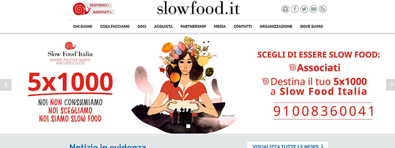
One excellent illustration of how WordPress can produce an interesting and educational website is the main page of Slow Food Italia. With a big banner showcasing their most recent campaign, the homepage is set up to grab attention right away. This establishes the site’s dedication to advancing decent, hygienic, and just eating.
Principal elements of the WordPress website for Slow Food Italia include:
- Informational Banners: Changing banners on the homepage encourage users to take action by highlighting important projects like petitions and educational campaigns.
- News Highlights: The newest information and updates are shown in a conspicuous area, along with pieces on sustainable agriculture, food biodiversity, and environmental concerns.
- Regional Events: To promote local involvement, the website provides a map-based interface to investigate Slow Food events in several Italian regions.
- Interactive Elements: The website is made very interesting with interactive elements including newsletters, event registration, and invitations to join the Slow Food movement.
Condensed highlights of the website’s advantages:
- Interesting and educational banners visually
- Newest information and developments on food and sustainability
- Events and actions particular to a region
- Features of interaction for users
In the footer, links to important places such media, contact information, and social media accounts ensure comprehensive support and connectivity. With WordPress, Slow Food Italia has produced a vibrant and educational website that successfully conveys its goals and initiatives.
Look over this excellent WordPress website at Slow Food Italia.
Discover Music Magic on the Pixies WordPress Website
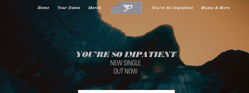
The website of Pixies Music is a fantastic illustration of how a band might use WordPress to build a dynamic and useful online presence. With its arresting image of their most recent hit, “You’re So Impatient,” the webpage draws in viewers right away.
Principal elements of the WordPress website for Pixies Music consist of:
- Strong Visuals: The homepage makes sure that visitors are visually engaged by prominently showcasing excellent photos and videos.
- Tour Dates: Fans may instantly locate and buy tickets for forthcoming performances thanks to the easily available extensive list of tour dates.
- Merchandise: Fans wishing to support the band by buying branded things will find it simple to shop in the band’s special sections.
- Clickable buttons for tickets and merchandise are among the interactive elements on the website that improve user involvement.
Points in bullets to emphasize the advantages of the website
- Superb images and multimedia material
- Lists of all tour dates together with links to buy tickets
- Simple access to the categories on music and goods
- Entertaining interactive elements
Fans can stay updated with the band by using the footer’s connections to social media accounts, update subscription form, and necessary contact details. Pixies Music has created a dynamic, user-friendly website with WordPress that successfully highlights their music and maintains fans interested.
View this excellent WordPress website at Pixies Music.
Tech News and Insights on TechCrunch’s WordPress Website

The TechCrunch website is a fantastic example of how to use WordPress to create a chic, informative, and user-friendly platform. The goal of the homepage is to maintain tech fans interested with the most recent upgrades and news in the field.
Principal elements of the TechCrunch WordPress website consist of:
- Highlights of Latest News: To keep visitors informed about current happenings, the site prominently displays the most recent news on technology advancements.
- Simple Navigation: To improve user experience, the top navigation bar offers quick access to areas including Startups, Videos, Events, and Newsletters.
- Featured Articles: Giving the most significant stories the attention they merit is ensured by a special area just for featured articles.
- Rich multimedia experience is offered by the website, which includes podcasts and movies to suit various content preferences.
Strengths of the website are highlighted in bullet points:
- News on current technology advancements
- Practical navigation
- Highlighted articles for significant events
- Video and podcast rich multimedia material
Vital connections to about pages, contact information, and social media accounts in the bottom provide complete support and connectivity. TechCrunch’s WordPress-built, dynamic, and engaging website has admirably served its readership. This website demonstrates how WordPress might be utilized in 2024 to create a sophisticated, content-rich platform.
View this excellent WordPress website at TechCrunch.
Ideas Worth Spreading on the TED Blog WordPress Website
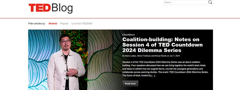
One particularly noteworthy WordPress website that blends ease of use with extensive content delivery is the TED blog. Key messages are highlighted in a large banner on the site that draws visitors in right away with the most recent noteworthy update or featured lecture.
Principal elements of the WordPress website for TED Blog include:
- Interactive and aesthetically pleasing, the homepage includes excellent photos and videos.
- Latest Articles: To help visitors stay up to current on new concepts and stories, the main content area is arranged to showcase the most recent TED blog entries and updates.
- User-Friendly Navigation: Users can rapidly select material that interests them by using the top navigation bar to swiftly access categories including Newest, Popular, and Live from TED2024.
- Social networking Integration: To encourage community participation, widgets on the side let users follow TED on several social networking sites.
- Newsletter Subscription: TED Talks Daily subscribers are encouraged to keep up with the most recent information straight in their mailbox by checking the subscription box.
Condensed highlights of the website’s advantages:
- excellent pictures and multimedia stuff
- News and articles from TED updated frequently
- Accessible design
- Solid integration of social media
The footer guarantees accessibility and openness by offering vital links to TED’s advertising information, privacy policy, and other legal information. With WordPress, the TED Blog has produced an informative, interesting, and user-friendly website that successfully reaches its worldwide readership.
See this excellent WordPress website by going to TED Blog.
Stay Tuned with the Spotify Newsroom WordPress Website
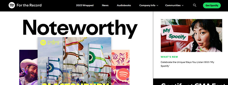
One lively and educational WordPress website is the Spotify Newsroom. The homepage highlights the most recent news and developments from Spotify and is visually appealing and vibrant.
Principal elements of the WordPress website for Spotify Newsroom include:
- Eye-Catching Images: The homepage is crammed with excellent photos and videos to make sure visitors have an interesting experience.
- Latest News and Updates: Users are kept updated on Spotify’s most recent projects and developments by prominent areas that highlight the most recent announcements and news reports.
- easier Access to Categories Like News, Audiobooks, and Company Info is made possible by the top navigation bar, which also makes it easier for consumers to locate the information they need.
- Clickable banners and embedded videos are two examples of the interactive components on the website that increase user interaction.
Condensed highlights of the website’s advantages:
- excellent pictures and multimedia stuff
- Recent news and declarations
- Simple to use navigation
- Compelling interactive elements
With its important links to additional resources, contact information, and social media profiles, the footer ensures comprehensive help and connectivity.. With WordPress, Spotify Newsroom has developed a vibrant and interesting website that successfully informs its audience about its most recent developments and news.
Look at the excellent WordPress website at Spotify Newsroom.
Synopsis
As we get to the end of our tour through the “20 WordPress Website Examples for 2024,” WordPress is still the best tool for web design innovation. These websites offer amazing functionality and user experience in addition to being aesthetically beautiful.
- Travel blogs: Visually spectacular narrative.
- Fitness Websites: Interesting information that inspires and instructs.
- Interactive, resource-rich educational platforms.
Examining these excellent WordPress websites might help you improve the look and functionality of your own. Utilising WordPress’s capabilities, build a website that grabs attention and successfully engages your visitors.
