
Ever Felt Like Your Website Is a Maze?
You know the feeling. You land on a website, ready to buy, sign up, or read something interesting—only to get lost in a mess of confusing menus, broken links, and annoying pop-ups. What do you do? Bounce. And guess what? That’s exactly what your users do when they hit usability roadblocks.
Bad usability is a conversion killer. In fact, studies show that 88% of online shoppers won’t return to a site after a bad experience. And with usability directly affecting SEO, user engagement, and revenue, fixing these mistakes isn’t optional—it’s survival.
So, what’s messing up your site’s usability? More importantly, how do you fix it without tearing your hair out? Let’s break down the biggest usability mistakes and how Plerdy helps you clean up the mess.
1. Cluttered, Confusing Layouts – Users Are Not Detectives

Ever seen a homepage so packed with buttons, banners, and pop-ups that it feels like a Times Square billboard? That’s a usability disaster waiting to happen. If users have to think about where to click, you’ve already lost them.
🔧 How Plerdy Helps:
- Heatmaps visually map out user activity, showing where they click, how they scroll, and which sections they ignore. This helps you spot usability mistakes instantly. For example, if users consistently click a non-clickable element, it signals a UI issue.
- Session Replays let you step into your visitors’ shoes, watching real interactions in action. If users rage-click on a broken button or hover too long over a confusing section, you’ll see it—and fix it.
- Website Funnel Analysis highlights drop-off points in user journeys. If 60% of visitors abandon a checkout step, Plerdy helps diagnose whether it’s bad UX, hidden CTAs, or too many form fields.
✅ Example: A SaaS company noticed that only 35% of users who landed on their pricing page scrolled below the fold. Plerdy’s heatmap revealed that critical pricing details were hidden. After restructuring the page, engagement increased by 45%, leading to 20% more sign-ups.
2. Slow Load Times – Nobody’s Waiting for Your Site
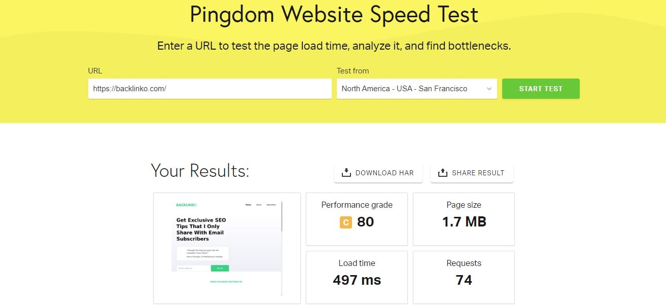
Here’s a brutal truth: 40% of users abandon a site that takes more than 3 seconds to load. Google doesn’t like slow sites either—page speed directly affects SEO rankings. And it’s not just about SEO. Slow load times are usability mistakes that frustrate visitors, tank conversions, and hurt revenue.
🔧 How Plerdy Helps:
- Event Tracking pinpoints sluggish interactions by analyzing how long users wait for elements to respond. If buttons are unclickable for a few seconds, that’s a red flag.
- A/B Testing Tool allows you to experiment with faster page versions—test lighter images, fewer scripts, or reduced animations to find the best-performing setup.
- SEO Checker automatically scans your site for heavy code, uncompressed images, or excessive redirects slowing things down.
✅ Example: A fashion eCommerce store struggled with slow product pages, leading to high cart abandonment. By optimizing page speed with Plerdy insights, load time dropped from 4.8 to 2.1 seconds, increasing completed purchases by 28%.
3. Poor Mobile Experience – Because 60% of Traffic Comes from Phones

Navigating a website on mobile shouldn’t feel like solving a puzzle. Yet, many sites still suffer from usability mistakes—buttons too tiny to tap, menus that disappear, and images that load in awkward places. With 60% of traffic coming from mobile, ignoring these issues is a recipe for disaster.
🔧 How Plerdy Helps:
- Mobile Heatmaps track tap zones, showing where users struggle to interact. If key areas get ignored, they likely need resizing or repositioning.
- Session Replays expose frustrating experiences in real-time—watch users rage-clicking or failing to navigate drop-downs.
- Pop-Up Software ensures overlays don’t disrupt usability, with mobile-specific display rules.
✅ Example: An eCommerce brand noticed users abandoning checkout on mobile. Plerdy’s heatmaps revealed that the “Proceed to Payment” button was below the fold. Moving it boosted mobile conversions by 25%.
4. Overwhelming Forms – Users Hate Homework
Tracking user behavior through a website funnel is key to spotting usability mistakes that block conversions. If visitors drop off before completing a purchase, it’s a sign of friction—confusing navigation, slow-loading pages, or missing CTAs.
🔧 How Plerdy Helps:
- Click Maps highlight dead zones where users expect interactivity but don’t get it.
- Session Replays show what users hesitate over or ignore, helping fix broken paths.
- Website Funnel Analysis tracks visitor movement across multiple pages, identifying where engagement drops.
✅ Example: An online store used Plerdy to refine its funnel, reducing unnecessary steps in checkout. This led to a 19% increase in completed purchases and 12% lower bounce rate.
5. Weak Call-to-Action (CTA) – Users Need a Push
A great CTA is like a great sales pitch—clear, compelling, and impossible to ignore. If your buttons say “Submit” instead of something exciting like “Get My Free Guide,” you’re losing conversions.
🔧 How Plerdy Helps:
- A/B Testing helps pinpoint the best-performing CTA variations, ensuring users take action.
- Click Tracking identifies ignored buttons, so you can tweak placement, color, or text.
- Pop-Up Software delivers strategic CTAs at the right moment, boosting engagement.
✅ Example: An e-commerce store used Plerdy to test CTA placements. Moving “Add to Cart” above the product description increased conversions by 18%, proving small tweaks drive big results.
Usability Mistakes & Fixes at a Glance
| Usability Mistake | Why It’s a Problem | How Plerdy Fixes It |
|---|---|---|
| Cluttered layout | Confuses users, increases bounce rate | Heatmaps, session replays, funnel analysis |
| Slow load times | Users abandon slow sites, Google ranks them lower | SEO checker, event tracking, A/B testing |
| Poor mobile experience | 60% of traffic is mobile—bad UX kills conversions | Mobile heatmaps, session replays, pop-ups |
| Overwhelming forms | Long forms = fewer leads | Funnel analysis, session replays, pop-ups |
| Weak CTAs | No clear direction means lost conversions | A/B testing, click tracking, pop-ups |
Fix It or Lose Sales
Bad usability isn’t just an inconvenience—it’s a revenue leak. Every frustrating experience pushes users away. Every extra second of load time costs you sales. Every broken mobile experience means lost traffic.
The good news? You don’t have to guess what’s wrong. Plerdy gives you the data to fix usability mistakes, optimize conversions, and grow your business.
So, what’s next? Try Plerdy today and see how better usability = better results.