Starting the digital voyage, smart companies understand that traffic by itself does not make the difference. Conversion rate optimization (CRO) has magic that turns casual users into devoted consumers.
Important realizations to make:
- Strategic refinements: Little changes can cause significant changes in user involvement.
- Diverse Approaches: Every website presents a different setting, hence the art of CRO becomes a dynamic task.
- Innovative Techniques: Modern Conversion Rate Optimization (CRO) uses methods and technology catered to today’s user, therefore transcending standard pop-ups.
Thrilled to improve the performance of your website? Explore these ten cases that show the finest techniques and wise moves resulting in unquestionable success. Even if these models could inspire you, adding the correct tools enhances your CRO path. With Plerdy, a great tool for Conversion Rate Optimization (CRO) & UX that will surely help your tactics shine brighter, bring your optimization to life.
Prepare to guide your website into a time of increased conversions and strong user interaction with practical examples and insightful analysis. Let us start right now.
What is a Conversion Rate?
Enter the digital sphere and you will often run into the term “conversion rate.” The conversion rate is essentially the proportion of users of a website who, in whatever declared goal—buying, registering for a newsletter, or otherwise—take a desired action.
But why would it matter?
- Pulse Check: It shows right away how effective a website is. There’s space for development even if a site gets a lot of visitors but few of them interact or make a purchase.
- Income Source: More consumers result from higher conversion rates than from increasing traffic volume without this. Imagine a boutique that changed the way its site was laid and observed a sales increase without further promotional spending.
- Competitive Edge: In sectors like e-commerce, where margins might be almost nonexistent, maximizing conversion rates can make all the difference between prospering and just surviving.
Using “GreenLeaf Organics” as a model—an online retailer of environmentally friendly products. Their website first attracted thousands of daily users, but sales were flat. After a round of optimization, their conversion rate shot sky, greatly increasing income.
All things considered, the conversion rate is not only another statistic. It captures the degree to which a website converts visitors into consumers or subscribers. And in the digital era, companies trying to grow and flourish depend critically on their ability to manage this element of optimization.
What is Conversion Rate Optimization?
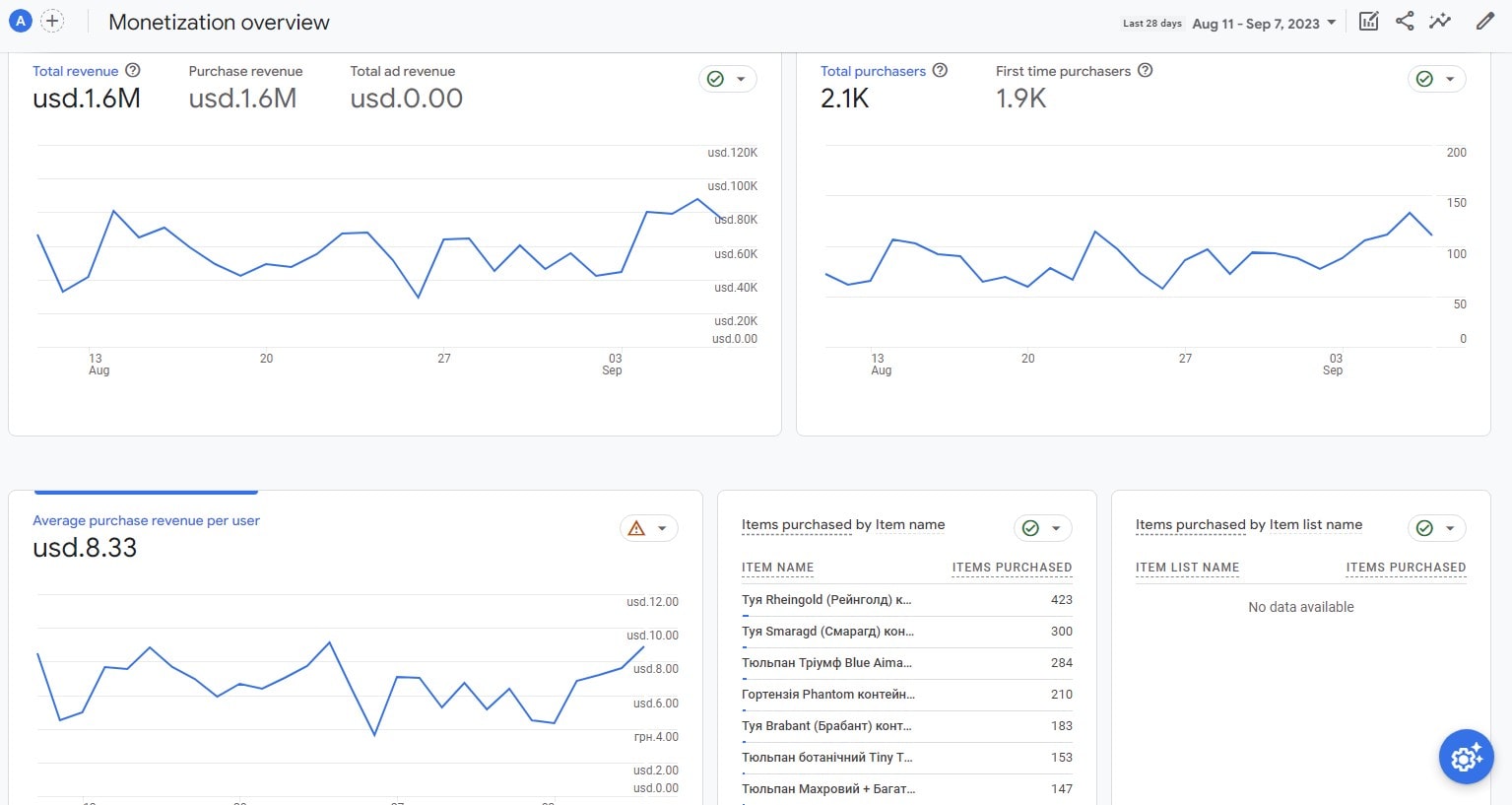
For companies trying to increase their online presence, Conversion Rate Optimization (CRO) is a pillar in the digital terrain. The main focus of CRO is increasing the rate at which users of a site or app carry out a desired action—that which is known as a “conversion,” ranging from newsletter enrollment to purchase.
Think through the following:
- E-commerce: CRO suggests changes to simplify the checkout process after noting why customers abandon their baskets.
- SaaS platforms: By means of optimization, SaaS platforms improve user onboarding, thereby guaranteeing users’ fast acquisition of the value of a program.
- Blogging: Optimization encourages readers to share or subscribe to materials thereby increasing their reach.
Central to CRO is a methodical process of comprehending user behaviors, testing changes, and implementing rolling-back improvements that increase the conversion rate. Driving conversions explores deep into user psychology, statistics, and an endless dedication to excellence, not only depends on a beautiful design.
An ideal site provides consumers with a flawless experience and naturally guides them to act. Every optimization sharpens this path by removing obstacles and highlighting the interesting parts.
Conversion Rate Optimization is, all things considered, a continuing rather than a one-time endeavor. Companies maximize conversion rates by means of continuous optimization cycles—assessment, iterating, and perfecting. In a digital environment when every click counts, CRO makes sure companies effectively grab interest, therefore promoting development and strengthening their online presence.
List of 10 Conversion Rate Optimization Examples
Your North Star is this carefully selected collection of “10 Conversion Rate Optimization Examples” as you negotiate the maze of the digital realm. With every case, you’ll uncover valuable nuggets of knowledge showing how the alchemy of conversion rate optimization may turn website visitors into committed customers. So put on your thinking cap and let’s delve closely into the specifics of excellent CRO techniques that have exploded online.
1. A/B Testing Landing Pages
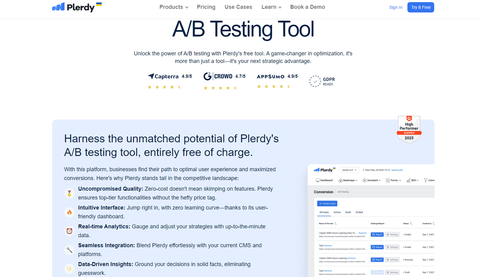
Still a pillar of conversion rate optimization is A/B testing. Running two versions of a landing page, Version A and Version B, helps companies find which best appeals to consumers. This method finds the most successful components, therefore improving website performance. In particular:
- Changing product images in e-commerce could affect judgments on buying.
- Changing call-to- action language for SaaS systems can increase software trial sign-up rates.
- Changing the layout in content marketing might inspire more eBook downloads.
A/B testing generates best website outcomes by means of constant iterations depending on actual user behavior, therefore improving user experience and soaring conversions.
Background: What is A/B Testing?
Leading conversion rate optimization tool, A/B testing is like a compass guiding brands toward improved website performance. Using two different versions of a single page or piece will help companies focus on better tactics. This entails:
- Two designs pitted against one another, perhaps as rival homepage layouts for a digital magazine.
- In e-commerce, testing several checkout routes helps to close the sale.
- On a subscription-based system, comparing different sign-up cues.
Companies find the design that increases conversions by precisely monitoring user interaction and engagement with every variation. Using A/B testing guarantees companies constantly improve and simplify their customer experience by means of ongoing refining and optimization.
Conversion Rate Optimization Example #1: Comparing Two Headlines to Increase Sign-ups
Often the main hook drawing users into the core of a website is headlines. Still, how can companies be sure they have selected the most interesting phrase to maximize conversion rates? Now consider A/B testing. Think of an online fitness company ready to boost sign-ups:
- Version A: “Unlock Your Perfect Fitness Path Right Now!”
- Version B: “Play into a Healthier Tomorrow Today!”
The program tracks user interactions with every headline over a prescribed duration. Findings show Version B resonates stronger and increases sign-ups by 15%. Such insights:
- Give brands tools to simplify website components for best effect.
- Encourage smart selections by removing design choice guessing.
- Increase general website interaction to guarantee visitors explore more of your offerings.
By means of intentional comparisons and A/B testing, conversion rate optimization has a clear road map. Businesses can greatly change user behavior and increase intended results by changing something as apparently small as a headline.
2. Streamlining Checkout Processes
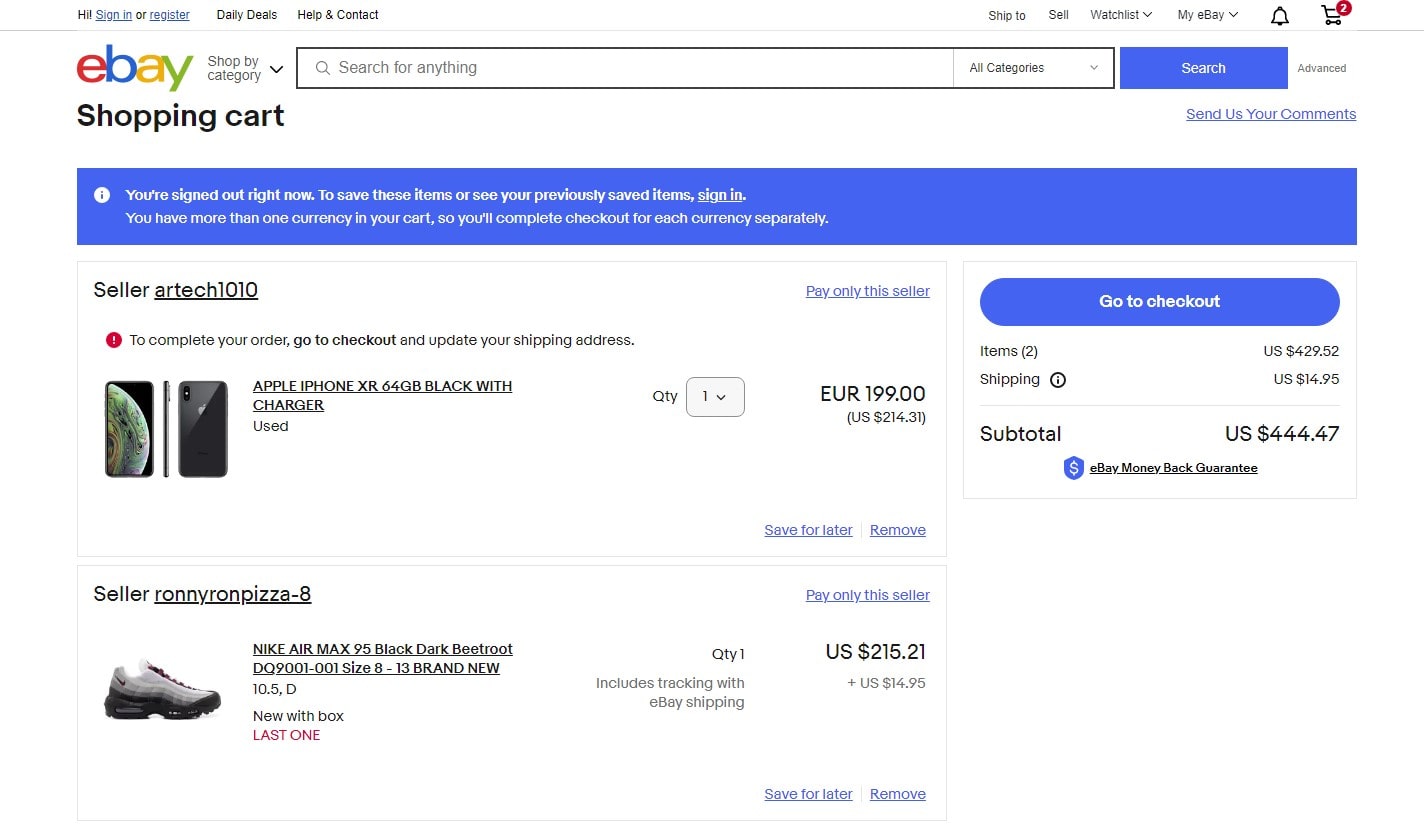
Optimizing checkout systems helps to both improve user experience and conversion rates. From small-town boutiques to massive e-commerce behemoths, online companies have embraced optimization techniques to increase conversions and lower cart abandonment.
Important lessons:
- Swift Navigation: Customers are kept flowing down the funnel with a straightforward, easy interface.
- Fewer Clicks: Reduce the steps needed to close a purchase so increasing the conversion rate.
- Open Pricing: Nobody enjoys unstated costs. Being honest straight forward increases optimization and trust.
Combining user comments with data analytics helps companies find areas of conflict in their checkout system. Once found, they can implement improvements strengthening brand loyalty in addition to improving the conversion rate. A good checkout creates the foundation for recurrent business rather than only chasing one transaction. Learn the craft of simplifying and see how optimizing one area affects your bottom line.
The Issue: Abandoned Carts in E-commerce
Negotiating the complex web of e-commerce, companies sometimes struggle with abandoned carts. These phantom leftovers of possible sales chew at the core of demand strict optimization techniques and conversion rates. Encouragement of a flawless purchasing experience becomes critical to overcome this obstacle.
There are many of solutions:
- Optimized Load Times: Faster page loading help to keep consumers interested, so lowering bounce rates.
- Simplified Checkouts: Cut out extraneous processes to expedite conversions.
- Reassurance Elements: Trust badges help to guarantee security and increase the conversion rate.
But it’s a continuous dance of improvement, not only about repairs and patches. Businesses can improve attempts at optimization by regularly evaluating user behavior and changing depending on feedback. Go deeply into creating plans that fit consumers, welcome openness, and give convenience first priority. The outcome is… Improved conversion rates, contented consumers, and a strong e-commerce infrastructure.
Conversion Rate Optimization Example #2: Reducing Steps in the Checkout Flow
Reducing the checkout flow directly increases e-commerce conversion rates. Imagine a luxury cosmetics website where customers can’t wait to get the newest lip color. Still, a thorough checkout process lessens their first thrill. Reducing the steps helps the brand to revive this passion. Think of the following tweaks:
- Combining on one page billing and shipping information.
- Providing a “save for later” choice to cautious consumers.
- Using auto-fill features for returning clients.
A gourmet chocolate business might find customers prepared to enjoy, but get sidetracked entering address information. They shorten the checkout process by including social media logons. A handcrafted furniture website can, however, include reviews in the flow to boost buyer confidence without straying. Simplifying checkouts guarantees that consumers flow from choice to purchase without any problems, hence increasing website conversions and brand loyalty.
3. Enhancing Call-to-Action (CTA) Buttons
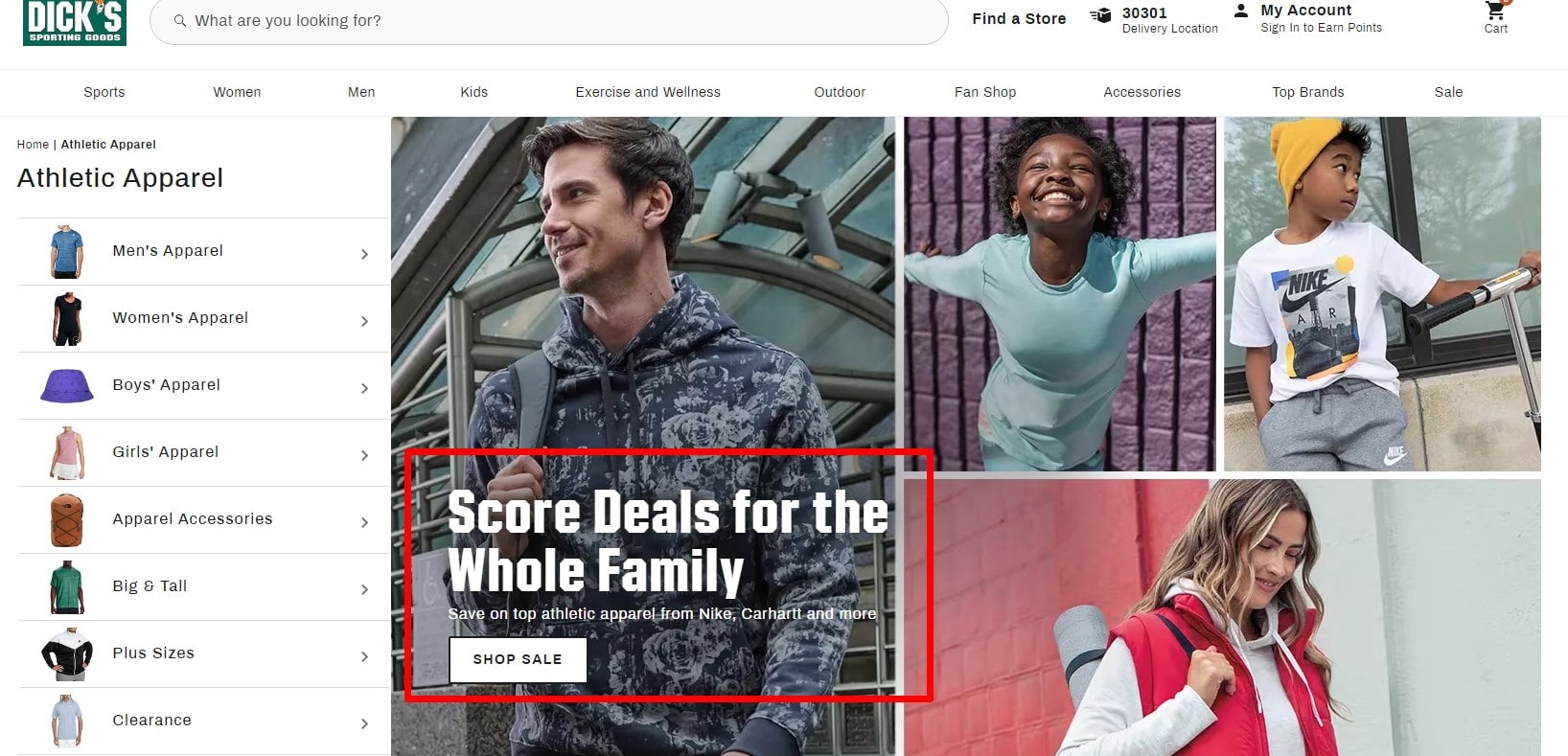
Essential touchpoints, CTA buttons guide users to act forcefully on a website. To really improve conversion rates, though, these buttons need delicacy and strategy. Think of a luxury watch store trying to increase web sales. Strategies for optimization could comprise:
- Increasing button visibility using opposing color schemes.
- Instead of a generic “Buy Now,” use striking language like “Claim Your Timepiece.”
- Arranging CTAs so they show up following compelling product descriptions.
From boutique bookstores to adventure gear hubs, e-commerce platforms—by sharping these CTAs—create magnetic draws, drawing in customers and directing them towards desired outcomes, hence optimizing conversion prospects.
The Importance of CTA Placement and Design
A well-crafted CTA is a fundamental tool for conversion improvement; it does more than just call to users. Not all CTAs, meantime, are created equally. Explore an artisan cheese website and you will see how a tempting “Taste the Craft” button may surpass “Add to Cart.” Here’s the lowdown on design and placement:
- Visibility Overload: Steer clear of drowning CTAs among an ocean of information. Space them out allowing them to breathe among descriptive language.
- A/B Testing: Strong palette selections: Neutral colors fade away. Choose complementary colors that catch attention yet also speak to the core of your brand.
- Physical Action Words: Replace cliches in your work. The website of a pizza restaurant may find more resonance for “Seize Your Slice” than for the overused “Order Now.”
Improved design and location help CTAs not only grab the eye but also inspire action, hence increasing website conversions stratospheric.
Conversion Rate Optimization Example #3: Changing CTA Color to Boost Clicks
Little modifications can increase conversion rates in the busy digital marketplace. Let’s explore the path taken by a neighborhood natural skincare company. Their site first featured a calm green “Shop Now” button that exactly matched their environmentally conscientious brand. But among the sea of pastel colors, this button disappeared from view and lacked appeal.
The brand decided to change things following optimization:
- Bold Red Makeover: Swapping off the green for a bright red, the CTA began to show immediately as a focus point.
- A/B Testing: The website ran simultaneous versions, the calm green against the strong red, to test the efficacy.
- Measured Impact: The click-through rate of the red button shot within weeks, clearly increasing conversions.
It’s a perfect illustration of how much a basic color change may improve website performance. Understanding user behavior and applying smart modifications can help companies identify the ideal point between brand aesthetics and optimization successes.
4. Offering Time-Sensitive Discounts
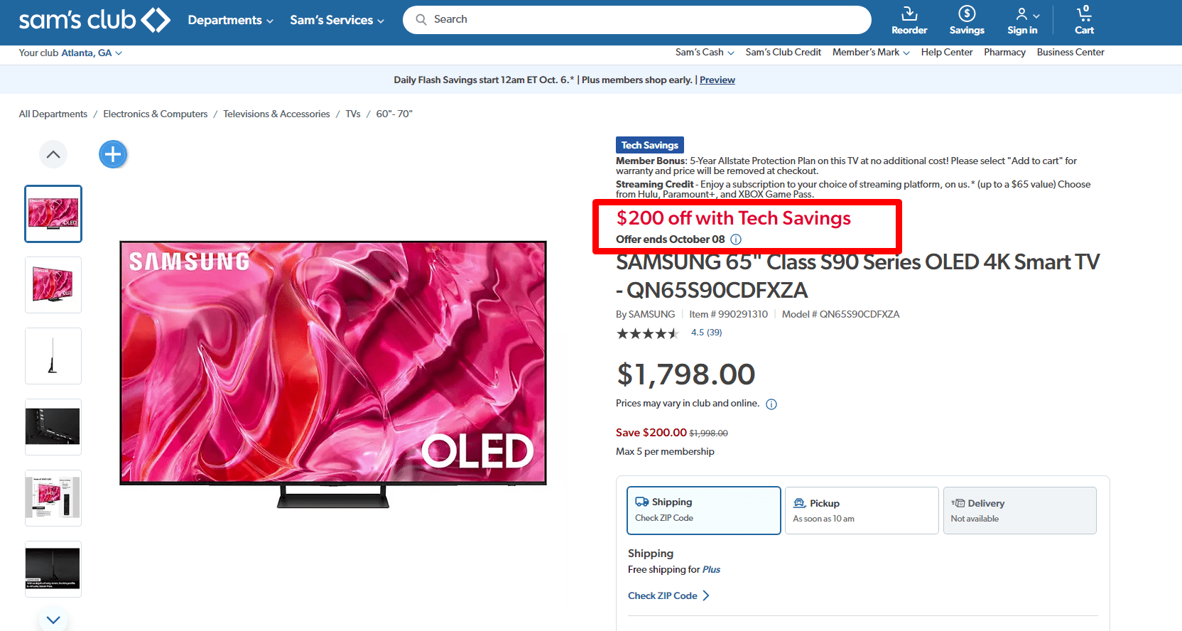
Using time-sensitive discounts would help an e-commerce platform’s conversion rate to be much improved. Faced with the fear of losing out, consumers are pushed into action, increasing sales and encouraging instantaneous involvement. Still, the success of such projects mostly depends on strategic optimization.
Strategies to maximize influence:
- Clear Countdowns: Show declining time, inspiring urgency and converting power.
- Targeted Outreach: Using email blasts or push alerts, customize offers to fit user behavior, hence optimizing rate of interaction.
- Transparent Terms: Clear, open terms for discount conditions will help to avoid baiting consumers.
Using these time-bound incentives and delving deeply into user preferences will help companies increase their conversion rate. It’s important to find a balance, though; offer too much and you run the danger of undervaluing your brand; too few and you lose out on possible optimizing chances. See your e-commerce platform flourish while riding the urgency wave.
The Psychology of Limited-Time Offers
Leveraging the human brain, limited-time offers act as a stimulant for e-commerce conversion rates. They create a sense of urgency, prod customers into quick response, and cause them to give a purchase they would have otherwise delayed top priority. Good optimization techniques can increase the effect of these offers even more.
Nuances to take use of:
- Scarcity Mentality: Items seen as more valuable when they are rare drive conversion rates skyward.
- Immediate Gratification: Giving quick rewards fulfills the natural human need for immediate gratification and motivates quick purchases.
- Social Proof: Showcasing the number of people who have accepted the offer can inspire the desire to join the throng, therefore improving the conversion rate.
Combining psychology’s art with e-commerce efficiency allows companies to create offerings that not only appeal but also translate. Enter the field of human behavior, combine it with deliberate optimization, and see a clear increase in interaction and conversion.
Conversion Rate Optimization Example #4: Implementing a Countdown Timer for Sales
Consider “TeaTales,” a young online retailer with an eye on exotic tea pairings. To raise their conversion rate, they integrated a dynamic countdown timer into their mid-year sale. Their style seems like this:
- Visual Appeal: Their really beautiful timer images made it tough to ignore.
- Positioning: Designed specifically at the top and checkout page, it constantly reminded readers of the ticking clock.
- Personalized Alerts: Should a guest add something to their cart, a pop-up alerting them on the sales time restriction.
The fact that sales of TeaTales increased remarkably after installation highlights the efficiency of the timer. Emphasizing the urgency helped them not only enhance the user experience but also significantly raise their conversion rates. This example highlights how modest changes to a website could lead to significant variations in user behavior.
5. Personalizing Content with User Data
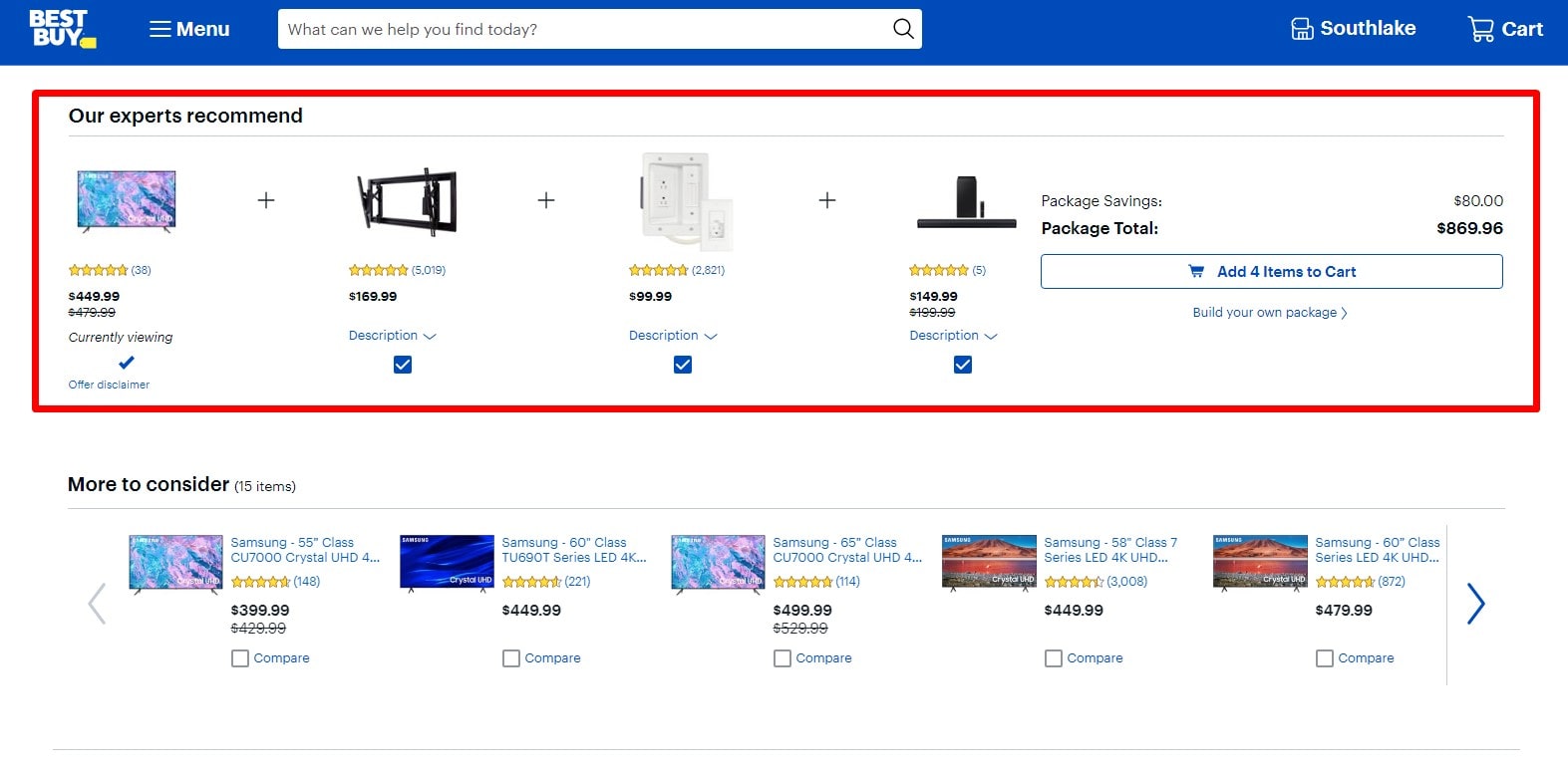
In the digital age of today, customizing material using user data is an unmatched strategy to increase conversion rates. Customizing products that appeal to consumers helps businesses establish a closer relationship and so make them visible and valuable. This link thus enhances engagement rate and, when combined with suitable optimizing strategies, can improve general performance.
Important strategies consist in:
- Offering products or services based on past experiences helps to boost the conversion rate by behavior-driven recommendations.
- Customized email campaigns send materials appropriate for audiences separated out by behavior or inclination.
- Dynamic web content—changing pictures or offers based on user data—guarantees relevancy and assists efforts at optimization.
Companies can create a user-centric experience by integrating new optimization techniques with the ability of user data. Customized materials not only improve the conversion rate but also create long-lasting relationships, so guaranteeing ongoing success.
The Power of Personalization in Marketing
Turning now into the marketing terrain, personalization becomes a powerful tool boosting conversion rates in many different fields. It’s not merely about calling clients by name; it’s a sophisticated ballet of analytics and strategy with great results.
Main components:
- Customized Content Distribution: Presenting content based on user activity will help to increase the conversion rate.
- Adaptive User Interfaces: Changing paths and graphics depending on decisions helps to boost user interaction rate.
- Feedback-Driven Improvements: Making sure campaigns are always optimized by means of real-time feedback.
Companies that expertly weave customizing into their marketing tapestry have transformational results. Not only a strategy, this is an art integrating conversion, rate, and optimization to produce unmatched user experiences.
Conversion Rate Optimization Example #5: Using User Browsing History for Targeted Recommendations
Discover the success story of “TechGlide,” an electronics e-commerce website employing user browsing data to raise conversion rates. The algorithms of TechGlide started operating the second a user touched their platform:
- Past Interests: Showing on the web lately seen objects.
- Advice for a niche: depending on previous purchases, offer accessories or complementary pieces.
- Trending Now: Stressing products in sectors the consumer usually seeks.
Those using this tailored approach traveled a journey that appeared both familiar and intriguing. Every click they sensed and knew, like if the page was designed just for them. TechGlide consequently noticed a clear rise in sales and a decline in cart abandonment rates. Customizing the online purchase experience using user data not only enhances the user journey but also transforms browsers into committed buyers, therefore stressing the incomparable potential of individual-oriented marketing strategies.
6. Using Video Demos for Products
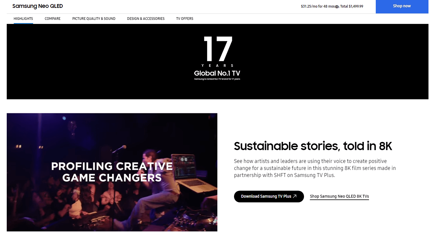
In the active digital industry, video demos have turned into very successful instruments for raising conversion rates. Visual presentation of product functionality helps potential buyers to grasp the core and thereby increases their buy intention. Designed with optimization in mind and thoughtfully produced, these demos can revolutionize the purchasing process.
Key benefits:
- Visual storytelling: Helps to bring objects to life and raise conversion by means of better experiences.
- User-Centric Demonstrations: Help to emphasizing how objects enhance daily activities, therefore optimizing the value proposition.
- Real-Time Engagement Metrics: Monitoring user interactions with the video helps metrics to be adjusted for best rate enhancement.
Including video demos in the marketing toolkit generates a dynamic link with the audience that raises conversion rates as well as other aspects. Emphasizing optimization at all levels can help companies ensure their products stand out and inspire confidence and excitement in potential customers.
The Rising Demand for Video Content
The need for video material keeps exploding in the digital world, which drives great conversion rates on many other platforms. Those companies that adopt this trend and focus on optimization techniques will really benefit. From social media to streaming services, video governs supreme and supports its unrivaled capabilities in rate elevation and audience connection.
Crucially important observations:
- Audience Preferences: Modern consumers lean largely into video for information and fun, therefore boosting conversion rates.
- Optimization Strategies: Optimizing video content to fit audience niches will assist it to be more effective, thereby optimizing influence and reach.
- Influential Impact: Good video material may assure a committed audience, boost conversion, and affect decisions.
Companies might ride this wave by prioritizing video content optimization first, so guaranteeing they meet evolving consumer expectations and optimize the possibility for excellent brand conversion rates.
Conversion Rate Optimization Example #6: Integrating Product Demo Videos to Increase Sales
Modern e-commerce sites like the eco-friendly garments business “EcoWear,” are leveraging product demos to inspire buy-in. Drawing on the visceral, they maximize user experience; their conversion rates show notable rise. EcoWear took advantage of videos and deftly merged them here:
- Texture Close-ups: Textual quality Showcasing fabric quality and design complexity, close-ups allow shoppers almost “feel” the products.
- 360-degree Views: Making sure consumers see every angle and design detail ensures a whole picture.
- Style Pairings: Combining various items of clothing in style sessions offers fashion-forward ideas for potential consumers.
- User-generated clips: User-generated clips develop trust with their honest, unguarded moments and real-world application.
EcoWear developed an immersive experience by adding such material into their website, therefore transcending simple presentation of their clothes to convey a story. Not just displayed products, they drew viewers and turned casual browsers into eager consumers. This is a fantastic activity demonstrating how well video-rich content can raise a company’s internet profile.
7. Improving Site Speed and Performance
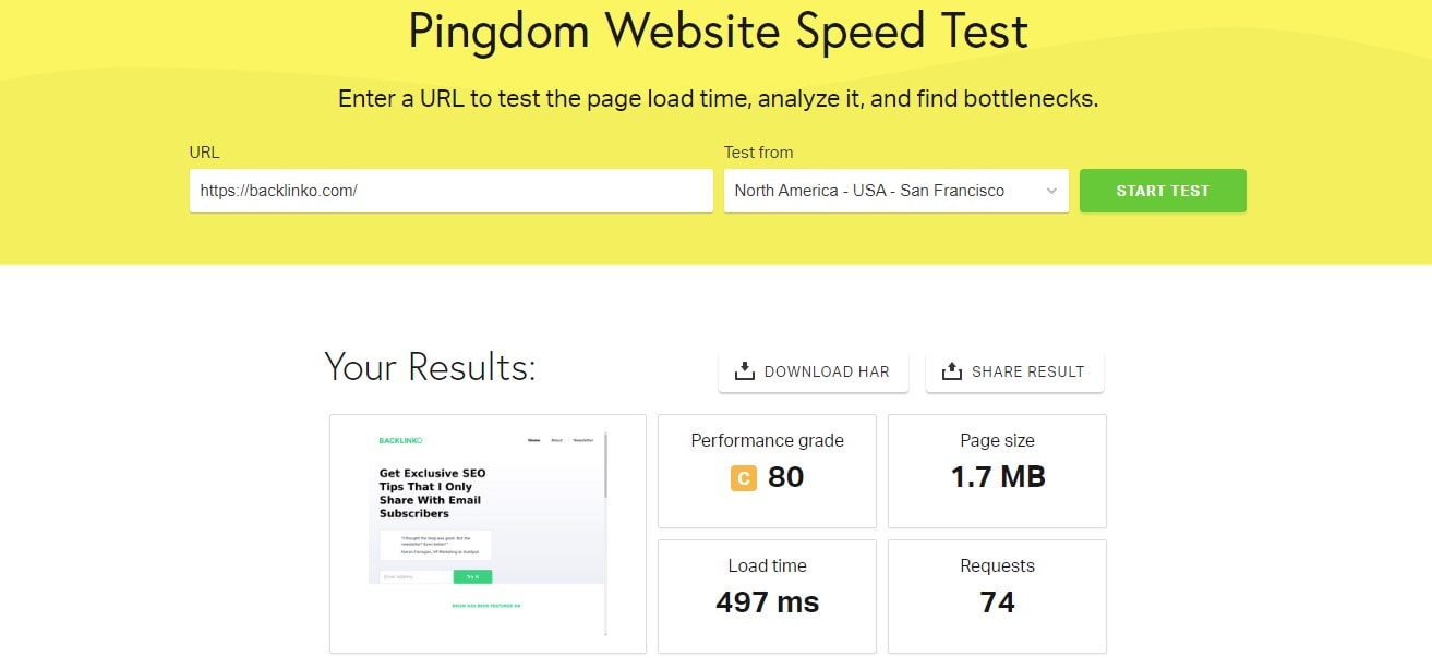
Not only is better site performance a tech benefit; it’s also a required first step towards greater conversion rates. When “GreenTech,” a green gadget e-commerce upgraded their website’s speed, they noted:
- Swift Browsing: Users sped throughout product pages to significantly reduce bounce rates.
- Quick Checkouts: Accelerated transaction methods helped to lower cart abandonment.
- Enhanced User Experience: Simplified website components increasing general satisfaction led to enhanced user experience.
GreenTech demonstrated by zeroing down on performance optimization that fast, responsive websites not only satisfy the tech-savvy but also draw in new customers.
How Page Load Time Affects Conversions
Digital purchasers seek instant access. The delayed site replies of the environmentally friendly clothing retailer “EcoFashion” clearly resulted in:
- Dwindling Engagement: Customers negotiated away before the webpage loaded, therefore lowering the potential for upselling on the website.
- Skyrocketing Bounce Rates: Unwanted to wait, impatient customers ditched their shopping trolleys midway through a transaction.
- Tarnished Brand Image: EcoFashion’s poor online speeds reflected as a trailing, outdated brand image.
Handling optimization, EcoFashion changed its digital architecture. Their updated website produced circumstances for better conversion rates in addition to accelerating across pages. By explicitly linking performance to sales, they underscored the inevitable relationship between load time and customer retention.
Conversion Rate Optimization Example #7: Optimizing Images for Faster Loading
TravelSights, a well-known destination website, first piqued wanderlust with high-quality images of amazing locations. Although visually striking, their rich pictures slowed down websites and gradually lowered conversion rates.
TravelSights acted quickly and instituted a series of drastic changes:
- Format Selection: Swapping out larger JPEG and WebP formats allowed them to preserve visual quality while reducing file size.
- Compression Tools: Using technologies like TinyPNG, they clipped unnecessary data from each image without compromising its core.
- Responsive Images: SRCSET let them ensure appropriate picture sizes depending on a user’s device, therefore preventing any unneeded loading delays.
- Lazy Loading: Images now load as visitors scroll down, therefore preventing the site from becoming bogged down with front-end loading.
Site performance post-optimization improved significantly for TravelSights, which immediately matched enhanced user experience and more conversions. Emphasizing picture optimization, they effectively merged digital efficiency with aesthetic appeal, therefore highlighting in the field of digital marketing that sometimes the most important changes come from the invisible tweaks.
8. Offering Social Proof via Testimonials and Reviews
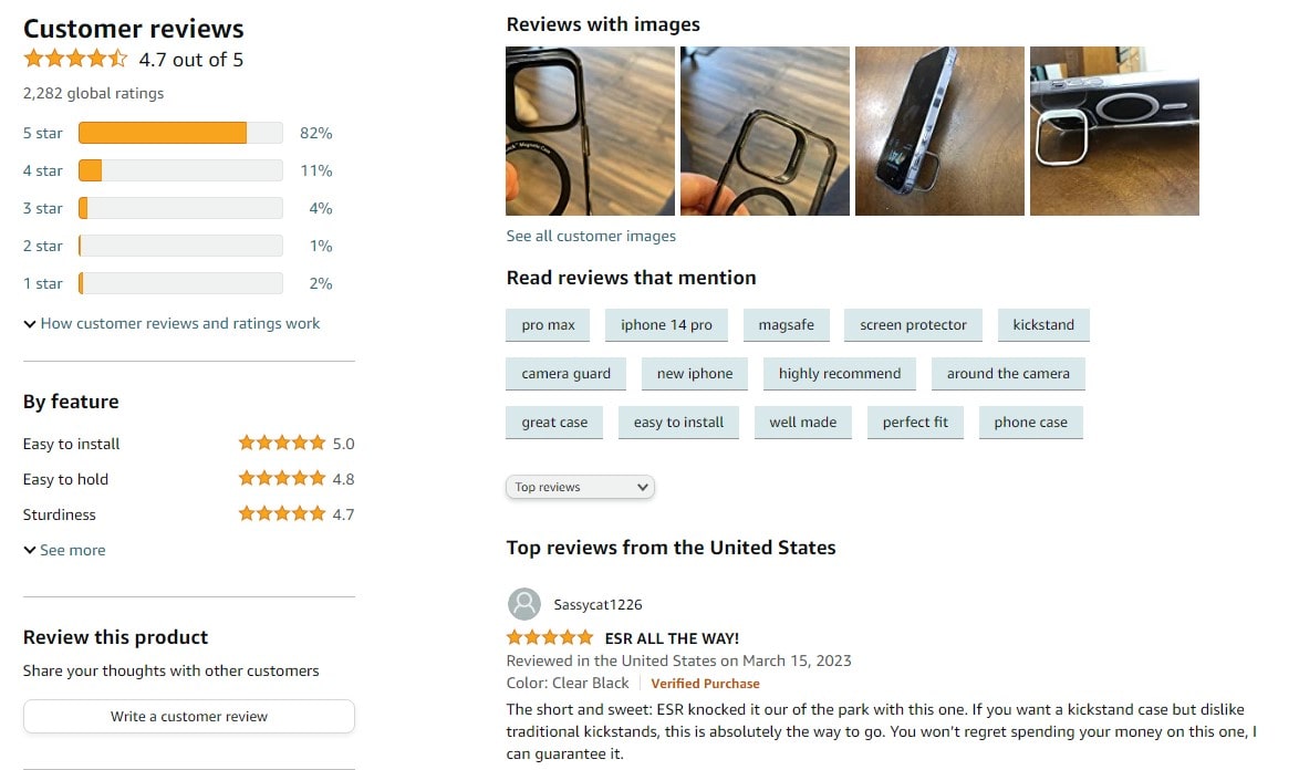
Credibility development in the digital terrain causes great difficulty for businesses. One strategy that actually helps to raise conversion rates is using real reviews and endorsements. Real customer experiences enable brands to show their products or services, therefore fostering trust and improving optimization results.
Let us breakdown it:
- Genuine Feedback: Real comments engage candidates, hence boosting conversion.
- Diverse Voices: Emphasizing broad contentment from numerous groups, many voices help to emphasize efforts at optimization.
- Rich Narratives: Personal stories—connect strongly and motivate possible consumers to act, therefore increasing the conversion rate.
Combining reviews and testimonials helps businesses not only utilize their channels for more contact but also build a basis of trust, which is crucial for consistent development. Regarding conversion rate optimization, real voices lead the way, transforming businesses into very visible and persuasive audience confidence. Remember, in a time when authenticity rules supreme, real feedback becomes an unmatched instrument for every brand looking for optimal conversion and optimization.
The Trust Factor in Online Shopping
Trust is quite important for e-commerce systems to be successful. Given the focus on conversion optimization of companies, understanding the need of trust becomes vitally crucial. Consumers who depend on honest user ratings, carefully defined return policies, and excellent customer service now give transparency top priority.
Important components fostering confidence are:
- Transparent Operations: Clearance in shipping, pricing, and delivery timeframes will assist to significantly increase conversion rates.
- Certified Secure Checkout: Guarantained security measures boost customer confidence, therefore affecting optimal conversion rates.
- Authentic Brand Stories: Sharing behind-the-scenes knowledge or business values might help to start better optimization.
By means of these trust channels, not only does a company’s reputation grow but also exactly matches strategies aimed for optimal conversion rate optimization. In a digital environment where consumers may rapidly switch between tabs, trust is still the rock solid anchor retaining their attention and driving transactions. Combining trust-centered approaches becomes the key to managing conversion and optimization in the e-commerce sector as companies innovate.
Conversion Rate Optimization Example #8: Displaying Top Reviews on Product Pages
In the field of digital commerce, companies struggle for trust and attention. “HealthyStride,” the athletic shoe brand, seeks to increase online conversion rates. On every product’s landing page, reviews started to take front stage instead of being buried under another tab or page. They undertook this:
- Spotlighting Five-Star Feedback: Brilliant testimonies grabbed front stage directly under the product description.
- Dynamic Review Updates: The display changed to guarantee a current and representative sample when fresh assessments arrived.
- Engaging Visuals: Including user-uploaded photographs to support assessments, you let prospective clients see real wear.
Apart from boosting HealthyStride’s revenue, this intentional optimization—a mix of strategy and pragmatic implementation—raised customer trust. Using the brand’s website, consumers didn’t have to go great distances to find actual remarks. For many on-the-fence buyers, instead they were met with honest recommendations that clinched the sale. HealthyStride’s approach highlights the need of transparency in internet business and shows how closely success follows when you establish trust from front.
9. Implementing Exit-Intent Pop-ups

Using exit-intention pop-ups will help to drastically change the conversion environment dynamics on your website. The environmentally friendly drinkware company “EcoBottle,” saw a clear increase in conversion rate following launch. Their approach:
- Timely Offers: Users were shown an attractive deal just as they were ready to travel away.
- Engaging Design: Visually engaging pop-ups guaranteed users gave them more than a quick look.
- Swift Loading: These pop-ups loaded in the blink of an eye to help to prevent user irritation.
Using this approach, EcoBottle not only rebuilt potential lost sales but also improved customer brand connection.
Capturing Potential Conversions Before They Leave
Every moment counts for conversion in the busy digital hallways where possible buyers stray. Capture their interest before they go away if you want best rate optimization. Above all, creative ideas customized to the always changing terrain are vital.
Techniques that differentiate:
- Engaging Exit-Intent Pop-ups: Encourage consumers back into the conversion path when they try to browse away.
- Swift Chat Responses: Quick responses to questions help to maintain rate optimization by maintaining speed at top focus.
- Exclusive Offers: Dangle limited-time offers to entice people about to leave back in line.
Businesses use these strategies to maximize possible conversions from fashion stores to subscription services. It’s about reading the room, moving quickly, and making sure every opportunity to increase conversion isn’t lost. Learning this dance places brands as tuned, responsive leaders in rate optimization, therefore transcending mere numerical improvement.
Conversion Rate Optimization Example #9: Offering a Discount on Exit-Intent
Think about “BloomBuds,” a small florist focused in exotic flowers. Though they had trouble turning surfing visitors into purchasers, their web platform exudes grace. Their approach to turn the tide of leaving guests was introducing exit-intent optimization.
- Dynamic Offers: A wonderfully crafted pop-up that offered a time-sensitive 15% off sprang to life just as guests were ready to leave. This was an offer to stay a bit longer, not just a shove.
- Personalized Appeal: BloomBuds made sure the offer connected with the surfing behavior of the visitor using data-driven insights. Had anyone been looking at orchids? Using the discount code, the pop-up highlighted those very flowers.
- Easy Redemption: The discount applied at the checkout automatically with a single click. No hoops to jump through, no tiresful of code entering.
BloomBuds not only improved their conversion rate but also strengthened the bond of trust and interest with possible consumers by staging a last-minute performance for the attention of the visitors. The nimbleness to involve consumers as they waver in this digital age might make all the difference between a lost chance and a happy, recurring customer. Essentially, optimizing exit-intention closes that brief gap and invites guests to rethink, interact, and ultimately make purchases.
10. Utilizing Chatbots for Immediate Assistance
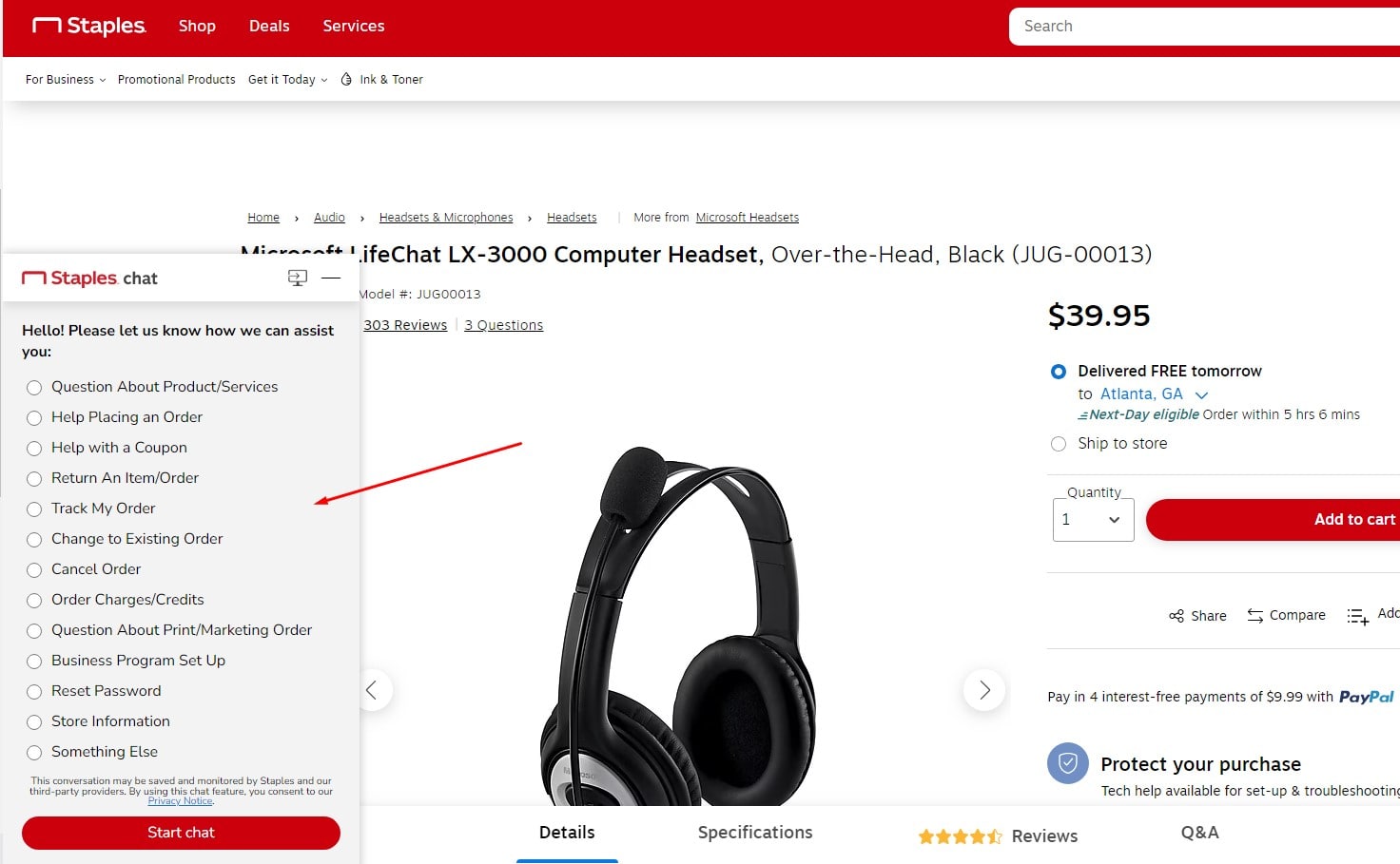
Chatbots become essential players for maximizing conversion rates in the busy online marketplace, where fast responses can either make or kill a deal. Instant, around-the-clock responses greatly increase customer satisfaction so that consumers may quickly discover what they need. Reduced wait times and customised solutions let chatbots directly affect conversion rate optimisation.
Methods to maximize chatbot capability:
- Personalized Product Suggestions: Chatbots, using data analysis, can suggest products depending on user browsing behavior, therefore improving conversion possibilities.
- Swift Issue Resolution: Quick problem solving by direct troubleshooting or user guidance increases satisfaction and, hence, optimization.
- Simplified transactions: Help consumers through the checkout process, therefore reducing cart abandonment and increasing conversion rates.
From fashion stores to the financial industry, different areas combine chatbots to provide a flawless and efficient user interface. Ensuring these AI-driven assistants remain user-friendly, intuitive, and consistent with brand voice will be the secret. Businesses can optimize their conversion potential by giving quick, relevant, and effective interactions first priority, therefore defining the gold standard for digital rate optimization.
Why Instant Communication Matters
Instant answers promote conversion in the fast-paced online world of today. Every delay reduces possible income, hence underlines the critical need of quick communication for rate optimization. Hungry for quick responses, consumers value companies who give their time top priority and show devotion and trust.
Main advantages of immediate communication:
- Improved customer satisfaction: fast responses translate into less abandoned carts and more conversion.
- Real-time Issue Resolution: Resolving problems right away helps to maximize rates and improve user experience.
- Builds Brand Reliability: Quick answers show a company’s dedication, thereby strengthening confidence and hence optimization.
From tech help to medical consultations, many industries see the transforming power of immediate communication. It is now absolutely necessary, not just a nice-to-have. Companies following this trend not only increase their conversion but also differentiate themselves as leaders in rate optimization in their sector.
Conversion Rate Optimization Example #10: Introducing a Support Chatbot to Decrease Bounce Rate
For “EcoLuxe,” an elegant online boutique, improving customer experience has been paramount. They unveiled an artificial intelligence-driven assistance chatbot to address high bounce rates. Here’s how their website dynamics changed:
- Immediate Responses: Visitors not had to twiddle their fingers; the chatbot kept them interested by quickly answering questions.
- Tailored Recommendations: Using data-driven insights, the chatbot recommended items that matched user tastes, therefore improving the likelihood of a sale.
- Always 24/7. Availability: The chatbot was alert even after hours, always ready to help to guarantee no customer felt left without support.
- Effortless Navigation: For those lost in space, the chatbot cleared a clear path to desired portions, therefore removing possible escape triggers.
The outcome is A notable decline in bounce rate and an increase in conversion. “EcoLuxe” not only improved its online show but also set a model for others in the e-commerce market. This action demonstrated how easily websites might close the gap between user needs and quick answers given the correct tools.
FAQ: Conversion Rate Optimization Examples
What is conversion rate optimization (CRO) and why is it important?
Conversion rate optimization (CRO) is the process of improving a website’s performance to increase the percentage of visitors who take a desired action, such as making a purchase, signing up for a newsletter, or filling out a form. It’s crucial because it helps businesses maximize their existing traffic, improve user experience, and drive more revenue without increasing ad spend.
How does A/B testing improve conversion rate optimization?
A/B testing compares two versions of a webpage, email, or ad to see which one performs better in terms of conversions. By systematically testing elements like headlines, CTAs, images, or layouts, businesses can make data-driven decisions that enhance user experience and improve their conversion rate.
What are some common mistakes in conversion rate optimization?
Some common CRO mistakes include:
- Ignoring mobile optimization, leading to poor user experience on smaller screens.
- Using generic CTAs that don’t motivate users to take action.
- Failing to analyze user behavior and relying on guesswork instead of data-driven decisions.
- Overloading pages with too many elements, which can distract visitors and reduce conversion rates.
How can Plerdy help with conversion rate optimization?
Plerdy offers powerful tools for CRO, including heatmaps, session replays, and website funnel analysis. These features help businesses understand user behavior, identify bottlenecks, and implement data-backed optimizations to improve conversion rates effectively.
What’s the fastest way to improve a website’s conversion rate?
The quickest way to boost conversions is to optimize key elements like CTA buttons, page load speed, and checkout processes. Adding exit-intent pop-ups, personalizing content based on user behavior, and using tools like Plerdy to analyze visitor interactions can also lead to immediate improvements.
Final Remarks on Examples of Conversion Rate Optimization
As we wrap up our thorough exploration of “10 Conversion Rate Optimization Examples,” it is clear that using the art of CRO is no more optional for companies hoping for digital supremacy. These real-world examples show the transforming potential of smart optimization strategies, which act as a road map for website owners trying to increase their conversion rates. Every example shows several approaches that break through layers of complicated user behavior and customize website components for best visitor interaction.
Important insights:
- Strategies of Hotjar and HubSpot expose the vitality needed in contemporary CRO.
- When combined sensibly with user-centric UX designs, email marketing performs miracles.
- Far from simple website essentials, cookies and tags are essential for segmenting audiences for focused advertisements.
Plerdy is a great tool for SEO and UX analysis for those wanting to improve their game, therefore guaranteeing your website stays on target and optimizes profits. Discover Plerdy right now to equip your company with data-driven insights ready for unheard-of expansion.
