Here’s your e-commerce success roadmap. Here to assist you negotiate the busy world of online retail is our “10 E-commerce User Experience (UX) Best Practices” book. Fundamentally, this handbook attempts to:
- Reach previously unheard-of levels with your online store.
- Promoting a smooth user experience increases client loyalty and pleasure.
- Utilise the UX & SEO analysis tools from Plerdy to maximise your platform.
In the busy online marketplace, your website is your booth, your goods your goods, and the user experience the kind smile and kind welcome that entices visitors to stay. Using techniques like efficient navigation, quick checkout, and customized experiences, you can turn your online store into a client magnet. Buckle up and come along on our quest to build an amazing user experience that draws clients and turns them into brand ambassadors.
What is E-commerce User Experience?
The foundation of your online business and the thing that makes casual visitors into devoted customers is the e-commerce user experience (UX). It extends beyond a nicely stocked product line or an attractive website. Making every customer contact with your e-commerce website smooth, pleasurable, and profitable is the goal.
Imagine, if you will, that a customer visits your online store. It looks good, and a fascinating product display entices them in. The site’s easy-to-use design directs users and provides customised product suggestions. They move as naturally as breathing from looking to buying. They have no problems and no needless procedures during their checkout. And they feel appreciated and want to come back since they get timely, individualized communication following the purchase. This is superior e-commerce user experience.
Important components to support this UX paradise consist of:
- Make finding what you want simple for users to do.
- Customization: Base product recommendations on user tastes.
- Checkout made simple: reduce steps and get rid of errors.
- Keeping clients informed and valued after a purchase is key to engaging communication.
Great internet shopping UX is your lifeboat in a crowded digital market. Selling an unresistible user experience is equally as important as selling a product.
Why Is E-commerce UX So Important For Online Stores?
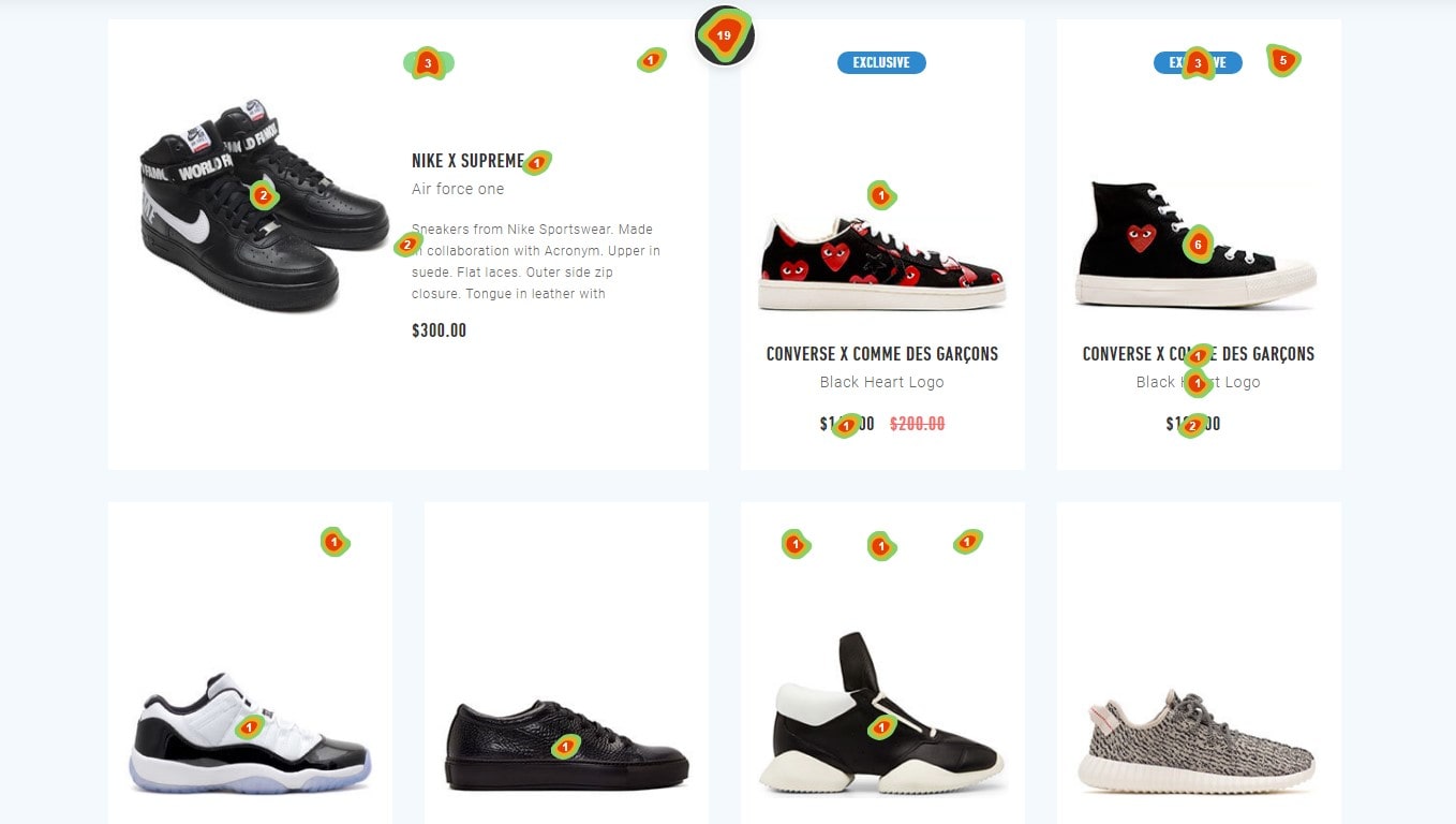
In the very competitive e-commerce market, e-commerce user experience (UX) is your golden ticket. When your online store has a great user experience, customers can easily explore, locate what they need, and finish their purchases. Because shopping is easy and quick, they will come back.
Picture a web store. The e-commerce website is attractively designed, the products are arranged rationally, and the checkout procedure runs well. Equally important to a customer as the things supplied is a straightforward and pleasurable shopping experience. In the end? Renowned clients doing business again.
Why give user interface for e-commerce top priority? There are strong arguments as follows:
- Boosts Customer Satisfaction: Easy and pleasurable shopping is how great e-commerce UX pleases customers.
- Increases Conversions: Purchases are more likely from clients who find items quickly and go through the checkout process.
- Improves Customer Retention: Because it encourages customers to come back, a good UX raises customer retention rates.
- Encourages Good Word-of-Mouth: Happy clients are likely to tell others about their good experiences, which will drive additional traffic to your online store.
All things considered, great user experience is essential to success in e-commerce. It serves as your manual for growing an online business and maintaining satisfied, involved, and ready-to-shop clients.
How Plerdy Can Help Your E-commerce Website
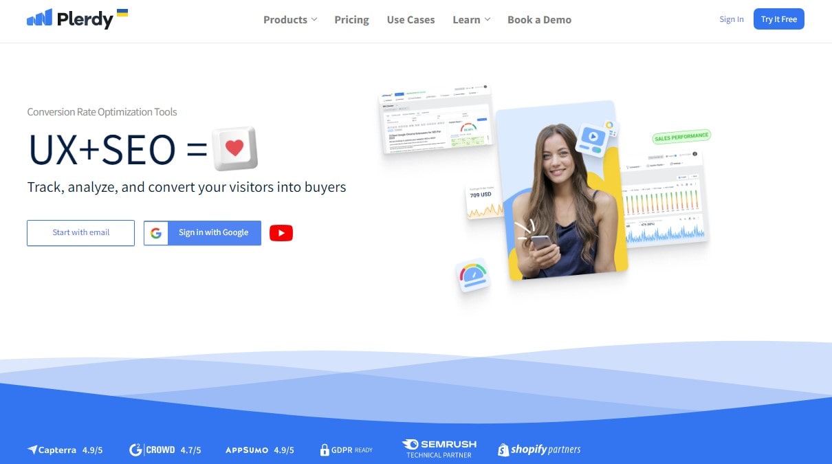
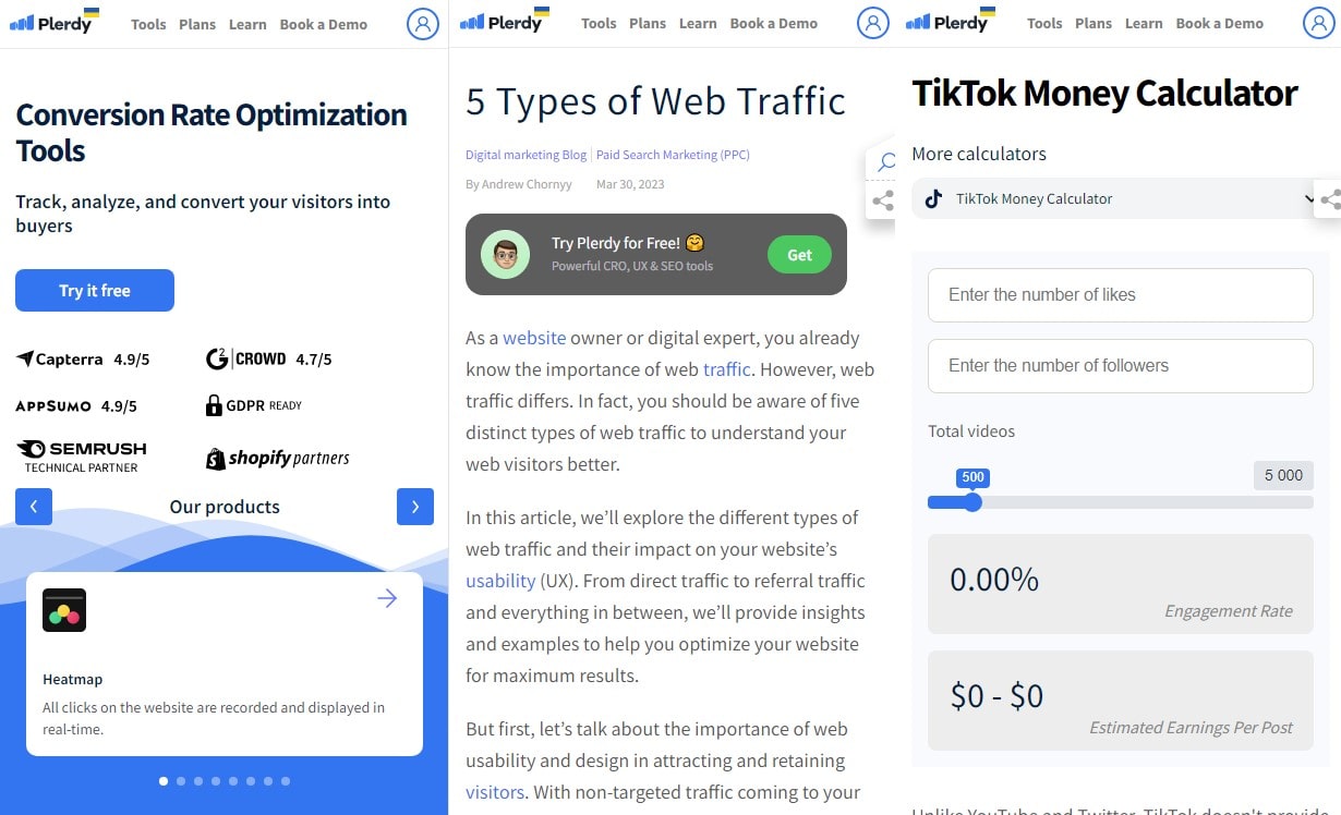
Plerdy emerges as a whirlwind of optimization when it comes to improving your online shop. This technology opens doors to improved user experience (UX) and successful e-commerce. You get a whole platform with Plerdy that is intended to improve every part of your website, not just a basic instrument.
Plerdy provides a remarkable feature set centered on website effectiveness and consumer engagement:
- Real-time recording of every click on your website, a heatmap offers insightful information about user activity.
- Continually gathers important SEO tags from your website, SEO Checker helps with exposure.
- Understanding the behavior of your visitors, Session Replay provides a clear picture of user interactions.
- Events are tracked and quickly synced with Google Analytics.
- Popup Forms: Quick customisation of flexible popup forms increases user interaction.
- Sales Performance: To help in sales analysis, gives each item on your website purchase information.
- Conversion Funnel: To assist you fix weak points, this displays where visitors leave off and what pages they neglect.
- One really good way for getting input is the Net Promoter Score.
Plerdy excels beyond its specific features in its efficiency and simplicity. It won’t slow down your website and installation just takes thirty seconds. It functions flawlessly on all widely used browsers and combines easily with other web services. SSL technology provides data security, and results for conversion rate optimization are produced promptly. Among many other things, Plerdy allows you to create hypotheses to evaluate and improve your conversion rate and evaluate usability using heatmap data. With an intelligent form builder, the platform seeks to enhance conversion and polish the UX/UI of your website.
1. User-Friendly Website Design

An e-commerce company’s lifeblood, a user-friendly website design gives every user encounter life and energy. The magic that makes the trip from landing page to checkout easy and turns browsers into purchasers.
Imagine if you will, a customer who has heard about a product visits an e-commerce website. Navigation of the site is made easy by its intuitive design. Products are enticed to be explored by clear, sharp pictures, and the sale is sealed with succinct, compelling descriptions. Just a click away is the cart, and checkout is so easy it seems like a guided tour. That’s the power of intuitive design.
Think on these important elements to improve the usability of your website:
- Easy Navigation: Your clients need to have no trouble finding what they need.
- Clear Imagery and Descriptions: Customers find it easy to make decisions when they see excellent images and read engaging product descriptions.
- Simple Checkout: The route to buy is kept obvious via a simplified, error-free checkout procedure.
User-friendly design is, in short, the foundation of your online store, not just an extra. You’re positioning your online store for success when you put the demands of your customers at the heart of your website architecture.
2. Clear and Easy Navigation
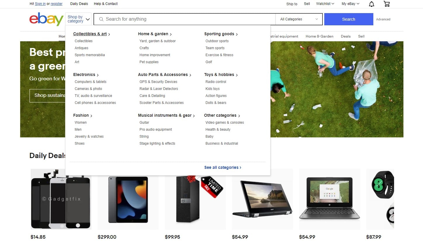
Navigation is the road map of your e-commerce site, designed to be simple and intuitive, guiding clients through a vast array of products. When navigation in e-commerce is user-friendly, it encourages clients to explore, make purchases, and spend more time on the site.
Consider a new customer visiting an e-commerce retailer. They are welcomed by a tidy, well-organized homepage that effortlessly directs them through various product categories. With every click, a new item is discovered, yet they never lose their way. This creates a shopping experience free from stress and confusion. Clear and straightforward navigation is key to this experience.
To fine-tune your e-commerce site’s navigation, consider the following:
- Logical Structure: Organize your product categories in a way that makes sense to your e-commerce clients.
- Ensure that your navigation menu is easily accessible and consistently visible on every page.
- Implement breadcrumb navigation to help users easily trace their steps back.
In the bustling e-commerce environment, your site’s navigation acts like a friendly tour guide, enhancing the UX to make every visit memorable. With effective navigation in place, customers are more likely to return for the seamless experience and your diverse product offerings.
3. Detailed Product Information
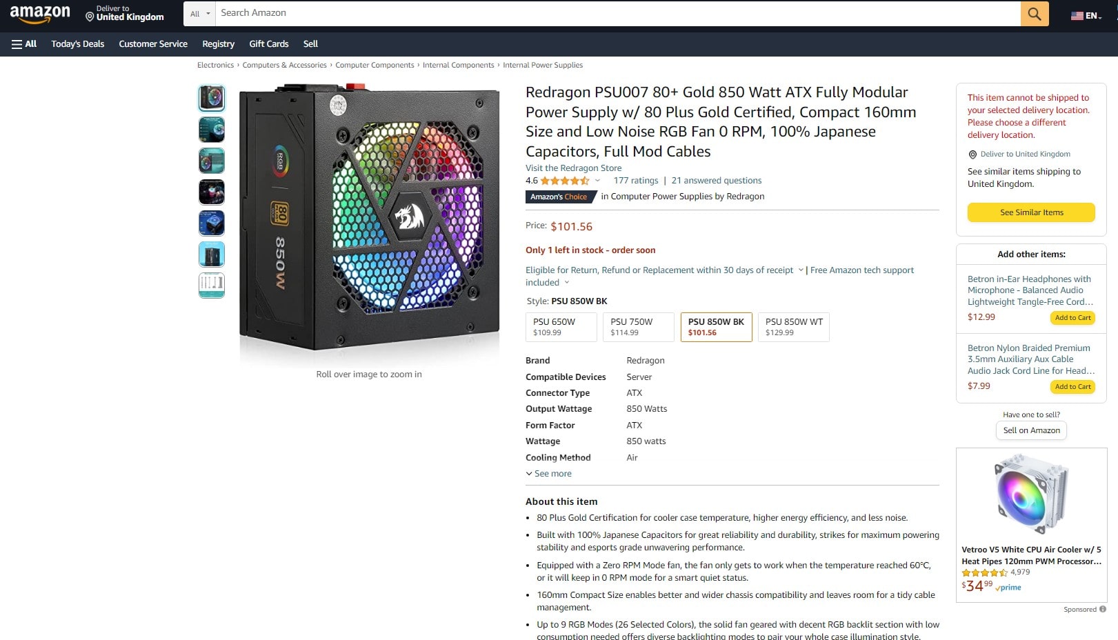
A happy buying experience is unlocked by thorough product information on an e-commerce website. It facilitates the process of clients moving from browsing to buying by enabling them to make well-informed judgments.
Imagine if you will, a shopper browsing an internet store, captivated by a striking item. They get a ton of information when they click, including detailed descriptions, high-quality images, product specs, and user reviews. Then, knowing more, they go to the register, sure of what they have bought. This is what detailed product information does.
Ingredients for comprehensive product information are:
- Superior Images: To truly appreciate the product, include a number of crisp, detailed images taken from various perspectives.
- In-Depth Descriptions: Explore all the details of the product, including its advantages.
- Product Specifications: Give people interested in the finer points all the technical information.
- User Reviews: To promote confidence and support decisions to buy, share the experiences of past customers.
Finally, providing thorough product information on your e-commerce website can improve user experience and boost client confidence, which raises conversion rates. It is an essential component of the UX puzzle that will make your online store the destination of choice for discriminating customers.
4. High-Quality Product Images
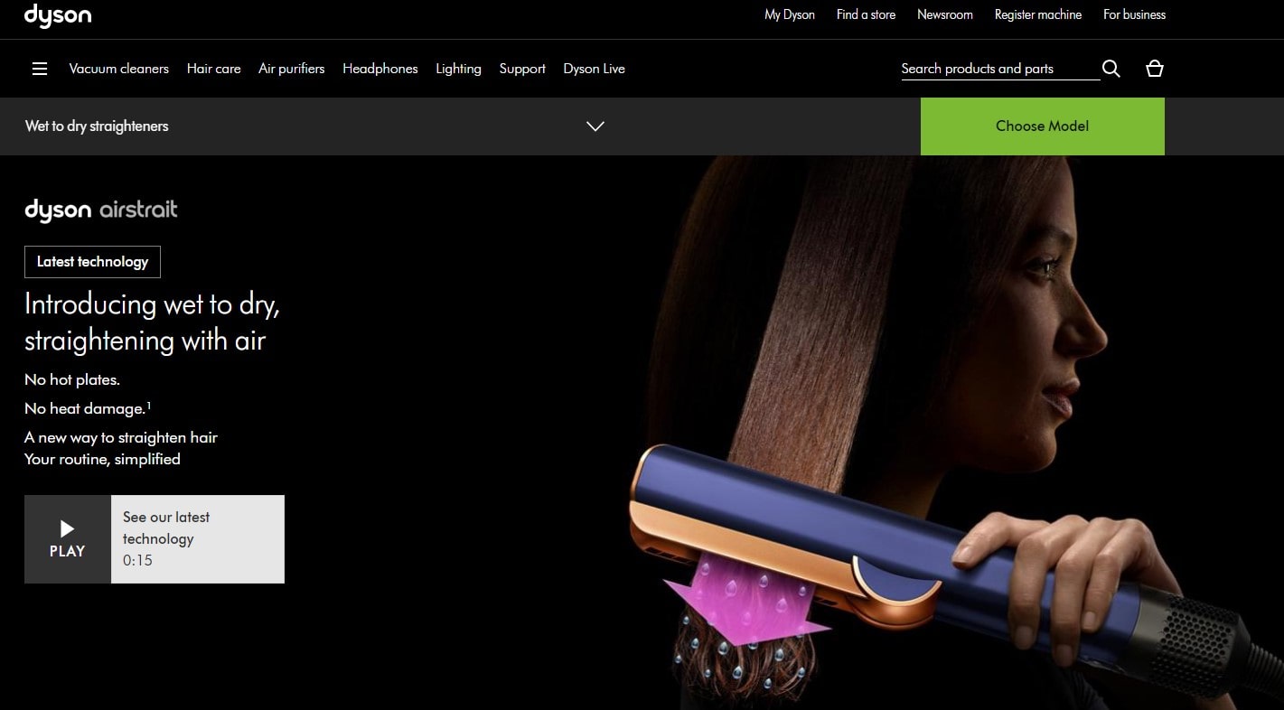
In e-commerce, great product images are the first step toward a great online buying experience. These photos provide an e-commerce clientele a visual feast that attracts attention and guarantees quality, bridging the gap between online and real buying.
Consider an e-commerce consumer looking for a certain product online and then going to a store. A gallery of clear, high-definition images presenting the product’s minute features from different perspectives welcomes them. Though digitally, the product seems more real with every zoom, almost as though it were in their hands. This is how powerful excellent product photography is for online shopping.
Recall these basics to use this capability in e-commerce:
- Multiple Views: Give your online shoppers a thorough 360-degree overview of your offerings.
- Zoom Features: Make thorough analysis of every facet of your merchandise possible.
- Images of your products in use can arouse passion.
- Consistency: Keep every product image looking the same to improve the online buying experience.
Better product images do more than only fill screens; they are essential to the e-commerce process, improving user experience, increasing sales, and increasing customer involvement. Putting money into excellent photography enables you to present your products clearly and make an impact on your e-commerce customers that will remain.
5. Mobile Optimization
These days, most people use their cellphones to shop online. Mobile optimisation of your e-commerce website is therefore now necessary rather than an option. It answers the desire of the consumer for convenience and makes mobile buying easy.
Imagine if you will a harried consumer on the go who pulls out their smartphone, goes on an e-commerce website, and is met with a website that fits exactly onto their screen. Pages load quickly, and everything from products to descriptions to pictures to buttons is precisely sized. They spend minutes browsing the site and making purchases. In short, this is mobile optimization.
Mobile optimization’s recipe calls for:
- Responsive Design: Make sure every screen size on your website is flawlessly adjusted.
- Quick Load: A site that loads quickly keeps visitors interested and lowers bounce rate.
- Simple Layout: For easy browsing, keep menus and buttons big.
- Streamline the checkout procedure to promote fast and simple transactions.
Simply said, making sure your e-commerce website is mobile-friendly is a huge benefit for the user experience and makes it possible for clients to shop anytime, anywhere. Furthermore, this is a move that will increase client happiness and, consequently, your sales.
6. Fast and Secure Checkout Process
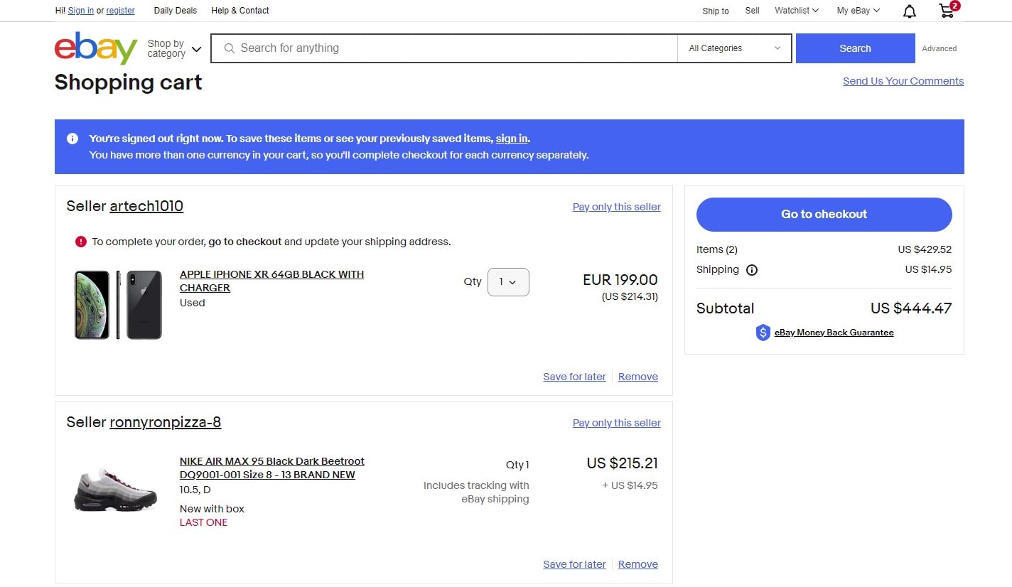
Imagine if you will, a happy consumer who has enjoyed perusing your e-commerce website loads their shopping cart with desired items. Excited to check out, they become mired in a maze of intricate paperwork and sluggishly loaded pages. They’ll probably ditch their cart, and you’ve lost a sale.
Often the last obstacle in the e-commerce UX is the checkout procedure. Either a successful transaction or a lost customer can be determined by a quick and safe checkout process. There can be no time for second ideas or security worries during this quick and secure procedure.
Parts of a successful checkout procedure consist of:
- Speed: Reduce loading times and stay clear of superfluous procedures that impede the procedure.
- Short and understandable forms are best. To save time, if it is feasible, autocomplete fields.
- Security: Give outright assurances of the existence of security protocols, including SSL certificates, to foster confidence.
- Offering a range of payment options will allow you to satisfy every need of your clients.
- Let clients check out as guests without requiring an account.
Basically, a quick and safe checkout procedure lowers the possibility of a cart being abandoned and establishes confidence with your clients. Enhancing the customer experience in turn promotes return business and propels your e-commerce company forward. By concentrating on speed and security, you are offering a service and developing a relationship.
7. Personalized User Experience
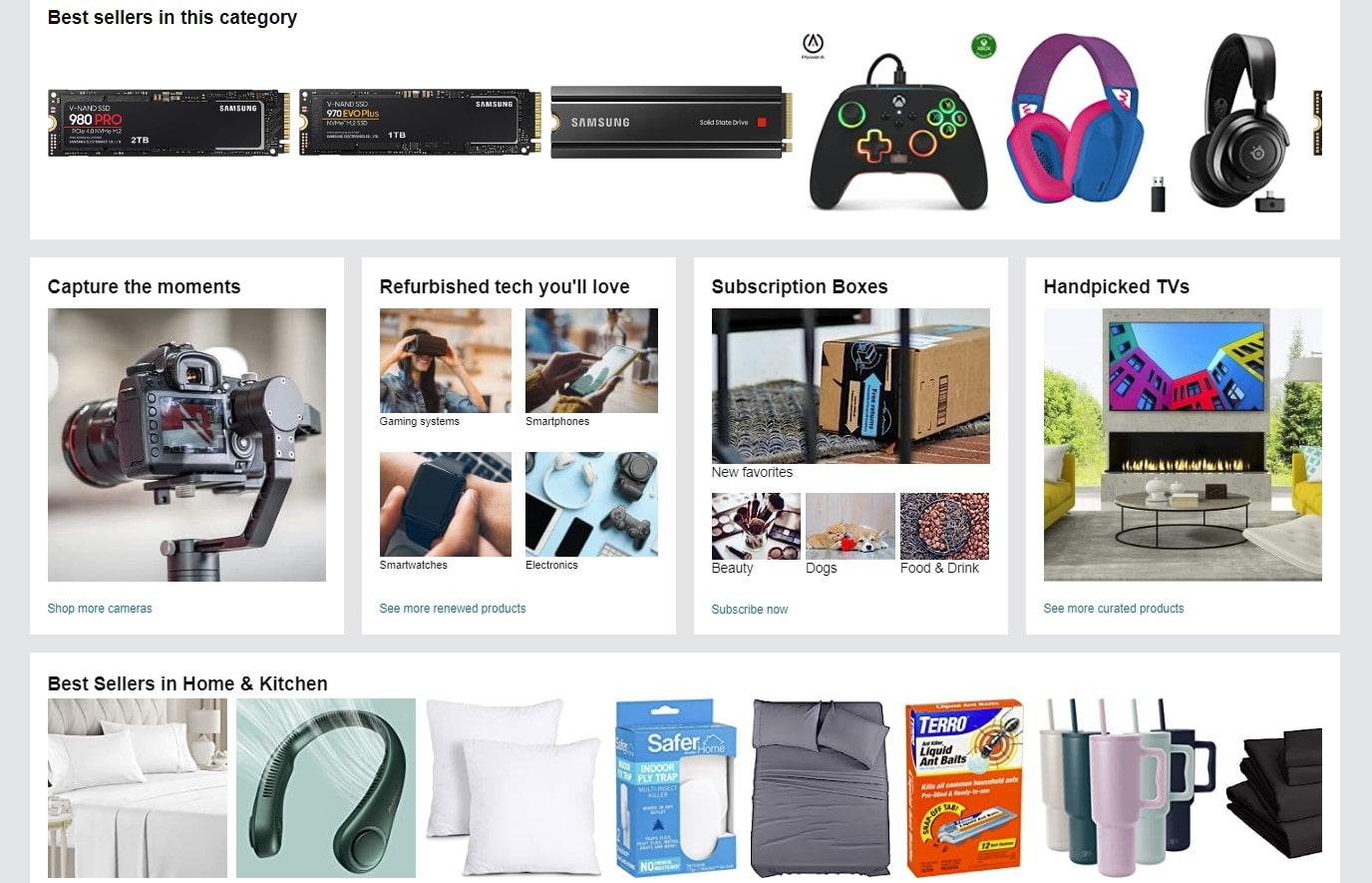
In the fast changing e-commerce sector, the “one size fits all” strategy is out of date. These days, every consumer needs a customized e-commerce experience. Customer satisfaction, involvement, and eventually e-commerce revenues can all be greatly increased by personalization.
Think of a web shopper who has already bought environmentally friendly household items from your website. They come back to discover suggestions for allied goods including bamboo toothbrushes and ecological cleaning supplies. Customers will see from this degree of customization that your e-commerce strategy values and takes into account their preferences.
Important components of a customized e-commerce user experience consist of
- Product Suggestions: Designed to improve the online shopping experience, they are based on personal browsing patterns or past orders.
- Personalized Content: Blog entries or special e-commerce sales that cater to the interests of the clientele.
- Personalized Emails: Marketing efforts made especially to correspond with the buying patterns of internet shoppers.
- Available now Personalized Support: When e-commerce consumers need it, offer customized, in-the-now help.
By putting people at the center of the e-commerce experience, personalization turns a generic journey into a well chosen, meaningful one that speaks to every consumer. This customized strategy enhances the whole e-commerce purchasing experience and fortifies the bond between consumers and your online business.
8. Efficient Customer Service and Support
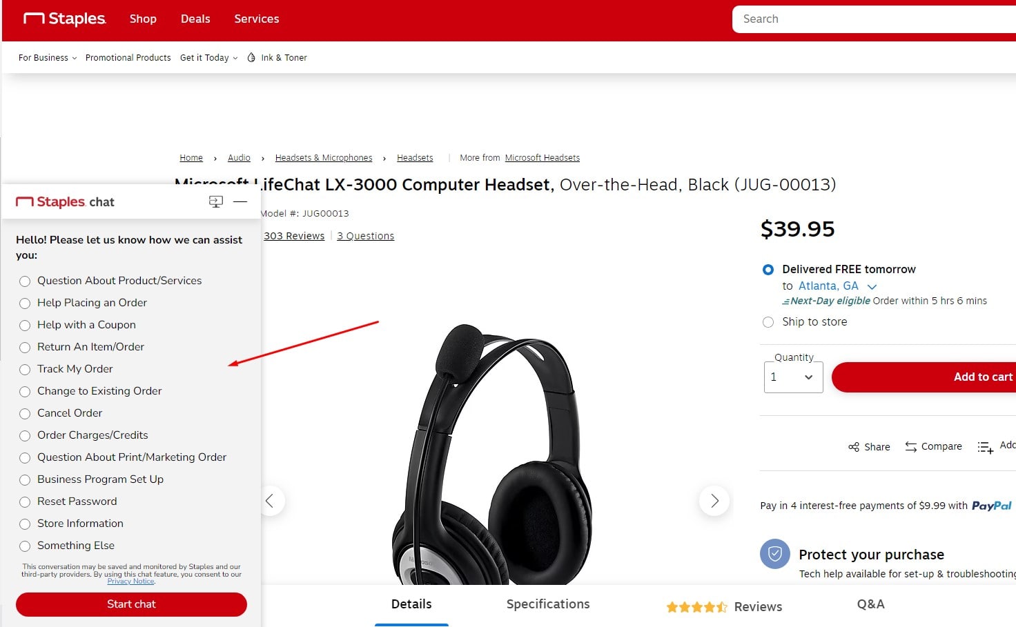
First-rate customer care and support delivery is essential in e-business. It is the foundation of the user experience and what propels the development of enduring client connections. First-time customers who receive effective and timely customer service may become devoted brand ambassadors.
Imagine if you will, a consumer visits your website and sees an interesting product, but they are unsure of its specifications. They contact using the built-in live chat function and receive a fast, informed answer. They come away from that exchange feeling appreciated and secure in their purchase.
Important components of effective customer service and assistance include:
- Instant assistance provided by live chat makes buying decisions easier.
- FAQs: Preemptively answers often asked questions to save direct communication.
- Email support: For more complicated questions, offers thorough answers.
- Customer Reviews: To establish confidence, it provides frank perspectives from other users.
The whole experience of a consumer with an e-commerce website is influenced by each interaction. Help that is prompt and dependable not only answers their questions right away but also demonstrates your dedication to their happiness. Good customer service makes the difference between the ordinary and the remarkable in this digitally driven market, allowing your company to stand out from the competitors.
9. User Reviews and Ratings
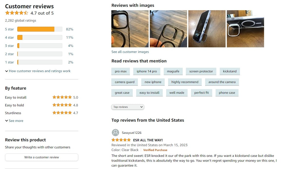
The way that customers experience the digital marketplace is greatly influenced by user evaluations and ratings. They give consumers direct knowledge of products and are the foundation of confidence in e-commerce.
Consider a prospective client perusing a product on your website that piques their curiosity. They read the good experience of another customer by scrolling down to the review area and feel more comfortable making a purchase. That’s the value of user ratings and reviews.
Think about these crucial features of customer ratings and reviews:
- Authenticity: Real, confirmed reviews reassure possible buyers about the caliber of your offering.
- To keep credibility, be transparent and show both good and bad ratings.
- Interactive: Invite customers to give products ratings according to their own experiences.
- Reactivity: Answering reviews shows that you care about what customers think.
The core of e-commerce user experience are user reviews and ratings. They improve product finding, give customers more confidence, and make the user experience more customized. Putting these on your website is crucial to developing a profitable online business. Being transparent is a need as much as a plus.
10. A/B and UX Testing for Continuous Improvement

Your website in e-commerce has to change and grow all the time to satisfy the always shifting needs of your customers. For this process to continue being fluid and responsive, A/B and UX testing is necessary.
Basically, A/B testing is comparing two versions of your website to determine which one works better. You might, for instance, evaluate color and position on the ‘Buy Now’ button on your product page using an A/B test. Analysing which version converts better will help you improve the user experience and fine-tune your website.
But UX testing shows you how actual people use your website and highlights areas that need work.
Stress these fundamentals of UX and A/B testing:
- Setting Objectives: Streamline the checkout process or increase product page conversions are two obvious objectives for every test.
- Analyze user behavior with heatmaps and session recordings to learn how visitors engage with your website.
- Get user feedback directly for UX enhancements.
- Data-Driven Modifications: Enhance user experience by modifying websites in response to testing results.
Success with e-commerce is mostly dependent on ongoing improvement. A/B and UX testing improves user experience and expedites the process of a consumer from product discovery to purchase when included into growth plan. Your compass to the highest level of user experience perfection is ongoing testing and modification.
How E-commerce User Experience (UX) Directly Impacts Conversions?
Activate UX and see how much more your e-commerce conversions increase! A well-designed website is similar to a well-stocked store in that users may quickly locate what they need, peruse the selection, and make a purchase.
Imagine a website that loads quickly and is as efficient as a well-oiled machine. Navigating intuitively leads consumers on their trip. They are enthralled by crisp, high-resolution product photos, they have their questions answered by thorough descriptions, and they feel appreciated by the individualized recommendations.
Recall that a good user experience goes beyond closing a transaction. It promotes repurchases, fosters loyalty, and establishes trust. Think on these major effects of UX on conversions:
- Clarity and Simplicity: A website’s ease of use lowers friction and encourages visitors to look through more items and buy them.
- Customisation: Adapting the buying experience to each customer increases interaction and sales.
- Quick and Safe Checkout: Making the checkout process quick and safe stops cart abandonment, which increases conversions.
- Mobile Optimization: A website that is mobile friendly draws in a fast expanding audience of mobile customers, which raises conversion rates.
Your online business is built around the UX of your e-commerce website; improve it, and your conversion rates will soar.
Bottom Line
From the time a customer visits an e-commerce website until checking out a product, there is a careful ballet between conversion rates and user experience (UX). Elegant dips and fluid motions in a top-notch UX design guide the user through their buying process with ease.
The interaction of a customer with a website is experiential as well as transactional. We use UX to elevate a passable website to greatness and turn average sales into amazing figures. It has to do with personalizing every user’s experience, learning about their preferences, and making necessary adjustments.
Take your website as a kind of storefront. What would draw consumers to come in, stay, and buy? Main ideas are as follows:
- Adapt it to Yourself Personalize greetings, product recommendations, and cookie-based preferences recalling.
- Simple Navigation: Remove all the complication. Make the structure of the website obvious, understandable, and easy to use.
- High-resolution photos, interesting videos, and thorough product descriptions can all improve the customer experience.
- Mobile Optimization: A mobile-optimized website is not only advantageous but also required in the digital era of today.
Plerdy tools should be seen as a priceless ally by every online retailer. Heat maps, thorough UX and SEO research, and other features let you make sure your website stands out from the competition using Plerdy. Why then accept the present situation? Register for a free trial to improve the UX of your online store right now. Never forget that the first click a buyer makes starts their journey; make it count!
