Dive into the digital storefront of tomorrow with our curated selection of the Top 15 Ecommerce Website Designs of 2024. These standout sites exemplify how strategic design can propel user engagement and streamline shopping experiences. From the minimalist elegance of luxury fashion platforms to the vibrant interfaces of tech gadget stores, each example showcases a unique approach to capturing consumer attention and enhancing navigability.
- Fashion Retailers: Sleek layouts that emphasize high-quality imagery and seamless checkout processes.
- Tech Shops: Interactive product demos with quick, intuitive navigation panels.
- Home Goods Stores: Warm, inviting designs that mirror the comfort of home.
These sites aren’t just about aesthetics; they’re built on foundations encouraging shoppers to act, making every click a potential sale. For businesses aiming to refine their user experience or boost their conversion rates, Plerdy’s analytical tools offer deep insights into user behavior, helping to optimize both CRO and UX with precision. Explore these top ecommerce designs to inspire your next website overhaul.
What Makes a Well-Designed Ecommerce Website?
In the bustling digital marketplace, a well-designed ecommerce website acts as both a storefront and a salesperson. What sets apart a successful ecommerce design? The seamless blend of aesthetics, functionality, and tailored user experience aligns perfectly with brand ethos. This agency excels in crafting ecommerce solutions that captivate and convert.
Key elements of their ecommerce website designs include:
- User-Centric Navigation: Ensures that site visitors find what they need effortlessly.
- Responsive Design: Optimizes the ecommerce experience across all devices, enhancing accessibility and user engagement.
- Strategic Brand Integration: Seamlessly incorporates brand elements to foster identity and trust.
Each ecommerce website this agency develops is meticulously designed to enhance user interaction while simplifying the path to purchase. By prioritizing intuitive layouts, compelling visuals, and robust functionality, they create ecommerce platforms that stand out in a crowded market. The design of each ecommerce website is a strategic endeavor, aiming to maximize user satisfaction and drive business growth. Through innovative design practices, this agency continuously sets the bar high for ecommerce excellence, proving that a great design transcends pure aesthetics—a comprehensive approach supporting any ecommerce venture’s commercial goals.
List of 15 Top Ecommerce Website Design Examples
Perusing the “Top 15 Ecommerce Website Designs of 2024” feels like a masterclass in digital craftsmanship. Each entry showcases how cutting-edge design can revolutionize an ecommerce platform, making it a marketplace and a digital experience. From innovative layouts to intuitive user interfaces, these websites exemplify the best practices in ecommerce design, setting new benchmarks for the industry.
Tessemae’s
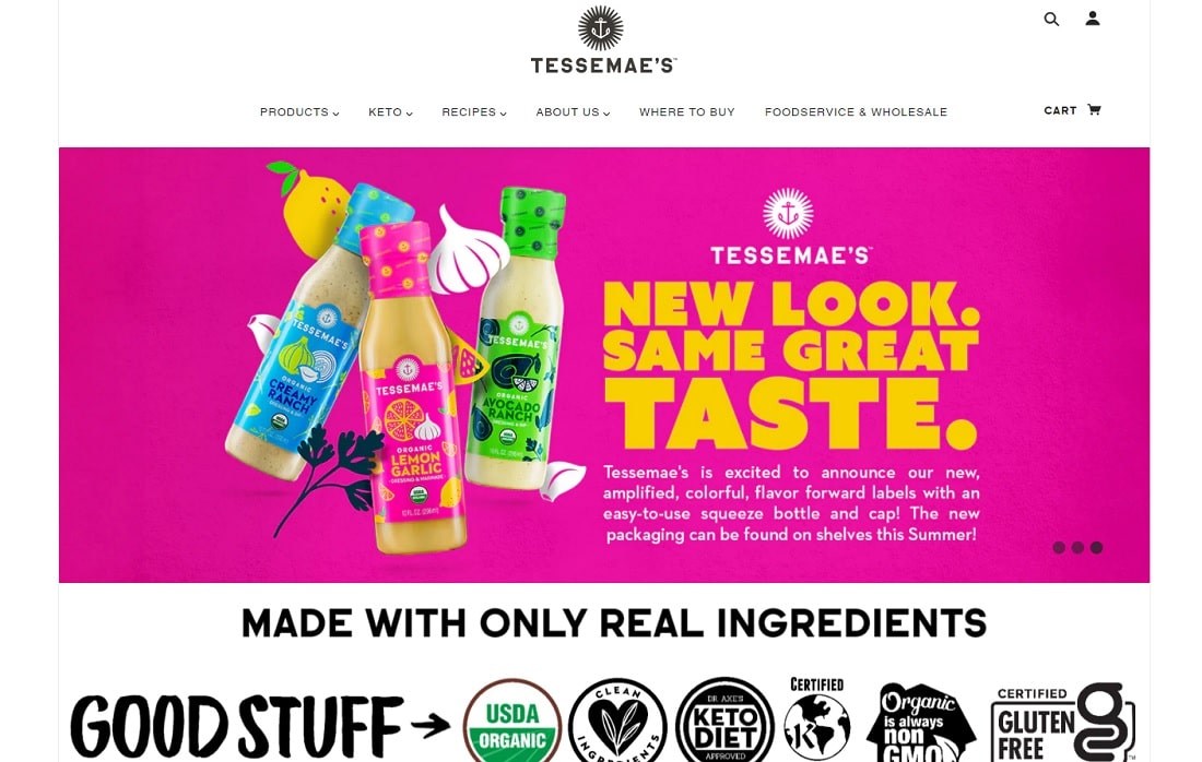
Tessemae’s ecommerce website stands out in 2024 as a top contender in our “Top 15 Ecommerce Website Designs Examples,” thanks to its vibrant design and streamlined user experience. This site perfectly showcases their all-natural condiments and dressings, emphasizing health and flavor with a visually appealing layout that engages shoppers when they arrive.
What makes the Tessemae’s website design effective:
- Vibrant Visual Aesthetics: The site uses bright, eye-catching colors that reflect the freshness of its ingredients and the liveliness of its brand.
- Clear Product Displays: Each product is prominently displayed with high-quality images and star ratings, making it easy for customers to browse and select.
Enhancing the ecommerce experience, Tessemae’s includes:
- Organized Layout: Products are neatly categorized and accessible, ensuring a smooth navigation experience.
- Educational Content: Including featured recipes encourages visitors to buy the products and engage with the brand by trying new dishes.
Key features of the site include:
- Simple, intuitive user interface that facilitates an effortless shopping process.
- Promotional banners that are strategically placed to catch the eye without being intrusive.
- Health and dietary certifications like USDA Organic and Keto are displayed to reassure health-conscious shoppers.
In summary, Tessemae’s ecommerce platform is not just about selling but also about creating a dynamic shopping environment that promotes healthy eating through well-designed visual and functional elements. This makes their website a sales tool and a source of inspiration for nutritious living.
POKETO
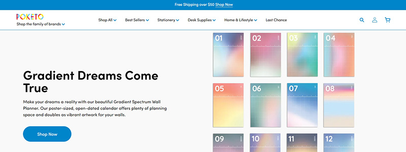
Dive into a world where color and functionality blend seamlessly on Poketo’s ecommerce website, a beacon for contemporary design enthusiasts. The site isn’t just a platform; it’s a showcase, highlighting how ecommerce can be visually stunning and user-friendly.
Noteworthy features of Poketo’s website include:
- Vibrant Visuals: The homepage is a canvas of gradient dreams, instantly engaging visitors with its bold, colorful designs.
- Streamlined Shopping Experience: User-friendly navigation that lets shoppers quickly peruse inventory and make purchases is an essential component of every successful e-commerce site.
- Product Highlights: Items like the Headspace x Poketo collection are displayed with clear, high-quality images that make browsing enjoyable.
Each section of the website is meticulously crafted to elevate the everyday through design, adhering to ecommerce best practices while offering a distinct aesthetic that sets Poketo apart in the digital marketplace. The website’s leadership in ecommerce design is further cemented by this method, which improves the shopping experience.
With a focus on artful presentation and ease of use, Poketo’s website exemplifies how ecommerce platforms can excel at engaging customers visually and functionally. As a result of its mastery of both aesthetics and functionality, this site is a strong candidate for our list of the best ecommerce website designs of 2024.
Chubbies
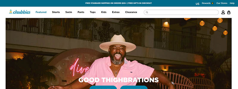
Welcome to a splash of fun with Chubbies, an ecommerce website that epitomizes the vibrant spirit of summer all year round. Among the top 15 ecommerce website designs in 2024, this one stands out because it offers more than just clothes—it sells an experience.
Here’s what sets the Chubbies website apart:
- Engaging Hero Images: The homepage opens with dynamic, joyful images that instantly communicate the brand’s ethos of fun and freedom.
- Intuitive Layout: Navigation is a breeze, allowing shoppers to transition from one category to the next without confusion.
- Clever Copywriting: The site’s use of silly jargon, such as “Good Thighbrations” and “Water You Waiting For,” adds fun to the purchasing process and captures the irreverent spirit of the business.
Chubbies’ design optimizes the user experience in several ways:
- Product Visualization: High-quality images showcase the products in real-life scenarios, giving customers a genuine taste of purchasing.
- Clear CTA Buttons: Clear and prominent call-to-action buttons let customers know exactly what to do next, whether purchasing or reading more product details.
This online store is a model of how a company’s image can be reflected in a website’s design. This smooth and engaging user experience turns shopping into an enjoyable journey rather than a chore. Chubbies is at the forefront of cutting-edge web design because it masterfully incorporates entertainment into the practical aspects of online shopping.
PopFit Clothing
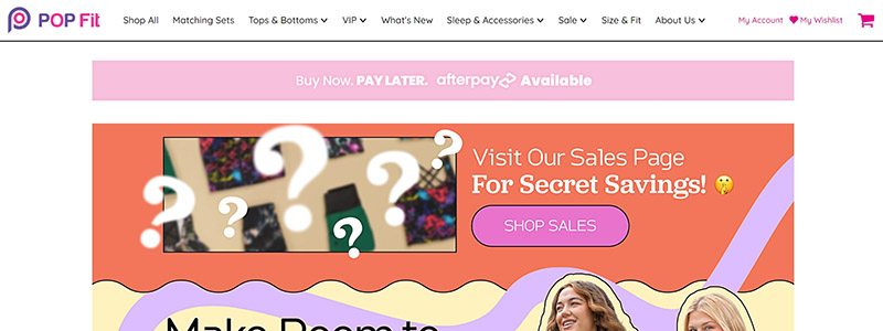
PopFit Clothing’s ecommerce website bursts onto the digital scene with a vibrant and inclusive design that’s as dynamic as it is user-friendly. We chose this site as one of the fifteen best examples of 2024 ecommerce website design because of its exceptional combination of form and function.
Here’s why PopFit shines in the ecommerce space:
- Bold Visuals: Attractive visuals and inspiring statements entice customers when they click on the homepage.
- Clear Navigation: Shoppers can effortlessly navigate the website thanks to a well-organized layout that categorizes products intuitively.
- Inclusive Imagery: Featuring models of diverse body types, the website promotes representation and inclusion, crucial for modern ecommerce platforms.
Notable features of the website design include:
- Easy-to-access categories such as Leggings, Tops, and Dresses ensure that users can quickly locate their needs.
- Engaging product displays that offer a quick view of the latest styles and most popular items.
- The ‘Shop Now’ buttons and other prominent calls to action make the transition from browsing to purchasing a breeze.
PopFit’s ecommerce design excels in making shopping an enjoyable and easy experience. With its punchy colors, straightforward user interface, and inclusive approach, this website meets the needs of today’s diverse shopper base and does so with style and efficiency. PopFit Clothing is transforming how we think about ecommerce design, proving that a website can be both beautiful and powerfully functional.
Decibullz
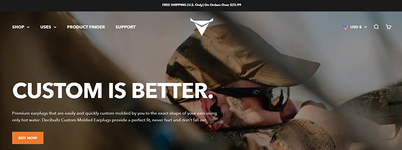
Decibullz stands out in the crowded ecommerce space with a website design emphasizing custom hearing protection solutions. Their approach to online retail is as finely tuned as their products, making them a highlight in our top 15 ecommerce website designs of 2024.
What makes the Decibullz website a design that stands out?
- Streamlined User Experience: The website is easy to navigate and offers quick access to product information and purchasing options.
- Focused Branding: Their brand message, “Custom is Better,” resonates through every page, reinforced by images of custom-fitted earpieces and satisfied customers.
- Interactive Elements: Users can explore product features through displays and detailed visuals.
Key design features include:
- Crisp, clean layout that guides the user naturally from one section to the next.
- High-quality images that showcase the products’ intricate details and usability.
- Direct calls-to-action, such as “Shop Now” buttons, are strategically placed to catch the user’s attention.
Decibullz’s ecommerce website combines functionality with aesthetics, proving that practical ecommerce sites can also be visually appealing. This site makes shopping easy and enjoyable and educates consumers on the importance of customized hearing protection, setting a high standard in ecommerce website design.
MeUndies
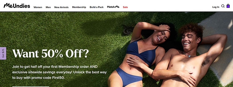
With its lively, user-centric layout, MeUndies raises the bar for e-commerce website design. We included this site in our article because it exemplifies how cutting-edge layouts can improve online purchasing.
Key highlights of the MeUndies website:
- Engaging Visuals: The homepage features eye-catching, aesthetically pleasing images that resonate with a diverse audience.
- Intuitive Navigation: Easy-to-use menus and submenus ensure visitors can find what they need without hassle.
- Personalized Shopping: The “Personalize Your Pack” feature increases consumer happiness and loyalty by providing a customized experience.
The MeUndies website excels in ecommerce design by combining these elements:
- Promotions are prominently displayed, offering 50% off on memberships, which hooks new visitors immediately.
- Product categories are marked, from new arrivals to Star Wars-themed underwear, making it easy to browse and shop.
- The site boasts impressive social proof with a claim of “over 30 million pairs sold” and customer testimonials that build trust.
Overall, the MeUndies website is a prime example of how effective e-commerce design can be in connecting with customers. Its innovative combination of form, function, and personal touch not only satisfies but also exceeds online customers’ expectations.
Urevolution
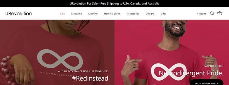
URevolution’s ecommerce website is a shining example of how thoughtful design can foster inclusivity and diversity, making it a standout in our “Top 15 Ecommerce Website Designs Examples in 2024.” This platform not only sells apparel but also promotes a message of empowerment and representation, which is reflected in every element of the site.
Key features of the URevolution website include:
- Bold Messaging: Each page broadcasts powerful messages like “Neurodivergent Pride” and “Be Inclusive,” encouraging visitors to embrace diversity.
- Clear, Accessible Design: The website’s simple and uncluttered design makes it user-friendly for people of all skill levels.
- Engaging Visuals: High-quality images featuring diverse models resonate with a broad audience, emphasizing the brand’s commitment to inclusivity.
The design elements that make URevolution a leader in ecommerce are:
- Intuitive navigation that guides shoppers seamlessly through different sections.
- Prominent calls to action, such as “Shop Now,” are strategically placed to enhance user engagement.
- Colors that work together in harmony with the brand’s values and purpose.
Overall, URevolution’s ecommerce platform is not just about selling products—it’s about making a statement. This website successfully merges aesthetic appeal with social responsibility, creating a space where commerce and activism intersect. By integrating powerful visuals and inclusive messaging, URevolution sets a new standard for ecommerce websites in 2024.
Kettle & Fire
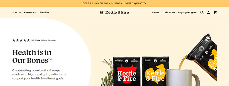
Kettle & Fire’s ecommerce website elegantly showcases their bone broth products with a design that’s as rich and inviting as the broths they sell. This website stands out as a top contender in our “Top 15 Ecommerce Website Designs Examples in 2024” thanks to its optimal balance of aesthetic appeal and functionality.
Key aspects of the Kettle & Fire website include:
- Visually Engaging: The homepage captures attention with high-quality images of their products, emphasizing their broths’ richness and health benefits.
- User-Friendly Design: The site’s navigation is simple and effective, allowing users to easily access different categories, including new arrivals, best sellers, and delectable recipes.
Notable features that enhance the ecommerce experience on this website:
- Clear Call-to-Action Buttons: Strategically placed prompts like “Shop Now” and “Subscribe & Save” guide users smoothly from browsing to purchasing.
- Educational Content: Informative sections explaining the health benefits associated with their broths build trust and educate the consumer, adding depth to the shopping experience.
The website also excels in:
- Utilizing a clean, uncluttered design allows the products and their benefits to shine.
- A subscription model directly on the homepage encourages repeat business and customer loyalty.
If you want to see how to combine content with commerce successfully, go no further than Kettle & Fire’s ecommerce platform. It guarantees that visitors will browse and engage. By integrating compelling design elements with practical ecommerce functionality, Kettle & Fire creates a seamless shopping environment that appeals to health-conscious consumers looking for quality and convenience.
Laird Superfood
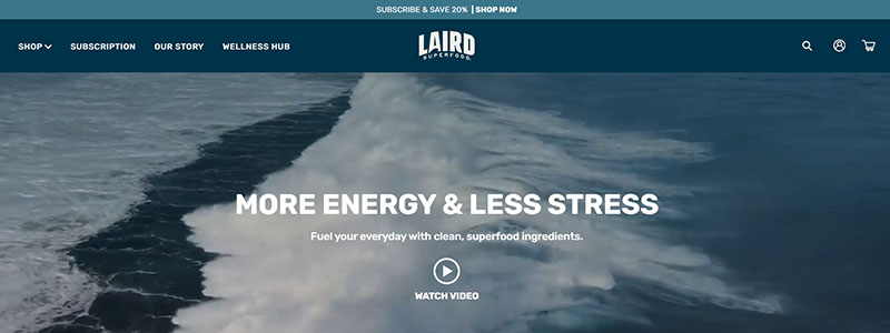
Because of its eye-catching layout and intuitive design, Laird Superfood’s online store is one of our “Top 15 Ecommerce Website Designs Examples in 2024.” The website provides an easy way to buy health and wellness items by utilizing the power of aesthetic appeal and simplicity.
Key elements that define the Laird Superfood website include:
- Vibrant Visuals: The homepage features dynamic images of waves, symbolizing the brand’s emphasis on natural energy and stress reduction.
- Streamlined Navigation: Easy-to-follow menus and well-organized product collections facilitate a hassle-free shopping experience.
- Engaging Content: The site effectively uses engaging content to educate visitors on the benefits of its superfood products.
The design of the website enhances ecommerce functionality through:
- Clear, concise product descriptions that highlight key benefits such as energy boost and stress relief.
- Prominent calls-to-action like “Subscribe and Save” encourage ongoing engagement and repeat purchases.
- An organized design that highlights product lines with their associated health advantages, allowing customers to find what they’re looking for easily.
Furthermore, Laird Superfood’s website includes:
- A section titled “How Can We Help?” offers customer support options, enhancing user satisfaction.
- Testimonials and user reviews are prominently displayed, fostering trust and community.
With its clean design, effective use of color, and intuitive user interface, Laird Superfood’s ecommerce website attracts customers and provides them with a fulfilling and informative shopping experience.
Zelie for She
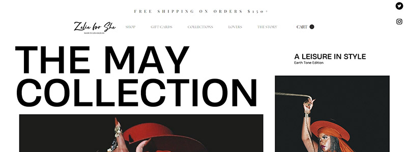
Zelie for She redefines e-commerce with its vibrant and inclusive website design, marking it as a standout in our “Top 15 E-Commerce Website Design Examples in 2024.” The website showcases the brand’s commitment to celebrating diversity through fashion, making it not just a shopping destination but a powerful statement of style and identity.
Why Zelie for She excels in ecommerce design:
- Striking Visuals: Images from “The May Collection,” which embodies confidence and elegance, adorn the homepage daringly and attractively.
- Fluid Navigation: The buying experience is easy and fun for users because they can easily peruse different selections.
- Inclusive Approach: The site features models of different sizes, promoting body positivity and inclusivity, which is crucial in today’s fashion landscape.
Key elements of the website include:
- A clean, minimalist layout that focuses on product visuals to engage users.
- Easy-to-access categories such as new arrivals, best sellers, and the story behind the brand, enhancing the ecommerce journey.
- Prominent calls to action, like “Shop Now,” are smartly placed to drive conversions.
Additionally, Zelie for She’s website design is distinguished by:
- From the site to check out, the user-friendly interface makes buying a breeze.
- Animated videos that convey the brand’s story and principles while showcasing its products’ attributes.
This e-commerce platform demonstrates how good web design can elevate a brand by ensuring that every customer sees products and gets a sense of the company’s distinctive cultural and fashion-forward mindset.
Slumberjack
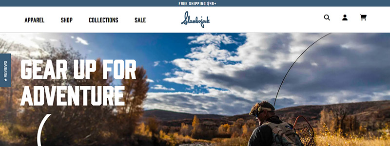
Slumberjack’s ecommerce website is an impressive example of how design can enhance user experience, making it a standout in our “Top 15 Ecommerce Website Designs Examples in 2024.” The site perfectly captures the spirit of adventure that the brand embodies, providing an inviting atmosphere for outdoor enthusiasts.
Here’s what sets Slumberjack apart in the ecommerce space:
- Dynamic Visuals: The homepage features engaging, high-quality images of outdoor scenes that instantly convey the brand’s focus on adventure gear.
- Intuitive Layout: Navigation is streamlined with clearly labeled categories like Fishing, Hunting, Camping, Apparel, and Sleep, making it easy for users to find what they need.
- Engaging Product Displays: Each product is showcased with detailed visuals and descriptions, enhancing the shopping experience.
Key design elements include:
- Clean Aesthetic: Using whitespace and an organized structure ensures the website is easy for the eyes and simple to use.
- Responsive Design: The site adjusts smoothly across devices, a must for shoppers on the go.
Additionally, Slumberjack’s website offers:
- Easy Access to Information: Quick links to customer service, partnerships, and detailed product specifications help users make informed decisions.
- Promotional Displays: Current sales and partnerships with well-known brands like Walmart and Bass Pro Shops are prominently featured, attracting and retaining customers.
Overall, Slumberjack’s ecommerce platform showcases their products and builds a community around outdoor living, combining superb functionality with creative website design.
KITH
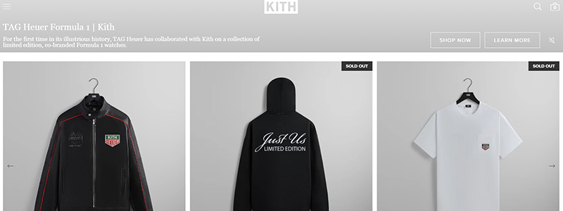
KITH’s ecommerce website is a stellar example of contemporary design blending seamlessly with functionality, landing it a spot in our “Top 15 Ecommerce Website Designs Examples in 2024.” The site leverages a minimalist aesthetic, highlighting its trendy and diverse product offerings, ranging from apparel to accessories.
Key elements that make KITH’s website design effective include:
- Streamlined Layout: The product pages are neatly organized, allowing easy navigation and a straightforward shopping experience.
- High-Quality Imagery: The products are shown in detail using crisp, clear photos, highlighting the quality and style unique to the KITH brand.
- Consistent Branding: The website maintains a strong brand identity with a consistent color scheme and typography that align with KITH’s modern urban appeal.
Features that enhance the user experience on KITH’s ecommerce site:
- A clean, uncluttered interface that focuses attention on the products without overwhelming shoppers.
- Responsive design elements that ensure the website performs well on both desktops and mobile devices.
- You can access new arrivals and exclusive collections directly from the homepage, facilitating easy discovery of the latest offerings.
KITH’s ecommerce platform is not just about shopping; it explores style and functionality. The website’s design effectively communicates the brand’s fashionable ethos, making it a benchmark for ecommerce success in the fashion industry.
Personal Fav
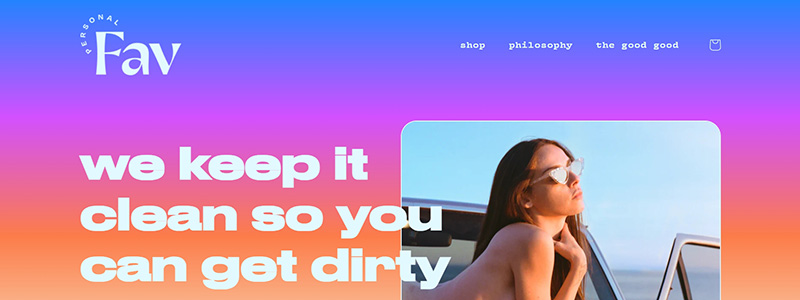
Personal Fav’s ecommerce website stands out at the Top for its bold, vibrant design that captures the essence of the brand’s commitment to pleasure-driven sexual wellness for everybody. This site marries colorful aesthetics with a user-friendly experience, making it eye-catching and highly functional.
Here are the standout features of Personal Fav’s website design:
- Vivid Color Scheme: The website uses a playful and vibrant color palette that reflects the brand’s fun and inclusive philosophy.
- Clear Navigation: Despite the vivid design, the website remains easy to navigate, with a clean, intuitive layout that seamlessly guides users through product categories and educational content.
Important features that improve the online shopping experience on this website are:
- Engaging headlines communicating the brand’s core message, such as “We keep it clean so you can get dirty.”
- High-quality product images that are both informative and appealing encourage further exploration.
- Quick access to shopping options and detailed product information, ensuring a smooth transaction process from browsing to checkout.
Additionally, Personal Fav’s website is exemplary for:
- Highlighting its philosophy prominently helps build a connection with the target audience.
- Offering educational resources that enhance the shopping experience by informing customers is crucial in the sexual wellness industry.
Personal Fav is at the forefront of creative e-commerce solutions because this platform exemplifies how good website design can attract and retain clients.
Satya Organic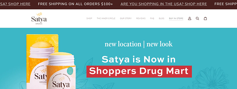
We proudly feature Satya Organic’s ecommerce website design in our “Top.” It is a stunning illustration of how aesthetic and practical aspects may work together to improve the user experience. The site is visually beautiful and incredibly user-friendly and combines a clean, fresh style with straightforward navigation.
Key features of the Satya Organic website include:
- Minimalist Aesthetic: Soft color palettes and uncluttered design emphasize the brand’s organic and natural ethos.
- Easy Navigation: Clearly defined sections for products, testimonials, and the brand’s philosophy ensure a smooth browsing experience.
The website also excels in:
- Providing detailed product information that helps customers make informed decisions.
- It prominently announces Satya’s availability at Shoppers Drug Mart, which enhances brand credibility and reach.
Additionally, the website effectively uses the following:
- Engaging visuals that connect with the audience, showcasing the products in everyday settings.
- Educational segments about the product’s benefits and uses reinforce the brand’s commitment to customer health and well-being.
Satya Organic’s ecommerce platform facilitates easy shopping. In the e-commerce industry, it stands out for its superb design and practicality in promoting health and sustainability. It informs visitors about the benefits of natural and organic skincare.
Beardbrand
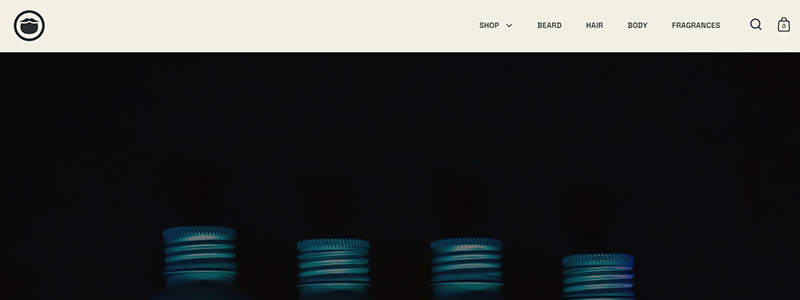
Beardbrand’s ecommerce website emerges as a leader in the 2024 roundup of “Top 15 Ecommerce Website Designs Examples,” thanks to its dynamic interface and customer-centric approach. This platform sells grooming products and champions a lifestyle, deeply resonating with its target audience through a visually compelling, easy-to-navigate design.
Key features of Beardbrand’s website include:
- Striking Visuals: The homepage boasts high-quality images that reflect the brand’s essence, focusing on lifestyle rather than just products.
- Streamlined Navigation: Users can effortlessly browse through categories such as beard, hair, and skin, enhancing the shopping experience.
Highlights of the design that enhances its ecommerce functionality:
- Product pages are neatly organized, with informative descriptions and attractive pricing displays.
- The site uses a consistent, dark color scheme that speaks to its sophisticated and masculine audience.
Additional notable elements include:
- Interactive Elements: Live reviews and ratings on the homepage boost consumer confidence and engagement.
- Educational Content: The blog and advice sections provide valuable content, establishing Beardbrand as an authority in male grooming.
In sum, Beardbrand’s ecommerce platform creates a seamless user experience that merges great design with functional ecommerce capabilities. The site’s thoughtful layout and engaging content drive sales and build a strong community around the brand’s philosophy.
Conclusion
As we wrap up our exploration of the “Top 15 Ecommerce Website Designs of 2024,” it’s clear that the benchmarks for ecommerce platforms have been spectacularly redefined. The strategic integration of design elements we’ve witnessed across various sectors—fashion, technology, or lifestyle—highlights the pivotal role of innovative ecommerce solutions in enhancing user engagement and optimizing functionality.
- Fashion sites: Utilizing dynamic visuals and fluid transitions to reflect contemporary trends.
- Technology vendors: Emphasizing clean lines and interactive elements to simplify the shopping experience.
- Lifestyle and home goods: Merging comforting aesthetics with easy navigability to create an inviting digital atmosphere.
Each ecommerce website we’ve dissected offers a unique lesson in marrying aesthetics with user experience, proving that a well-crafted ecommerce design is crucial for converting visitors into loyal customers. These sites serve as a blueprint for upcoming ecommerce projects and underscore the importance of cohesive design in driving ecommerce success. As the digital landscape evolves, these top ecommerce designs offer a glimpse into the future of online shopping—where creativity meets conversion.
