Welcome into the realm of website analysis! We explore today why even the largest market players—Zappos, Apple, and Amazon—invest time and money on website analysis. This goes beyond simply keeping ahead to include knowing the fundamental components that capture users and generate conversions. Andrew, CEO of Plerdy, provides insights that drive our conversation on the doable tactics employed by effective businesses to improve their online profile. Whether you run a little business or work for a big company, these ideas will help you to properly maximize the performance of your website.
Why do you Need to Analyze a Website?
Analyzing a website is essential since it reveals how users engage with your website, thereby directly affecting business success. Companies like Plerdy, for example, help customers apply techniques that highlight rather much user activity. Heat maps help you to pinpoint areas of your site that draw visitors and those that do not, so offering a clear direction on what should be improved or deleted. Analyzing scroll depth also helps one determine whether being too far down the page is missing any important information. Furthermore, user video sessions provide real-time observation of how guests engage with different components, so guiding areas for development. Such analysis not only helps to maximize user experience but also improves the general performance of the website, therefore improving customer satisfaction and conversion rate.
Alex (Host): Hello everyone! Today we’re talking about how to analyze a website. As far as I know, big market players like Zappos, Apple, and Amazon do this, right?
Andrew (CEO of Plerdy): Hi! Yes, analyzing a website is the key to success. Our clients at Plerdy know this well, and we often help them use these strategies.
Alex: Oh, wonderful! What exactly do you recommend paying attention to when analyzing a website? I know our viewers are eager to hear this.
Andrew: First, it’s important to look at heat maps. You wouldn’t believe it, but many forget about areas where users don’t click! Or they don’t see these elements. So, it’s important to analyze which elements users interact with. This can be a real eye-opener.
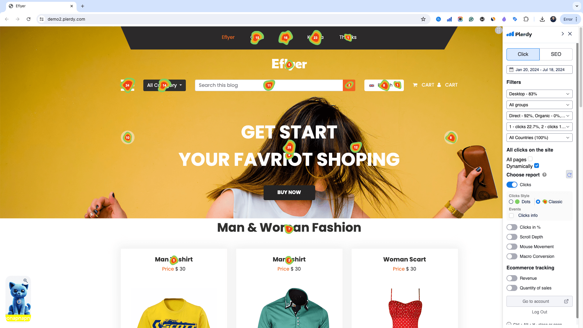
Alex: Wow, so this can save money and improve usability!
Andrew: Exactly! Another thing is scroll depth. Often, useful information goes unnoticed because it is too low on the page. Many top stores, especially in Europe and the USA, don’t make long home pages anymore.
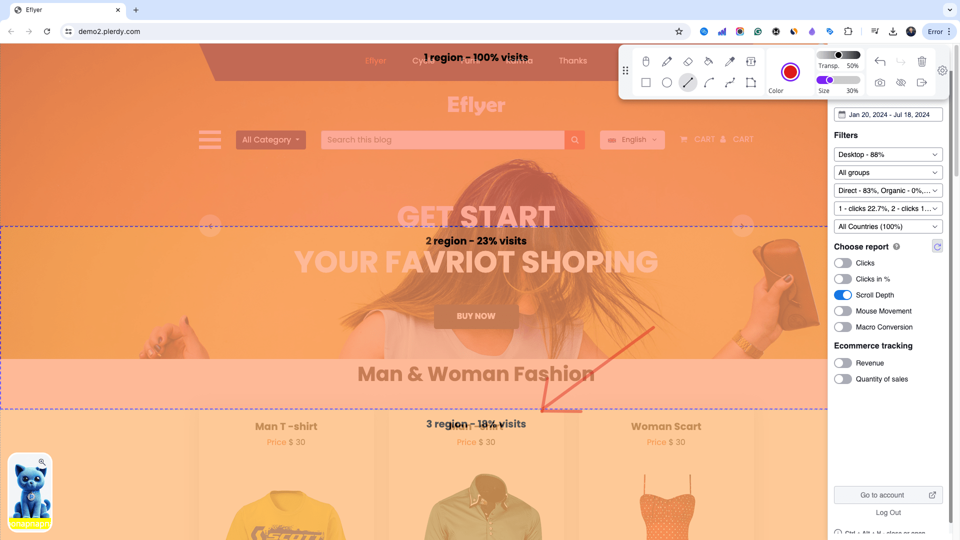
Alex: So, should we move elements higher up?
Andrew: Yes, sometimes it’s necessary to move important elements higher or even remove them. The third tip is user video sessions. You’d be shocked to see how people interact with the site. For example, you can often see rage clicks, or how the basket doesn’t work, or the filter. It’s important to regularly watch these and look for issues in the website design.
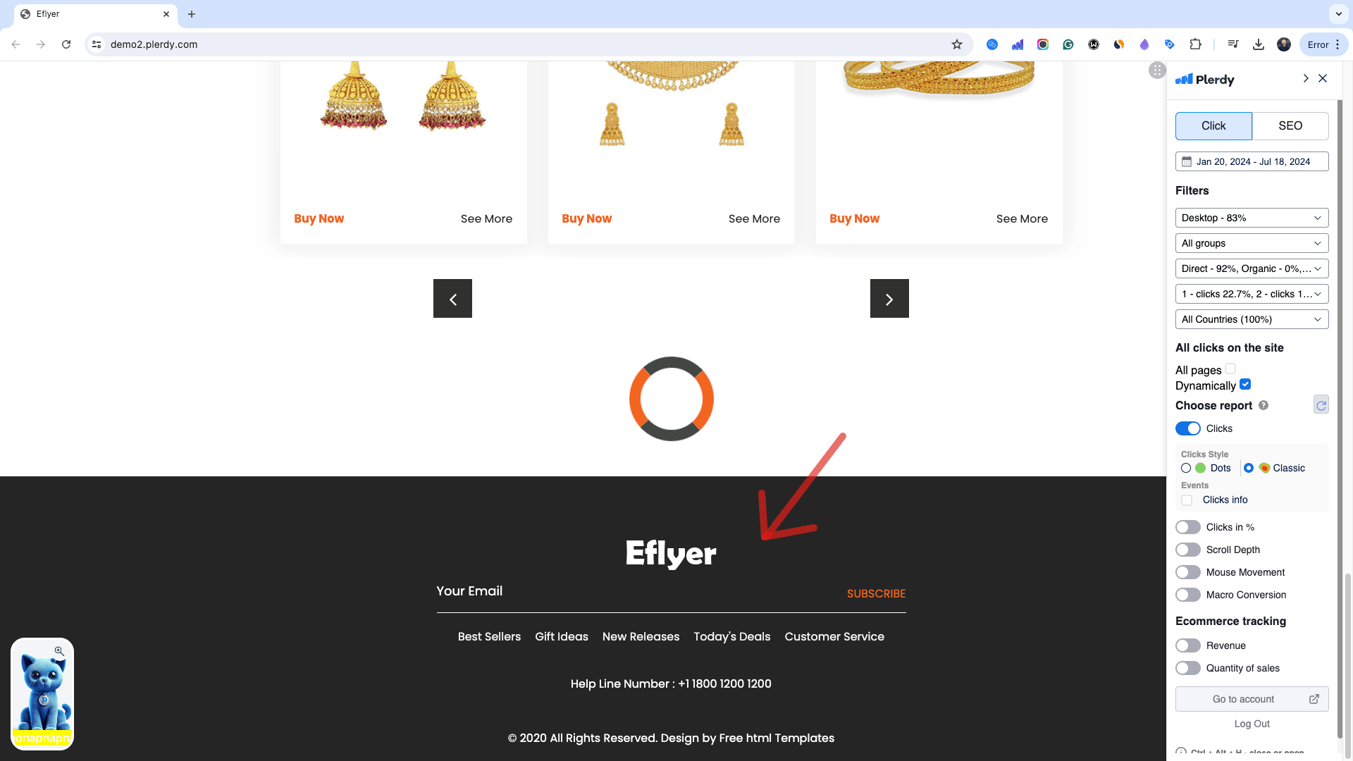
Alex: Wow, that must be incredibly helpful!
Andrew: No doubt. And remember pop-ups asking questions to visitors. This helps them understand what they dislike and what can be improved.
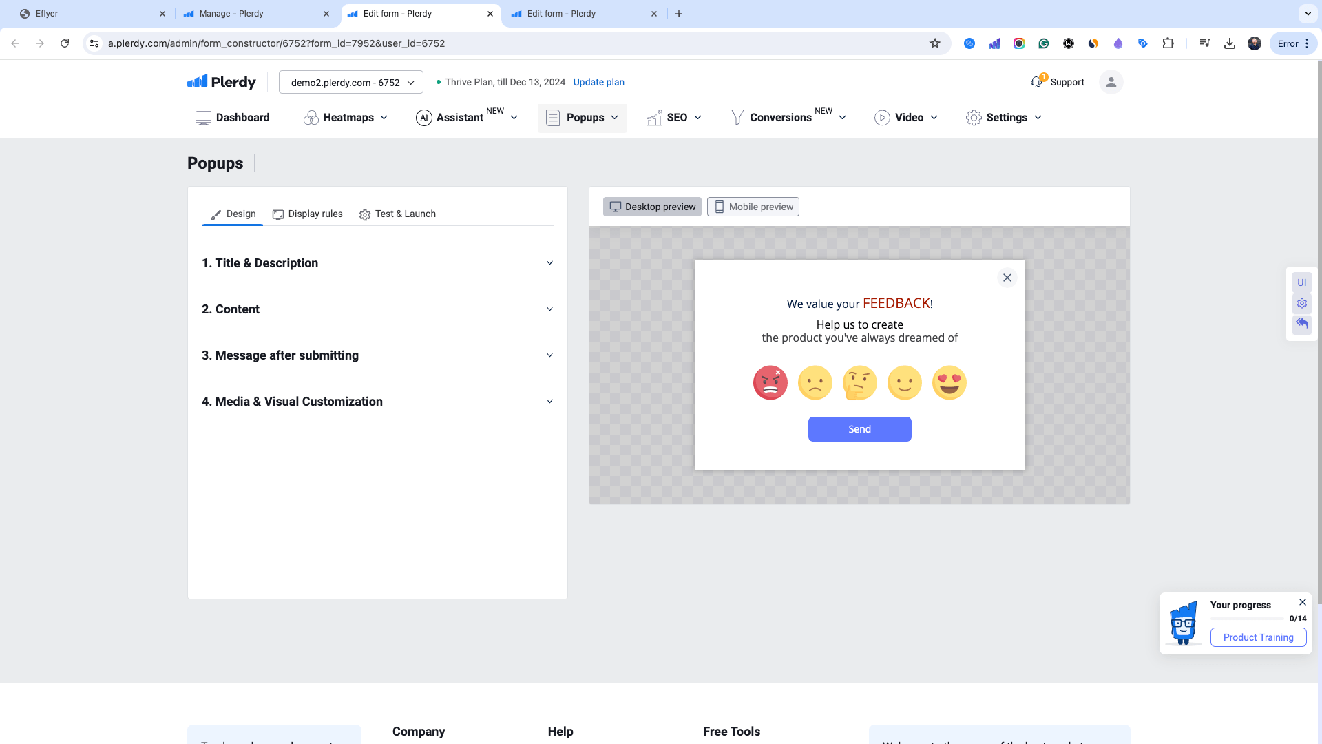
Alex: Very appropriate! And the last tip?
Andrew: Run A/B tests. Nothing improves conversions like experimenting with different design options and website elements. You can do this in Plerdy, for free.
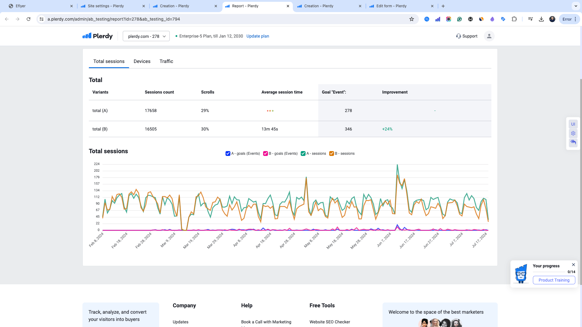
Alex: Thank you for these amazing tips! This is how Plerdy helps businesses grow. Don’t miss our next videos!
Andrew: Thank you for being with us! We hope these tips help. If you have questions, leave them in the comments!
Alex: Don’t forget to subscribe to our channel to not miss more interesting tips! Goodbye!
Finish
Finally, website analysis is a necessary habit with many advantages from enhancing user experience to raising conversion rates. Using solutions like Plerdy, which are used by well-known worldwide businesses, the insights they offer show the need of knowing visitor interactions on your website. Finding both strengths and areas for development is much aided by methods including heat mapping, scroll depth analysis, and user video sessions. Using techniques like A/B testing will also help you to improve the usability and design of your website so that it not only satisfies but beyond user expectations. Recall that the objective of website analysis is not just to compile facts but also to evaluate and apply them to guide wise decisions that propel development and success.
