Form analysis is a subtype of website analysis used to measure the effectiveness of website forms. Since website forms often have a high bounce rate, you need to make them as convenient as possible. Even the slightest issue can confuse users, and they will skip some fields or abandon the form at all.
Profound form analysis helps to detect the problematic spots and fix them. You can do it with heatmaps and session recordings. While heatmaps show where users click on dynamic website elements, recordings offer realistic videos of user behavior.
This article shares examples of form analysis and explains how to analyze forms with Plerdy. Keep reading to find the best form analysis solutions.
Examples of Form Analysis and Common Issues
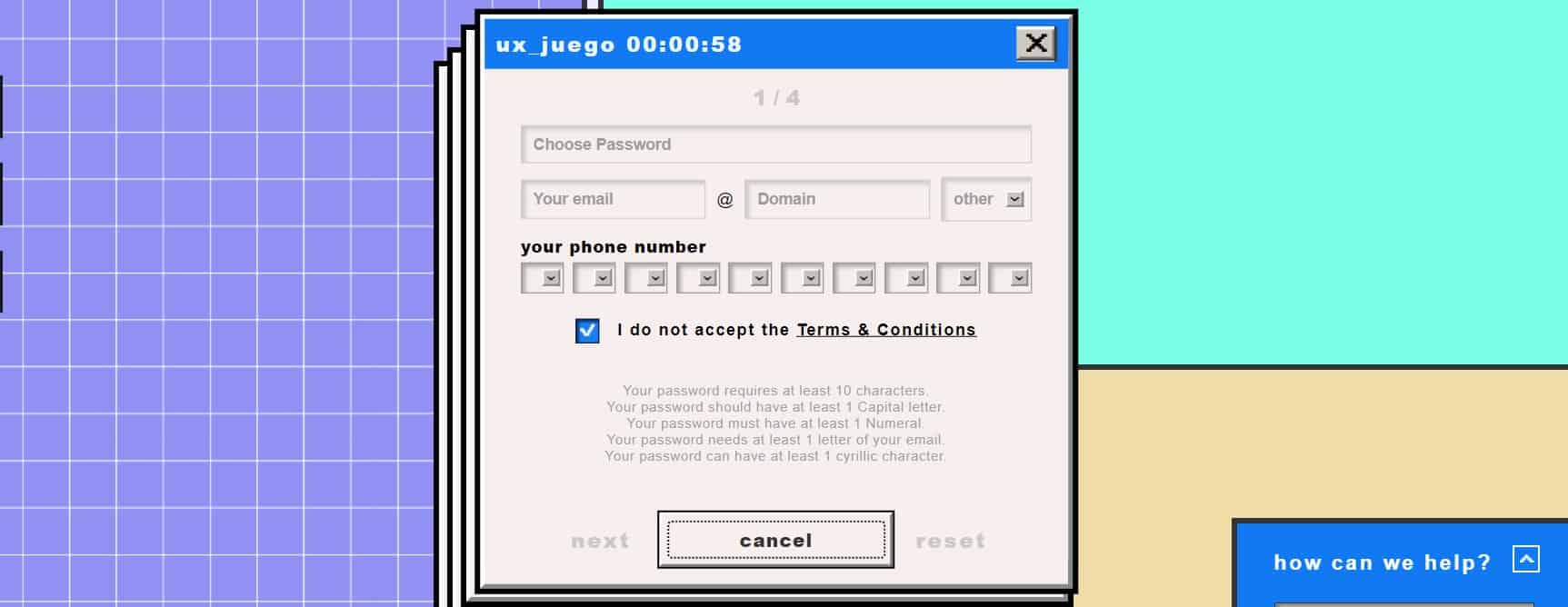
If you want to understand how users feel on a website with poor usability, follow this link. We designed an engaging game that shows why people will never complete a form with a low-quality design. Strange CTAs, confusing instructions, excessively bright colors, lengthy verification, and strange pop-ups repel visitors. Play it now to feel everything yourself.

When you design a form and analyze it, you should be aware of the common mistakes. Usually, websites that suffer from low conversion rates have the same issues, including:
- Forms ask for too much information
- Users need to take many actions to complete the form (e.g., select numbers from a drop-down menu manually)
- Field labels are confusing, so users aren’t sure where to enter information
- No automated pre-fill for loyal customers and address autocomplete
- Verification and captcha are hard to enter and slow down form submission
- Multi-column forms instead of single-column
- Unclear error messages and pop-ups
Fortunately, these and other issues are easy to detect with form analysis. When you notice that users have trouble filling out forms, some design elements don’t work. Website analysis software like Plerdy helps to locate the design issues to fix them.
Analyze the Performance of Forms
Plerdy offers multiple website analytics products that allow you to monitor different aspects of user behavior and collect data. When it comes to forming analysis, click heatmaps and session recording provide the most valuable insights. You can learn where people click and see why they ignore some elements.
Heatmaps

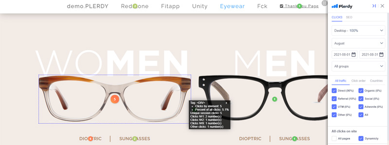
Plerdy heatmaps combine online tools for visitor behavior tracking. Color-based maps highlight different website elements with hotter or colder colors depending on user activity level. The more visitors interact with something, the hotter it is. Heatmaps also record user interactions as numeric values displaying how many clicks visitors have made. It gives a more precise picture of user behavior and backs up design decisions with data.
Plerdy heatmaps ensure 99% data accuracy, which means you see where exactly users interact with your web resource. Besides, it’s one of a few solutions that collect data on dynamic elements like pop-up forms.
Example of form analysis with heatmaps
Recently, we ran a CRO&UX Party where speakers discussed website usability issues, SEO, and analytics tools. Before starting it, we launched a registration form to collect the contact details of potential participants. Let’s now use Plerdy heatmaps to analyze this form:

- Once we open the registration page with Plerdy heatmap installed, we can see how many clicks users made. Predictably, people often clicked on the Name, Phone number, Email, and OK (Submit Form) field.
- There were some clicks we didn’t expect. For example, users tried to close the form with the Exit icon 89 times, which didn’t work. Hence, it would be better to change this design element to avoid confusion. Many people also clicked the main header, trying to find a link to additional information. Since this element was unclickable, it’s also a design flaw.
- The menu on the right allows selecting a period, traffic source, and other parameters. This feature is helpful to narrow down data or visualize it on the screen. We activated the Clicks in % toggle to see where people clicked the most frequently. The results didn’t surprise us since the heatmap showed that only 13.4% of users made clicks at the bottom of the page. Thus, it would be better to shorten the page and avoid placing critical elements in the last section.
Session Recordings

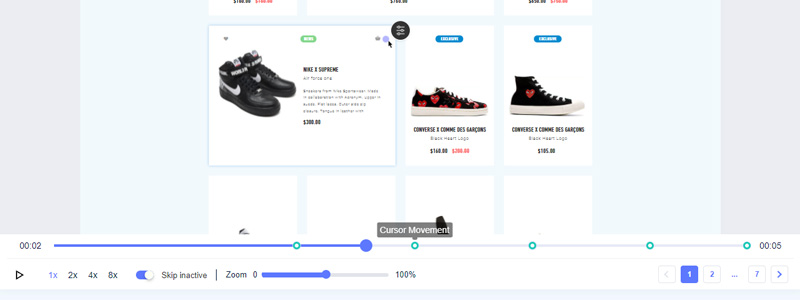
Session replay software gives fuller information about user behavior on a website. Marketers, UX/UI designers, and website owners can see what people do with web forms step by step. Plerdy video sessions feature only critical moments of user activity. You don’t have to watch the entire session. Use filters to see only significant parts. Plerdy also supports session playback and controls that considerably simplify the processing and analysis of captured videos.
Example of form analysis with session recordings
- We can analyze the same website form with session recordings. The heatmap findings showed us that the page was too long and had confusing elements. Session recordings can explain how people behaved when they were irritated or lost during navigation. This information is useful for designers to realize how to fix the problem.
We recommend combining heatmaps and session recordings for deeper form analysis. These tools cover different stages of form analysis. Heatmaps data is valuable at the start when you want to measure what people do with your forms. It shows where they click and how often. Session recordings help to find the meaning and intention behind these clicks. They give a realistic picture of user activity heatmap software cannot ensure.
Conclusion
If you place website forms or banners, you should analyze them with specialized software. Such analysis helps to learn what makes people leave a website or delays conversion. With this knowledge, you will optimize your web design to remove any conversion bottlenecks and make more users complete the necessary action.
