
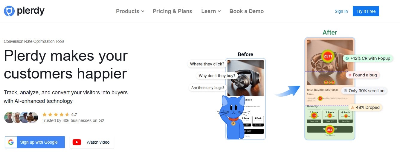
Your website might be beautiful. Slick design, fancy fonts, top-notch animations. But guess what? If your UX sucks, no one cares. People land on your pages, get lost, frustrated, and poof—gone.
Don’t panic. Most websites have these problems. It’s not about being perfect—it’s about fixing what matters. And to do that, you need solid data. Not vague assumptions. Not “I think this color works.” Real, useful, behavior-based data.
Enter Plerdy. A tool made for folks who want to turn traffic into conversions and fix UX issues without crying over Google Analytics dashboards.
Website UX Is Not a Vibe—It’s a Science (With Emotions)
Here’s the deal: UX isn’t just making your website “nice to use.” It’s about understanding user behavior. It’s emotions + logic + data.
Bad UX makes your visitor confused or annoyed. Good UX? It guides them. Think Apple, Airbnb, Spotify—they invest millions into perfecting the website experience. Why? Because they know that better UX = higher revenue. Period.
Now, you don’t need millions. You need the right process—and that’s where Plerdy jumps in.
Heatmaps: Where the Website Story Begins
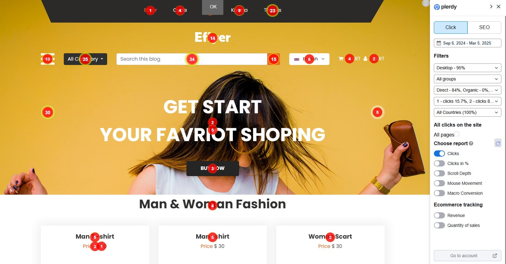
If you’re not using heatmaps, you’re basically walking blindfolded on your website. Plerdy heatmaps are the flashlight.
Here’s how it works:
- Heatmaps show you where users click on your website.
- They reveal ignored areas, dead zones, and gold spots.
- You see real user behavior on every page, not guesses.
But that’s just the beginning. Plerdy provides detailed reports: Clicks, Clicks in %, Scroll Depth, Mouse Movement, and even Macro Conversion data. For example, if you want to see what part of the website led users to buy something, you can check the Macro Conversion report. Want to know which block generated more revenue? The Ecommerce Tracking reports—Revenue and Quantity of Sales—show exactly what was clicked before checkout and how much it brought in.
Example: One agency noticed that nobody was clicking the “Contact Us” button at the bottom of their website. After moving it to the top and changing the color (thanks to Plerdy heatmaps), click-throughs jumped by 41%.
That’s not design magic. That’s data-powered UX improvement—real insights, turned into action.
Scroll Maps: Are Users Even Seeing Your Content?
Have you ever written a killer paragraph… only to find out nobody scrolls that far?
Plerdy’s scroll depth tool slices your website into 10 vertical sections. It tracks how far users go. If 90% of visitors bounce before reaching the pricing table, that’s a problem. No one’s reading your offer.
Use this data to:
- Cut the fluff
- Reorganize sections for better flow
- Move CTAs to visible areas
It’s basic UX hygiene. But many ignore it. Don’t be one of them.
And it goes deeper—Plerdy combines this with cursor tracking (Staying a Mouse), showing which elements users hover on, even without scrolling. That’s essential for identifying what’s visible and engaging at a glance. Scroll + hover = the full website experience. Want to go even further? Check macro conversion reports to see which sections led to purchases. If your pricing table only reaches 33% scroll depth but contributes to 70% of revenue, you know where to focus. That’s not guesswork. That’s smart UX decisions, backed by real data.
Table: Scroll Behavior in Action (Real Example)
| Website Section | Scroll Reach % | Average Time Spent |
|---|---|---|
| Hero Headline | 100% | 5.8 sec |
| Feature Highlights | 78% | 3.9 sec |
| Case Study Carousel | 55% | 2.5 sec |
| Pricing & Packages | 33% | 1.4 sec |
| Final CTA (Footer) | 12% | 0.7 sec |
If most users drop off at the halfway mark, your CTA in the footer is as good as invisible. That’s a classic UX fail. Use the data. Move it up.
Session Replay: Watch, Learn, Improve Website UX
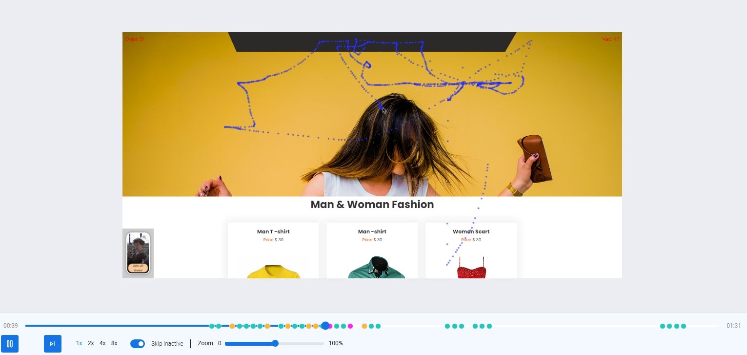
Want to feel the pain your users feel? Watch them.
Plerdy session recordings let you see real users interacting with your website. You see the rage clicks, the scroll hesitations, the form abandons. It’s like user testing… without paying for user testing.
What you’ll notice:
- Users getting stuck in your checkout flow
- Visitors failing to find product details
- Confusion caused by modal popups or dropdown menus
But there’s more. You can filter sessions by country, traffic source, URL, or even specific user actions—Data gets granular. Want to know why some videos are only 3 seconds long? That’s your cue something’s wrong with your UX. You can tag sessions, add comments, and even share replays with teammates to troubleshoot faster. Plus, you can track micro goals, like clicks on “Add to Cart,” and see all related recordings in one place. Plerdy even protects personal input by masking form fields—ensuring privacy while still delivering powerful behavioral insights. This isn’t just analytics. This is understanding your website’s true story.
Conversion Funnels: Stop Guessing, Start Tracking
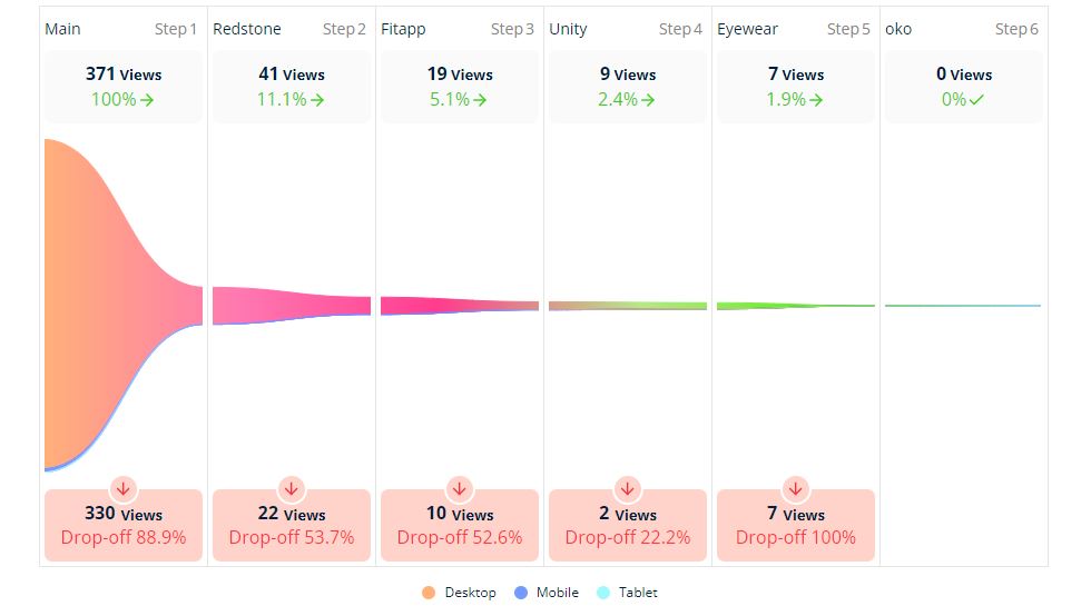
Plerdy’s funnel analysis maps out the exact steps your users take across your website. Want to know where they drop off between your homepage and the checkout page? You’ll see it.
Let’s say you have:
- Landing Page
- Product Page
- Cart
- Checkout
- Thank You
If 60% drop off between product and cart—yikes. Maybe your “Add to Cart” button blends into the background. Or the form is asking for too much info. Whatever it is, now you’ve got data to act on.
To start, simply set up your first funnel in Plerdy: define the landing page where users arrive from traffic channels, then add the product view page (use a segment like “/product”), and finish with a unique “Thank You” page. Each step must be different—no repeats. That’s crucial for accurate tracking. The tool visualizes where users stop, what stage kills conversions, and which UX element ruins the flow. Want even deeper insights? Segment by device type or traffic source. This is not just theory. This is website optimization based on cold, hard data.
Popups That Don’t Kill the UX
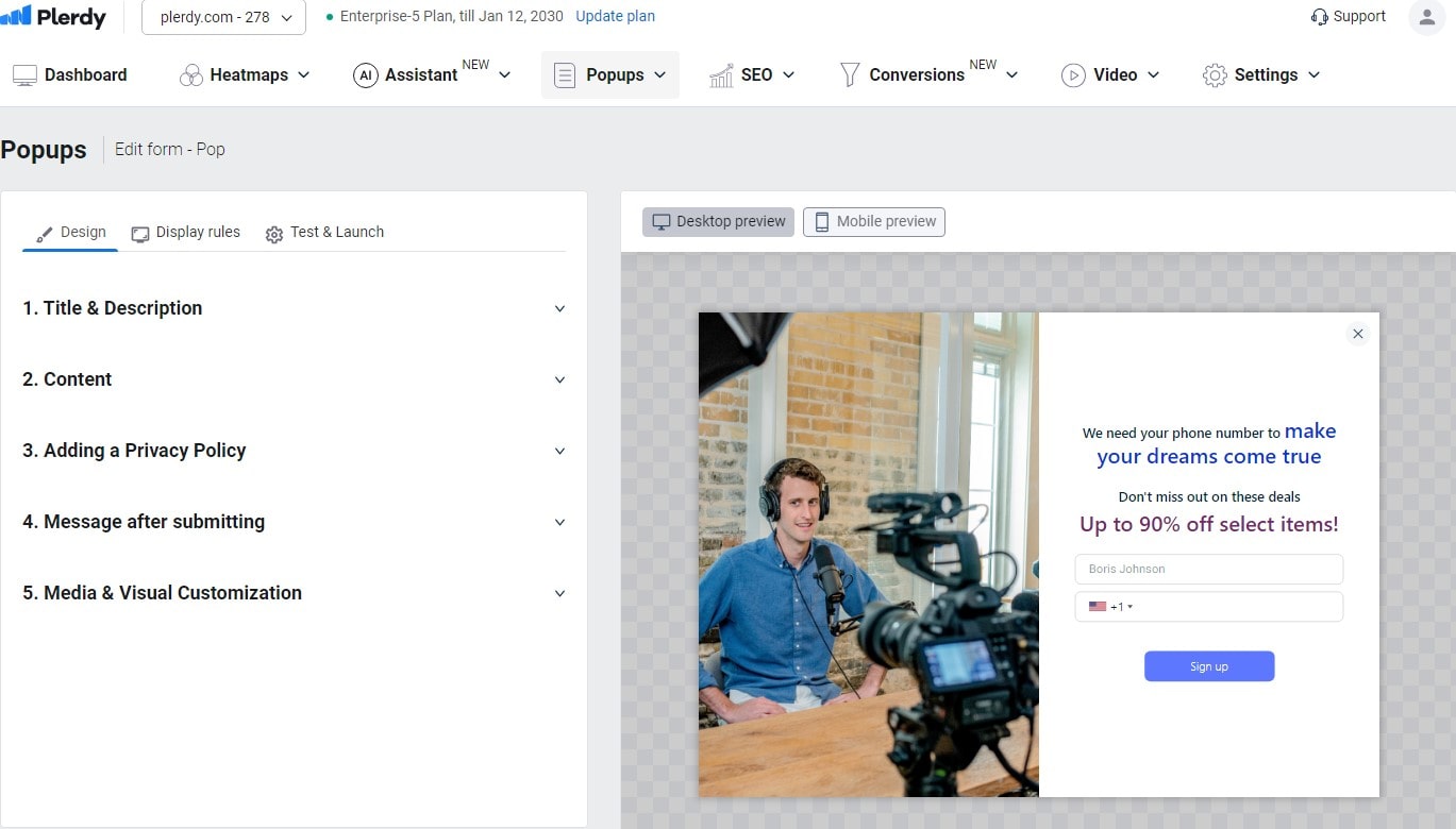
Popups can be annoying. But when they’re used smartly? They boost conversion and improve user engagement.
Plerdy popups aren’t random. You trigger them based on real website data—scroll depth, exit intent, inactivity.
Here’s how to make them work without ruining the UX:
- Show a discount after 20 seconds on a product page
- Ask “Was this helpful?” after a blog post
- Offer a free guide when users hover over the pricing plan
But there’s more. With Plerdy, you can build custom pop-up forms for lead generation, promotions, surveys, or video invites. Add events, segment users by traffic channel, and even trigger popups on specific devices. Want to highlight a sale or collect emails with a lead magnet? Set up targeting rules and watch the Data flow. Plus, every popup form can be styled to match your website, with no coding needed. Use impression and closing metrics to see what works. The result? Personalized UX that feels helpful, not pushy—and gets real conversions.
Microfeedback for Macro UX Wins
Sometimes the smallest feedback leads to the biggest fixes. With Plerdy feedback forms, users tell you exactly what’s wrong—confusing wording, broken buttons, unclear copy.
Collect that feedback, act fast, and you’ll see instant improvement in how your website feels.
One client added a simple “Was this helpful?” widget. Within a week, they got 142 responses. Tweaked a few paragraphs. Bounce rate dropped 19%. All from listening.
Benchmark Your Website UX with Plerdy (And Track Progress)
Improving UX isn’t a one-time thing. It’s ongoing.
Plerdy’s dashboards help you benchmark key metrics:
- Time on page
- Scroll rate
- Click concentration
- Funnel progression
Check those weekly. Fix weak spots. Run A/B tests. Track again.
Compared to old-school tools? This is fast, visual, and actually fun to use.
Why Plerdy Over Other UX Tools?
There are many tools out there—Hotjar, Crazy Egg, FullStory. All decent. But Plerdy combines everything in one place:
- Heatmaps
- Funnels
- Popups
- Session replays
- SEO audit
- UX analytics
And it runs on your website in real-time, without slowing it down.
Other tools need external setups, third-party integrations, or heavy configs. Plerdy? One script. Boom. Done.
Plus, it’s affordable. You’re not paying Netflix-level prices to get website UX under control.
Final Thoughts: You Can’t Fix What You Don’t Measure
Look, we all want a website that converts. But wanting isn’t doing. If your UX isn’t tracked, tested, and tweaked—it’s broken. Full stop.
Data is the lifeline. Plerdy gives it to you without the headache. The faster you understand what users actually do on your website, the faster you fix it—and the better your business runs.
Don’t overthink it. Don’t delay it. Go check your heatmaps. Watch a few session recordings. Find that one UX blocker killing your conversions.
Then fix it.
And hey—maybe boost sales 17% while you’re at it.
Try Plerdy today and stop guessing. Start improving. Your website UX depends on it.