Googleplex is the headquarters of the most world-renowned American company that delivers 50+ services and products – Google LLC. But still, the core of its prosperity and recognition is its search engine. Can you imagine that such a huge corporation originated from a dorm room? Here’s how it all began…
History of Google in 1998

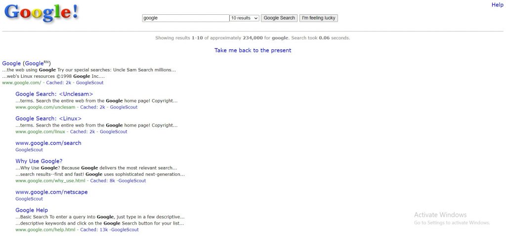
It was 1995 when two computer science students of Stanford University, Larry Page and Sergey Brin, collaborated to develop a new program. Their project was called BackRub and, despite their shoestring budget, it became the predecessor of Google. The search engine was based on the PageRank data collection system. The technology-enabled tracking and recording data online by analyzing backlinks. It counted the number of pages, analyzed their relevance, and linked them back to the original web page. After viewing its demo version in August 1998, Andy Bechtolsheim, a co-founder of Sun Microsystems, invested $100,000 in the students’ project. The money enabled them to move from the dormitory to a garage in suburban Menlo Park, California that became their first office. It was the rise of Google Inc.
Google in 1998. History of logo

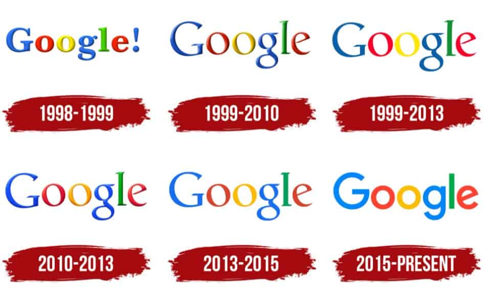
Google is known for its vibrant logos. The very first logo was designed in 1996. It was a red “BackRub” inscription against a hand. Only in 1998, when BackRub was rebranded to Google, the first commonly recognized multicolored logo appeared. It consisted of blue, red, yellow, green letters, constituting “Google”, and an exclamation point.
With time, the logo underwent a series of redesigns.
Firstly, the exclamation point was removed not to resemble other brands using the same mark. Originally, the logo inscriptions featured the Adobe Garamond typeface that was smoothly replaced by Catull, and, finally, Product Sans.
Ruth Kedar suggested black logo variants with bright eye-catching elements in the middle. Still, pretty soon, Google got back to their conventional multi-colored designs. In 2015, they designed the “G” logo that preserved the color scheme and was used as a favicon to represent some features.
Nowadays, Google’s doodles, dedicated to variable events and holidays, please their users’ eyes daily.
Conclusions
A long story lies behind any tremendous prosperous corporation. All in all, everything huge, like Googleplex, starts with something tiny, like a dorm room. Google has lived through a series of rebranding and redesigning but is still one of the best-recognized and most widely-used search engines.
