Have you ever heard the phrase “Graphic design is my passion”? Then, you are probably related to the web design field and love memes.
It all began in 2014 on Tumblr. The user nicknamed Yungterra posted a green cartoon frog on the cloudy gray sky and added the caption, “Graphic design is my passion.” This image illustrated how a low-quality web design looked and became surprisingly popular. Over a year, it got over 352,000 notes and gave birth to hundreds of memes. Today, when someone wants to describe a bad design, they use this phrase.
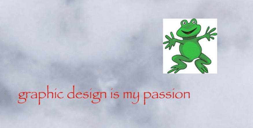
Here, we have collected 18 memes that show how far graphic design passion can go and illustrate the famous phrase.
18 Graphic Design is My Passion Memes
#1.
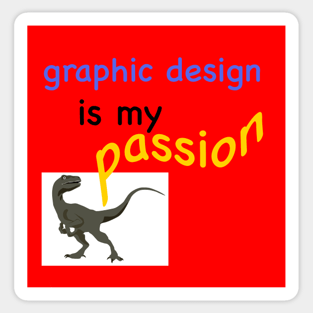
The dinosaur placed in the corner of the image looks terrified with what it sees. Unmatching fonts on the red background strain eyes and prove that the creator of this masterpiece knows nothing about design (or has a good sense of humor).
#2.
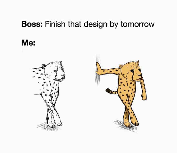
This meme will touch the heart of every designer working under strict deadlines. When a boss pushes you to complete the work sooner than it’s possible, the result is usually poor.
#3.
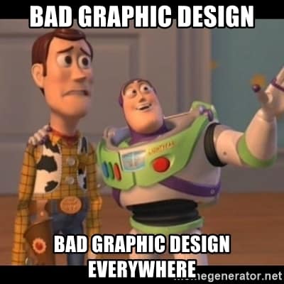
This meme features a renowned moment from the Toy Story cartoon with Buzz Lightyear. People create such memes to explain the reaction to something negative. In this case, it’s bad graphic design.
#4.
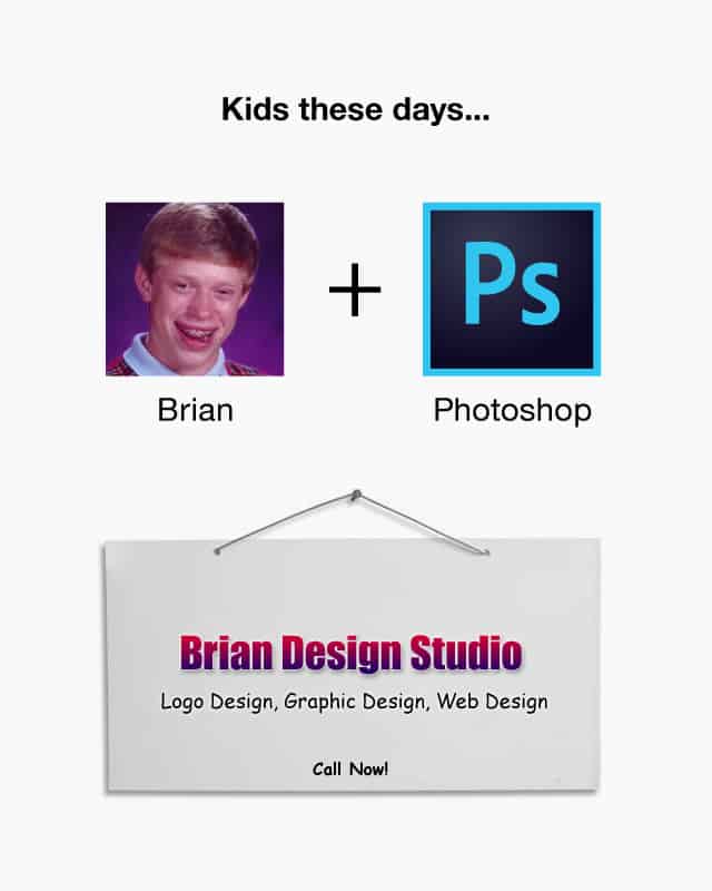
This illustration ridicules people who offer design services with no education and experience. Not everyone can do graphic design. It takes time to master it.
#5.
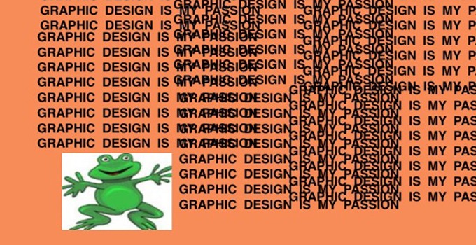
The meme has the classic frog and the “Graphic design is my passion’ capture. The overlapping text that makes your eyes hurt perfectly explains what a low-quality graphic design is.
#6.
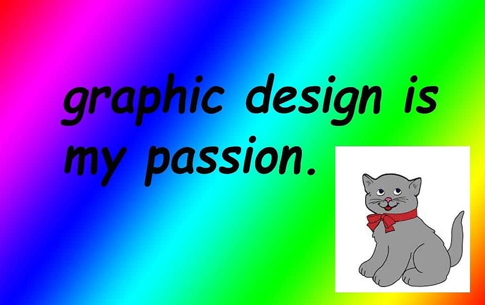
Everyone loves cats, so adding a cat might be a great solution. But don’t overuse it in web designs. Especially when you chose a rainbow background and strange fonts.
#7.
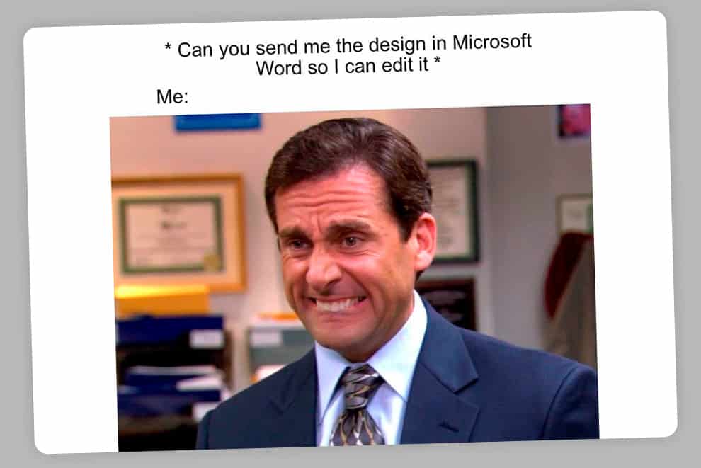
Designers often suffer because of the variety of formats they need to convert. They suffer even more when a client asks to send the file in a format, which is not suitable for graphic designs.
#8.
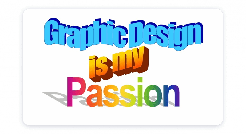
If you loved Word Art fonts, this meme may upset you. Professional graphic designers no longer use them and, moreover, they make fun of people like you. Word Art elements were only good for school presentations. Now, no one likes them.
#9.
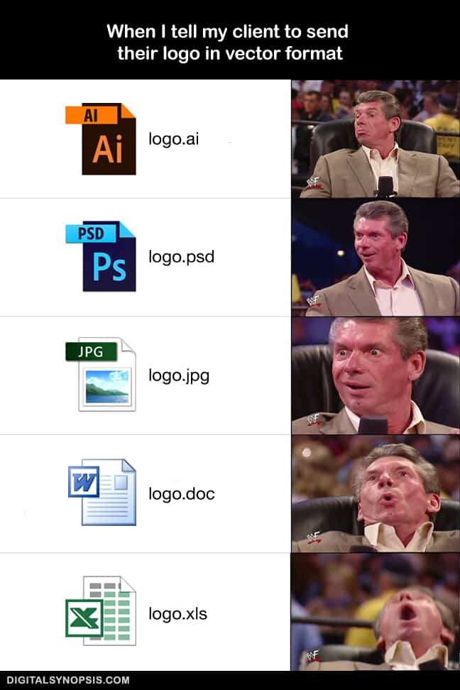
Here’s another meme that symbolizes the attitude of designers towards wrong source file formats. Although it’s funny, we hope nobody sends logos in excel files.
#10.
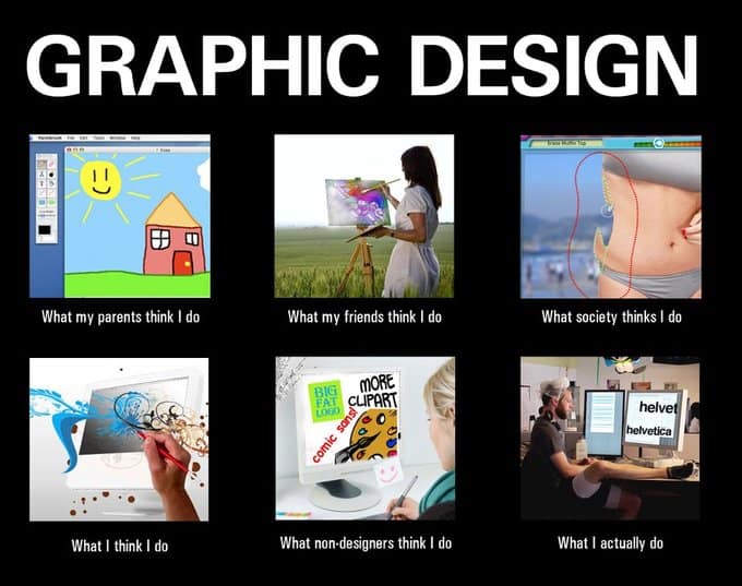
This time, designers make fun of themselves. It’s a popular “What I think I do/ What I actually do” meme that contrasts the myths about all kinds of jobs. Whereas designers overestimate their creativity, the reality is harsh.
#11.
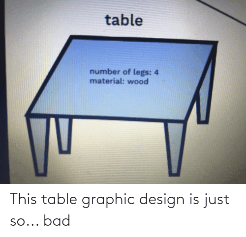
The image and caption tell for themselves. Quality designs don’t need additional explanation and allow understanding the meaning of the visualization at first glance.
#12.
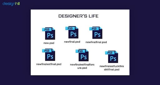
Only designers and students who edit their final essays can relate to this meme. Unfortunately, to create something decent, you must be ready to change it many times and store multiple copies. If you have an overly demanding client, expect even more edits.
#13.
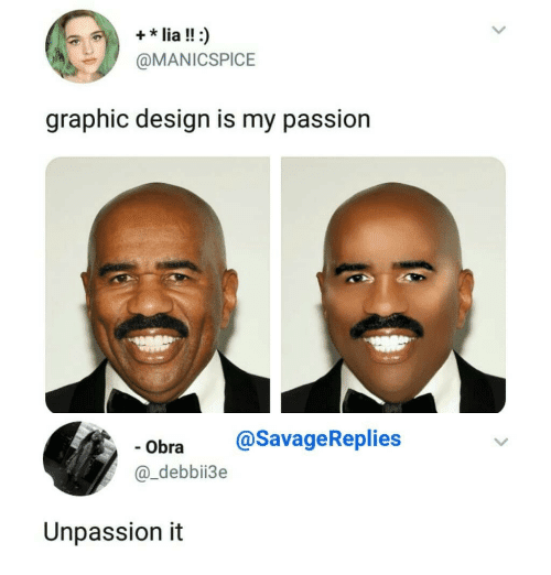
Professional designers always remember about balance. They don’t get obsessed with their passion and can stop before turning their projects into a mess. “Unpassion’ is the right word for this.
#14.
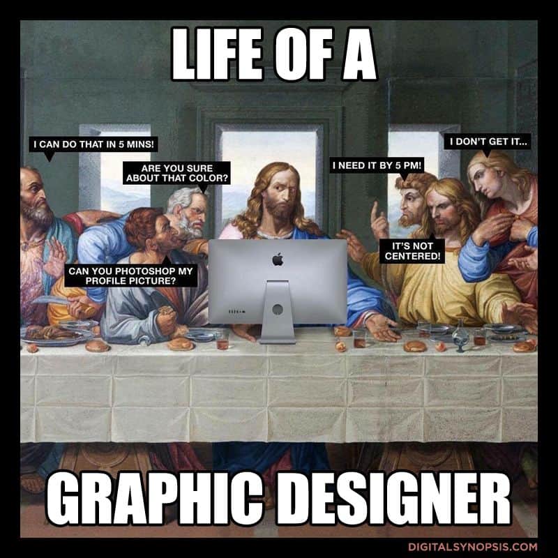
If Jesus were a graphic designer, his workplace would be similar to the Last Supper picture. He would be surrounded by many people who make stupid comments and requests.
#15.
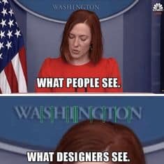
Designers are obsessed with spacing. If you miss a space or add too much space, it kills them. Besides, they see what other people usually don’t notice.
#16.
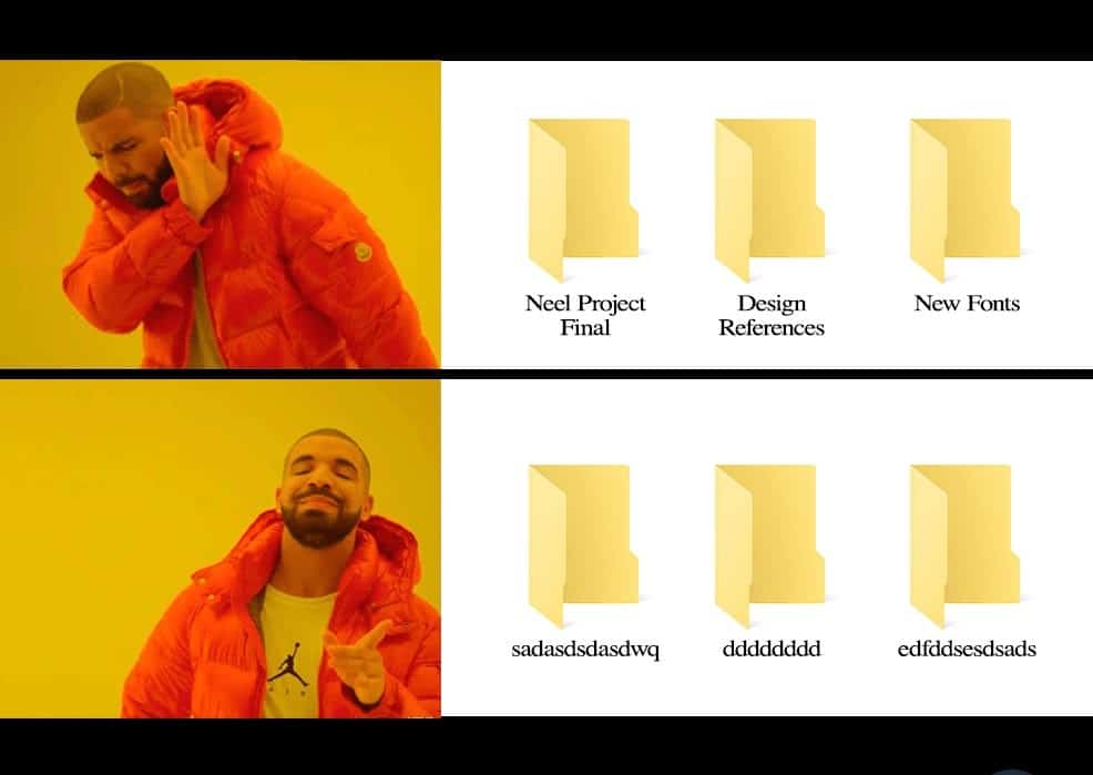
Clear names of folders are for losers. Professionals make up random names to later waste hours searching the necessary file. It makes their everyday routine more engaging.
#17.
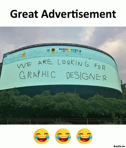
In a way, this advertisement is an effective solution for finding a graphic designer. It shows how desperately the company needs someone to select proper fonts and use more advanced software than Microsoft Paint.
#18.
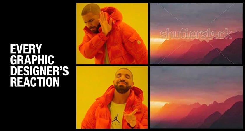
Never use Shutterstock or any other images with watermarks. Unique content is the best.
Conclusion
Although people create memes to make each other laugh, they have powerful messages. Vector graphic design requires specific knowledge and experience. It’s not an easy job anyone can do. Professionals know how to combine different design elements, choose fonts and other details to create appealing visualizations. If you want to do it, be ready to learn a lot.
