
If you want to really know what your visitors do on your site, Plerdy heatmaps and Usability features are your best friends. Plerdy heatmaps show where people click, scroll, or move their mouse. Plerdy’s Usability tools help you turn those visuals into real changes. No more guessing which button works or where users drop off. Instead, you have clear Plerdy data to guide you.
What Are Plerdy Heatmaps and Usability?
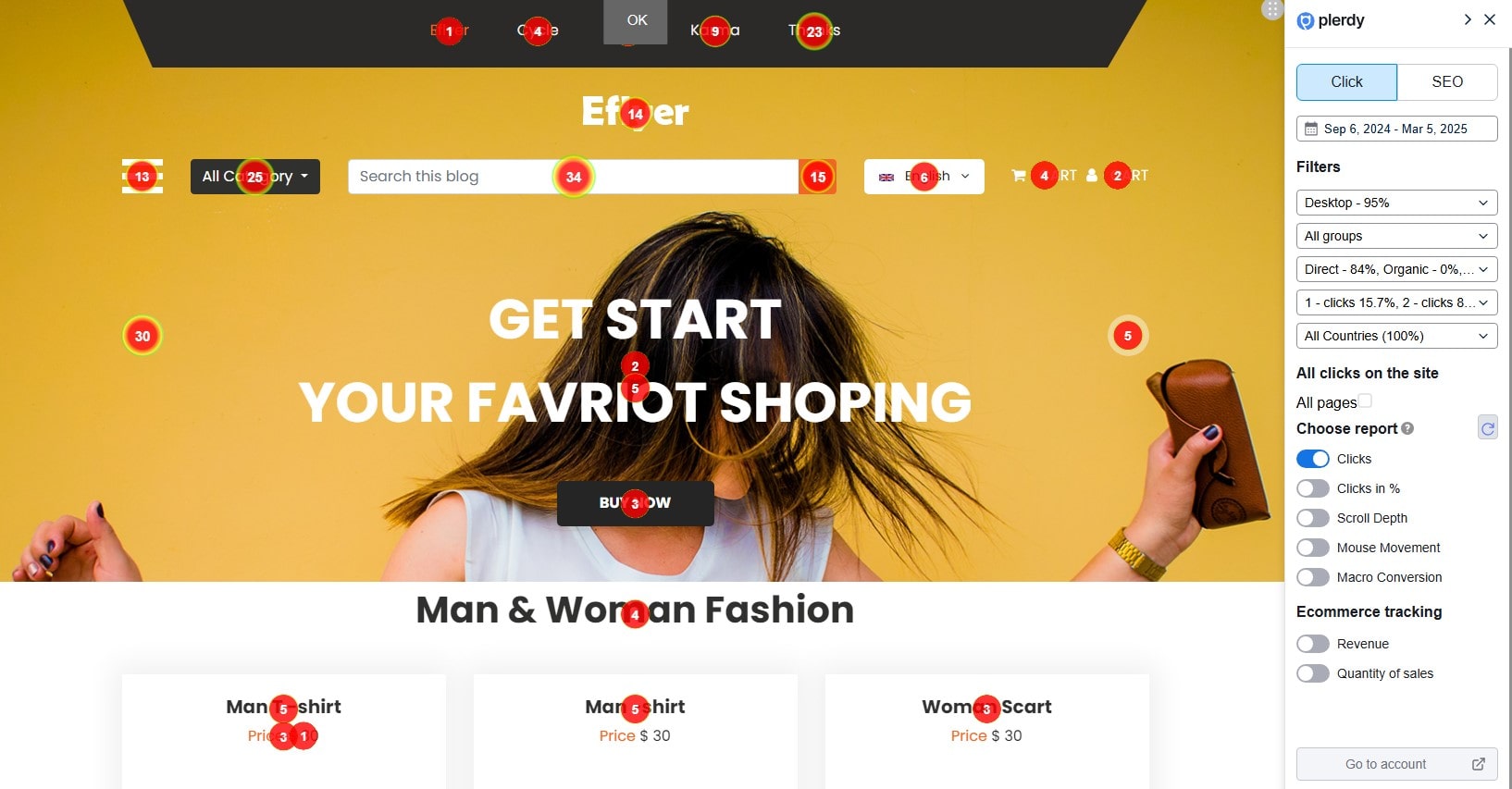
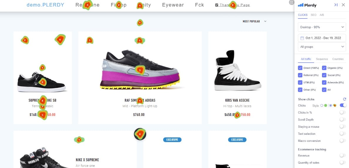
Plerdy heatmaps are color‑coded overlays. They let you see visitor behavior at a glance. Usability means making your site easy and pleasant. With Plerdy, you get both: deep heatmaps and Usability insights. This combo helps you fix issues fast. You don’t need hours of manual review. Plerdy’s real‑time updates do the work for you.
Beyond basic click maps, Plerdy heatmaps also include scroll depth tracking and mouse cursor movement reports, so you understand not just where users click, but how far they scroll and where their attention lingers. These Usability features automatically adapt to dynamic content—menus, pop‑ups or sliders—without manual tagging. Data refreshes every 10 minutes, giving you instant feedback on layout tweaks. Plus, Plerdy integrates form analytics to reveal drop‑off points and macro‑conversion heatmaps to pinpoint which elements drive purchases. All of this fosters stronger Usability, turning raw heatmaps data into actionable improvements.
Types of Plerdy heatmaps
Plerdy offers three main heatmaps and Usability modules:
- Click Heatmaps for clicks or taps on desktop and mobile.
- Scroll Heatmaps for how far users scroll down pages.
- Move Heatmaps for tracking mouse movements to guess interest areas.
Each Plerdy heatmap loads in minutes. Then you can improve Usability right away.
Feature Comparison Table
| Feature | Plerdy heatmaps & Usability | Other Tools (Hotjar, Crazy Egg) |
|---|---|---|
| Real‑Time Updates | yes | often delayed by 1–2 hours |
| Unlimited Page Views | yes | usually caps at 10,000 per month |
| Click Heatmap | auto‑track all clicks and taps | manual tag setup |
| Scroll Heatmap | full‑page scroll depth | limited to top 75% |
| Move Heatmap | desktop and mobile mouse gestures | desktop only |
| Form Analytics | auto‑detects form fields and drop‑offs | manual configuration |
| GDPR & Privacy | built‑in anonymization and opt‑out handling | user must configure privacy settings |
Top Plerdy Usability Strategies with heatmaps
Here are simple Plerdy strategies using heatmaps and Usability data:
- Move your main button into a hot zone if heatmaps show few clicks.
- Shorten forms when 50% of users drop at field three.
- Add anchor links mid‑page if scroll heatmaps show a big drop.
- Change image positions when move heatmaps indicate user eyes skip them.
- Use session recordings in Plerdy’s Usability module to see mobile struggles.
Try these tactics with Plerdy heatmaps and notice dramatic usability gains.
Detailed Strategies and Examples

1. Improve Above‑the‑Fold Usability
A small ecommerce brand saw only 15% of visitors click their signup link at the bottom of a long banner. Plerdy heatmaps revealed the top click area was above the headline. By moving the sign‑up link there, clicks jumped to 38%. That change alone added an extra $4,000 per month in sales. Usability improved and bounce rate dropped from 48% to 35%.
2. Boost Content Engagement
On a blog with 80,000 monthly readers, scroll heatmaps showed most people stopped at 300 px. The team added clear headings and a table of contents at 200 px. Average time on page rose from 1:10 min to 1:50 min. Plerdy Usability data confirmed readers spent 25% more time on key articles.
3. Reduce Form Abandonment
A coaching website used Google Forms and had 45% abandonment at the “Phone Number” field. Plerdy’s form analytics pointed to confusion there. They made the phone field optional and added a tooltip. Abandonment dropped to 22%, boosting lead submissions by 18%.
4. Optimize Mobile heatmaps and Usability
Heatmaps on mobile showed users tapping a non‑interactive image carousel over 600 times per day. Plerdy’s Usability session recordings proved frustration. After switching to a swipe‑enabled slider, mobile conversions rose by 7%, adding about $2,500 extra monthly.
5. Run Smarter A/B Tests
Instead of guessing whether red or green is better, use Plerdy heatmaps to find high‑attention zones. Place both buttons there in a split test. One SaaS tool cut test time by 35% and saved $1,000 in developer fees. Usability scores improved, too.
Comparing Plerdy Heatmaps with Other Tools
Most alternatives require manual setup or limit data. Plerdy heatmaps and Usability stand out because:
- Automation: Plerdy auto‑detects forms and clicks.
- No Limits: Unlimited page views and sessions.
- Speed: Data refreshes every 10 minutes.
- GDPR‑Ready: Built‑in compliance, no extra work.
Crazy Egg and Hotjar offer basic maps, but Plerdy’s combined heatmaps and Usability tools give a fuller picture. You’ll know not just where users click, but why they might get stuck.
Credibility, E‑E‑A‑T and Proof
Plerdy holds ISO certification and follows GDPR rules. Over 3,000 businesses trust Plerdy heatmaps and Usability for real‑user analytics. Experts like Sarah Williams (UX Author) and Mike Brown (Google Certified) recommend Plerdy. Featured in Forbes and TechCrunch, Plerdy shows strong E‑E‑A‑T: expertise in analytics, authority in UX, and trust via data privacy focus. On average, customers report a 14% boost in Usability scores and save roughly 20 hours per month on analysis.
Conclusion & Next Steps
Heatmaps and Usability are the dynamic duo you need. Plerdy heatmaps give clear visuals, while Plerdy Usability tools turn insights into action. From rearranging CTAs to refining mobile flows, Plerdy helps you optimize every page. Ready for clear data, real‑time results, and better user experience? Try Plerdy heatmaps and Usability for free today and watch your conversions grow.