
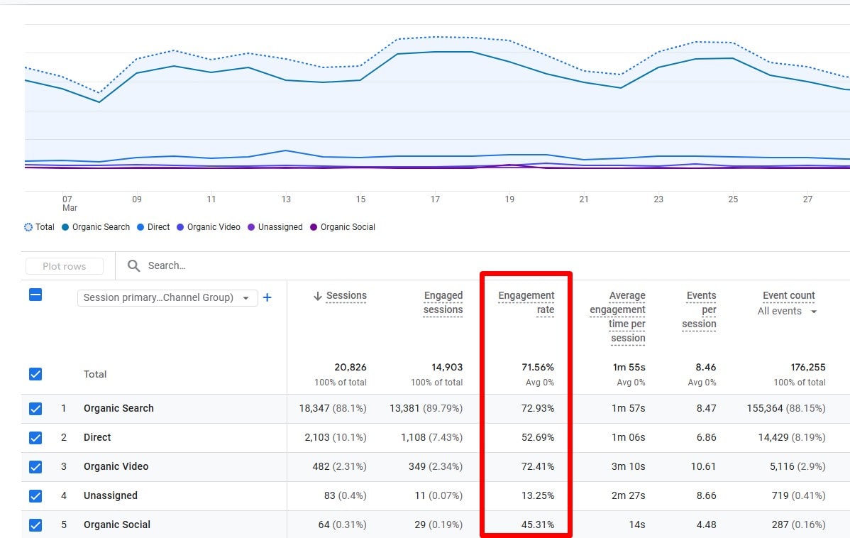
Search engine rankings aren’t just about stuffing pages with keywords anymore. Google cares about how users interact with your website. Do they stay? Do they engage? Or do they bounce away in seconds? That’s where Plerdy’s Click Maps step in—giving you real user behavior insights to fine-tune your SEO strategy for better engagement.
Why Click Maps Matter for SEO
Let’s be real—SEO isn’t just about getting traffic. It’s about keeping visitors engaged. You can rank #1 on Google, but if users bounce faster than a bad Tinder date, your rankings will tank.
Google tracks engagement metrics like:
- Dwell time – How long users stay on your page.
- Bounce rate – Do they leave without interacting?
- Click-through behavior – What elements actually get clicked?
Plerdy’s Click Maps give you this data in a visual, easy-to-digest way. You see exactly where users click (or don’t), so you can tweak your pages to keep them engaged.
Using Click Maps to Improve On-Page SEO
1. Optimize Internal Linking (Because Dead Ends Kill Engagement)
Ever clicked on an article, got interested, then… nowhere to go next? That’s a lost SEO opportunity. Plerdy’s Click Maps show where users hover but don’t click. Maybe they expected a link but found none. Fix that, and you reduce bounce rate while improving internal linking—a big SEO win.
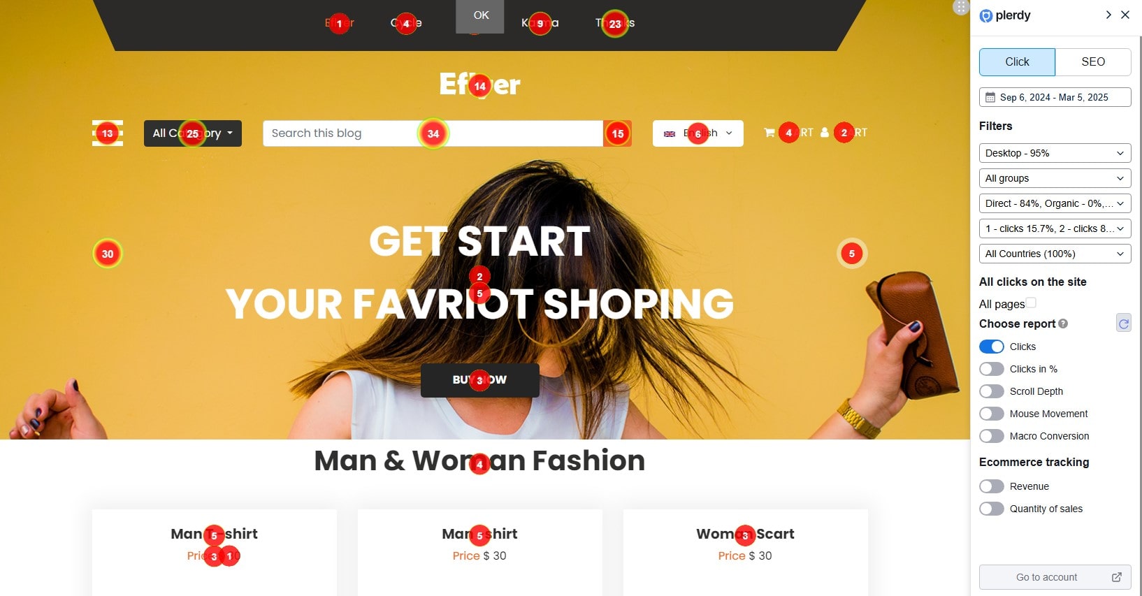
Plerdy’s Clicks report provides precise click data on each element, showing the total number of clicks. As you scroll through the report, clicks appear dynamically within 1-2 seconds. Meanwhile, the Clicks in % report segments pages into five equal parts, revealing hidden click activity within dynamic elements.
🔹 Example: If users are hovering over an unlinked keyword like “SEO best practices” in a blog post, that’s a hint—add a relevant link! If Plerdy’s reports show zero clicks on a crucial internal link, you know it’s either misplaced or not enticing enough. A simple CTA tweak or repositioning could increase engagement by 30%.
2. Heatmap Insights for CTA Placement (Don’t Let Users Play Hide & Seek)
Your Call-to-Action (CTA) placement can make or break conversions. If your CTA is buried in a cold zone (a spot with few clicks), you’re losing potential leads.
Plerdy’s Click Map provides real-time insights into which elements attract the most clicks and which remain unnoticed. The Clicks report dynamically updates as you scroll, allowing you to instantly see if users interact with your CTAs or ignore them. If a button isn’t getting enough attention, the Clicks in % report helps identify whether it’s positioned in a low-engagement section of the page.
Using Scroll Depth, you can determine how far visitors scroll before abandoning the page. If your CTA is sitting in the bottom 30%, where only 15-20% of users reach, you might need to move it above the fold for maximum visibility.
Plerdy’s Click Maps highlight hot spots where users naturally engage, so you can:
- Move CTAs to high-engagement areas
- Test button colors & text variations
- Reduce friction in conversion paths
💡 Example: A case study found that adjusting CTA placement based on heatmap insights led to a 35% increase in click-through rates. With Plerdy’s SEO-driven Click Map analysis, you can optimize button placement and ensure your CTAs grab maximum engagement..
Table: Click Behavior & SEO Impact
| Click Behavior | SEO Impact | Optimization Strategy |
|---|---|---|
| High clicks on internal links | Boosts page authority | Expand internal linking structure |
| Low clicks on CTA buttons | Lost conversions | Move CTAs to hot zones |
| High engagement on images | Users expect interaction | Add links or lightboxes |
| Users exit after reading 25% | Poor content structure | Improve readability & flow |
3. Find & Fix Content Blind Spots
Plerdy’s Click Maps reveal what users ignore. If key SEO elements (H2 headings, tables, product sections) get zero clicks, it’s time to rework your content layout.
Plerdy’s Clicks in % report is particularly useful here, as it divides the page into five equal parts, ensuring that hidden or low-visibility clicks in dynamic elements don’t go unnoticed. If an important CTA or a key product feature is in a low-engagement zone, you know it needs to be repositioned.
The Scroll Depth report helps identify how far users actually scroll. If only 30% of visitors reach a crucial section, the content should be moved higher up to increase visibility and clicks.
📌 Example: A blog post about “SEO Trends in 2025” had a key statistic buried in a paragraph. Nobody clicked. The fix? Convert the stat into a bolded, eye-catching bullet point—engagement jumped 52%.
Using Plerdy’s SEO-driven Click Map insights, businesses can strategically adjust their pages to ensure that crucial content elements get the attention they deserve.
4. Mobile vs. Desktop Click Maps (Because Mobile SEO is a Different Beast)
Google prioritizes mobile-first indexing. But are your mobile visitors actually engaging with your site?
Plerdy’s Mobile Click Maps help analyze differences between desktop & mobile interactions, ensuring your site is fully optimized for every device. The Clicks report instantly shows how users interact with elements on both versions, updating in real time as you scroll. If crucial buttons get low engagement, the Clicks in % report highlights whether they are misplaced in low-visibility areas.
The Scroll Depth tool is essential for mobile SEO, revealing if visitors are dropping off too early. If 70% of users never scroll past the second screen, your most important content needs to be moved higher up.
- Reduce tap frustration (small buttons = higher bounce rate)
- Prioritize mobile-friendly layouts (pop-ups can kill conversions)
- Adjust navigation for thumb-friendly interactions
🚀 Example: A case study showed that a travel blog optimized its mobile menu based on click map insights and saw a 40% decrease in bounce rate on mobile. With Plerdy’s SEO-driven click map reports, you can ensure your site keeps mobile users engaged and converting.
5. Reduce Bounce Rate by Enhancing UX
Nobody likes confusing navigation or cluttered pages. If users leave fast, Google assumes your content isn’t relevant. That’s an SEO nightmare.
Plerdy’s Click Maps pinpoint areas of user frustration, helping you:
- Trim unnecessary elements that users never engage with
- Fix confusing layouts that cause rage clicks
- Improve scroll depth by making content more engaging
Using Scroll Depth, you can see how far users actually read before leaving. If key sections remain unseen, consider moving them higher for better engagement. The Clicks in % report helps identify hidden clicks in dynamic elements, ensuring that no crucial interactions go unnoticed.
📌 Example: A study found that improving user experience can boost dwell time by up to 25%, signaling to Google that your page is worth ranking higher. With Plerdy’s SEO-driven click maps, you gain real-time insights into how visitors interact with your content and what makes them stay longer.
Why Plerdy Beats Traditional Analytics
Sure, Google Analytics gives bounce rates and session durations, but it doesn’t show why users leave. Plerdy’s Click Maps fill the gap, offering a visual breakdown of real behavior.
Let’s compare:
| Feature | Google Analytics | Plerdy Click Maps |
|---|---|---|
| Bounce Rate Data | ✅ | ✅ |
| Heatmap Visualization | ❌ | ✅ |
| Click Behavior Tracking | ❌ | ✅ |
| Mobile vs. Desktop Clicks | ❌ | ✅ |
| UX Optimization Insights | ❌ | ✅ |
Conclusion: Turn Click Data into SEO Wins
SEO isn’t just keywords & backlinks. It’s about real user engagement. If visitors interact, stay longer, and convert, Google rewards you.
Plerdy’s Click Maps give you the data that actually matters—so you can optimize what users care about, improve dwell time, and skyrocket your rankings.
Want higher engagement & better SEO? Try Plerdy’s Click Maps today and turn clicks into conversions!
FAQ: How Click Maps Help Optimize SEO
What is a Click Map and how does it work?
A Click Map is a visual representation of user interactions on your website, showing where visitors click (or don’t). Plerdy’s Click Map provides real-time data, allowing you to see hotspots, hidden areas, and identify dead zones. This insight helps you optimize your page layout to improve SEO by enhancing user engagement and reducing bounce rates.
How do click maps contribute to improving SEO?
Click maps offer a detailed look into how users interact with your content, from internal links to call-to-action (CTA) buttons. By analyzing this click data, you can refine your SEO strategy—ensuring that engaging elements are well-placed and that users stay longer on your site. Plerdy’s click data empowers you to make informed adjustments that can boost dwell time and signal to Google that your page is valuable.
In what ways does Plerdy help optimize internal linking and CTA placement?
Plerdy’s tool tracks where users expect links and interact with CTAs, highlighting areas with low engagement. If users hover over a text element expecting a clickable link or ignore a CTA button, Plerdy’s Click Map will reveal these trends. You can then optimize your internal linking structure and reposition CTAs to ensure they capture more clicks, ultimately enhancing both UX and SEO.
How is Plerdy’s click data different from traditional analytics?
While traditional analytics tools provide metrics like bounce rate and session duration, they don’t offer detailed visual insights into user behavior. Plerdy’s Click Map not only tracks click data but also visualizes it, giving you a clearer picture of user interactions across both desktop and mobile. This comprehensive data helps you pinpoint UX issues and content blind spots that traditional analytics might miss, making it a powerful tool for SEO optimization.
Why is analyzing mobile vs. desktop click maps important for SEO?
With mobile-first indexing, understanding how users interact on different devices is crucial. Plerdy’s Click Maps allow you to compare mobile and desktop click behavior, ensuring that each version of your site is optimized. By analyzing scroll depth and click engagement on mobile, you can adjust layouts and CTAs to reduce tap frustration and bounce rates, which are vital for maintaining strong SEO performance across all platforms.