
Running a Shopify store isn’t just about adding products and waiting for sales to roll in. If only it were that easy, right? The real challenge is understanding why visitors don’t convert, where they drop off, and what stops them from checking out. That’s where heatmaps come in.
Heatmaps visualize user behavior, showing you exactly where people click, scroll, and lose interest. Think of them as a digital crystal ball—except based on data, not magic. And if you’re serious about boosting sales, Plerdy’s heatmaps can give you the competitive edge. Let’s break down how heatmaps help you optimize your Shopify store performance and, ultimately, sell more.
🔥 The Power of Heatmaps for Shopify: What They Reveal
Ever wondered why some pages bring in sales while others scare visitors away? Heatmaps uncover:
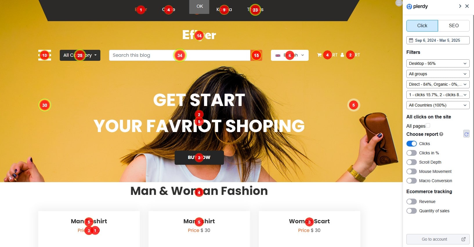
- ✅ Click Activity – See where users click the most (or completely ignore). Plerdy’s Clicks report tracks every interaction on Shopify store elements, updating clicks dynamically as you scroll.
- ✅ Clicks in % – Divides the page into five equal sections, ensuring hidden clicks in dynamic elements don’t go unnoticed.
- ✅ Scroll Depth – Find out how far visitors actually scroll before bouncing. This metric is split into ten equal parts to give you precise engagement insights.
- ✅ User Attention – Discover which areas catch the most engagement. Plerdy’s Staying a Mouse report maps cursor movements, helping identify what elements catch a visitor’s eye before they even click.
- ✅ Dead Zones – Identify sections that get zero interaction. With Macro Conversion tracking, you can pinpoint which elements Shopify customers click before making a purchase.
Plerdy’s Ecommerce Tracking takes it further. The Revenue report links user interactions to actual purchases, assigning sales value to elements. Want to know which section drives the most sales? The Quantity of Sales report shows exactly that.
Imagine knowing which “Buy Now” button or product image generates the most revenue—Plerdy’s heatmaps help you optimize your Shopify store with data-driven precision.
🛒 Optimizing Product Pages with Heatmaps
Your product page is the money page. If it doesn’t convert, your Shopify store is just an expensive hobby. Heatmaps help you:
- Refine CTA Placement: If users don’t click “Buy Now,” maybe it’s in the wrong spot. Move it higher, make it bigger, or change the color. Plerdy’s Clicks report tracks every interaction on Shopify store elements, updating clicks dynamically as users scroll.
- Fix Image & Description Layouts: If customers hover over product descriptions but don’t convert, maybe they need more trust signals like reviews. The Clicks in % report splits the page into five equal sections, ensuring hidden clicks in dynamic elements don’t go unnoticed.
- Spot Distractions: Are visitors clicking a random sidebar link instead of the checkout button? Time to clean up. Scroll Depth analysis reveals how far users go before bouncing, ensuring key content stays above the fold.
- Track User Attention: Plerdy’s Staying a Mouse report highlights where visitors move their cursor, showing which sections draw interest before actual clicks happen.
- Identify Pre-Purchase Behavior: The Macro Conversion report pinpoints which elements customers interact with before buying. Want to know which section drives the most revenue? The Revenue and Quantity of Sales reports connect user actions to actual sales, giving Shopify merchants precise insights to optimize their store.
💡 Example: An online jewelry store saw a 15% increase in conversions after using heatmaps to move their “Add to Cart” button above the fold.
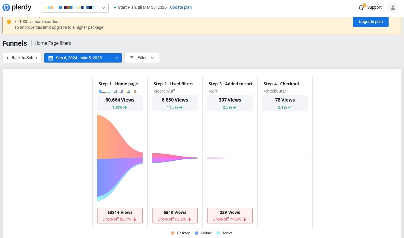
🚀 Shopify Checkout Funnel: Where Do Shoppers Drop Off?
The checkout process should be smooth as butter. But guess what? 70% of online shopping carts get abandoned. That’s a lot of lost revenue!
Heatmaps pinpoint the exact step where people leave. Maybe they hesitate at shipping costs? Or struggle with a clunky form? With Plerdy’s funnel analysis, you can track every interaction and refine the checkout journey.
How to Fix It with Plerdy:
- Define the First Step – Select a landing page where users arrive from traffic sources. Shopify category pages are a good start.
- Add a Second Step – Track user movement to a key page, like product listings that share a common segment in the URL (e.g., /product).
- Set the Final Goal – The last page should be unique, such as the “Thank You” page after a purchase.
With heatmaps and session replay, you’ll see where users hesitate. If rage clicks appear on a shipping fee section, it’s time to reconsider your pricing strategy. Every step matters, and Plerdy helps optimize each one.
📊 Heatmap Insights: A Quick Shopify Case Study
Let’s say you run a Shopify store selling sneakers. You notice high traffic but low sales. Using Plerdy’s heatmaps, you discover:
| Issue | What the Heatmap Shows | Fix |
|---|---|---|
| High bounce rate | Users leave after scrolling halfway | Improve headline, add trust signals |
| Low “Add to Cart” clicks | Visitors hover on images but don’t buy | Highlight benefits, tweak CTA color |
| Checkout abandonment | Users rage-click on shipping costs | Offer free shipping or show fees upfront |
Result? After fixing these issues, your store’s conversion rate jumps from 1.8% to 3.2%. That’s almost double the revenue without spending more on ads!
🔎 Heatmaps vs. Other Analytics Tools: Why They’re Essential
Google Analytics tells you how many people visit your store. But heatmaps show you what they actually do once they’re there.
- GA = Cold numbers (bounce rate, time on page).
- Heatmaps = Visual insights (user behavior, engagement).
This is why Shopify store owners use both. Data is great, but seeing it in action? Game-changer.
🎯 A/B Testing with Heatmaps: What Works Best?
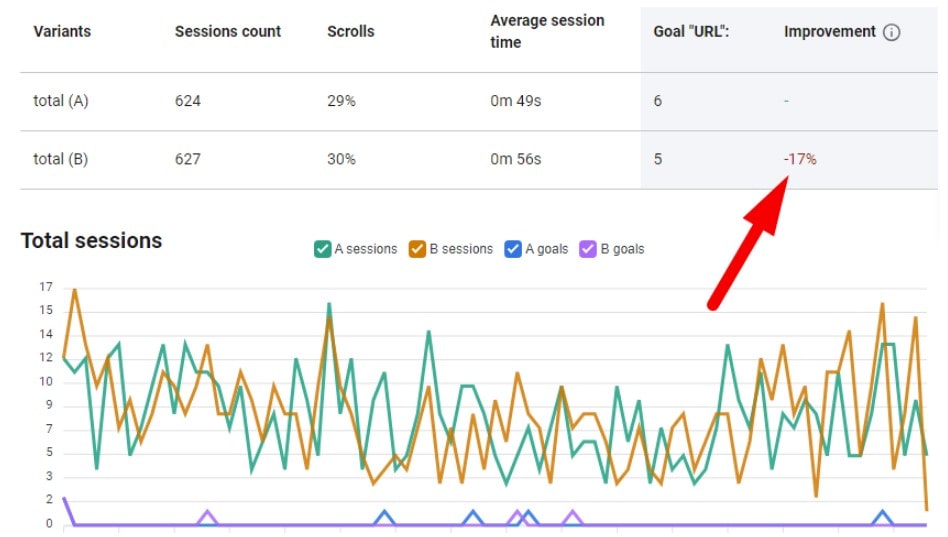
No more guessing games. Heatmaps help you test different versions of your Shopify store to see what actually converts. With Plerdy’s A/B Testing Tool, you can run unlimited tests without worrying about traffic limits or pageview restrictions. Unlike many other Shopify tools, Plerdy’s A/B testing allows you to experiment freely without additional costs.
Try changing:
- CTA Text: “Buy Now” vs. “Get Yours Today” – which drives more clicks?
- Pricing Display: Show full price or discount first?
- Product Image Placement: Left side or right side?
- Page Variations: Redirect users to a completely new URL for a different experience.
- Goal Tracking: Set conversion goals like checkout completions, button clicks, or product page interactions.
Plerdy’s heatmap analytics make A/B testing effortless—just track, tweak, and win. Plus, with real-time analytics and seamless GA4 integration, you get instant insights into which version of your Shopify store performs best.
🚀 Take Action: Start Using Heatmaps on Shopify
If you’re serious about boosting sales, you need heatmaps. Shopify has tons of apps, but Plerdy’s lightweight, no-lag heatmaps deliver the insights that actually increase conversions.
- Identify weak spots in your store layout.
- Optimize product pages for better engagement.
- Fix checkout friction to recover lost revenue.
💡 Try Plerdy’s heatmaps today and turn Shopify visitors into loyal buyers!