
Hey there! You’ve probably noticed that visitors don’t stay long on your website. You might think it’s your content that’s boring—but, honestly, it’s usually because your website navigation is as confusing as the instructions for assembling IKEA furniture. But don’t panic yet. Plerdy can help you fix this. Let’s dive in and make your website’s navigation smoother than ever!
Why Does Good Navigation Matter for Your Website?
Imagine your website is a supermarket. Would your customers stay if your shelves were a mess, the products scattered everywhere, and nobody could find the milk? Definitely no! Bad navigation on a website is the same as messy shelves. It makes visitors confused and frustrated. Actually, 88% of users leave the site if navigation is confusing. Yep, that’s a huge number. Your website visitors are impatient. They want clear paths to find what they’re looking for. Good navigation can help you:
- Boost your conversion rates (more money in your pocket!).
- Reduce bounce rates (because who likes to lose visitors?).
- Make visitors happy, so they keep coming back (return visitors are the best!).
So, navigation matters—a lot. Let’s see how you can easily make it better with Plerdy.
How to Use Plerdy Heatmaps to Improve Your Website Navigation
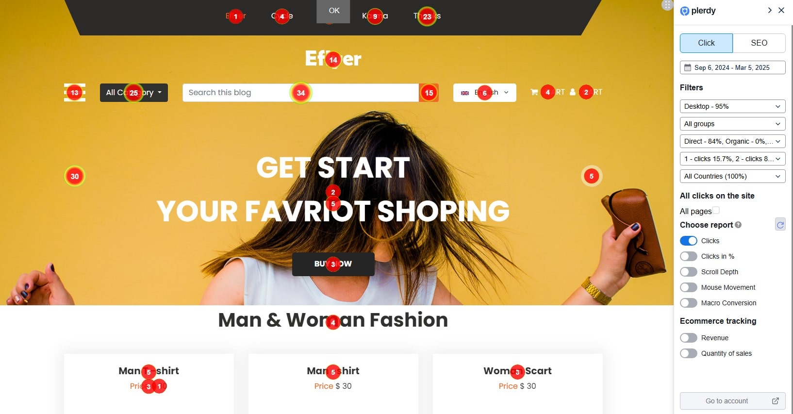
Heatmaps are probably the coolest tool in the Plerdy toolbox. They’re colorful, visual, and show you exactly what your visitors are doing on your website. Seriously, heatmaps are your secret spy!
With Plerdy heatmaps, you can check which buttons users actually click and what they completely ignore. Let’s say your CTA button is at the bottom of the page, but 80% of users never scroll that far—Plerdy heatmap will clearly show it. Move it up and watch your conversions soar! For example, a store selling sneakers (like Zappos) boosted their conversion rate by 35% just by moving the buy button to where visitors clicked the most.
Heatmaps from Plerdy give you:
- Click analysis (so you understand what users really want).
- Scroll depth analytics (know exactly how far users scroll down).
- Real-time data for immediate improvements (no guessing, just facts).
Plerdy heatmaps also come packed with other useful reports for making your website navigation clearer and more effective. For instance, the Scroll Depth report quickly shows how deep visitors actually scroll, letting you know if your top products or important content are hidden from view. Staying on mouse cursor movements, you’ll discover where visitors pause—sometimes the mouse moves nervously without clicking, and that’s your chance to rearrange content or CTA buttons. Macro Conversion reports help pinpoint which element visitors clicked right before purchasing something. Plus, with the Ecommerce analysis in Plerdy, you can clearly spot what part of your website generates the most revenue. This way, you don’t just guess—you’re backed by real numbers, showing exactly where the navigation needs tweaking. It’s like having your own navigation detective who finds all the weak points. Sounds cool, right? No more blind decisions, just simple improvements for higher conversions!
Plerdy’s Funnel Analysis for Better User Flow
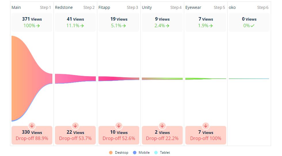
Ever been stuck in traffic for hours? Annoying, right? That’s how visitors feel on a poorly designed website funnel. With Plerdy’s Funnel Analysis, you can identify exactly where users are dropping off and why.
Let’s say you have an online clothing store. Users enter, browse products, add them to the cart, but suddenly leave at checkout. With Plerdy Funnel Analysis, you’ll quickly notice that maybe your payment page has too many unnecessary fields (nobody enjoys filling endless forms!). Simplify it, remove the unnecessary fields, and users won’t run away anymore.
Plerdy funnel tools will help you:
- Spot bottlenecks in navigation (why visitors get confused).
- Test changes immediately (fix problems on-the-go, not next month).
- Increase sales (because happy visitors spend more money!).
Companies like Booking improved their booking process by 25% just by optimizing their checkout funnel. And you can too!
Ever wondered exactly how your customers move across your website pages? With Plerdy’s Funnel Analysis, you can easily set up a step-by-step funnel to clearly see your user journey. First, pick a target landing page—usually the first page visitors land on from your marketing channels. Then add the next logical pages visitors should click through, like product listings or checkout pages. Finish with a confirmation page, such as “Thank You!”. Plerdy funnel analysis will instantly show if users skip a step or drop off entirely, meaning navigation might be unclear or confusing. Now you’ll know exactly where to adjust your website navigation for higher conversion rates and happier customers!
Website Session Replay: See Your Site Through Visitors’ Eyes
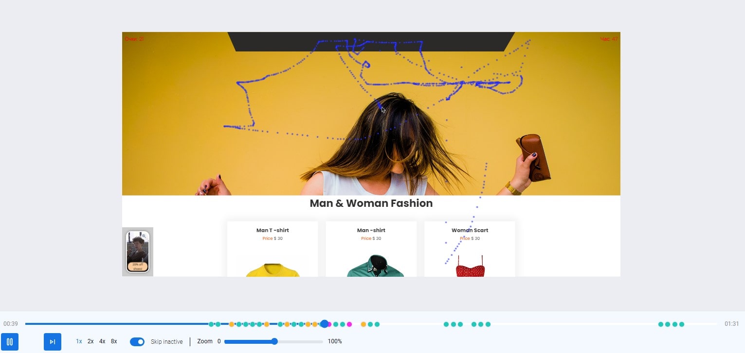
Have you ever wondered what visitors actually do on your website? With Plerdy’s Session Replay tool, you can literally watch their every move. Creepy? Maybe a bit, but super useful!
Session replay shows real user sessions, so you’ll notice exactly when visitors hesitate or get confused. For instance, imagine you’re selling subscriptions online, and customers hover nervously over your confusing pricing plan—maybe it’s time to simplify it. Amazon did this once, and guess what? They increased sign-ups by nearly 20%.
Plerdy’s Session Replay features let you see:
- How users really interact with navigation elements (menus, buttons, links).
- Where confusion happens (like complicated menus nobody understands).
- Easy ways to make navigation simpler and intuitive (happy user = more money!).
Plerdy’s Session Replay also makes analyzing website navigation even simpler by allowing you to easily sort videos according to micro-goals, for example, clicks on “Add to Cart.” Quickly find out why some visitors abandon the checkout process early, or why they repeatedly hesitate on certain navigation elements. With Plerdy, you can also integrate user IDs from your CRM system to closely watch individual customer journeys. Don’t forget—Plerdy’s smart privacy settings mask sensitive input fields, but if you need to track specific fields, like search boxes, it’s easy to configure. This ensures your navigation stays intuitive and efficient, encouraging users to smoothly flow through your website’s conversion paths.
Using Pop-Ups Wisely (No, They’re Not Always Annoying!)
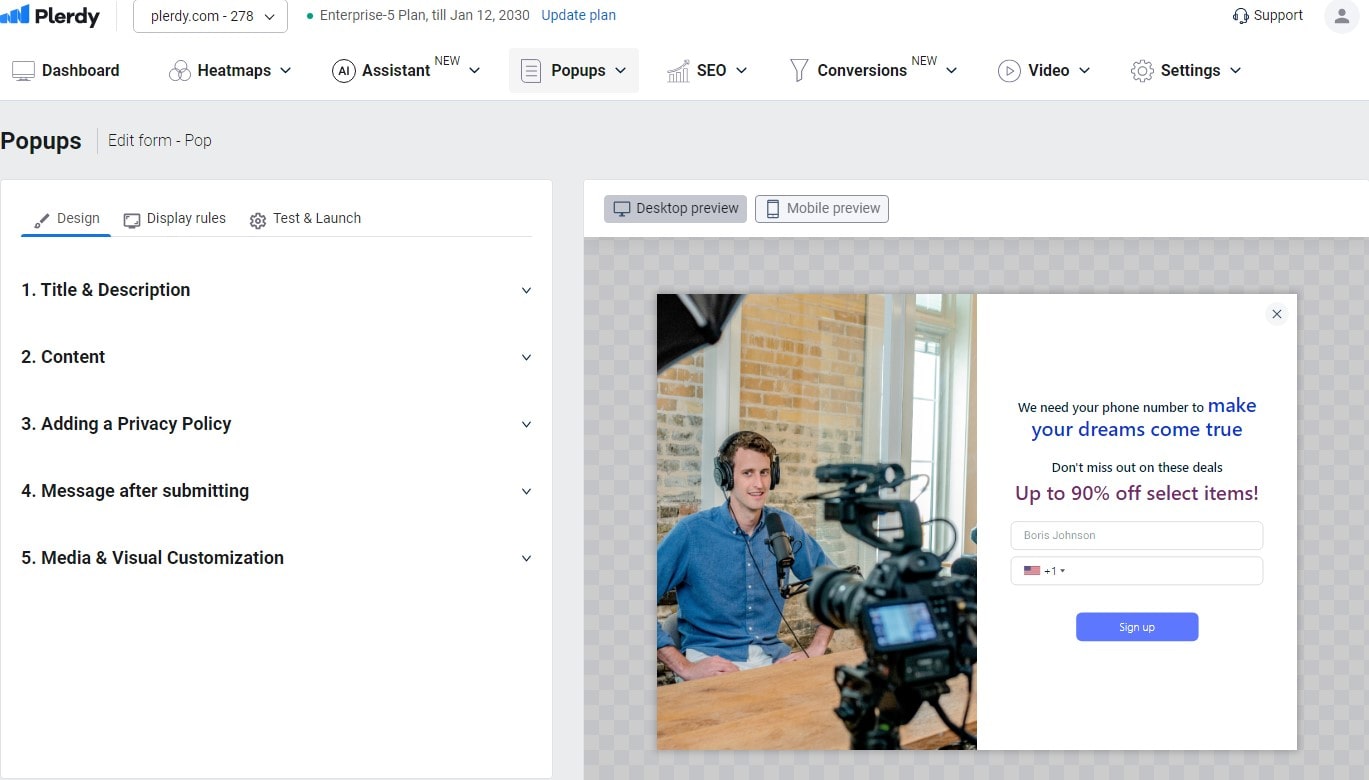
Pop-ups have a bad reputation, but used correctly, they’re a magic wand. With Plerdy’s Pop-up Software, you can guide visitors gently through your website, keeping them engaged and leading them exactly where you want them to go.
Think about a visitor who spent 2 minutes reading your article about gardening tools. A helpful pop-up suggesting related products with a 10% discount coupon can easily turn a casual reader into a happy customer. And don’t worry—Plerdy pop-ups are smart; they appear only when visitors need them.
For example, companies like Shopify use pop-ups cleverly to recover around 15% of abandoned carts. So don’t underestimate pop-ups. They’re your website’s little helpers!
Plerdy’s pop-up forms can seriously improve website navigation and boost engagement, too. With Lead Generation pop-ups, you’ll easily collect visitor emails in exchange for something valuable—a useful checklist, guide, or discount. Promotional pop-ups show your visitors exciting deals or special offers they’d otherwise miss—boosting sales and keeping your visitors happy. Feedback pop-ups help you quickly discover navigation or usability problems directly from your visitors themselves. You’ll instantly see where your website might frustrate users. And don’t forget Engagement pop-ups—you can add short, engaging videos to announce webinars or product launches, adding a personal touch that visitors love. Custom forms let you design exactly the fields you want, perfect for collecting user-specific info.
Quick Tips to Instantly Boost Your Website Navigation Using Plerdy:
- Simplify menus: Use heatmaps to see which menu items visitors rarely click and remove them.
- Fix broken links: Plerdy’s SEO Checker quickly detects navigation links leading nowhere.
- Personalize: Use pop-ups based on the user’s behavior (if they stay longer, offer them a discount!).
- A/B test: Plerdy’s A/B Testing Tool helps you see exactly which navigation elements improve your user flow.
Just small adjustments can improve user experience by up to 50%. Not bad, right?
Why Plerdy is Your Go-to Tool for Website Navigation
Look, managing your website’s navigation without a proper tool is tricky—like trying to assemble furniture without instructions. Sure, you could do it, but you’ll waste lots of time and nerves. Plerdy gives you clear insights into user behavior, so no more guessing games!
From heatmaps and session replays to funnels and pop-ups, Plerdy combines all tools you need to make your website a joy to navigate. Remember, a happy visitor today is a loyal customer tomorrow!
Ready to try it out? Give Plerdy a spin—you won’t regret it.