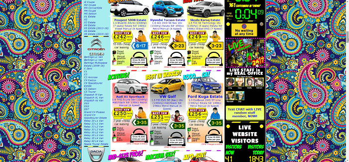
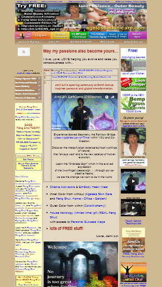
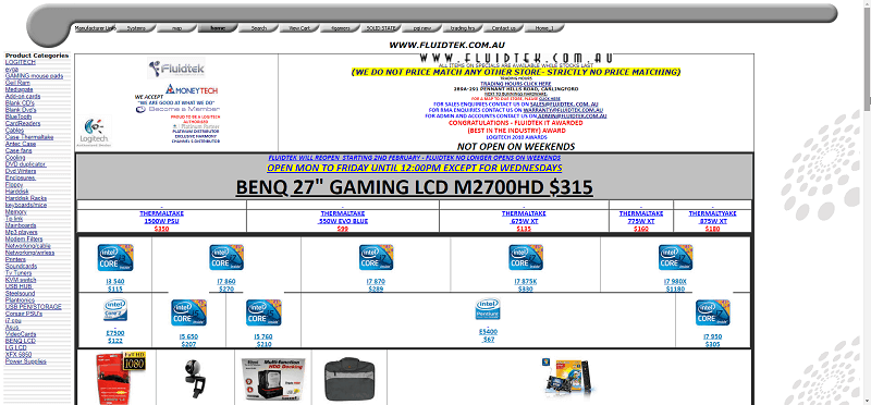
Ease of use is one of the factors that affect website conversion. Whereas traffic demonstrates whether users are interested in a website, usability shows whether the design is clear. Obviously, the quality of a website design isn’t limited to its technical characteristics. Visitors who understand the design are more willing to place an order or leave their contact details.
The first impression is 94% formed by its interface, while trust depends on the look by 75%.
The majority of usability mistakes have been studied long ago. Nevertheless, numerous websites still ignore basic design demands. They often try to explain low sales by external factors and much less often pay attention to the behavior of users on their site.
Usability Testing: Website Tips and Examples:
What is online store usability about?

Internet users more and more often buy from smartphones. It is no wonder that Google first tested and now fully implemented mobile-first indexing. Responsive layout is an extremely crucial factor for website usability.

From the brand development perspective, your website should be easy to remember. That’s why you need a unique and appealing design. Therefore it’s better to create an individual logo and select a color scheme. Unfortunately, many websites don’t take branding seriously, even though uniqueness affects their recognizability.
Based on the evaluation provided by Roger Pressman in his book “Software Engineering”, $1 invested in UX returns $10 to $100. The work with an interface is closely connected with the understanding of loyalty metrics and user retention. When users look at your website, emotions are directly linked to their further actions (going to the next page or closing your website).
Well-organized navigation
Developing a website, make sure to work on its structure. For example, most online stores have several thousands of pages of product categories and subcategories.

50% of visitors that landed on a website via referral pages use the navigation to find their way.
It’s not only about a search bar but also about a convenient and clear menu.
Tips are also a great solution. A hint maybe really helpful when a user sees an element for the first time and doesn’t know what to do.
Visitors of online stores don’t like spending a lot of time on the search. Instead, a potential buyer should quickly get to a product page. Some experts insist on the three-click rule, which states that an optimum website structure must allow you to get anywhere with no more than 3 clicks.
In reality, everything is a bit different. Users don’t care about the number of clicks.
Content quality
Clicking a link in search results, users want to see an answer to their request. In this case, you should take into account that content has a superpower of convincing and selling. When you show that you are an expert, have a deep understanding of customer needs and use professional vocabulary, you get users’ trust. Until users make a purchase, everything they think about you depends on the content.
Tips on content
- Use clear and correct page titles. They are shown in search results and tell users which page they are currently browsing.
- Important ideas and thoughts must be in headings (H1) and section titles (H2, H3 tags, etc.). Divide text into several sections and start each new thought with a new paragraph.
- Use convenient typography (font, typeface, size, line spacing, etc.). The visual presentation of text is one of the most powerful web design tools.
- If possible, use lists (numbered and unnumbered). Lists contain concise information and therefore are easier to read.
- Remember about the F-pattern of reading. Most Internet users perceive information from left to right and from top to bottom. Always put important information in the top left corner.
A text should be interesting to visitors and nudge them into target actions (newsletter subscription, callback, etc.) to increase conversion.
Some online stores don’t have descriptions on their product pages. This gives a competitive edge to other, more scrupulous websites. You can always add low competition keywords in small 500-1000 word texts, which are important for SEO and usability since users can learn more about the product.
Talking of content, we have to say a few words about images. First, it’s not a secret that high-quality images are a must-have for sales.
Contact details
If you want to increase conversion, put your contact information in plain sight of the website. Contact details should be readable and attract attention. Usually, they are placed in a header or a separate block on the left or right side.
According to the research by Huff Industrial Marketing, KoMarketing, & BuyerZone, 64% of visitors would like to see contact details on a website. Moreover, 44% of users will leave if a page doesn’t have contact info.
Organize newsletter subscriptions to inform customers about new arrivals. Promotions, bonuses, and discounts also have a positive impact on conversion. Additionally, it would help if you displayed separate blocks with similar or new products. Finally, post useful articles related to a website’s subject, as they effectively attract the target audience’s attention.
Technical condition
Don’t forget about the technical part (load speed, working links, etc.). A visually nice but technically not optimized website is doomed to a high bounce rate.
The research shows that 40% of users leave websites that load longer than 3 seconds.
Conversion increase depends not so much on the volume of traffic as on the ease of use of an online platform. A website is a business card of a company on the web. Its condition forms the impression of your trademark.
Conclusion
In a competitive environment, usability is one of the crucial requirements for a website. Therefore, to improve UX/UI, you need to allocate time and resources. To make your site more convenient, pay attention to the quality of its design, text and graphic content, structure, navigation, and technical issues.
As you are getting more competitors, usability becomes more important. If users are satisfied with the condition and content, most probably, they will make a purchase. Even if they don’t buy during the first visit, they will return thanks to a nice impression the website left.
