
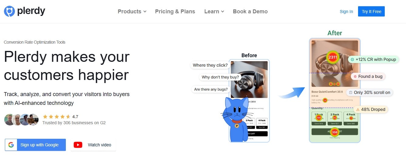
User Experience (UX) isn’t just about making things look pretty—it’s about crafting experiences that feel effortless, intuitive, and engaging. A single frustrating click can send users running to competitors. That’s why every UX designer needs a powerhouse tool that delivers real user behavior insights. Enter Plerdy — a game-changer in the UX world, offering deep analytics, heatmaps, and behavior tracking without drowning you in meaningless data.
But how exactly can UX designers squeeze every drop of value out of Plerdy? Let’s break it down.
Why UX Designers Need More Than Gut Feelings
You can have the best design instincts in the world, but without real user data, you’re flying blind. Plerdy reveals how users actually interact with a website, helping designers make informed, strategic decisions instead of relying on assumptions.
Consider this: 88% of online users say they won’t return to a website after a bad experience. If users struggle with navigation, unclear CTAs, or confusing layouts, you need to spot those roadblocks fast—before they impact conversions.
Plerdy equips UX designers with heatmaps, session recordings, event tracking, and form analytics, giving a clear picture of what’s working and what’s killing engagement.
Unleashing Plerdy’s Power for UX Optimization
Not all UX insights are created equal. Some tools overwhelm you with raw data that require hours of analysis. Plerdy makes insight extraction effortless, so you can focus on fixing rather than just analyzing.
1. Heatmaps: Seeing Beyond Clicks
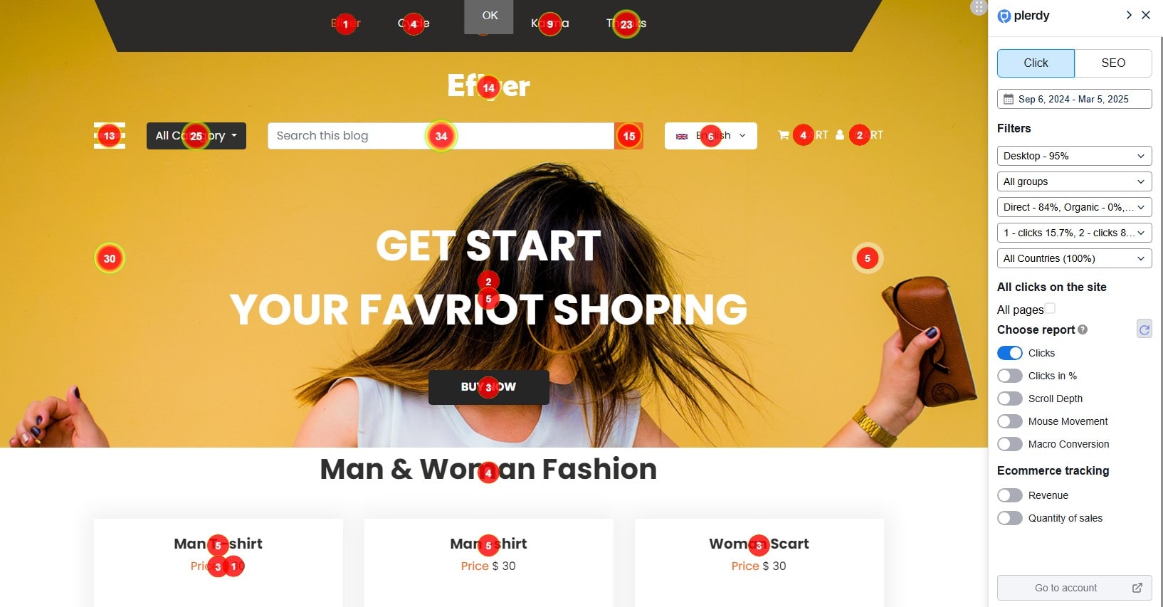
Heatmaps aren’t just about pretty colors—they tell the story of how users interact with a page.
With Plerdy’s click, scroll, and move heatmaps, UX designers can:
- Identify dead zones where users don’t click—wasted space means wasted potential.
- Spot areas of high engagement, ensuring critical elements (like CTAs) are in the right place.
- Track how far users scroll before they bounce. If 70% of visitors drop off before reaching key content, it’s a sign of layout issues.
Example? A SaaS company found that only 12% of users reached their sign-up button because it was buried in a long page. A small tweak—moving it above the fold—boosted conversions by 37%!
2. Session Recordings: The Closest Thing to Mind-Reading
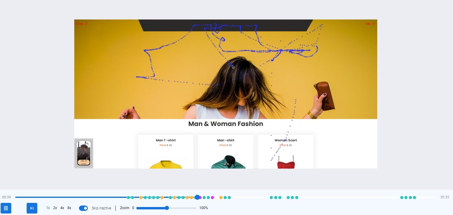
Ever wish you could watch users navigate your site in real time? Session recordings are the next best thing.
Plerdy lets UX designers:
- See exactly where users hesitate, rage-click, or abandon tasks.
- Detect confusing layouts and broken interactions that might not show up in standard analytics.
- Understand why users drop off before completing a form or checkout process.
Example? An eCommerce store noticed users repeatedly clicking an image, thinking it was a button. By simply adding a label, they cut drop-off rates by 29% in that step.
3. AI UX Assistant: Smarter UX Optimization for SaaS Companies
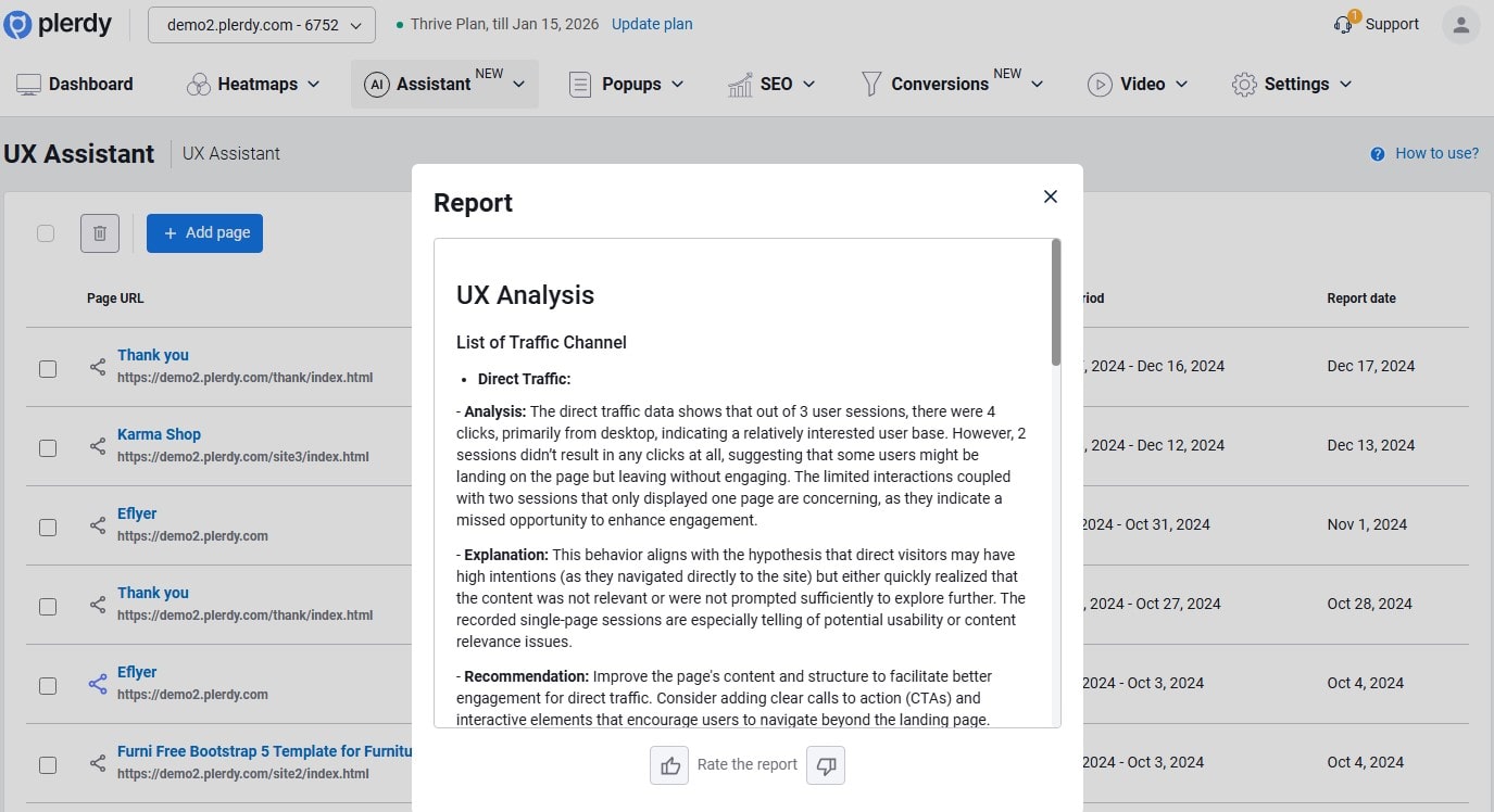
Forget guesswork—Plerdy’s AI UX Assistant is here to decode user behavior and help SaaS companies optimize their digital experiences effortlessly. Instead of drowning in raw data, this tool transforms complex analytics into clear, actionable insights that actually improve website performance.
The process is simple:
- Select a URL with over 100 sessions to ensure data accuracy.
- Head to Assistant > UX, click Add Page, and pick the date range, device, language, and URL.
- Generate a comprehensive report that highlights usability strengths and weak points.
- Share findings with your team or agency for collaborative UX improvements.
Why does it matter? Because poor UX kills conversions. If users struggle to navigate your site or engage with content, they leave—fast. Plerdy’s AI-powered analysis pinpoints exactly where friction happens by integrating heatmaps, session replays, and behavioral tracking.
With AI-generated UX reports, SaaS companies can streamline decision-making, avoid costly design mistakes, and improve key engagement metrics. No more hunches—just data-driven strategies that boost CRO and user satisfaction.
Want an optimized site without the headaches? Try Plerdy’s AI UX Assistant and make every click count.
Data-Driven UX Tweaks That Pay Off
Seeing patterns in user behavior is one thing—making data-backed changes is where the magic happens.
| UX Issue | Plerdy Insight | Solution |
|---|---|---|
| High bounce rate | Heatmaps show users aren’t scrolling far | Move key content above the fold |
| Low form completion | Form analytics show drop-offs at specific fields | Simplify the form or enable auto-fill |
| Confusing navigation | Session recordings reveal users getting stuck | Improve menu structure and labels |
| CTA ignored | Click heatmaps show lack of engagement | Make the button stand out with contrasting color |
With Plerdy, UX designers don’t just guess—they test, tweak, and win.
How Plerdy Stands Out from the Competition
Sure, there are other UX tools—Google Analytics, Hotjar, Crazy Egg—but here’s where Plerdy pulls ahead:
- Real-time data – No waiting for reports; get instant insights.
- Event tracking without coding – Unlike Google Analytics, no setup headaches.
- Deep form analytics – Most tools ignore this, but Plerdy helps fix conversion-killing forms.
- SEO & UX combo – It’s not just about clicks; Plerdy helps with site performance and user experience together.
A/B testing, session recordings, heatmaps, all under one roof.
Actionable UX Strategies Using Plerdy
Now that you know what Plerdy can do, here’s how to put it to work:
1. Test Before Launching
Launching a new design? Test it first! Set up heatmaps and session recordings to catch issues early before they frustrate real users.
2. Optimize Landing Pages
- If a CTA isn’t getting clicks, A/B test button colors or wording.
- If users scroll but don’t convert, shorten the page or tweak messaging.
3. Reduce Shopping Cart Abandonment
- Use form analytics to spot which fields users hate.
- Use session recordings to see where they hesitate before checkout.
4. Improve Mobile UX
- Heatmaps show where mobile users tap versus desktop users.
- Adjust button sizes and layout based on actual user behavior, not assumptions.
FAQ: How UX Designers Can Gain Better User Experience Insights
Why should UX designers rely on data instead of intuition?
Even the most experienced designers can’t predict user behavior with complete accuracy. Real user data—such as heatmaps, session recordings, and behavioral tracking—helps eliminate guesswork, ensuring that design decisions are based on actual user interactions rather than assumptions.
How do heatmaps improve UX design?
Heatmaps show where users click, scroll, and move their cursors, highlighting dead zones, navigation friction, and engagement hotspots. If key elements like CTAs are being ignored, heatmaps provide clear insights for repositioning them to maximize conversions.
What makes session recordings valuable for user experience improvements?
By watching real user interactions, designers can see where visitors hesitate, rage-click, or abandon tasks. This helps identify confusing layouts, misleading elements, or technical issues that might not be obvious in static analytics.
How does Plerdy’s AI UX Assistant enhance website optimization?
Plerdy’s AI UX Assistant simplifies UX analysis by generating automatic reports on usability strengths and weaknesses. Instead of spending hours analyzing raw data, designers get instant, actionable insights to refine UI elements, improve navigation, and enhance overall user satisfaction.
Can UX insights help optimize mobile user experience?
Absolutely. Mobile users interact with websites differently than desktop users, often facing navigation issues due to touch interactions. Heatmaps and session recordings reveal these patterns, allowing designers to adjust layouts, button sizes, and content placement for a seamless mobile experience.
Final Thoughts: Get Smarter UX with Plerdy
UX isn’t about making things look nice—it’s about making them work seamlessly. Plerdy is the tool that turns UX design into a science rather than a guessing game.
If you’re ready to ditch assumptions and make data-driven decisions, Plerdy is your secret weapon. Get those insights, fix what’s broken, and create experiences users won’t just tolerate—they’ll love.
Ready to see where users struggle on your site? Try Plerdy today and start making UX decisions based on real data.