
Ever landed on a website and immediately felt lost? Maybe the menu was a maze, or the buttons seemed like they were placed by a toddler experimenting with web design. Bad UX (User Experience) kills conversions, frustrates users, and makes them flee faster than a free-trial signup page asking for credit card details. But fear not—Plerdy’s UX features are here to save the day!
From heatmaps that reveal user behavior to intuitive funnel tracking, Plerdy provides powerful tools to optimize website navigation and improve user flow. Let’s break it down and see how Plerdy turns frustrating websites into smooth, high-converting experiences.
Why UX and Website Navigation Matter
Let’s get one thing straight—if your website feels like an escape room without clues, visitors will leave. Fast.
- 88% of online consumers say they won’t return to a site after a bad experience (source: Amazon Web Services).
- 53% of mobile users abandon a site if it takes longer than three seconds to load (source: Google).
- Good UX design can increase conversions by up to 400% (source: Forrester Research).
User flow and navigation are the backbone of a website’s success. Plerdy’s UX tools don’t just highlight issues—they help you fix them before visitors click away.
Plerdy’s UX Tools: The Secret Sauce for Seamless Navigation
1. Heatmaps: See What Users Actually Do
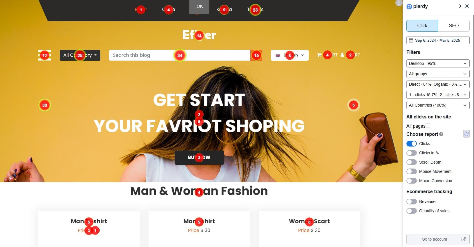
Ever wondered why your high-converting CTA button isn’t getting clicks? Plerdy’s heatmaps show you exactly where users are clicking, scrolling, and hovering. But it’s not just about seeing red blobs on a page—Plerdy provides detailed heatmap reports that break down user interactions at every level.
- Clicks Report: Displays exact click counts per element. As you scroll down the report, clicks appear dynamically within 1-2 seconds, ensuring real-time insights.
- Clicks in %: If dynamic elements hide clicks, this report divides the page into five equal sections to reveal hidden interactions.
- Scroll Depth: Not all users scroll to the bottom. Plerdy divides each page into 10 equal parts, showing how far users actually go before they bounce.
- Mouse Movement: Some users hover over important elements without clicking. Plerdy tracks these micro-movements, helping you optimize visibility.
- Macro Conversion Tracking: Identify which elements users click right before making a purchase—critical data for boosting conversions.
Imagine this: You place your main “Buy Now” button in the top-right corner. But Plerdy’s heatmap reveals that most visitors are ignoring it and instead focusing on an unrelated image below. With this insight, you move the button to the center, and boom—your conversion rate jumps by 27%.
🔍 Pro Tip: Use heatmaps to analyze user behavior before making drastic design changes. A simple tweak—like repositioning a CTA or optimizing a product image—can mean the difference between engagement and abandonment.
2. Session Replay: Watching Real User Journeys
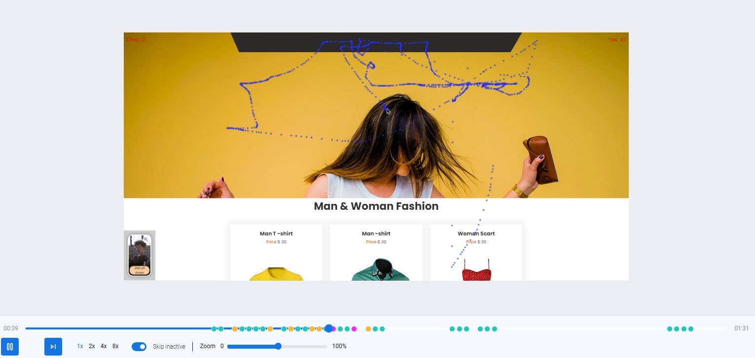
Numbers tell one story, but watching how users interact with your website tells another. Plerdy’s session replay feature records real visitor interactions, showing you where they hesitate, struggle, or rage-click.
To start, you need to enable session recording and set up rules for capturing video sessions. Plerdy allows you to record sessions for all website pages or specific ones. You can even filter sessions by country, device, or session length, ensuring only relevant data is stored.
For deeper insights, micro-conversion tracking helps you pinpoint specific actions, like users clicking the “Add to Cart” button. This makes it easy to find all videos where customers reached this step but didn’t complete their purchase.
Plerdy also respects user privacy—any input fields in forms are automatically masked. However, if you need to analyze search field inputs, you can adjust settings to reveal this data.
🔍 Pro Tip: Use session replay to investigate why some sessions are too short (users bouncing immediately) and analyze longer sessions to spot frustration points or UX flaws. With sorting options and event filters, you can quickly find recordings that reveal the biggest conversion blockers.
3. Conversion Funnels: Pinpoint Where Users Drop Off
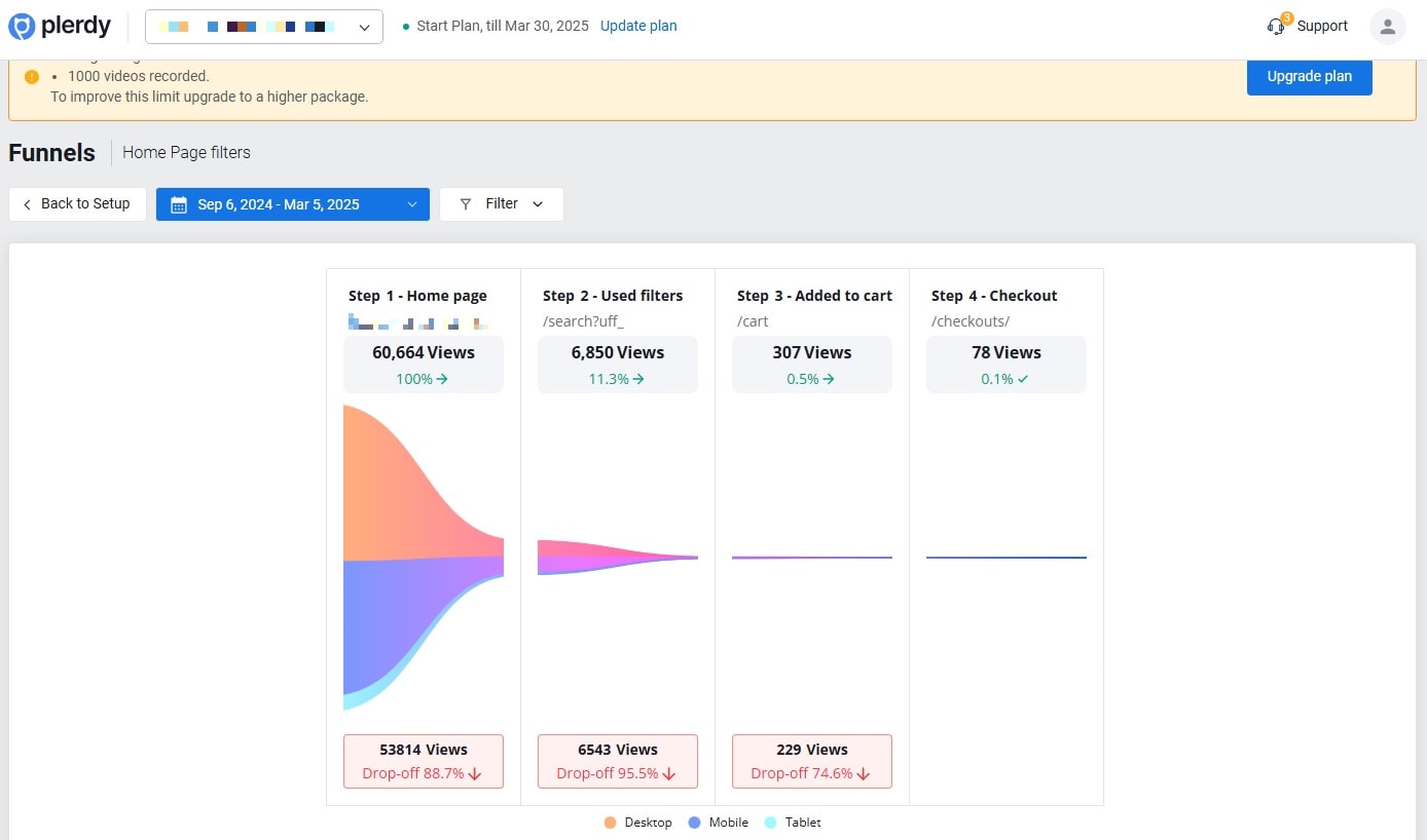
A funnel without a bottom is just a tube, and a website without a conversion-optimized user flow is just wasted potential. Plerdy’s conversion funnel tracking helps you identify the exact stage where users are dropping off.
To build an effective website funnel, follow these steps:
- Select the entry page – This is the first step where users land from various traffic channels. For example, an eCommerce store might use a category page as the first step.
- Define the next step – This could be a product page or a specific category with items sharing a similar segment in the URL, like “product”.
- Set the final step – The ultimate goal is conversion. For an eCommerce website, this might be the “Thank You” page after completing a purchase.
Each funnel step must be unique—if a step repeats or overlaps, tracking will be inaccurate. With Plerdy’s funnel analysis, you can also segment data by traffic source, device, and user behavior, identifying where users abandon the process.
Consider this:
- 1,000 people land on your homepage
- 500 move to the product page
- 150 add an item to the cart
- Only 25 complete the purchase
🔍 Pro Tip: Use Plerdy’s session replays alongside funnel tracking to understand why visitors exit. Analyze clicks, scrolling depth, and interactions to pinpoint weak spots in the user journey.
How Plerdy Stacks Up Against Other UX Tools
Let’s do a quick comparison of how Plerdy performs compared to other popular UX tools like Hotjar and Crazy Egg.
| Feature | Plerdy | Hotjar | Crazy Egg |
|---|---|---|---|
| Heatmaps | ✅ Yes | ✅ Yes | ✅ Yes |
| Session Replay | ✅ Yes | ✅ Yes | ✅ Yes |
| Conversion Funnels | ✅ Yes | ✅ Yes | ❌ No |
| SEO Analytics | ✅ Yes | ❌ No | ❌ No |
| Real-time Tracking | ✅ Yes | ❌ No | ❌ No |
| Pricing | Affordable | Expensive | Mid-range |
Plerdy not only matches competitors but also offers extra features that improve website UX without breaking the bank.
The Practical UX Fixes You Can Implement Today
Now that we know what Plerdy can do, let’s talk about some actionable UX fixes you can make today to improve website navigation and user flow.
🔥 Simplify Your Navigation Menu
Nobody likes an overcomplicated menu with 20+ options. Keep it simple—stick to 5-7 key categories and use clear labels.
Plerdy Fix: Analyze heatmap data to see which menu items get ignored. Remove the unnecessary ones.
💨 Optimize Load Speed
A slow website is a dead website. 47% of consumers expect a page to load in under two seconds.
Plerdy Fix: Use real-time tracking to see how loading speed affects user behavior.
🖱 Improve CTA Placement
Your CTA buttons should be big, bold, and impossible to miss. Don’t bury them under walls of text.
Plerdy Fix: Use heatmaps to check whether users are seeing (and clicking) your CTAs.
👀 Make Forms User-Friendly
Ever abandoned a form because it was too long? You’re not alone—67% of users leave forms that ask for unnecessary details.
Plerdy Fix: Analyze form interactions to remove unnecessary fields and boost completion rates.
Conclusion: A Better UX = A More Profitable Website
A confusing website isn’t just frustrating—it’s expensive. Lost users mean lost revenue, and in today’s competitive digital world, businesses can’t afford to ignore UX.
Plerdy provides heatmaps, session replays, funnel analysis, and real-time tracking to uncover and fix user experience issues before they cost you conversions. Whether you’re a small business or an enterprise, making data-driven UX improvements with Plerdy can lead to higher engagement, happier users, and more sales.
So, what’s next? Try Plerdy’s UX features and see how even small changes can transform your website from “meh” to money-making machine!