Ever considered the extent to which connections define your internet experience? From one page to another with simply a click, they are the silent heroes of the internet leading you. Linkages are the glue keeping the whole internet together, not only for navigation. Link design has changed over time; from simple blue underlining on first Google pages to today’s elegant designs on websites like Airbnb.
Why does this matter? A well-designed hyperlink addresses usability, accessibility, and even SEO, not only looks. Good links ultimately are functional, transparent, and user-friendly—not spectacular. All set to explore their development? Let us go!
Value of Thoughtfully Designed Hyperlinks
User Experience and Accessibility
Click a link once and find yourself lost? Bad hyperlink design accomplishes is confuse people and slows them down. But a simple, well-crafted hyperlink? It guides you gently to your target like a traffic sign on a crowded highway. WCAG, or Web Content Accessibility Guidelines, state that links should be easily found and used. This yields underlining, color contrast, and unambiguous labels.
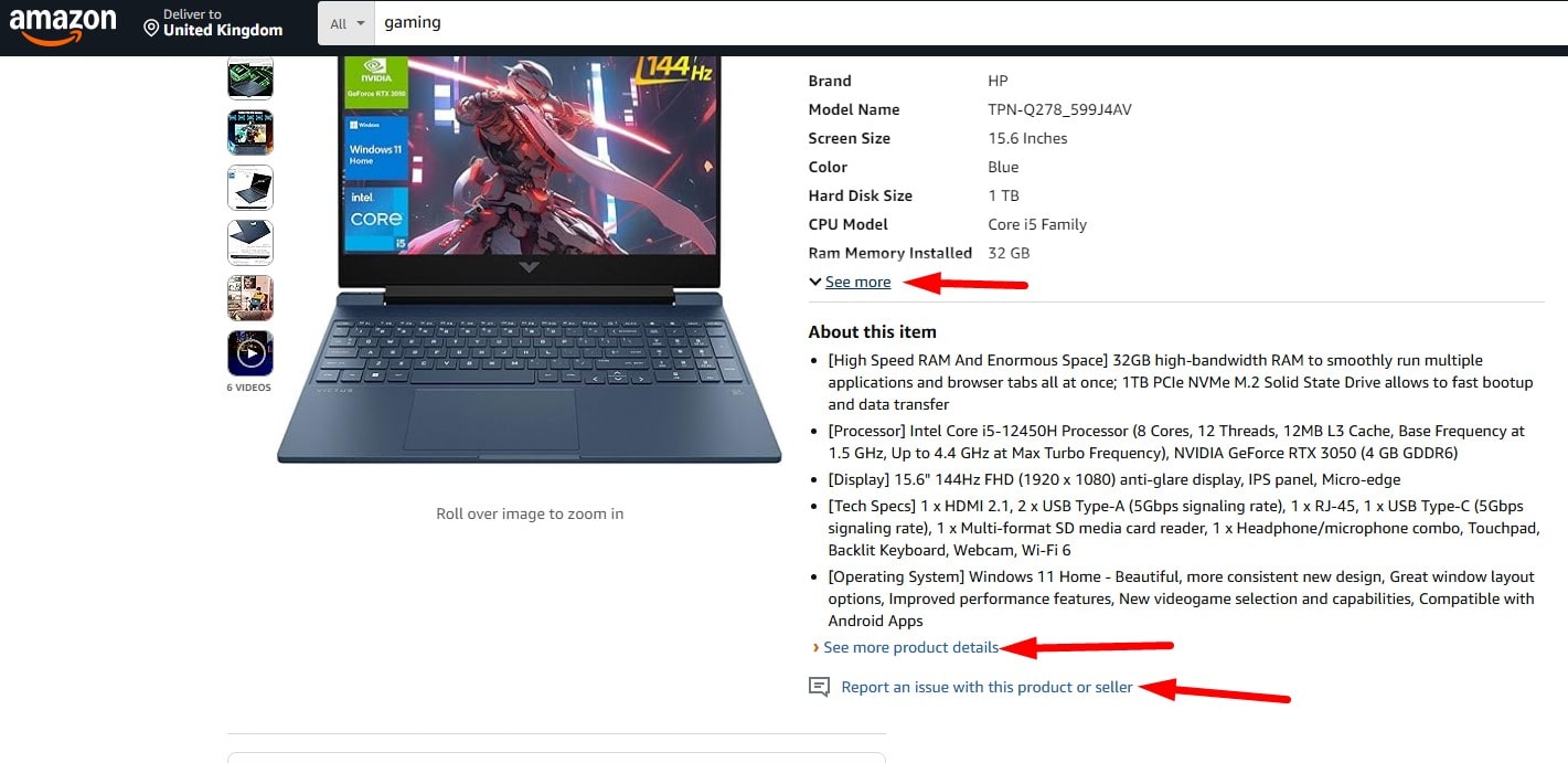
Say, for instance, that you are on Amazon. View details are shown in a bold, blue link. You are totally right about what to expect. Now consider it against ambiguous words like “Click here,”ugh, so annoying. Besides, accessibility depends on effective design. Screen readers are used by those with visual problems. They are mired in listening to “Link… link… link.” Without detailed links. frustrating, no?
Accessible hyperlinks are not only courteous but also vital. Whether they utilize assistive technology or a laptop, make every user welcome.
Engagement and SEO Advantages
Let us discuss how hyperlinks might improve the search engine optimization of your website. Those small links, you know, are more than just means of getting users from one website into another. For Google, they’re like gold. Descriptive anchor text—that is, “best SEO tools for 2025” rather than “read more”—helps search engines better grasp your material. This raises your ranking.
Still not everything, though. Well crafted links also keep users interested. Consider, for example, your browsing of HubSpot’s blog. You click a hyperlink pointing to another even more valuable article. You suddenly find yourself on their site spending ten more minutes. Retention functions in this way.
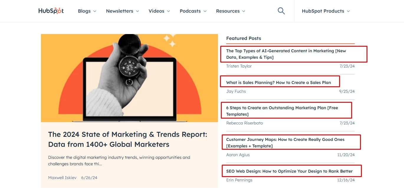
Internal links assist every page rank better by spreading link juice and strengthening site structure. Oh, and references? They are the best victory available. One link from Forbes could indicate a traffic surge—and perhaps some additional money if you run advertisements. You should hence not undervalue your hyperlinks. Though small, they are really strong!
Common Hyperlink Design Elements
Color and Contrast
Blue is almost a legacy for hyperlink design; it is not only a decision at will. Blue is still the most identifiable; a strong link color can lead users easily. But hyperlink design is about contrast as much as it is about choosing a pleasing color. Should your link not be particularly distinctive, users may completely overlook it. While AAA (7:1) takes access to the next level, WCAG’s AA contrast ratio of 4.5:1 guarantees links are easy to notice.
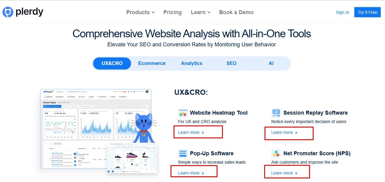
Not overlooked are color-blind users, over 8% of men find red and green difficult to see. Imagine planning a website where 50% of your audience finds it difficult to view your links. Plerdy’s heat map and other tools help you to see how good your hyperlink design is really. Basically, a badly visible link is a hurdle for users rather than only poor design. To build the trust (and clicks) of your guests, keep those links strong, clear, and easily available.
Underlining and Readability
Oh, the traditional underlined hyperlink. It’s not without problems, but it has existed since the start of the web. Underlining can tamper with reading, according to research by Nielsen Norman Group, particularly for letters like y, g, or p. Ever seen how they seem squashed? That design is not very good.
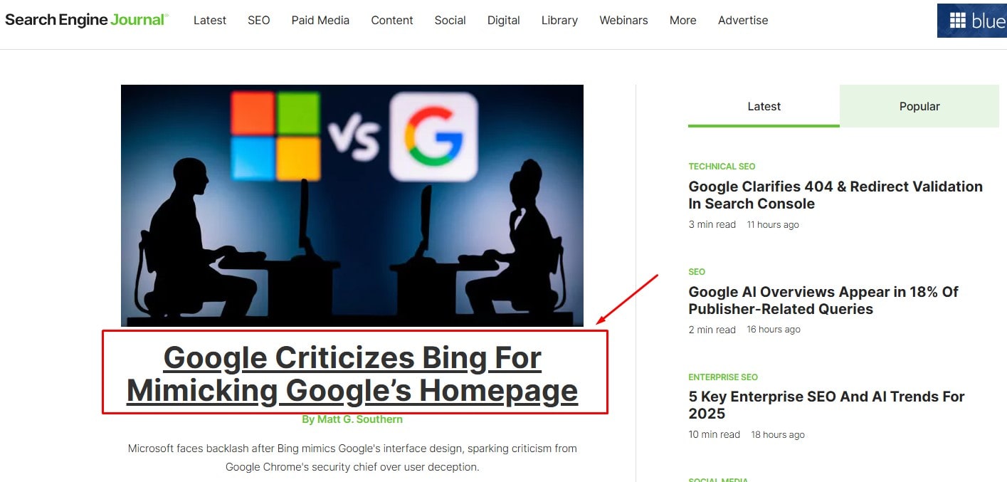
Still, underlining is still a fundamental strategy for establishing relationships clear-cut. Apple maintains it, but just for hover states; their design is slick and contemporary. Get your links to pop out without compromising readability. Try gentle backdrop colors, strong lettering, or perhaps a subdued shadow effect. The key to hyperlink design is balance—that is, making the links clear while yet maintaining readable language.
Hover and Focus States
Hyperlink design finds interactive expression in hover and concentration states. Imagine yourself on Amazon hovering over a link that changes color and perhaps gets underlined. That little adjustment comfort you; “Yes, this is clickable.” Trust is developed in design by the small details.
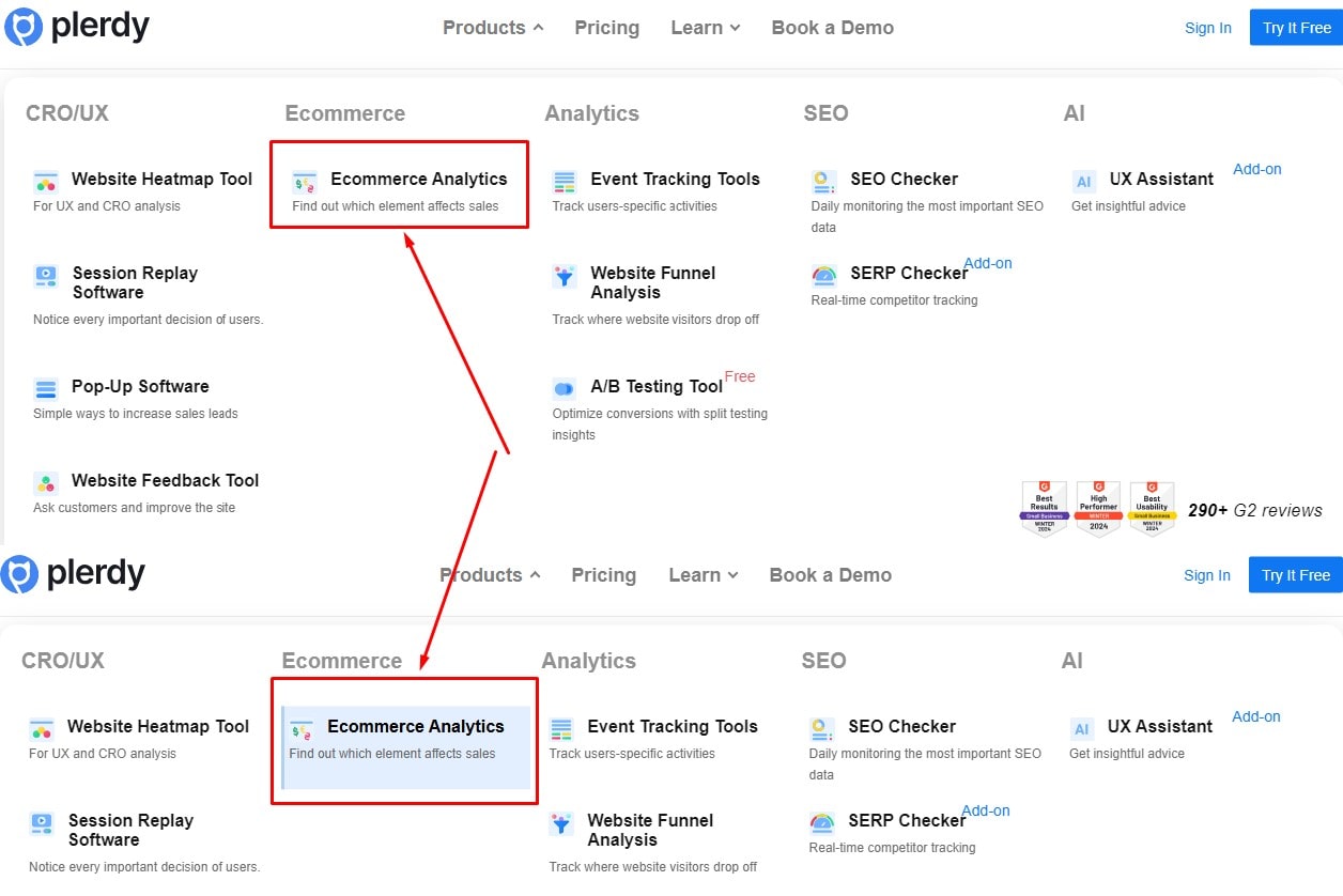
Focus now, though? They are the unheralded accessibility heroes. Users running across keyboards depend on them to know their position on the page. Is there no apparent focus state? You are leaving them behind. You shouldn’t gamble on it. Keep your design approachable by adding distinct outlines or color variations. Would you like your link design to be even better? Try a hover animation; just avoid overdoing it to slow down the site. Maintain simplicity, smoothness, and user friendliness.
Ideal Hyperlink Design Strategies
Meaningful Anchor Text
In hyperlink design, using meaningful, unambiguous anchor language changes everything. Consider yourself on a page where the link says “Click here.” Where click? With what? Right, confusing? Descriptive text, such “Explore Marketing Guide” or “Download Report,” provides consumers with immediate background. Before even clicking, they are aware of what they are entering into.
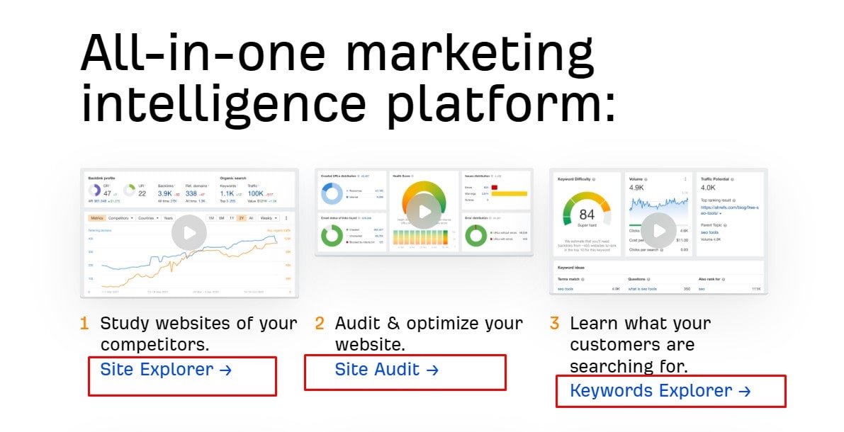
Furthermore, important anchor language clarifies the website content for search engines. Google, for instance, enjoys links including pertinent terms. It builds trust, not only about improved SEO. Links that seem clear and plain are more likely to be clicked upon by users. And who would prefer to lower bounce rates while raising user experience?
Remember, try not to obsess about it. Keep your work brief, neat, and pertinent. Phrases like “Read Case Study” or “Check Pricing Plans” perform far better than general terms. Good design is all about making people happier since better linkages imply such things.
Avoiding Link Overload
Ever come across a page bursting with hyperlinks you have no idea where to click? That’s link overload, and design as well as users suffer greatly from it. Many links packed into one area can overwhelm your visitors. Most likely, they will leave rather than click.
Group your links for a basic fix here. Assuming you own an internet store, arrange your links into categories such as “Product Categories,,” “Customer Reviews,,” or “Top Deals.” Clean design is pragmatic as well as beautiful. Link related items using bulleted lists; add secondary links in a sidebar.
Make your main call-to- action stand out as another recommendation. Give it time to breathe whether it’s “Sign Up for Free” or “Shop New Arrivals.” Good hyperlink design is more about bringing readers to the most crucial areas on your site free from distractions than about quantity. Keep it understated; your audience will appreciate it.
Modern Approaches to Hyperlink Visualization
Alternatives to Blue Underlines
To be really honest, blue underlining. Classic, although rather out of current. The hyperlink design of today is raising the standard. You have choices with more modern feeling and cleaner appearance. Ever tried emphasizing? It’s quite good for attracting attention without yelling click me! One further trend is bold text. Though subtle, it works magic for links within paragraphs.
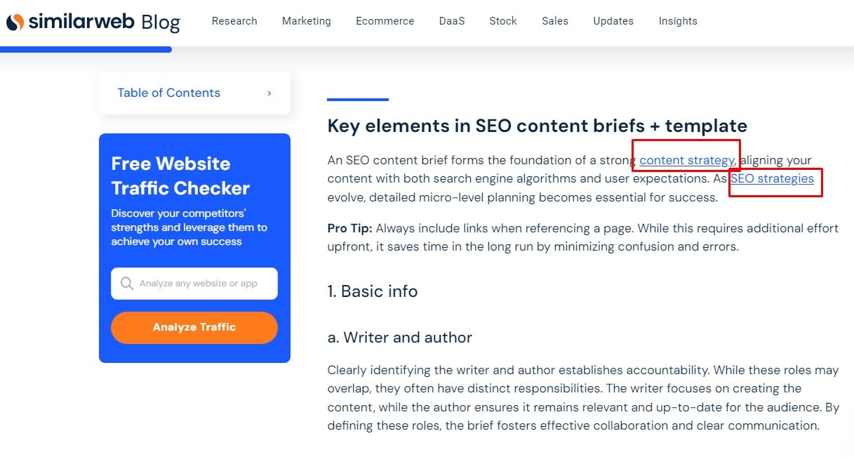
One other clever step is background shading. Websites like Medium show this, where hyperlinks naturally mix with the content and yet stand out. It comes all down to balance. The design should not divert but rather gently guide the user’s eye.
Don’t overlook accessibility either. Beautiful designs should not sacrifice utility. Stay with highly contrast ratio colors. Remember, about 8% of men are color-blind; so, neglecting this phase could offend a sizable portion of your audience. Though functional design is even better, cool design is fantastic.
Hyperlink Design from Mobile First
The fact is, mobile runs the internet these days. Mobile devices account for over fifty-five percent of web traffic. Hyperlink design must thus be thumb-friendly. Touch-friendly links? absolutely necessary. Pad links to prevent inadvertent clicks. Starting a rage-scroll and clicking the incorrect link is nothing worse.
Still another ploy? Consider the zone of the thumb. Since most users use one hand to operate phones, putting links within reach simplifies navigation. You want folks doing thumb yoga not only to click “Contact Us.”
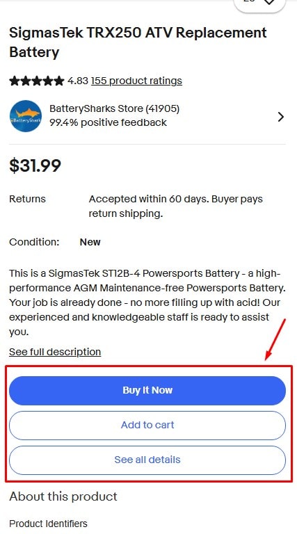
Even leading brands—Amazon, eBay—are failing with responsive designs. Should they make investments in mobile-first linking tactics, so should you. More conversions follow from happier users derived from better design. simple arithmetic, then?
Case Studies and Real-Life Examples
Minimalist Hyperlink Designs
Have you ever found Apple’s website to be almost soothing, clean? Their understated hyperlink style is quite important. Not clutter, not showy diversions; just elegant, useful connections. Apple guides consumers easily with subdued contrast and clean typefaces. Minimalism has beauty in that sense.
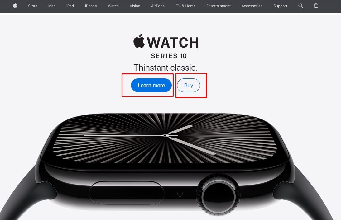
Another behemoth, Google, maintains things even more easy. Though the design relies more on usability, hyperlinks are just blue. It’s about getting you where you need to be friction-free, not only about appearances. Minimalism makes navigation clear, which is why consumers come back—often.
Studies reveal, in fact, that minimalist site designs increase user involvement by 25%. Thus, avoid the clutter if you want a contemporary, user-friendly website. Maintain functioning, clear, and clean hyperlinks. Less certainly is more.
Creative Hyperlink Styles
Your style isn’t minimalist? Not to worry; imagination sells too. Look at linked animated websites. Including Dropbox, for example. Their links sparkle when hovered to give some flair. It seems current, lighthearted, yet businesslike all at once.
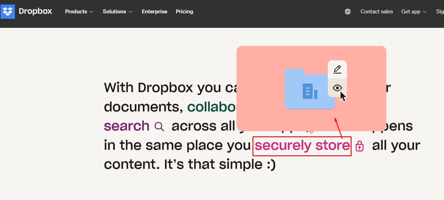
Certain designers even go so far. Consider dynamic effects—a hyperlink turning into an icon upon click. This looks great and enhances user input as well. By means of such strategies, Shopify guides consumers and lowers bounce rates by up to 30%.
Pro tip: keep from overdoing it. Though they are fantastic, creative hyperlink designs still need to complement the general layout of your website. Key is balance; be daring but keep pragmatic. Your readers will appreciate it.
Challenges in Hyperlink Design
The ideal hyperlink design requires a balancing act. Indeed, a slick design grabs attention, but it’s useless if the link breaks down. Imagine a hyperlink with extensive animations slowing page load times or one too small for consumers to view. That is detrimental for company, not only inconvenient.
One finds difficulty cracking the nut of accessibility. About eight percent of men are colorblind, did you know? Indicating URLs just using color could alienate these people. The fix is Stir it—use highlighting, strong text, or even icon-based layouts. Little changes that have great effect.
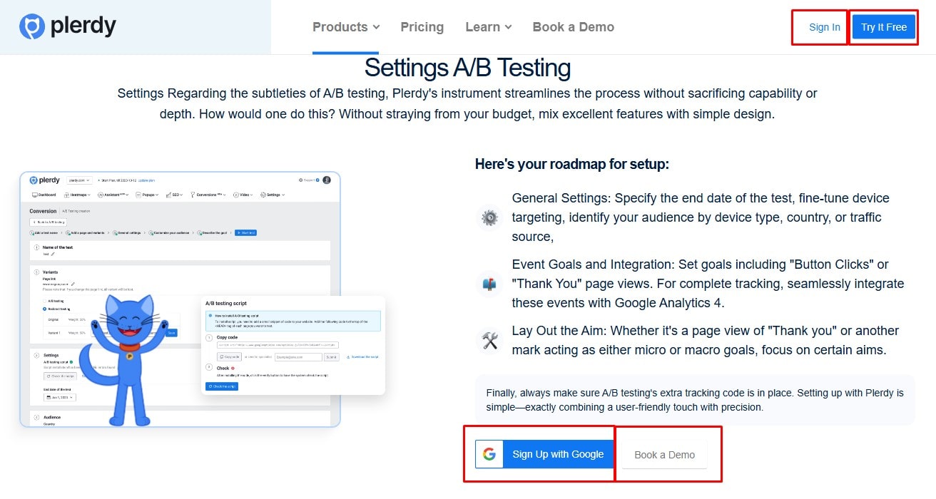
Another beast is usability. Links should scream, “Click me!,” devoid of users engaged in detective work. Generic anchor text such as “Click here” or “Read more” is off-limits. Try something more particular, though: “See Hyperlink Design Examples” or “Download the SEO Checklist. A win-all, this enhances SEO as well as user experience.
An excessive number of hyperlinks That is visual anarchy. It is overwhelming when readers come upon a paragraph full of links. Group links alternatively logically or tuck them into dropdown menus. Check websites like Google and Plerdy; they have really nailed it.
Never skip A/B testing your hyperlink design. On desktop, anything visually striking could feel awkward on mobile. Till your hyperlinks find the ideal mix of design and usefulness, keep testing and improving.
Verdict
Though it seems little, hyperlink design has a great influence. Well-made hyperlinks simplify and ease navigating, hence increasing user pleasure. Consider sites like Amazon or Netflix, where every link leads you naturally. That is the enchantment of deliberate architecture.
In addition to helping consumers, a clear, easily navigable hyperlink boosts the performance of your website. Greater usability translates into more engagement, which search engines enjoy. Well-optimized links can raise your click-through rate by up to 20%, did you know?
Thus, avoid discounting the specifics. Every design decision counts, including color corrections or anchor text.
