
Hey, ecommerce friends! Ever noticed your visitors vanish right before clicking that lovely “Buy Now” button? Annoying, right? That’s probably because your checkout UX might need some serious love and care. Don’t panic—you’re in the right place. Here’s where Plerdy’s heatmaps come to your rescue. It’s your ecommerce UX superhero that’ll make your checkout smoother than Amazon’s one-click (okay, almost). So let’s dive into how you can turn visitors into happy buyers, not frustrated abandoners.
Why Your Checkout UX Needs Heatmaps (Seriously)
Imagine you’ve built the perfect ecommerce website: awesome products, great marketing, but your checkout looks messier than your browser history after Black Friday shopping. Here’s the tough truth—70% of shoppers ditch their carts during checkout, often due to poor UX. Ouch.
Here’s how heatmaps from Plerdy help:
- Shows exactly where users click (or where they angrily rage-click).
- Reveals scrolling patterns—finding out where they get bored.
- Highlights elements visitors completely ignore (sorry, that flashy “buy now!” might actually scare them off).
With these insights, you’re practically seeing through your customers’ eyes. Plerdy’s heatmaps put you inside the shopper’s mind—minus the creepy factor.
Spotting Checkout Issues with Plerdy (with Real-Life Examples)
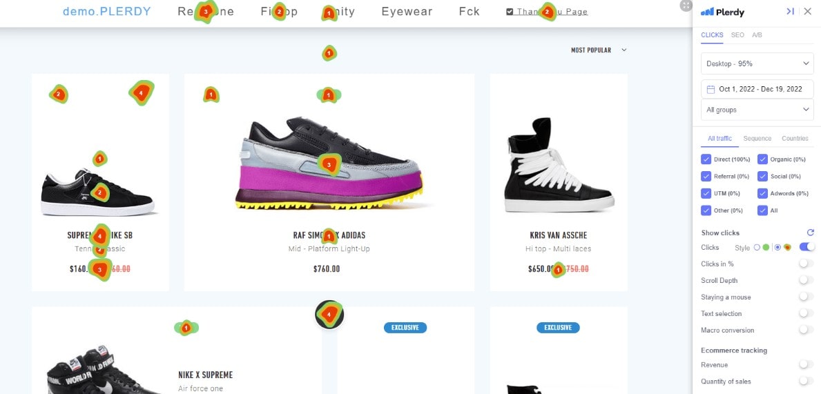
Ever felt customers vanish into thin air? Plerdy’s heatmaps expose exactly why your ecommerce visitors abandon carts at checkout. Maybe your payment button hides at the bottom, or your promo code box is mysteriously invisible to 90% of shoppers. Plerdy’s session recordings show that awkward pause (you know the one) right before they give up and close the tab.
Using heatmaps, an ecommerce store—let’s call it ShopSavvy—discovered 72% of visitors missed the checkout button due to confusing color and placement. After tweaking it (just moving it 3 cm up), their conversions increased by a juicy 21%. Plus, ShopSavvy used Plerdy’s Macro Conversion report and realized customers repeatedly clicked the product image instead of “Checkout.” By linking images directly to checkout pages, their conversions jumped another 15%. That’s ecommerce UX gold, uncovered simply by visualizing user clicks with heatmaps.
Simple Strategies for Better Ecommerce UX with Plerdy Heatmaps
Strategy 1: Simplify the Checkout Form (Less Is More)
Nobody enjoys filling endless forms. Not even you. Plerdy heatmaps can quickly tell you which form fields are deal-breakers for your customers.
For example, let’s take a quick look at H&M’s online store:
- Shortened checkout forms boosted their conversion by 30%.
- By tracking form interactions with heatmaps, they removed fields that scared customers (phone numbers, anyone?).
With Plerdy, you can easily track form abandonment patterns. Find which fields people hate most, remove them, and watch your sales go up. Simple, right?
Strategy Time: Using Heatmaps to Prevent Cart Abandonment (Yes, It’s Possible)
Cart abandonment is the villain in ecommerce. But with heatmaps, you can finally defeat it.
Let’s imagine you own CoolShoeStore. After installing Plerdy heatmaps, you noticed:
- 58% of users get stuck clicking your terms and conditions (ouch!).
- 34% try clicking images instead of the checkout button.
- Your shipping costs surprised and disappointed 44% of visitors.
Thanks to these revelations, you can make simple fixes:
- Clearly display shipping costs early.
- Adjust the design of the CTA button so users stop mistaking it for decoration.
- Add a subtle Plerdy popup offering discounts for users about to leave.
Boom! Reduced abandonment by at least 20%. Customers happy, sales up—everybody wins.
Emotional UX Design with Heatmaps (Make Customers Feel the Love)
Yes, UX isn’t just technical stuff—it’s emotional. How your customer feels during checkout can decide if they buy or flee. Plerdy heatmaps help you tweak design elements for maximum emotional appeal.
Ever noticed how Booking.com’s checkout gives customers reassurance with tiny messages (“You’re almost there!”)? Using Plerdy, you’ll see whether such emotional triggers really work on your audience. If your heartwarming “We’re saving your cart for you!” doesn’t even get seen (or clicked), change it ASAP.
With Plerdy’s heatmap reports—Clicks, Clicks in %, and Scroll Depth—you quickly find out how users actually behave at your checkout. Maybe they aren’t scrolling enough to see your carefully designed reassuring messages, or they’re clicking on random elements instead of your CTA. By checking Revenue reports in Plerdy’s Ecommerce tracking, you pinpoint exactly which UX tweaks boost your sales. For example, after spotting a “stuck” checkout button with heatmaps, a client, StyleHub, moved it slightly and sales increased by 18% within one week. Simple changes based on Plerdy insights turn emotional UX into tangible ecommerce success.
Real-time UX Adjustments (Plerdy Makes It Easy, Even for You)
You might not be a UX designer guru, but Plerdy doesn’t mind. With real-time heatmap data, you instantly know what’s wrong without guessing. For example, if your ecommerce checkout page has a confusing payment button (oops), heatmaps quickly highlight this issue. No waiting months for confusing analytics reports—you see clicks immediately, make tweaks, and instantly boost your conversion rates.
With Plerdy, you also get detailed reports about user interactions—Clicks in % shows hidden clicks within dynamic elements like drop-downs or sliders, Scroll Depth tells exactly where visitors lose interest, and Mouse Cursor Movement tracks what grabs their attention. Ecommerce tracking with Plerdy offers additional powerful insights: the Revenue report assigns actual purchase values to specific clicks, letting you pinpoint exactly what boosts your sales. Whether you’re running a Shopify or Magento store, these UX insights from Plerdy’s heatmaps translate directly into higher revenue and happier customers.
Conclusion: Make Checkout Easy, Make Customers Happy
So, what’s next? Simple—try Plerdy heatmaps. Improve your ecommerce UX without losing sleep (or money). It’s fast, it’s easy, and your customers will thank you (with their wallets, obviously). Ready to boost conversions and make UX less stressful? Check out Plerdy today and finally see why heatmaps are the best friend your checkout ever had.
FAQ: How Click Maps Help Optimize SEO for Higher Engagement
What are heatmaps and how do they enhance ecommerce UX?
Heatmaps are visual tools that show exactly where visitors click, scroll, and hover on your website. In the ecommerce realm, they help you understand user behavior during the checkout process. By leveraging heatmaps, you can pinpoint confusing areas or overlooked elements on your page, ensuring that the overall UX (user experience) is optimized for smoother conversions. Plerdy’s heatmap tool, for example, gives you actionable insights that translate into tangible improvements for your ecommerce site.
How does Plerdy’s heatmap tool identify checkout issues?
Plerdy’s heatmaps reveal where users interact—and where they don’t. They highlight problem areas such as misaligned CTA buttons, overly complex forms, or elements that receive little attention. For instance, if many users are missing the checkout button or are clicking on the wrong elements, Plerdy shows you these patterns clearly. This allows you to fix design issues quickly, reduce cart abandonment, and improve the overall ecommerce UX.
What impact do heatmap insights have on conversion rates?
By using data from heatmaps to refine your checkout process, you can significantly boost your conversion rates. For example, moving a hidden payment button or simplifying form fields based on user interaction data can lead to noticeable improvements. With Plerdy, you can test adjustments and monitor real-time changes in conversion rates, ultimately turning hesitant shoppers into happy buyers and driving ecommerce success.
What strategies can be implemented using heatmap insights from Plerdy?
Heatmap data from Plerdy can drive a range of strategies to improve your ecommerce UX. Key approaches include:
- Simplifying checkout forms: Removing unnecessary fields to reduce abandonment.
- Optimizing element placements: Adjusting buttons, images, and CTAs to align with user behavior.
- Enhancing emotional design: Adding reassuring messages where users pause or get frustrated.
By systematically applying these strategies based on heatmap feedback, you create a more intuitive and conversion-friendly checkout process.
How can heatmaps influence emotional UX design on an ecommerce site?
UX is not just about layout—it’s also about creating an emotional connection with users. Plerdy’s heatmaps can show you if your emotional triggers, like reassuring messages or progress cues, are seen or clicked on by your visitors. By analyzing these insights, you can adjust the design and placement of emotional elements to better engage users. This tailored approach not only reduces frustration during checkout but also builds trust and improves overall user satisfaction on your ecommerce platform.