
Ever landed on a website and thought, “What am I even looking at?”—buttons all over the place, text you need a magnifying glass for, and a checkout process that feels like a full-time job? Yeah, that’s bad usability. If your visitors are struggling, they’re bouncing faster than a rubber ball on concrete. But hey, you’re in luck because fixing this mess is exactly what Plerdy’s UX tools are made for. Let’s break down how you can turn your website into a usability dream.
Why Website Usability is a Big Deal
Think about it—would Amazon still be a giant if their “Buy Now” button was hidden in the footer? Usability is what makes people stay, click, and convert. A site that’s hard to navigate = lost customers. A smooth experience = happy visitors who stick around and spend money.
And here’s the kicker: 88% of users won’t return to a site after a bad experience. That’s a lot of lost opportunities. So, how do we fix this? With the right tools, of course.
How Plerdy’s UX Tools Take Website Usability to the Next Level
1. Plerdy Heatmaps: Understand What Users Actually Do
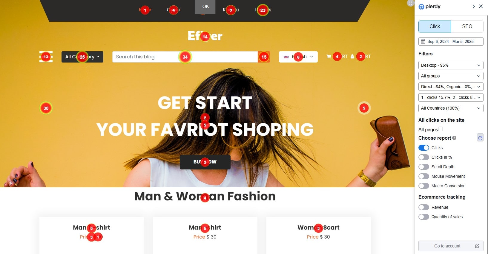
Not all clicks are equal. Some users are rage-clicking, some are lost, and some are desperately trying to figure out where the actual CTA button is. Plerdy’s heatmaps let you see where people click, scroll, and stop paying attention, helping you optimize website usability.
Click Data Breakdown
- Clicks Report – Shows the exact number of clicks per element, updating in real time as you scroll.
- Clicks in % – Divides the page into five sections to reveal hidden interaction patterns.
- Scroll Depth – Indicates how far users scroll, crucial for evaluating usability.
- Staying a Mouse – Tracks cursor movement to see where users hesitate.
- Macro Conversion – Identifies which elements users interact with before making a purchase.
With Plerdy’s Ecommerce Tracking, you can even assign revenue to clicks, making it easier to optimize the most valuable areas of your website.
✅ Example: Imagine you’re running an eCommerce store, and your main “Add to Cart” button is getting fewer clicks than an obscure blog link in the footer. That’s a design failure. With Plerdy’s click heatmaps, you can spot these issues and move key elements to high-engagement areas.
2. Plerdy Session Replay: Watch Real User Behavior (No Stalking, Promise)
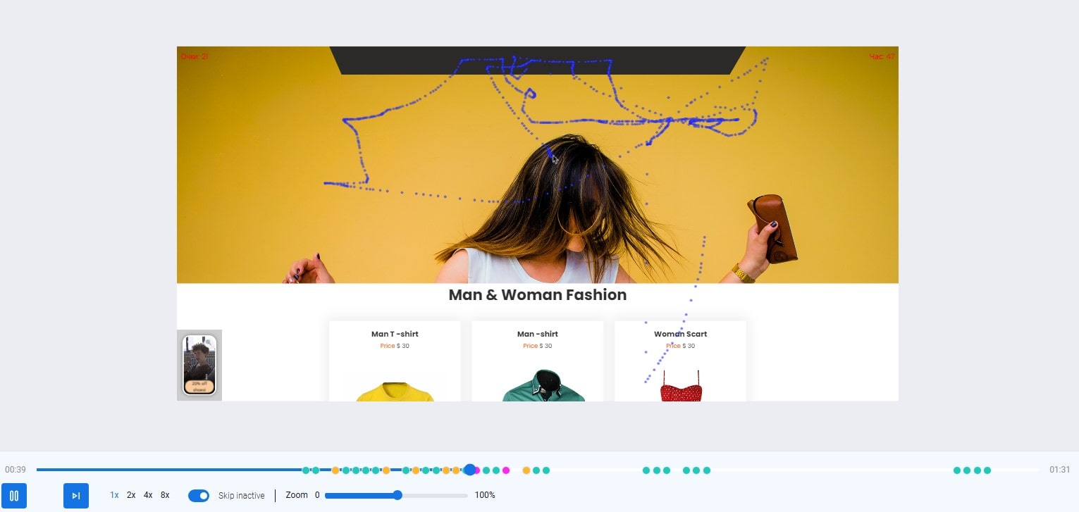
Let’s be honest—users don’t always behave the way you expect them to. You think your CTA is in the perfect spot, but session replays show users scrolling right past it. With Plerdy’s session recording, you can literally watch user interactions to see what’s working and what’s frustrating them.
How to Analyze Session Replays in Plerdy
- Select the right time period – Focus on the last 30 days to see the latest usability trends.
- Use filters – Sort videos by events, session duration, or specific actions to identify patterns.
- Check short sessions – If users leave too fast, something on the website might be turning them away.
- Analyze long sessions – Look for usability issues, slow-loading pages, or bugs that frustrate users.
Each session replay in Plerdy comes with key session details—filters for specific interactions, event markers, and a timeline for quick navigation. Add tags, comments, or share insights with your team to streamline website improvements. Need help? The built-in guide “How to Analyze Session Replays” is always there for you.
✅ Example: A SaaS website noticed a 35% drop-off on their sign-up page. Turns out, users were stuck on a confusing pricing table. A quick adjustment based on session replays boosted conversions by 18%.
3. Plerdy Pop-Ups & Smart Forms: Engage Without Annoying
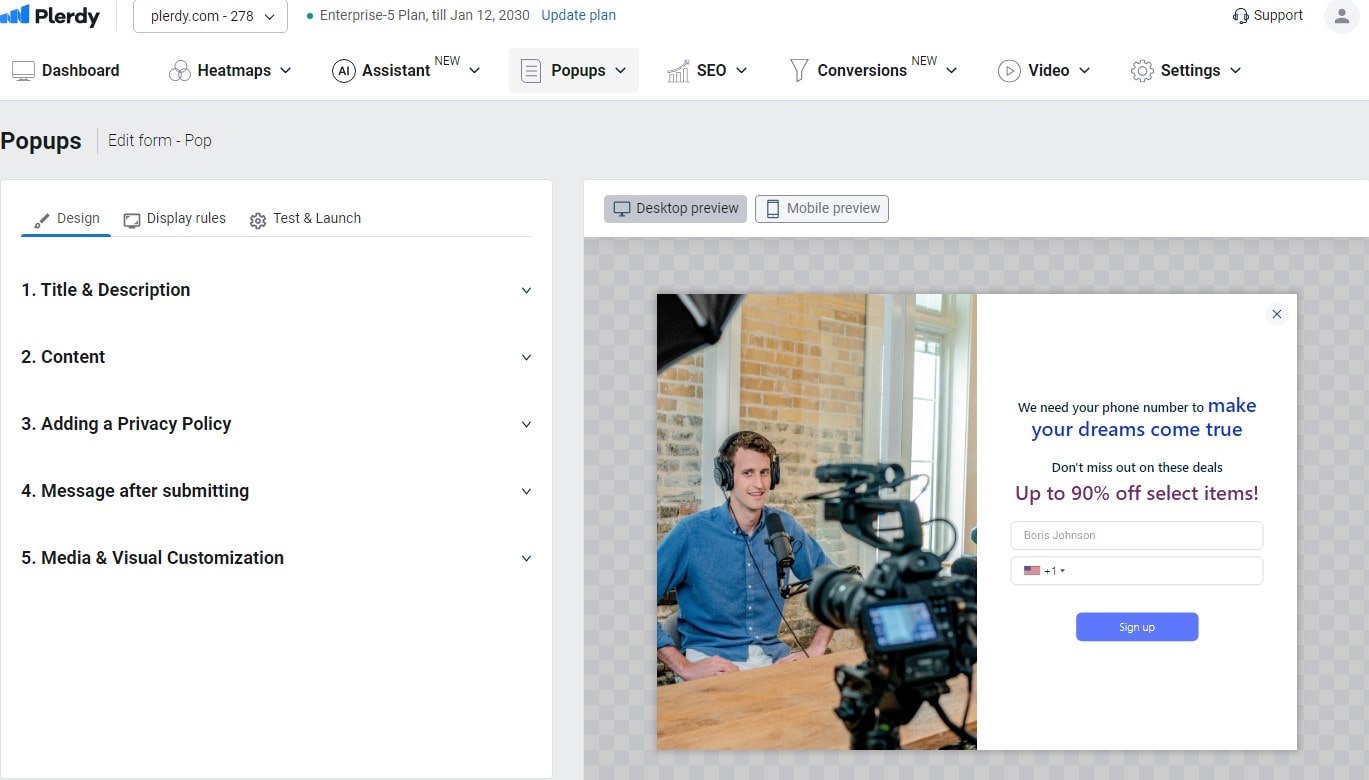
Pop-ups can be a UX disaster—or a game changer if done right. Plerdy’s pop-up builder helps you trigger messages at the right time, without annoying your visitors.
Types of Pop-Ups for Better Website Usability
- Lead Generation – Capture emails with lead magnets and use them for email marketing to boost sales.
- Promotional Pop-Ups – Highlight special offers users might otherwise miss, increasing conversions.
- Feedback Forms – Gather user insights about website usability, checkout experience, or product searches.
- Engagement Pop-Ups – Showcase vertical videos for webinars, new products, or special deals.
- Custom Pop-Ups – Design unique forms with custom fields for specific business needs.
✅ Example: A fashion retailer used exit-intent pop-ups offering 10% off, capturing 22% more sales instead of losing those visitors forever.
4. Plerdy UX Audit: The Quickest Way to Spot Usability Problems
A usability audit sounds complex, but Plerdy automates it. Instead of spending hours guessing why conversions are low, Plerdy’s UX audit tool scans your site for key issues—like slow load times, bad mobile experiences, and missing CTAs.
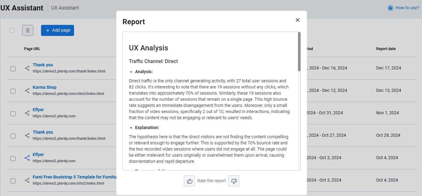
AI UX Assistant: Get Data-Driven Optimization Tips
If you’re new to UX analysis, Plerdy’s AI UX Assistant simplifies the process. It automatically analyzes user behavior and provides custom optimization tips based on real data.
Here’s how to use it:
- Ensure the URL has at least 100 sessions for accurate analysis.
- Go to Assistant > UX, click Add page, and enter the URL.
- Choose the time range, device type, and language, then generate the report.
- Share the report with your team or agency for usability improvements.
By leveraging AI-driven insights, you get precise recommendations for each webpage, boosting website usability without manual guesswork.
✅ Example: A digital agency used Plerdy’s UX audit and found 42 usability issues—including a hidden checkout button (yikes). Fixing these problems led to a 27% boost in conversion rates.
Quick Comparison: Plerdy vs. Other UX Tools
| Feature | Plerdy UX Tools | Google Analytics | Hotjar |
|---|---|---|---|
| Heatmaps | ✅ Yes | ❌ No | ✅ Yes |
| Session Replay | ✅ Yes | ❌ No | ✅ Yes |
| UX Audit | ✅ Yes | ❌ No | ❌ No |
| Pop-Ups | ✅ Yes | ❌ No | ❌ No |
| Pricing | 💰 Affordable | 🎯 Free (Limited) | 💰 Expensive |
Pro Tips for Boosting Website Usability with Plerdy
Want to maximize usability? Here’s what you should do:
- Run heatmaps regularly to track how user behavior changes over time.
- Use session replays to see where people get stuck.
- Test different pop-ups to find what engages users best.
- Perform monthly UX audits to catch new usability issues before they hurt conversions.
- A/B test your CTA buttons and headlines using real engagement data.
Final Thoughts
Bad usability is killing your conversions. But fixing it? That’s where Plerdy shines. With heatmaps, session replays, pop-ups, and automated UX audits, you get real insights into user behavior and the tools to fix issues before they cost you sales.
Ready to stop losing visitors? Try Plerdy today and make your website actually usable!