Not only a catchphrase, landing page optimization (LPO) is the lifeline of your internet marketing plan. Imagine having a tool that attracts attention and holds it to gently lead guests toward conversion. A well-optimized landing page has that ability. LPO is your digital handshake, inviting and motivating guests to act in a world when every click represents a possible client. At Plerdy, good LPO has had transforming power. We will provide the secrets to create aesthetically pleasing and functionally excellent landing pages in the future sections. Stay tuned since what you’re about to discover could transform your web presence.
Understanding the Basics of LPO

Entering Landing Page Optimization (LPO) can be like exploring a new city: interesting and sometimes taxing. But knowing LPO principles will enable you to negotiate to online success, just as a map takes you over strange neighborhoods. Let us begin this road by dissecting what LPO actually means.
Definition and Purpose
Landing Page Optimization, or LPO, is an absolutely vital component of your digital marketing plan. It’s the practice of improving particular landing page parts of your website to raise UX and boost conversion rates. The main objective is: Whether it’s registering, buying, or downloading a resource, turning your landing page into a magnet drawing guests and persuading them to act.
Core Components of LPO
Not only beautiful images, but also a good landing page reflects a flawless user journey. Important elements include:
- Your headline should quickly communicate the worth of your offer.
- Concise, pertinent material that speaks to your readers will be engaging.
- Strong Call-to- Action (CTA) is the way you gently guide guests towards the intended purchase or subscription.
- Make sure the page layout is simple and naturally flows to guide the user.
- A sluggish page can turn people away quickly. Simplify for speed to keep people interested.
Ultimately, understanding the foundations of LPO will help you to succeed in your online marketing. It’s about making every visitor’s trip on your landing page seamless and interesting. Deeper exploration of every component will help you to see the value of a well-optimized landing page not just in drawing visitors but also in turning them into devoted consumers. Keep tuned as we reveal more secrets to become LPO master.
Video Insight: Expert Discussions on Landing Page Optimization
Join our expert as he delves into the nuances of optimizing landing pages. Learn from a seasoned professional about the best practices and tips that can significantly boost your website’s effectiveness and user engagement.
Hello everybody! Speaking about improving the landing page excites me greatly today. I will provide you fifteen ideas and best practices that will surely assist to raise the usability of your website and boost conversions. Watching this video to the very end can help you to get suggestions on how to raise your earnings.
Problem 1: Page loads too slowly.
Verify your page loads speed. To monitor and speed up your load time, utilize Google PageSpeed Insights among others. Your site should have plenty of JavaScript and CSS as well as heavy pictures. Also maximize your server and hook up cache.
Problem 2: The page content isn’t catching visitors’ interest.
Your titles and materials must thus be enticing and worthful. Find out from Plerdy what actually speaks to your audience. Examine heatmaps and view video sessions to find what’s blocking users from traversing your website.
Problem 3: Visitors leave the page without doing anything.
Clear calls to action (CTA). Use striking buttons and concise directions to inspire guests to act right away. On the first screen of the website, this is a typical problem: users will just quit if they do not know what and where objects are.
Problem 4: The page isn’t well-adapted for mobile devices.
Make sure your landing page runs mobile-friendly. About ninety percent of traffic is made by mobile users. Examine with Plerdy how consumers interact on mobile—many usability mistakes occur here. Recall that a mobile screen only has limited area.
Problem 5: Lack of trust in the brand.
On your landing page, include client reviews. This will inspire more faith in your company. Given few people scroll down the page, these should be displayed at the top.
Problem 6: High rejection from forms on the page.
Sort the forms. Limit the fields to the minimum and use simple tips. Analyzing user activity with Plerdy will help you to find problems with the forms. Many times people try to fill in a form once more, fail to choose something, or stumble across a mistake.
Problem 7: Low personalization of content.
Create materials depending on the needs and preferences of your guests. Improved knowledge of your audience increases the possibility of increasing conversion. This entails conveying knowledge, utilizing sophisticated terminology, including examples, solving issues, etc.
Problem 8: Lack of visual appeal.
Make use of premium films and pictures that complement your brand. This enhances the page’s appeal to users as well as its looks. Use not dull stock images or movies. Better still utilize actual cases, team pictures, or product shots.
Problem 9: Unclear value proposition.
Alright, so it’s quite crucial to say exactly what your client gets from your good or service. Clearly underline your landing page your unique selling points and define them. Differentiate yourself from the others—this is absolutely important!
Problem 10: Weak integration with social media.
Add social share buttons and combine social reviews. This increases page social signals and generates additional traffic. But maybe hold off displaying that if you only have a few followers. Perhaps spend a hundred pounds to increase your followers; keep in mind that regularly uploading fresh material on social media is rather important.
Problem 11: No measurement of campaign results.
You have to define exact criteria to gauge your landing page’s performance. Track conversions, visitors, and other important statistics with analytical instruments such as Plerdy. Since it’s not affecting sales, feel free to change or even eliminate an element if a user clicks on none before making a purchase.
Problem 12: Complicated navigation on the page.
Make navigation intuitive and easy. Use a clear hierarchy of information and highlight key elements for better user orientation. On a desktop site, don’t hide the menu in a hamburger icon because it gets fewer clicks.
Problem 13: Insufficient information for decision-making.
Provide enough information about your products or services so that visitors can easily make a purchase decision. Include detailed descriptions, specifications, prices, and comparisons. And importantly, add an appropriate number of product photos. If it’s services, showing case studies is a great move.
Problem 14: No testing of different page versions.
Always conduct A/B testing for various elements of your landing page. This helps find the most effective options that increase conversions. Plerdy even offers a free tool for A/B testing—why not give it a try?
Problem 15: Too many distracting elements.
Minimize distractions like unnecessary graphics or anything that doesn’t impact sales. Focus user attention on the main actions you want them to take. Also, keep your texts short, divide them into blocks—it makes content easier to read and absorb.
Key Elements of an Effective Landing Page
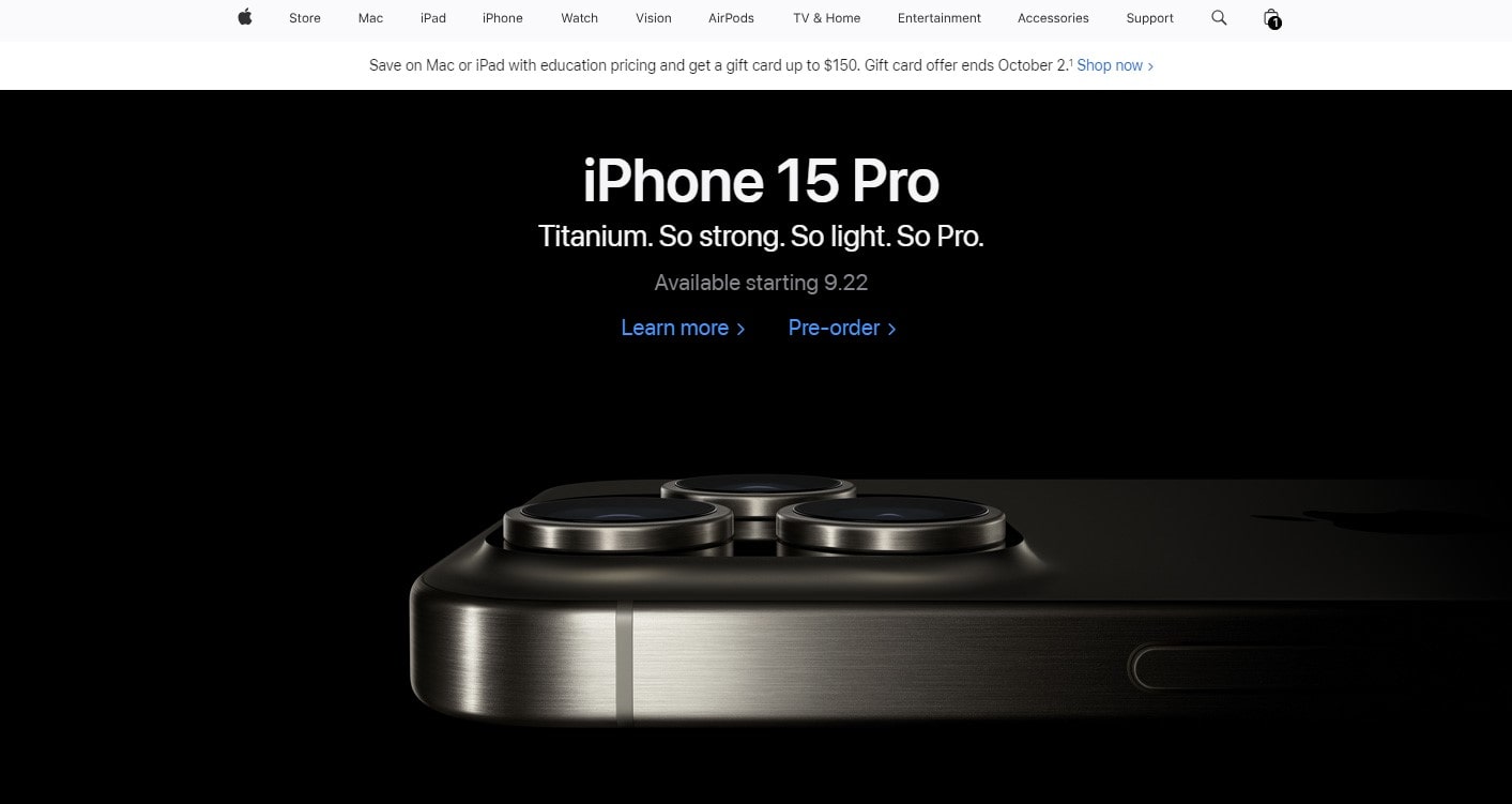
Designing a good landing page helps you to link your company objectives with the demands of your audience. It is about functioning rather than only appearances. Some essential components are non-negotiable if one wants this road to be fulfilling. Let’s investigate these basics that enable a landing page to flourish in the digital environment.
Headline and Content
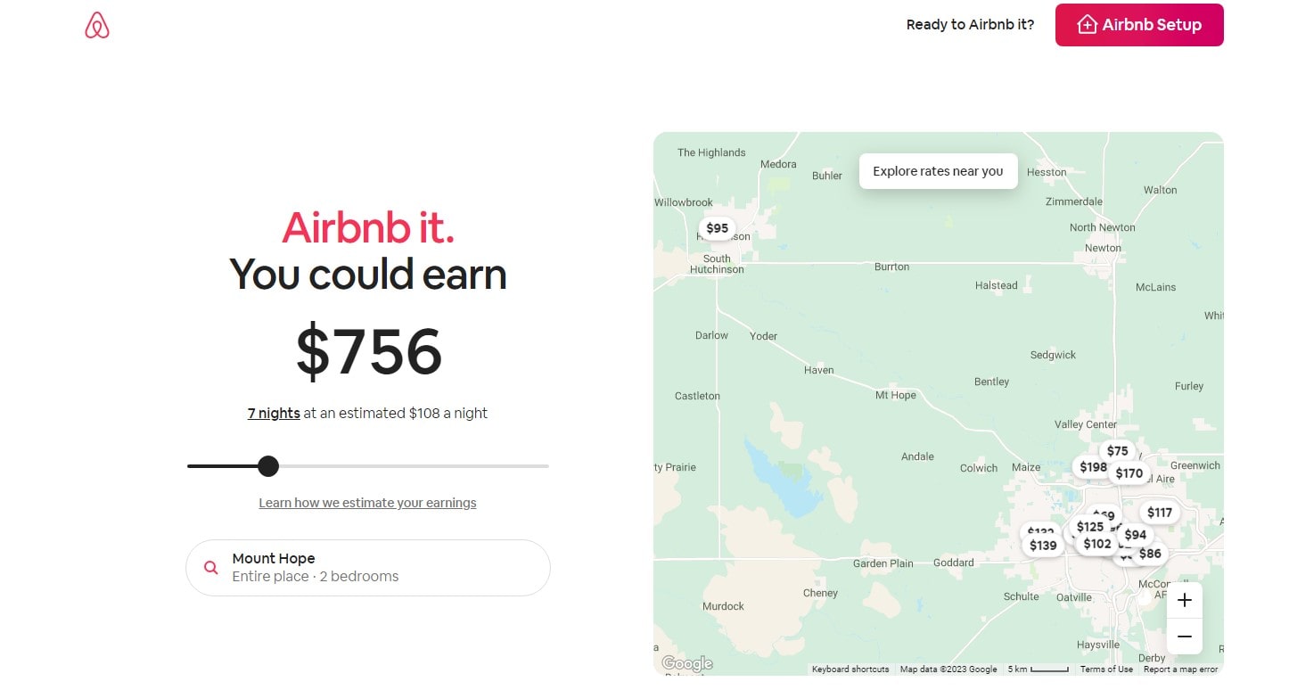
The gatekeeper of your landing page are headlines. Promising the rest of the page, they should be interesting and unambiguous. The material then is where you live up to the promise the headline promises. Make sure it is succinct, pertinent, and interesting so it directly addresses the requirements and tastes of your readers.
Call-to-Action (CTA) Strategies
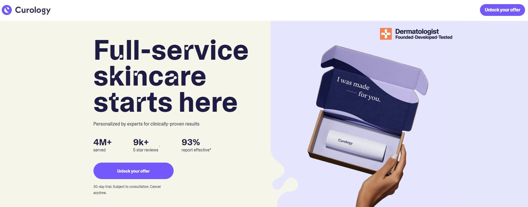
Your tests are the CTA. Strong and straightforward, it should point guests toward the targeted activity. Your CTA should be aesthetically arresting and emotionally strong whether it’s “Sign Up,” “Buy Now,” or “Learn More.” Arange it deliberately so that guests may easily move forward.
Visual Elements and User Interface
Engaging visitors on your landing page mostly depends on its visual aspects. Illustrate your point with striking images and videos. With a clear user interface, users should be able to negotiate your page without aggravation.
A good landing page is an assembly of carefully crafted elements cooperating to draw in and convert users. Every element counts—from the headlines to the CTAs. Remember that our aim is to create a pleasing, functional landing page as we investigate these elements. Stay around as we unearth more ideas to improve your landing page.
A/B Testing in LPO
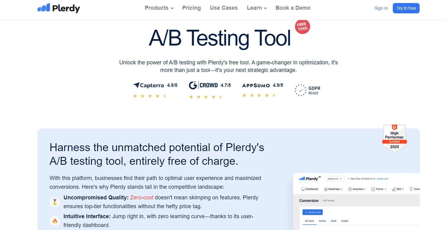
A/B testing is like your digital compass directing you over a sea of options to identify the most successful components in the search of the ideal landing page. It’s about knowing what works—not about guessing. A/B testing becomes absolutely essential for Landing Page Optimization (LPO), guiding your efforts toward success.
Fundamentals of A/B Testing
In LPO, A/B testing comprises designing two landing pages (A and B) with slight variations. This could be anything from modifying the page layout to adjusting the headline to changing a CTA button color. To precisely evaluate one element at a time for influence on user behavior, one must change them one at time. Plerdy’s A/B testing tool and other tools streamline this process so you may easily run tests and compile data-driven insights.
Analyzing A/B Test Results
You really should carefully review the outcomes of your A/B test once it is online. Search for variations in other pertinent statistics, user involvement, and conversion rates. The objective is to find out why and which version—A or B—performs better. Knowing the “why” is absolutely vital since it shapes your future LPO plans and guarantees ongoing development. Remember always that A/B testing is continuous.
All things considered, A/B testing is a great instrument for your LPO toolkit. It helps you to make wise selections and turns guesses into calculated actions. Remember that instruments like Plerdy’s A/B testing are there to help you, providing clarity and accuracy in your optimization path as we keep exploring the depths of LPO. Stay tuned as we reveal additional techniques to become proficient in landing page SEO.
Tools and Technologies for LPO
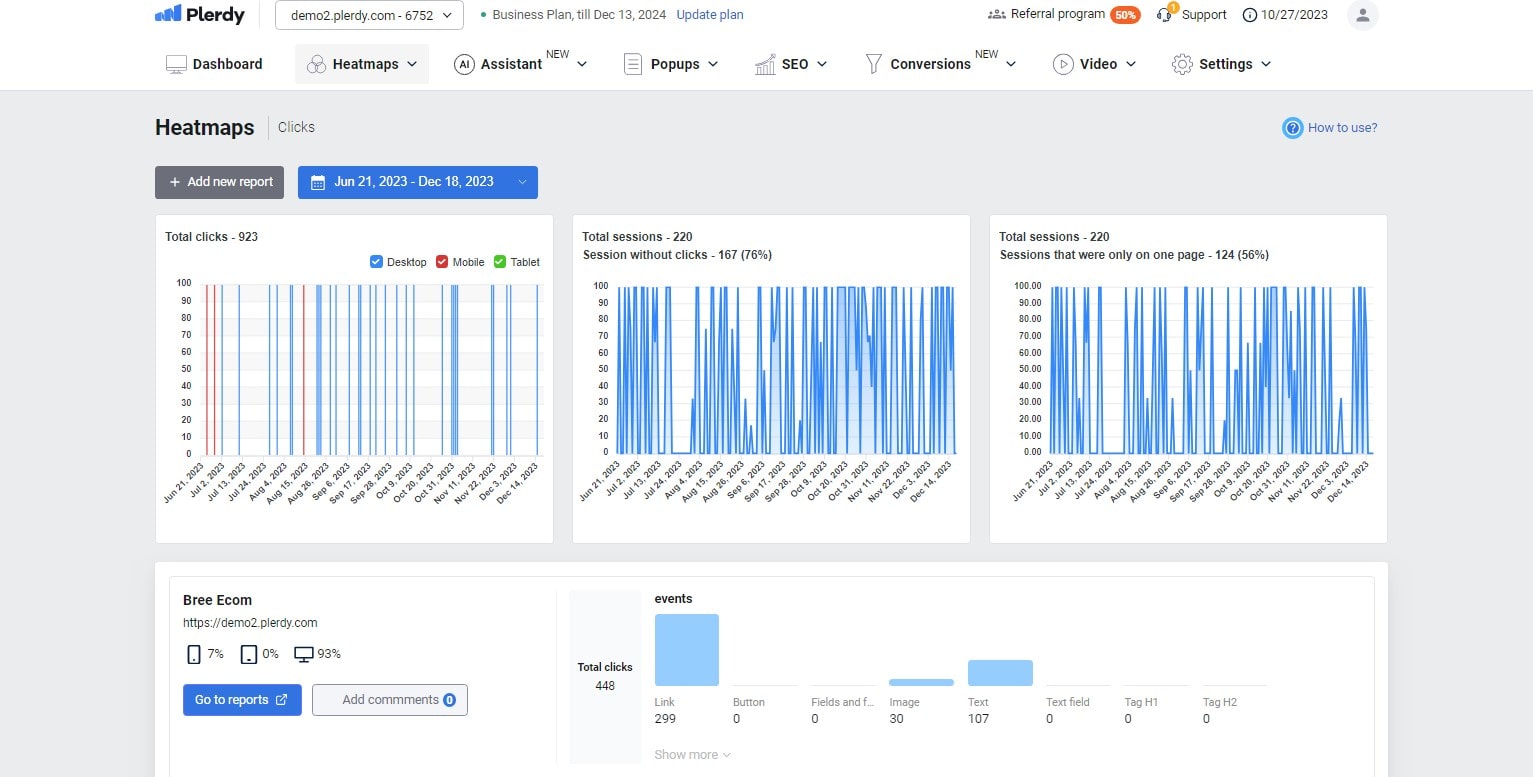
For Landing Page Optimization (LPO), the right tools and technologies are like the finest food and utensils a chef could use. Their influence can either strengthen or destroy your plan. Let’s investigate the key instruments from Plerdy that will turn your landing pages into highly converting assets—some creative ideas as well.
Overview of LPO Tools
Tools meant to improve the performance of your landing page abound in the LPO universe. Key instruments are A/B testing tools, heat mapping programs, and analytics systems. Plerdy provides tools, for example, that provide priceless insights on user behavior, so guiding your knowledge of what draws in and keeps people on your landing page. These tools can let you keep an eye on things including user engagement patterns, bounce rate, and conversion count.
Integrating Tools into LPO Strategies
Including these instruments into your LPO plan calls for more than simple implementation. It’s about using their talents to better grasp your audience. Heat mapping tools, for instance, may show you where people are most active on your page; A/B testing tools like Plerdy can help you ascertain which version of your page appeals more to your audience. The secret is to apply these realizations to improve your landing pages always.
Ultimately, your online success will be much influenced by the tools and technology you decide upon for LPO. Your LPO toolset would be much enhanced by these tools, which range from running A/B testing to improving your pages by examining user behavior with Plerdy. Remember that while we investigate landing page optimization, these tools are your allies. They help you best maximize your digital projects. As we explore more how to increase your online presence using LPO, keep a watch out for next entries.
Case Studies and Real-world Examples

Starting the path of Landing Page Optimization (LPO) gains enrichment from practical knowledge. It’s like having a road map created by people who have already followed the successful road map. We explore case studies in this part showing how successful LPO can be and techniques that turned potential into income.
Case Study 1
In our first case study, we find a healthcare company redesigning its landing page. Their page at first was messy and lacked a clear CTA. Following a strategic LPO with simplified content, notable CTAs, and trust-building testimonials, the firm saw a 40% increase in appointment reservations. This change emphasizes how crucial clarity and user confidence are to increasing conversions.
Case Study 2
The second case study centers on an online retailer focused on outdoor products. Their landing page had to first be more engaging. They rebuilt the page to highlight popular items and simpler navigation by applying targeted A/B testing and heat map analysis of consumer engagement. So the outcome is A strong 30% rise in revenues. This instance emphasizes the need of user-oriented navigation and data-driven design.
All things considered, these case studies are a monument to the transforming potential of LPO, not only success stories. Seeing practical uses helps us to pick insightful ideas to implement into our own plans. Recall that improving your landing page is an ongoing process; with each change and test, you go closer to meeting your digital marketing objectives. Stay tuned as we explore the ever changing landscape of LPO using knowledge from seasoned operators.
Future Trends in Landing Page Optimization
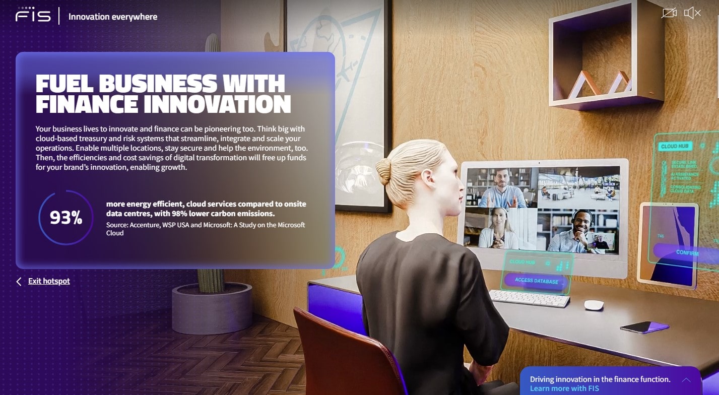
Looking ahead, the scene of Landing Page Optimization (LPO) is likely to change significantly. Being ahead of these trends can help you to be innovative, much as catching the early wave in surfing. This part looks at the new trends influencing LPO’s direction, so arming you to effectively surf the change wave.
Technological Advancements
Future LPO is being reshaped by technological developments. Leading edge developments in machine learning and artificial intelligence (AI) offer custom user experiences based on data gathered from site users. Landing pages that change in real-time to fit personal choices, behavior, and past should be expected. Furthermore, as more people rely on voice assistants for online browsing, voice search optimization will become absolutely vital.
Predictions for LPO
We see a change toward more engaging and immersive landing pages as digital marketing develops. Features of augmented and virtual reality (AR/VR) could go widespread and provide users an engaging, immersive experience. Moreover, ethical behavior and sustainability in web design will become increasingly important since they will affect how values and messages are presented on landing sites of brands.
Ultimately, LPO has a vibrant and exciting future full of chances for innovation and more involved users. Keeping a close eye on these forthcoming trends will help you to make sure your landing pages remain relevant and maintain fascinating and converting your audience. Remember that LPO’s path is always changing as we conclude our research; hence, keeping ahead depends on constant knowledge. As we continue negotiating the often shifting terrain of digital marketing, keep back-tracking for further updates.
FAQs
What is Landing Page Optimization?
- Landing page optimization (LPO) improves a webpage so as to raise conversion rates and user experience.
Can you give examples of Landing Page Optimization?
- Among the examples include adding interesting CTAs, speeding up page loads, using A/B testing on headlines, and streamlining forms for user convenience.
How does Landing Page Optimization differ from Landing Page Optimisation?
- They are the same idea; the only variation is spelling; American English uses “Optimization” while British English uses “Optimization”.
What are the benefits of Landing Page Optimization?
- Higher conversion rates, more user involvement, better SEO results, and a smaller bounce rate are among the benefits.
How can you optimize a Landing Page for SEO?
- To increase page loading speed for SEO, include pertinent keywords, maximize images and metadata, guarantee mobile compatibility, and so enhance SEO.
What are the best practices for Landing Page Optimization?
- Best practices call for consistent performance testing, a strong and obvious CTA, simple and elegant design, and succinct message.
Can a Landing Page be a Homepage?
- Although it’s not advised, yes. While landing pages are concentrated on a certain conversion goal, homepages have more general use.
What does optimizing Landing Pages involve?
- By means of layout, design, and content of the page, one aims to enhance the user experience and direct visitors to engage the necessary action.
What tools are used in Landing Page Optimization?
- Among the plerdy tools are analytics systems, A/B testing tools, user behavior monitoring tools, and conversion rate optimizing tools.
Why are Landing Pages important?
- Since they offer a focused platform for turning possible consumers into leads or sales, landing pages are absolutely vital since they immediately influence company growth.
Finish
Remember that LPO is a never-ending cycle of development and discovery rather than a one-and-done event as we conclude our tour of the Landing Page Optimization basics. Our discussed strategies and insights mark only the start. The Plerdy blog offers a vast universe of opportunities where ongoing education and adaptation are the secrets to digital success. Explore our pages more deeply to maintain improving your web presence. Furthermore keep in mind that Plerdy’s toolkit is meant to assist you at every level. Accept the tools and LPO trends, then see how your landing pages become effective assets propelling your online success. All set to bring your LPO forward? Look through Plerdy’s blog for further ideas and techniques.
