Ever found yourself tapping madly on an app, wondering why nothing’s happening? You’re not alone! Mobile apps are everywhere, transforming our daily routines in myriad ways. But, for developers, creating an app that’s both intuitive and engaging can be quite the puzzle. Enter mobile app heatmaps, your secret weapon to unlocking how users really interact with your app. These clever tools visualize every tap, swipe, and pause, painting a vivid picture of user behavior. So why not dive in and see what heatmaps reveal about your app? Try Plerdy today, and maybe you’ll discover just why users can’t get enough of your app—or why they might be giving up too soon. If you’re curious about making your app better, keep reading, and let’s explore together how heatmaps can make all the difference!
Understanding Mobile App Heatmaps

Ever felt lost or frustrated while using an app? Well, you’re not alone, and there’s a tool designed just to help developers understand these very issues—mobile app heatmaps. Let’s peel back the layers of this technology and see just how it can transform your app experience. Ready to dive in? Don’t forget to share this insight or try implementing a heatmap tool like Plerdy in your own projects!
What Are Mobile App Heatmaps?
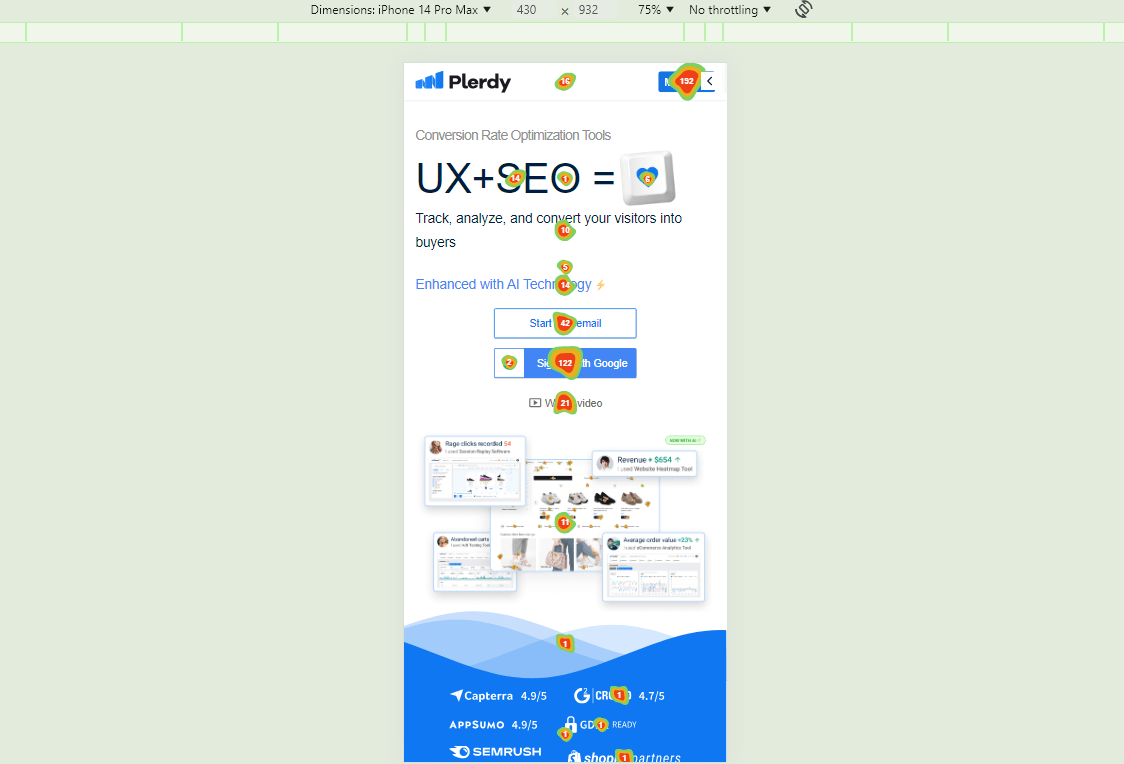
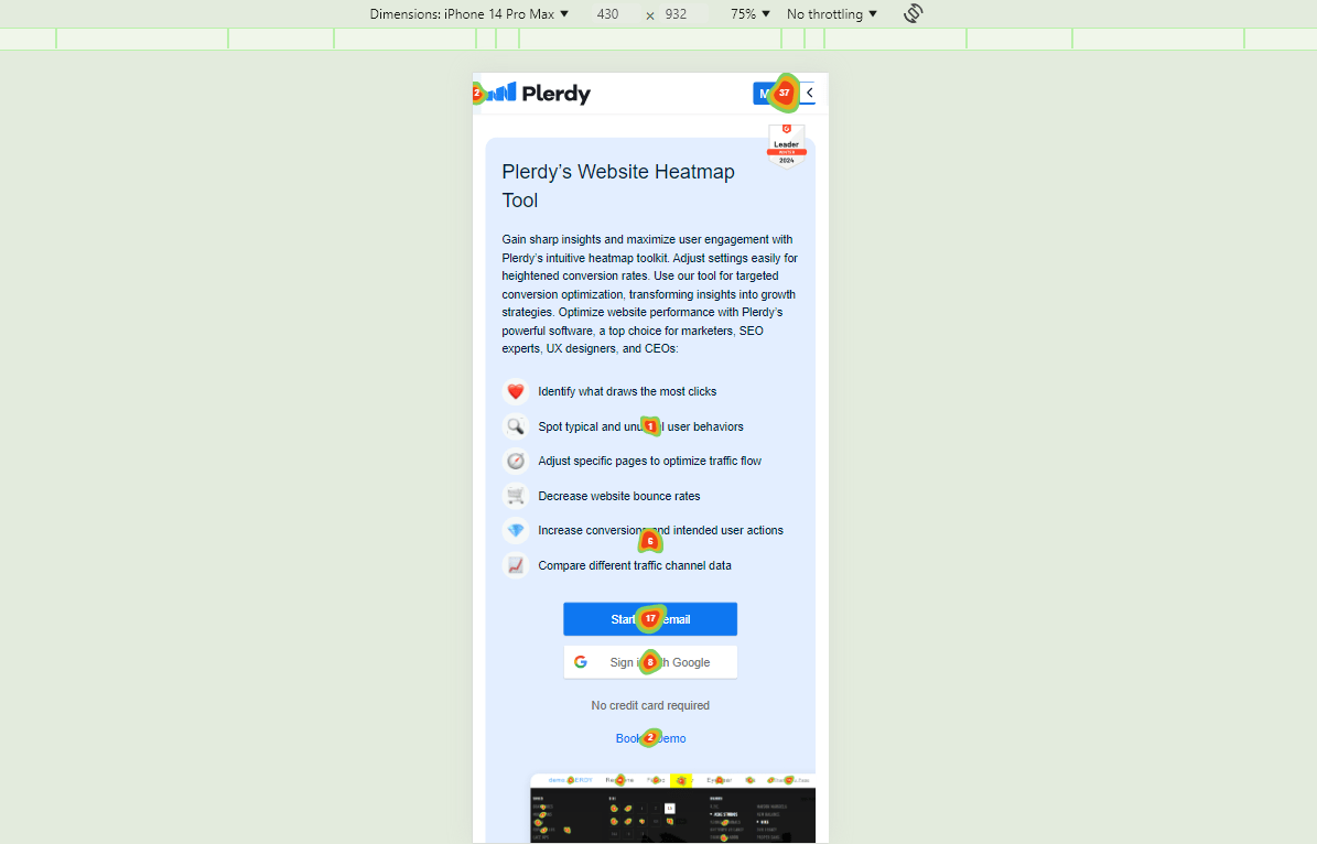
Imagine having a superpower that lets you see exactly where users are clicking, swiping, or even getting stuck in your app. That’s what mobile app heatmaps do! These tools create a visual map of your app, using colors to show where the action is hot and where it’s not. Reds and oranges highlight areas with the most activity, while cooler blues pinpoint neglected parts. This visual data isn’t just cool to look at—it’s a goldmine for developers looking to enhance app usability.
How Mobile App Heatmaps Work
Curious about how these heatmaps gather all that info? It’s quite the technical ballet:
- Data Collection: First off, the heatmap software tracks every interaction within the app. Whether it’s a tap, a swipe, or a pause, it’s all recorded.
- Data Visualization: Next, this data is overlaid onto the actual layout of your app. Each interaction is represented by a color on the spectrum—hot areas show up in warm colors, while less frequented zones are cool.
- Insight Extraction: The real magic happens in the analysis. By studying these colors, developers can intuitively understand user behavior, streamline app navigation, and optimize those tricky parts that might cause frustration.
Want to see it in action? Why not apply a heatmap to your app and watch as hidden patterns emerge before your eyes?
Types of Data Captured by Heatmaps
When dissecting the utility of mobile app heatmaps, it’s crucial to understand the types of interactions they monitor. Here’s what most heatmaps are capturing:
- Taps: Where are users clicking? Are they repeatedly tapping non-responsive areas?
- Swipes: Are users swiping smoothly through carousels or struggling with swipe-based actions?
- Scroll Depth: How far are users scrolling down your pages? Is important content being seen or skipped?
Each type of interaction offers unique insights:
- Taps:
- Button presses
- Link selections
- Menu interactions
- Swipes:
- Navigation gestures
- Image carousel engagements
- Scroll Depth:
- Content engagement levels
- Drop-off points
Understanding these patterns helps developers prioritize design changes and optimize the mobile app layout for a better user experience.
Curious how this can impact your app? Try integrating these insights into your next update and measure the difference! Also, if you’re itching to ask something or share your thoughts, don’t hesitate to drop a comment below. Let’s get the conversation started!
Key Benefits of Using Mobile App Heatmaps

Ever wondered how some apps seem to read your mind, knowing just what you need? The secret might just be in their use of mobile app heatmaps. These powerful tools are game changers in how developers understand and enhance your app experience. Let’s break down the practical benefits that make heatmaps a must-have in any app developer’s toolkit. And remember, if you find these insights useful, why not share this article or give heatmap tools like Plerdy a try yourself?
Enhancing User Engagement
Engaging users is the holy grail of app development, and heatmaps are your map to this treasure. Here’s how they make a difference:
- Identifying Hotspots: Heatmaps show where users interact the most, helping you understand what catches their eye.
- Content Placement: By analyzing where users most frequently engage, you can strategically place important content or features to boost interaction.
- Feedback Loop: Continuous heatmap analysis lets you see if changes you make are improving user engagement, allowing for real-time improvements.
This visual feedback tool ensures that your app evolves based on how users actually use it, not just how you think they should. The result? A more engaging app that users can’t wait to open.
Optimizing the Mobile Interface
A great user interface feels intuitive; it just works. Here’s how heatmaps contribute to this seamless experience:
- Layout Optimization: Heatmaps can reveal which areas of your app are being ignored, prompting a layout rearrangement that enhances usability.
- A/B Testing Validation: Use heatmaps to directly see how different designs perform, helping you choose the best option for user interaction.
With this level of insight, you can craft an interface that not only looks good but also feels right to the user. It’s like having a window into your users’ minds, allowing you to deliver exactly what they need, exactly where they expect it.
Identifying Usability Issues
Sometimes, things don’t go as planned, and users get stuck. Here’s how heatmaps help you pinpoint and fix these issues:
- Trouble Spots: Areas with excessive taps might indicate that users are confused or something isn’t working as expected.
- Navigation Improvements: Discover if users are failing to navigate through your app effectively and refine your navigation elements to alleviate user frustrations.
By identifying and addressing these issues, you enhance user satisfaction and reduce frustration. This proactive approach to problem-solving ensures your app remains favorable and functional in the competitive app market.
Heatmaps are not just tools; they are essential companions in your journey to create an app that users love. By providing a deep understanding of user behavior, heatmaps empower you to make informed decisions that significantly enhance user engagement, optimize your interface, and swiftly identify usability issues.
Types of Mobile App Heatmaps
Ever found yourself wondering why some areas of your favorite app feel just right, and others, not so much? Well, developers use various types of mobile app heatmaps to see exactly how you interact with their apps. These tools are incredibly insightful, revealing patterns that help enhance your app experience. Interested in seeing how these different heatmaps work? Let’s dive into the types that developers might use to make your app usage as smooth as butter!
Gesture-Based Heatmaps
Gesture-based heatmaps are all about understanding the subtleties of how you use your fingers to interact with apps. Here’s what they show:
- Complex Gestures: Tracks more than just taps, capturing swipes, pinches, and long presses.
- Interaction Flow: Reveals how gestures lead from one app section to another, highlighting user navigation paths.
- Contextual Engagement: Shows how gestures vary across different parts of the app, indicating areas that may require more intuitive design tweaks.
By analyzing these gestures, developers can refine how you interact with an app, making sure that every swipe and tap feels natural and effortless. Thinking of improving your own app? Why not try integrating gesture-based heatmaps to fine-tune those interactions?
Touch Heatmaps
Touch heatmaps go a step further, offering detailed insights into every tap and touch. Let’s break down what these heatmaps typically capture:
- Tap Density: Measures how often an area is tapped, highlighting popular features or possible points of frustration.
- Touch Accuracy: Indicates whether taps are hitting their intended targets or missing, which can be crucial for designing touch-friendly interfaces.
- Temporal Touch Patterns: Shows when and how long areas are touched, providing insights into user attention and engagement.
With this type of heatmap, you can pinpoint exactly where users expect to interact with your app, ensuring every touchpoint is optimized for satisfaction. If you’re curious about user behavior on your app, implementing a touch heatmap could reveal a wealth of actionable data.
Segment-Specific Heatmaps
Segment-specific heatmaps refine the insights further by focusing on particular user demographics or behavior patterns. These are some of the features they might track:
- Demographic Segmentation: Differentiates heatmap data by user age, location, or other relevant demographics.
- Behavioral Insights: Segments users based on their interaction patterns, such as new versus returning users or engaged versus occasional users.
- Custom Segment Tracking: Allows developers to create specific segments based on custom criteria relevant to the app’s goals.
This targeted approach helps developers understand how different groups of users interact with the app, enabling personalized enhancements that cater to specific needs or preferences. Interested in tailoring your app experience for diverse user groups? Segment-specific heatmaps are the way to go!
Heatmaps are a powerful tool in the mobile app development arsenal, offering insights that can dramatically enhance user experience. Whether you’re a developer looking to refine an app or a curious user interested in the behind-the-scenes of app design, understanding these heatmap types is invaluable.
Implementing Heatmaps in Mobile App Development


Ever wondered how to really understand what users are doing within your app? Integrating heatmaps into your mobile app development process is like giving yourself a superpower. Here’s a straightforward guide on how to choose the right tools, integrate them seamlessly, and interpret the data to make impactful decisions. Ready to dive in? Don’t forget to share this article or try out a tool like Plerdy to see these changes in action!
Choosing the Right Heatmap Tool
Picking the right heatmap tool is crucial for getting the insights you need. Here’s what you should consider:
- Compatibility: Ensure the tool works well with your development platform and mobile operating system.
- Features: Look for tools that offer the specific types of heatmaps you need, such as touch, gesture-based, or segment-specific.
- Usability: The tool should be intuitive and provide clear, actionable data visualizations.
- Support and Community: Good customer support and an active community can be invaluable for troubleshooting and ideas.
- Price: Consider the tool’s cost against your budget and the ROI it could generate through improved user engagement.
Make sure to try out a few tools if possible. Many offer free trials, which can help you get a feel for how well they fit into your development workflow.
Integrating Heatmaps into Development
Now, let’s get those heatmaps up and running in your development process. Here’s a checklist to help you integrate seamlessly:
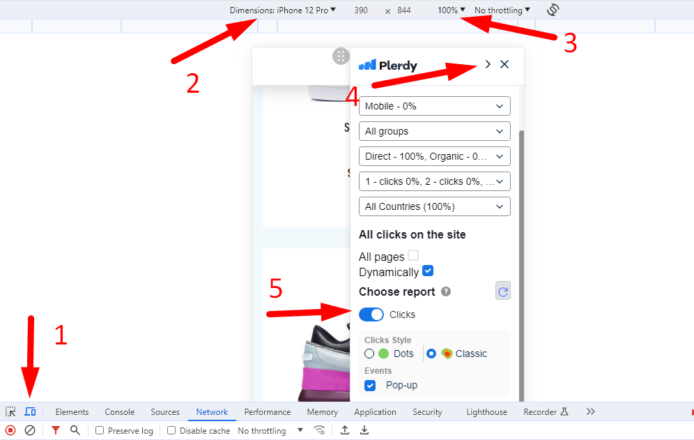
- Step 1: Install the heatmap tool’s SDK into your app codebase, typically involving adding a line of code to your initialization settings.
- Step 2: Configure your settings according to the type of data you want to capture. This might involve setting up specific screens or actions to track.
- Step 3: Test the integration on development or staging environments to ensure data is being captured correctly without affecting app performance.
- Step 4: Roll out the integration in a live environment but monitor app performance and user feedback closely for any unforeseen impacts.
Integration is just the start. The real magic happens when you begin to see the data flowing in!
Interpreting Heatmap Data
Interpreting heatmap data effectively can transform your app’s user experience. Here’s how to make sense of the data:
- Identify Patterns: Look for areas with high interaction (warm colors) and areas that are ignored (cool colors). High interaction might indicate a feature’s popularity or a potential usability issue.
- Contextualize the Data: Understand the context behind the interactions. For example, if a button has high engagement, is it because it’s useful, or are users confused?
- Make Informed Changes: Use the insights gained to make iterative changes. This could mean redesigning overlooked areas, simplifying navigation, or enhancing popular features.
- A/B Testing: Before making major changes, validate your hypotheses with A/B testing, comparing how different designs perform in terms of user engagement.
Each step in interpreting data is about turning raw numbers into actionable insights that can significantly enhance user satisfaction and engagement.
Implementing heatmaps is more than just collecting data; it’s about continuously improving your app to meet user needs more effectively. Each interaction captured is a piece of the puzzle in understanding your users better.
Remember, the goal is to make your app as intuitive and enjoyable as possible. With the right heatmap tool and approach, you’re well on your way to achieving just that. Ready to see the difference?
Case Studies and Real-World Applications
Wondering how mobile app heatmaps translate into real-world success? Let’s dive into two fascinating case studies where businesses leveraged heatmap analytics to dramatically enhance their mobile apps. By understanding user interactions, these companies were able to make targeted improvements, boosting user engagement and satisfaction. Ready to see what insights heatmaps could unlock for your app?
Case Study 1: E-commerce App
Imagine an e-commerce app struggling with low conversion rates on its product pages. The team implemented mobile app heatmaps to understand how users interacted with their app. Here’s what they discovered and how they responded:
- Problem Identified: Heatmaps showed that users were frequently tapping on images hoping to zoom in, but nothing happened. This frustration led to a higher drop-off rate.
- Solution Implemented: The app developers quickly added a pinch-to-zoom feature and made product images expandable.
- Results: Post-implementation, the app saw a 30% increase in user engagement on product pages and a significant increase in conversion rates.
The heatmap insights provided a clear direction, and the team was able to make a simple yet powerful enhancement that directly addressed user needs.
Case Study 2: Gaming App
Next, consider a popular mobile gaming app where players were unexpectedly exiting mid-game. The developers used heatmaps to pinpoint the issue:
- Problem Identified: The heatmap data revealed that a frequently used in-game button was placed too close to an ad banner, leading to accidental clicks and frustration.
- Solution Implemented: The layout was redesigned to move the ad banner to a less intrusive spot and the button was made slightly larger to ensure easy accessibility.
- Results: These changes resulted in a 40% decrease in accidental exits and a noticeable improvement in player retention and satisfaction.
This case study highlights how heatmaps can reveal design flaws that, once addressed, significantly improve the user experience.
These real-world examples show how powerful mobile app heatmaps can be in identifying and solving user experience issues. By visualizing how users interact with your app, you can make informed decisions that lead to better business outcomes.
Conclusion
So, what’s the real scoop on mobile app heatmaps? You’ve seen how they turn vague guesses into actionable insights. Whether it’s refining your app’s interface or boosting user engagement, heatmaps are like your secret detective, uncovering the hidden truths of user behavior.
Now it’s your turn! Imagine integrating these insights to transform your mobile app. Why not give it a shot? Try out a heatmap tool like Plerdy today, and start seeing your app through your users’ eyes. Got a burning question or an insight to share? Jump into the comments below or share this article with your team. Who knows? The next big app improvement could start with your click!


 300+ G2 reviews