2025: Web design Oh, these days, it goes beyond simply beautiful websites. This is your digital handshake, first impression. Imagine visiting a site and it feels like entering a future showroom—cool, elegant, and quite easy to use. Modern trends can do is that.
Staying behind is not a choice available to companies. Nobody wants a website looking to be from 2015 (sorry, Comic Sans aficionados). The new design trends hold attention, not only catch it. Websites work harder for your brand thanks to interactive elements, strong layouts, even environmentally responsible choices—yes, sustainable design is a thing!
Knowing these trends enables you to design a website that not only looks great but also converts. Tools like Figma or sites like Squarespace simplify jumping in and improving your skills.
Dynamic Cursors – Interaction That Engages
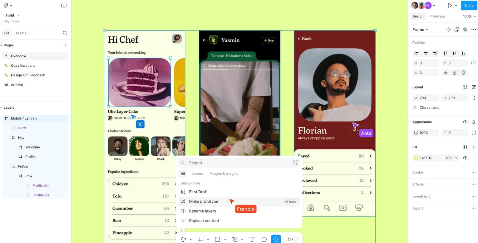
What Are Dynamic Cursors?
The fresh trend in web design is dynamic cursors! These days, they are not only a typical dull pointer. Rather, they metamorphose for your website like a design chameleon. Depending on where you hover, they can add animations, alter size or form. See your cursor hovering over a button transforming into a stunning hand icon or a spotlight on a picture. cool, huh?
Current web trends need for more than just fixed designs. Easy creation of these effects by designers is made possible by tools like Web flow and Figma. Dynamic cursors not only look great but also give your website users “Wow!sensation.
Benefits of Dynamic Cursors
For what reason should one follow this web design trend? since it keeps consumers involved. Nobody enjoys a boring, old website. Dynamic cursors help your design to come to life and greatly increase user interaction.
Check out these benefits:
- Better Navigation: Dynamic cursors let users quickly locate clickable spots.
- Personalized Web Experience: Your website design exudes modernism and originality.
- Increased Engagement: Visitors spend more time exploring since it’s enjoyable!
Paolo Fornasier’s portfolio, for instance, makes a basic online interaction unforgettable by using ripple effects for links.
How to Use Dynamic Cursors Effectively?
The truth is overdoing it can destroy your design. Nobody appreciates a website that resembles a circus. Keep your dynamic cursors understated yet effective.
Pro tips for web designers:
- Reflect the atmosphere of your design. Professional brand? Apply little influence. Fun brand: Go crazy!
- Coach user behavior. Point out buttons or highlight sections using cursor changes.
- Try for speed optimization. Laggy animations destroy the user interface.
- Test on several devices. On desktop, something appears great; on mobile, it can break.
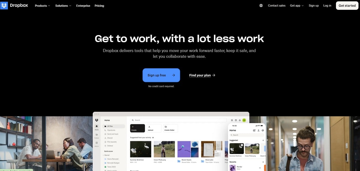
Need ideas? See the Dropbox website; their cursors mix function with trend exactly. Alternatively add seamless, interesting animations to your work using Framer.
Dynamic cursors are like seasoning; too much destroys the dish, but just enough distinguishes your website design. Maintaining balance will help you to see returning visitors on your website.
Sustainable Web Design – Eco-Friendly Digital Future
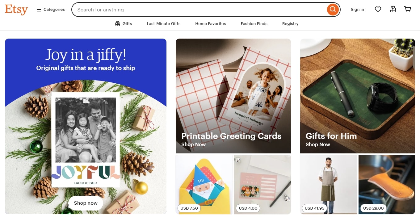
What Is Sustainable Web Design?
Design for sustainability on the web Sounds fancy, indeed. However, it’s basic. Making websites environmentally friendly and less energy-hungry is really key. You understand the effort required in loading a large-scale website? much. And non-renewable sources of this energy abound. Therefore, sustainable online design emphasizes on maximizing websites to be lighter, faster, and friendlier to the earth.
Minimalistic design trends, smaller graphics, and simple code—all of which have great impact. Already following these ideas are companies like Etsy and Patagonia. Apart from their aesthetically pleasing appearance, their websites are environmentally sustainable.
This clever trend goes beyond mere feeling good. People enjoy helping companies that share environmental concerns. Faster websites also imply better user experience. Win-wise!
Steps to Create Sustainable Websites
Ready to make your website more sustainable? It’s not rocket science. Here are some steps:
- Resize, compress, and apply WebP style picture optimization.
- Less clutter and more emphasis in minimalistic design trends.
- Sort your code: cut out superfluous JavaScript and CSS.
- Use green hosting; then, go to servers run by renewable energy.
- Less videos; substitute small animations or stationary content for long videos.
- Turn on lazy loading; load items just as necessary.
Following this trend is easier when businesses like GreenGeeks provide hosting driven by renewable energy.
Remember, each little adjustment counts. These guidelines will help your web design help lower the carbon footprint of the digital world. It is the future not only a trend. Why then should we not start today? Sustainable web design is a responsibility; it is not a hassle. Improve your website for the Earth and your audience!
Asymmetry – Controlled Chaos for Creative Appeal
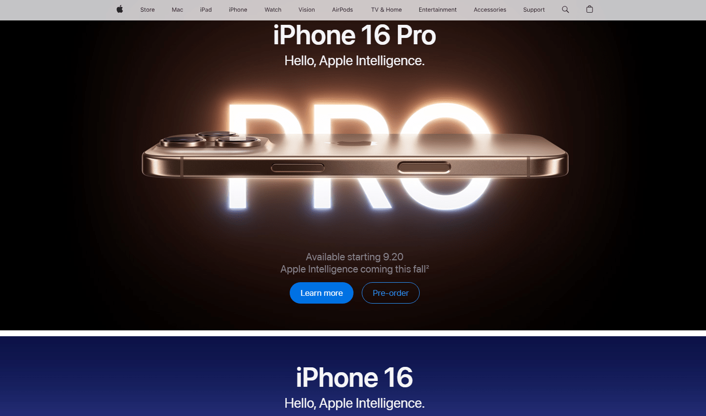
Why Asymmetry Works
Though symmetrically pleasing, let’s be honest: it’s expected. Conversely, asymmetry… In web design, it resembles well regulated anarchy. Imagine a webpage where imperfect alignment of parts nonetheless produces harmony. That is the enchantment of asymmetry. Well, it feels new and dynamic, hence it draws interest and keeps the user involved.
Asymmetry offers your design that distinctive touch and breaks the conventional online trends. Consider business like Apple or Spotify. Their landing pages have strong layouts with surprising placements that really work. Curious users scroll to discover more.
Tips for Using Asymmetry
Not all chaos is good chaos. Asymmetry in web design still needs a plan. Here’s how to nail it:
- Stressing balance, keep the design intriguing but avoid confounding it.
- Highlights important points; make CTAs stand out by arranging them off-center.
- Experiment with text and graphics; big pictures and small fonts? Sure, kindly.
- Follow a trend: for a polished look mix asymmetry with simplicity.
- Test it using instruments like Plerdy to observe user behavior.
Play about, but never forget the objectives of your website. Though usability usually comes first, asymmetry can be fashionable.
Mistakes to Avoid in Asymmetrical Design
The difficult part now is here. Asymmetry may go quickly awry. Steer clear of these land mines.
- Overloading the design—too many items strewn all around will perplex consumers.
- Ignoring visual hierarchy: Users should know initially what to look at.
- Not testing on mobile: Smaller screens may break what appears great on desktop.
- Using too many colors—stay with a basic palette.
Though it seems disorganized, asymmetry is about equilibrium. Test, change, and don’t hesitate to embrace chances. Because done well, this trend will make your website unforgettable.
Micro Animations – Enhancing User Experience
What Are Micro Animations?
In web design, micro animations are little motions. These are subdued, like a button bouncing when hoved over or a progress bar filling seamlessly, not ostentatious components. These animations give your web design life.
Their goal is not only aesthetic one. Micro animations create an engaging experience, provide feedback, and direct users. Imagine a webpage devoid of action; it seems out of date. Micro animations give your web interface new and interesting using current design trends. They are the additional element that keeps guests fascinated.
How Micro Animations Improve UX/UI
How then may tiny animations improve your website? Here’s the deal:
- Easy navigation: Arrows or highlights direct users toward their destinations.
- Interactive feedback: Links shining on hover or buttons pressed down feels good.
- Brand identity: Special animations might capture the web design attitude of your business.
- Trend-driven appeal: Following current web trends reveals your website is modern based on trends.
But keep your cool with them. Too many animations can overwhelm consumers and slow down the operation of your website. Carefully support the design and user experience of your website using animations.
Examples of Effective Micro Animations
Now ready for some ideas? Popular instances of how micro animations shine in web design are here:
- Hover effects: Like on Dropbox or Google Drive, buttons that somewhat expand or change color when hoved.
- Loading screens: animated progress bars or logos—a major advantage for online stores.
- Page transitions: Smooth slide-ins following Airbnb’s tendencies between web pages
- Interactive symbols—Heart icons seen on Instagram that “pop” upon clicking.
Micro animations assist your website fit the newest design trends by combining appearance and purpose, therefore enhancing user-friendliness. Considerate animation use That is your pass to a remarkable online presence.
Organic Shapes – Softening Digital Edges
Introduction to Organic Shapes
Natural, flowing, free-form features breaking the grid in web design are organic shapes. Consider circles, blobs, or wavy lines rather than exact, geometric squares or rectangles. These forms reflect the flawed, smooth forms found in nature—leaves, clouds, water ripples.
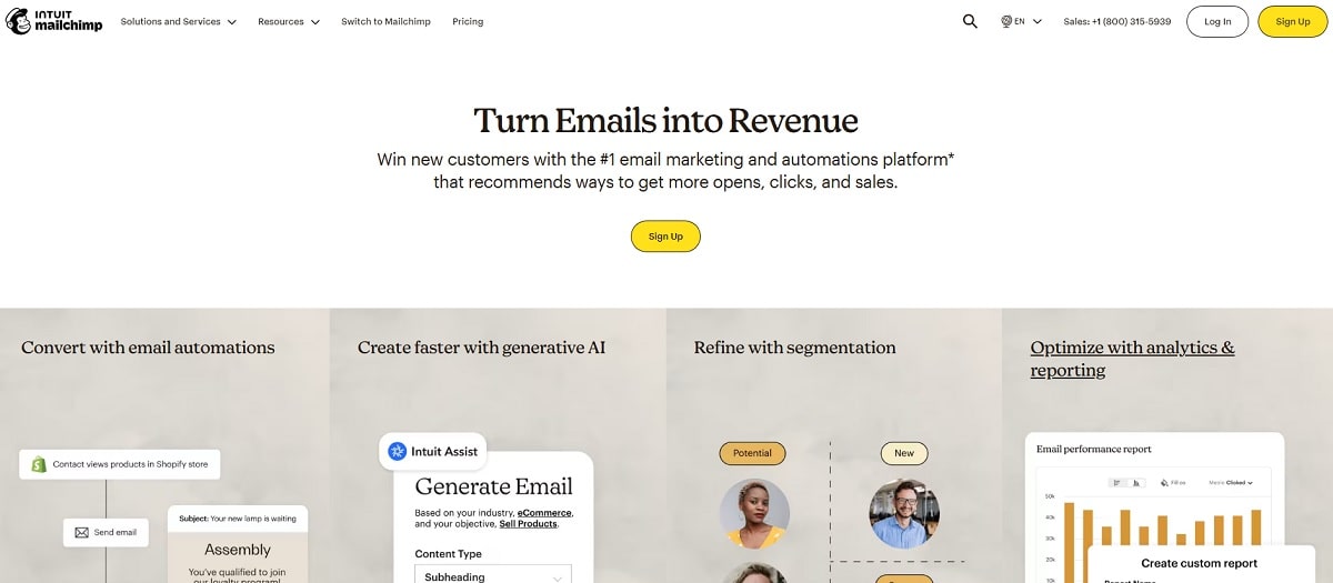
In web design, they provide your website a more friendly, softer attitude. This approach gives designs a human touch instead of strict, corporate tastes. To distinguish out and produce attractive, dynamic interfaces, companies like Spotify or Mailchimp employ organic shapes.
Including these forms into your website’s design will help it to feel lively, welcoming, and, quite “human.”
How Organic Shapes Influence UX
Organic forms provide purposes beyond mere beauty. Their consistent forms and seamless curves direct the eye, therefore enabling visitors to more naturally traverse webpages.
- Pay close attention; soft forms around CTAs (call-to- action) or headers help them pop without shouting.
- Break the monotony; nobody wants another formula website. These forms demonstrate imagination and liven web designs.
- Create emotion; rounded forms appear warm and accessible, therefore increasing confidence and involvement.
Following this trend is a clever approach to set your site design unique from competitors and enhance user experience (UX).
Practical Tips for Designers
Would like to explore organic forms? Here is how you get going:
- Key is balance; use organic forms to accentuate rather than overwhelm your page. Blobs too many can divert users.
- Combining natural forms with structured ones will give a modern web design style.
- Think strategically; arrange forms, buttons, or headlines close to key ideas.
- Use design tools; bespoke organic shapes can be created with plugins found in Figma or Adobe XD.
Organic forms are here to soften the borders of the digital world, not only a trend. Make careful use of them; your website will seem new, fresh, and user-friendly!
Bold Typography – Make a Statement
What Is Bold Typography?
Big, heavy typefaces that catch your eye right away define bold typeography. This is the web design loudspeaker, yelling, “Hey, look here!Headlines, CTAs (call-to- action), or anything on your website you want users to not miss generally call for bold fonts.
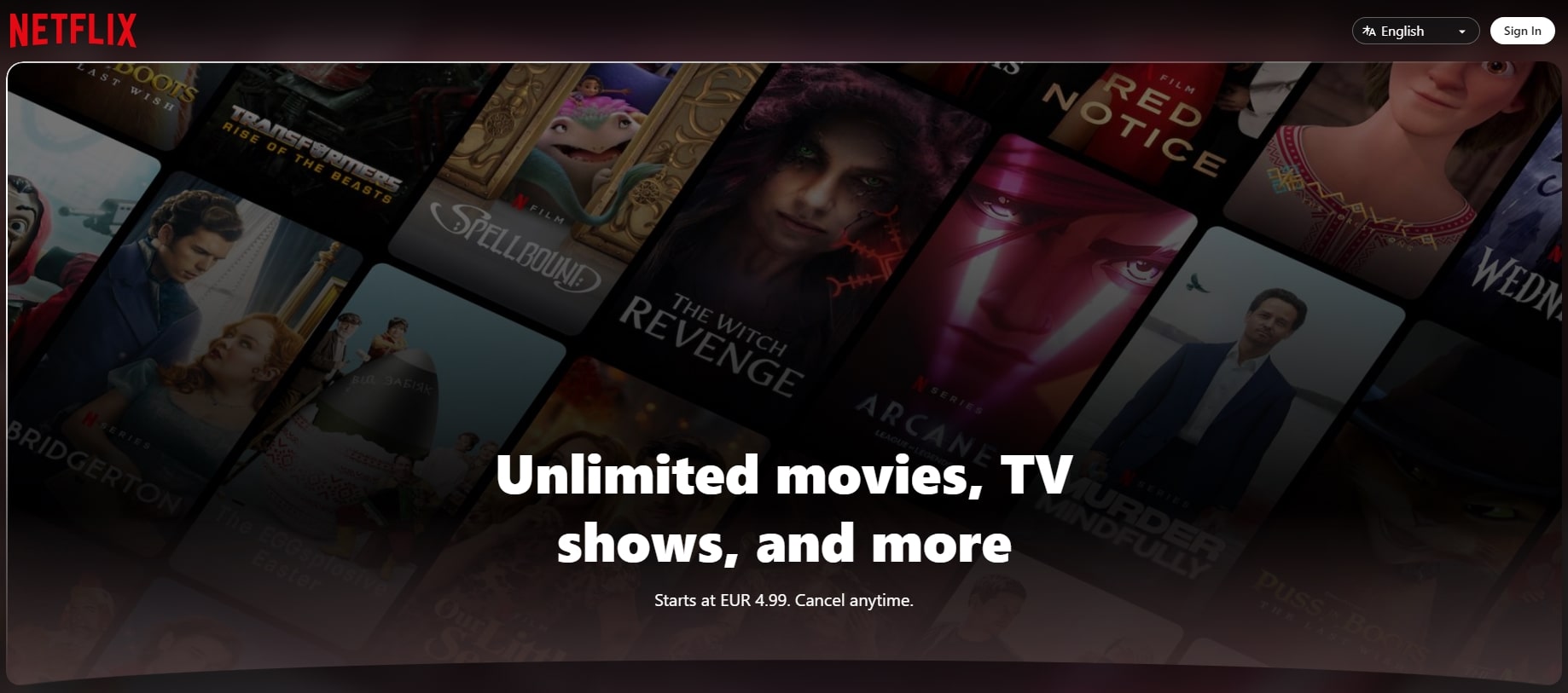
Contemplate companies like Apple or Netflix. They provide a clean, modern impression and convey strong ideas using bold typography. This approach is not only fashionable but also sensible, particularly with regard to accessibility. On small displays as much as on larger ones, big fonts are more readable.
Bold typeography can thus give your design more character and help your message to stand out whether you run an online store or a portfolio website.
How Typography Shapes User Perception
Typography speaks for your website, just as speech. Bold fonts convey to consumers confidence, dependability, and professionalism. When used sensibly, it can even help to direct emotions.
- Trust: Stable fonts are clean, strong ones.
- Energy is sparked by excitement—bright colors matched with strong typography.
- Elegance: Bold typeface in simple, minimalist designs seems sophisticated.
For instance, because it grabs attention and clarifies the action, a strong “Buy Now” button on your website can increase click-through rates.
Typography goes beyond design to include user experience when visiting your website.
Trends in Typography for 2025
Typography trends change; 2025 offers some interesting changes:
- Dynamic designs that fit screen widths vary in typeface.
- Fonts piled with textures or colors create layered typeography.
- Bold 1970s or 1980s designs returning under retro inspiration.
- Experimental forms challenge accepted design guidelines.
- Moving typeography gives webpages life with animated fonts.
These trends enable designers to keep ahead and produce original, interesting web environments. Discover these concepts to keep your website unique and current. Bold typeface is a design statement more than just a font!
Parallax Scrolling – Storytelling Through Motion
What Is Parallax Scrolling?
Parallax scrolling is the movement of several layers of a webpage under different speeds as you scroll. It’s like magic, for websites. A cool depth impression results from the gradual backdrop movement and rapid foreground piece movement.
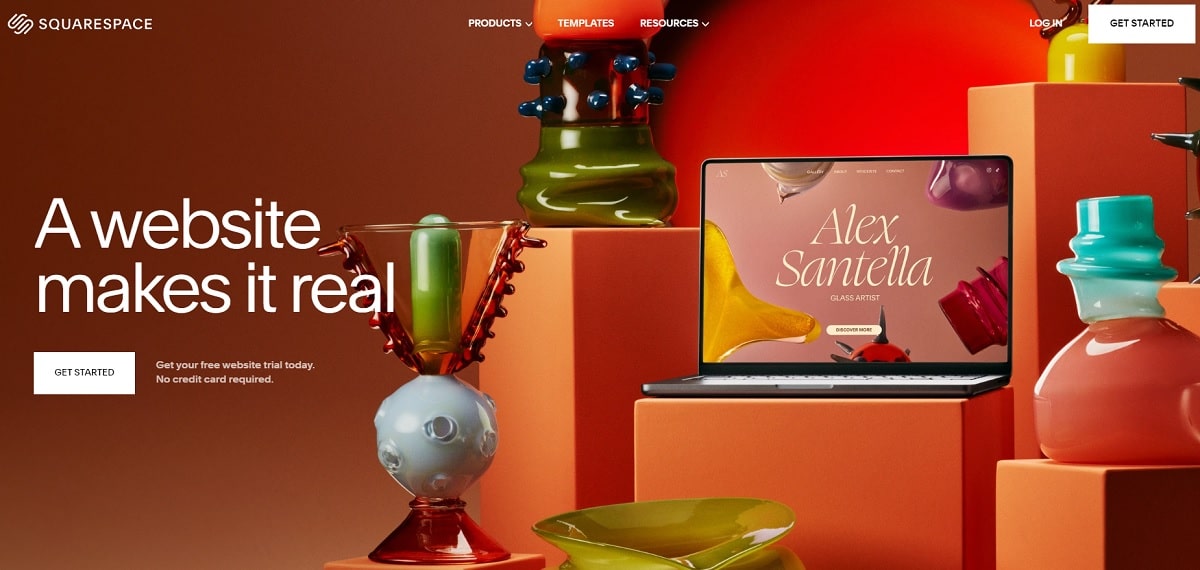
Consider those elegant Apple’s product pages or Squarespace landing pages. The design seems to be alive. In web design, this is a common trend since it grabs visitors’ attention and makes them want to scroll more. It also works wonderfully for dynamically presenting the features of your product or for storytelling.
This effect distinguishes your page—big time—for an online portfolio or an e-commerce website.
Why Parallax Scrolling Works
Parallax scrolling is clever rather than only hip. It keeps users involved longer and draws their attention. Imagine entering a 3D room on your screen—that is quite interesting.
- Provides design depth and gives a flat page a fascinating layered quality.
- Perfect for showcasing your brand journey or product attributes, this helps storytelling.
- Memorable events: Your website moves will help visitors remember it.
A website showing travel destinations, for instance, might employ parallax to lead readers through several excursions methodically. It is interactive but narrative.
Implementation Tips
Would you like parallax scrolling added? Begin here:
- Keep it seamless; nobody enjoys a jerky scrolling experience. Apply light web components.
- Emphasize important points using parallax not only for appearances but also for design purpose.
- Test mobile compatibility; parallax effects might slow down your website on phones, hence test extensively.
- Don’t overdo it; too many effects could confuse users or cause your website to seem disorganized.
Without any code, tools like Webflow or plugins make parallax scrolling rather simple. Add this to your toolkit of designs and see how often visitors to your website scroll!
Dark Mode – Sleek and Functional
Why Users Love Dark Mode
Dark mode is a feature users are insane about, not only a web design trend. Especially in low light, it is quite simple on the eyes. Imagine browsing a webpage at night devoid of that dazzling white light. For devices with OLED screens, it’s also fantastic since it extends battery life.
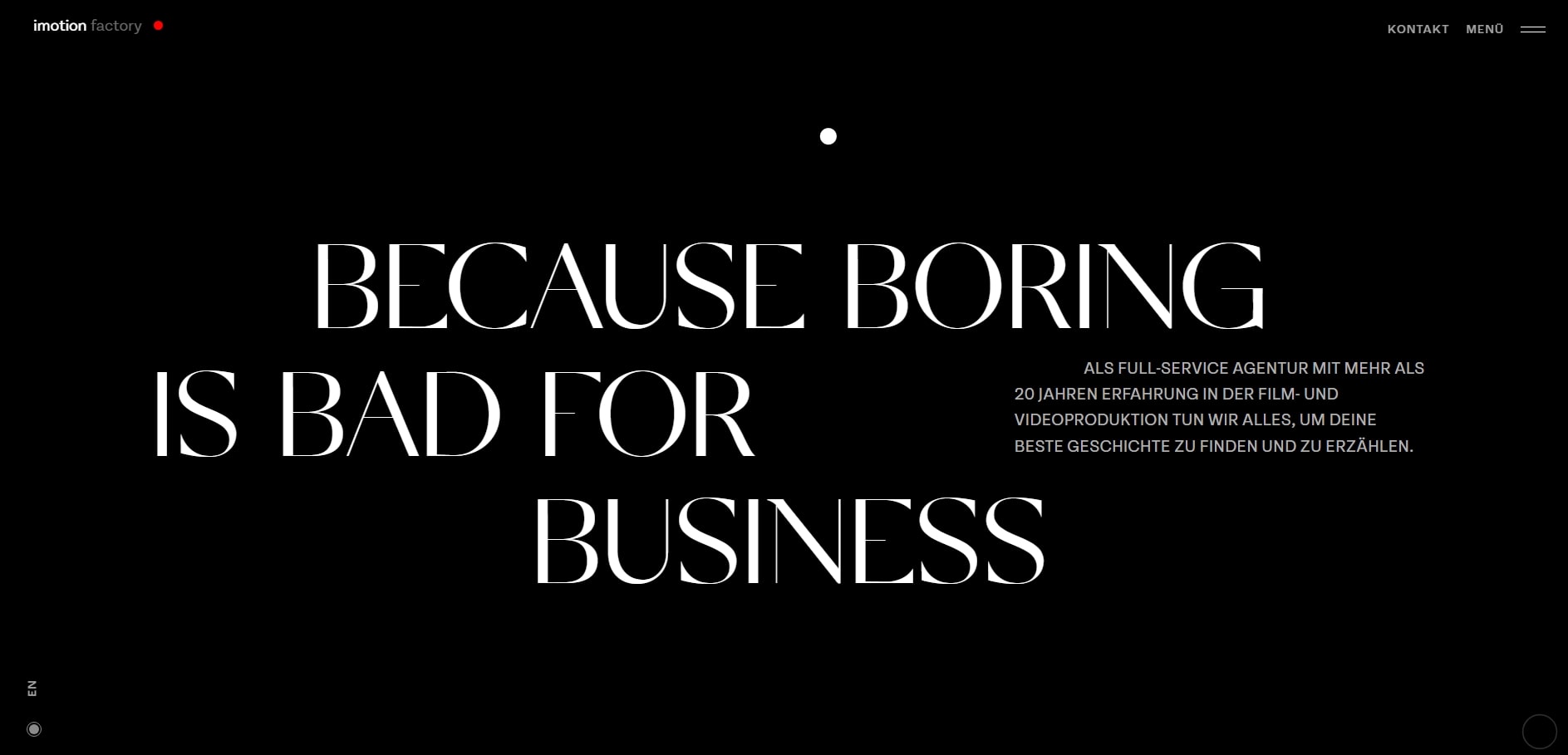
Dark mode web design offers that futuristic, sleek attitude. Sites like Spotify or Netflix show how contemporary and professional dark mode may look. It also increases access. For those with visual sensitivity, less glare translates into a more pleasant experience. It’s fashionable as well as useful.
How to Implement Dark Mode
Including dark mode into your online layout? Simple but you have to execute it correctly.
- Allow your users to move between dark and light modes with a toggle button.
- Design should have proper contrasts; avoid all black and utilize strong white writing in deep grays.
- Design elements should be clean and readable in both modes using easily available web-safe colors.
Bootstrap and Tailwind CSS tools simplify dark mode integration into your website design. You might even make it match user system settings. Those small architectural touches improve your site.
Examples of Great Dark Mode Websites
Could you need some design inspiration? Review these outstanding samples:
- Twitter: Perfect mix of dark tones creates seamless transitions.
- GitHub: For late-hour programmers, a lifesaver.
- Dribbble presents designs in a gloomy mode fit for design.
- Slack keeps its elegant look while lowering glare during extended meetings.
Done correctly, dark mode transforms your website from average to extraordinary. Indeed, it is a trend; however, it is one that will last.
In summary
Web design trends are the building elements of future-proof websites, not only interesting concepts. From elegant dark mode to strong typeface, these trends enhance the appearance of your website not just. They render it memorable, useful, and easy to utilize. Imagine it: would you hang around a dull, out-of-date website? Usually not.
Parallax scrolling or tiny animations help to create an experience out of a still page. Big names like Spotify and Netflix already do to keep consumers hooked. Why then should you not borrow these concepts for your own works?
The secret is trying different things. Combining imagination with pragmatism will let your website set rather than merely follow trends.
