Dive into the streamlined simplicity of one-page websites, where every scroll unveils a cohesive story of brand and functionality. In 2024, these sleek designs are not just trends—they are essentials for businesses aiming to capture and retain user attention with a minimalistic approach. Highlighting the top 10 one-page website examples, our exploration spans various niches:
- E-commerce platforms optimizing the path to purchase
- Portfolio sites showcasing artistic flair
- Event promotions that pack a punch in a single view
Each example underscores the power of thoughtful design to enhance user experience and interaction. As we dissect these masterpieces, notice how strategic elements like visual hierarchy, responsive transitions, and targeted call-to-actions work in unison to elevate a website from ordinary to extraordinary. To truly see your one-page site perform, consider leveraging Plerdy’s analytics tool—ideal for improving usability, enhancing conversion rates, and conducting insightful A/B testing.
How to Create a One-Page Website with a Great Design?
Crafting a one-page website with outstanding design begins by understanding that less is more—clear, concise, and compelling. Here’s how to achieve that streamlined elegance:
- Start with a strong foundation: a clear understanding of your goal for the site.
- Design should serve as a guide, leading visitors through content with intuitive ease.
- Use high-quality visuals that communicate your message without overwhelming the space.
This approach to website creation ensures that every element on the one-page site works harmoniously to tell a cohesive story. This method isn’t just about making things look good—it’s about making them work brilliantly in a compact space. Here are some key practices:
- Prioritize mobile responsiveness to ensure accessibility across all devices.
- Employ a visual hierarchy that emphasizes key information.
- Integrate smooth navigation that encourages exploration without the clutter.
Creating a one-page website that engages visitors involves attention to detail, design, and simplicity. This comprehensive approach improves user experience and website impact.
List of 10 Top One-Page Website Examples
Exploring the “Top 10 One-Page Website Examples in 2024” feels like unboxing hidden treasures, each revealing unique design insights that turn minimalism into a visual feast. These standout sites blend functionality and style, proving that a one-page website can pack a powerful punch when executed with precision. Dive into these examples, and you’ll find a masterclass in making every pixel count, where design meets clarity in a seamless dance.
Momentum
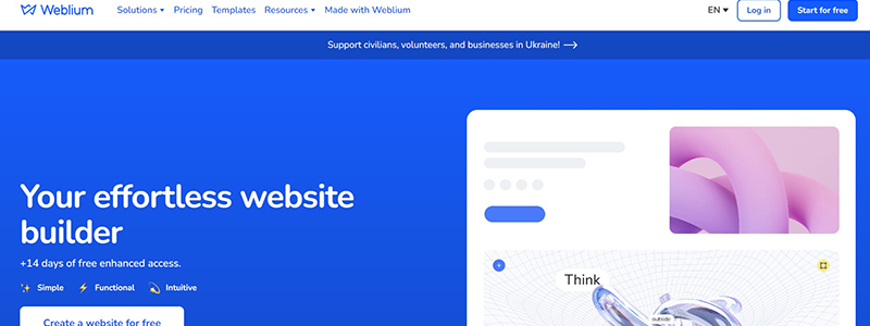
In the bustling digital era, having a sleek, all-in-one-page website is not just trendy—it’s essential. Weblium stands out as a premier example with its seamless, one-page website design that is both intuitive and visually appealing. This website effortlessly guides users through its various sections without the hassle of navigating multiple pages, making it a prime candidate for our “Top One-Page Website Examples.”
Key features of Weblium’s one-page website include:
- Effortless Navigation: Scroll smoothly from one section to the next all on a single page.
- Dynamic Content: Engaging visuals and interactive elements keep the user experience lively and effective.
- Optimized Performance: Fast loading times and responsive design ensure that the website performs well on any device.
This website not only showcases its product effectively but also illustrates the power of a well-crafted one-page website. Users can find everything from service descriptions to customer testimonials without ever leaving the page. Each segment is clearly delineated, yet the transitions are so smooth that you barely notice them.
Incorporating integrations like Hotjar and Zapier, Weblium’s one-page website also highlights its versatility and connectivity, appealing to a tech-savvy audience looking to maximize the utility of their website. It shows how one-page websites may provide a wide range of content without sacrificing user interest or appearance.
Treehouse
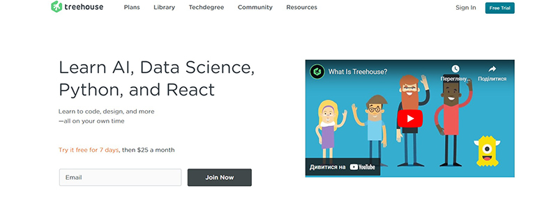
Embarking on a learning journey in tech has never looked as sleek and accessible as it does on Treehouse’s one-page website. This educational platform has mastered the art of single-page design, providing a comprehensive learning tool on one seamless webpage. Treehouse stands out in our “10 One-Page Website Examples in 2024.” because it has everything a budding tech enthusiast needs.
Treehouse’s website facilitates a smooth, uninterrupted user experience that emphasizes learning in a digestible format:
- All-in-One Learning: From AI to React, find everything on a single page.
- Interactive Sections: Engage with the content through interactive elements and video tutorials.
- Start Learning Promptly: Jump into lessons with minimal clicks or navigation delays.
The one-page website effectively showcases a wide array of courses and tools, making it easier for users to absorb information without the need to jump from one page to another. Noteworthy features include streamlined navigation, crisp design elements, and interactive content that engages users from start to finish. The website also highlights success stories and prominent companies that employ Treehouse graduates, enhancing its credibility and appeal.
This one-page website shows how instructional platforms may elegantly and efficiently offer complex knowledge for beginners and experienced developers.
James Oconnell

James O’Connell’s one-page website is suitable for our “Best One-Page Website Examples.” It blends simplicity and professionalism. This website distills O’Connell’s creative career into one scroll.
Here’s why this one-page website shines:
- Clarity and Cohesion: The website’s layout presents James O’Connell’s journey and portfolio in a way that is easy to follow and visually engaging.
- Comprehensive yet Concise: It effectively displays his positions as Creative Director, Designer, Illustrator, and Speaker without leaving the main page.
- Interactive Elements: Users get a taste of his dynamic style through subtle animations and hover effects.
James O’Connell’s one-page website ensures that every visitor gains a full understanding of his professional landscape in just one stop. The website highlights his collaborations with high-profile brands like Nike and YouTube, and emphasizes his belief in the power of networking and story-sharing within the industry. With easy access to his contact information and social media links, the website not only showcases his work but also invites further engagement. It’s an exemplar of how a one-page website can tell a compelling story and maintain functional simplicity.
Typetalk

In a heartfelt announcement on their one-page website, Typetalk declares the end of its journey. This single-page website effectively communicates the sunset of Typetalk—a platform celebrated for fostering connections among teams. Our “Best One-Page Website Examples.” includes this one-page structure because it exemplifies clear, concise communication.
Key aspects of this one-page website include:
- Straightforward Layout: Information flows logically, guiding visitors through the announcement with ease.
- Emotional Connection: The use of direct, sincere language establishes an emotional link with the readers.
- Efficient Use of Space: Despite being a one-page website, it successfully covers the company’s journey, the reasons for the decision, and what lies ahead.
Typetalk’s one-page website demonstrates the power of minimalistic design without sacrificing depth or meaning. Visitors to the website can quickly grasp:
- The history and achievements of Typetalk
- The reasons behind its closure
- Next steps for users
With its user-friendly design and poignant messaging, Typetalk’s one-page website not only delivers essential information but also captures the emotional essence of saying farewell to a beloved platform. This makes it a standout example of effective web design in our digital age.
Hourly

Our “Top 10 One-Page Website Examples.” includes Hourly, which revolutionizes time management. With a bold and straightforward design, this website seamlessly integrates functionality and style, catering to both hourly workers and those looking to optimize their productivity.
Key Features on the One-Page Website:
- Easy Navigation: Users glide through information effortlessly, making understanding app features a breeze.
- Vivid Typography and Colors: Engaging visuals capture attention and enhance readability.
- Interactive Elements: Taps and scrolls reveal app functionalities and user benefits engagingly.
This one-page website serves as more than just a digital brochure for the app; it’s a portal to enhanced productivity. Here’s why Hourly’s website excels:
- It simplifies the message — “Stay home, track time, be efficient.”
- It highlights the app’s key benefits, such as increased earnings through better time management and the ability to track diverse activities.
- It assures potential users with a closing bold statement, “oh, and it’s free,” which effectively removes any barriers to trying the app.
Hourly’s one-page website is instructive and invites professionals and ordinary people to try a new time management method. This clever use of a one-page design ensures that every visitor leaves with a complete understanding of what Hourly offers without the need for additional clicks or navigation.
Upstate Laundromat
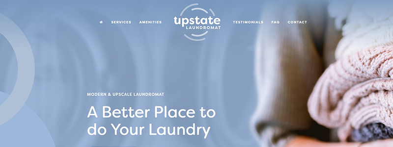
Upstate Laundromat’s one-page website brings a breath of fresh air to the chore of laundry, turning a mundane task into an upscale experience. This one-page website shows why Upstate Laundromat is a leader in laundry experience transformation, making it our “Best One-Page Website.”
Key Elements of the One-Page Website:
- Ease of Navigation: Users glide effortlessly through services, amenities, and customer testimonials, all on one page.
- Clean Design: The website uses soothing colors and minimalistic design to reflect the cleanliness and modernity of the laundromat itself.
- Interactive Features: From FAQs to service explanations, everything is accessible with just a scroll.
This one-page website excels in providing all the necessary information without overwhelming the visitor. Features include:
- Coin & card-operated machines
- Fold & wash services
- Loyalty discounts
Upstate Laundromat’s website is educational and engaging, with client testimonials. It embodies the concept of simplicity and efficiency, ensuring that every visitor can quickly understand the full range of services offered. The one-page layout emphasizes convenience, mirroring the hassle-free experience the laundromat promises, making it an exemplar in the one-page website domain.
Coppé – MILK
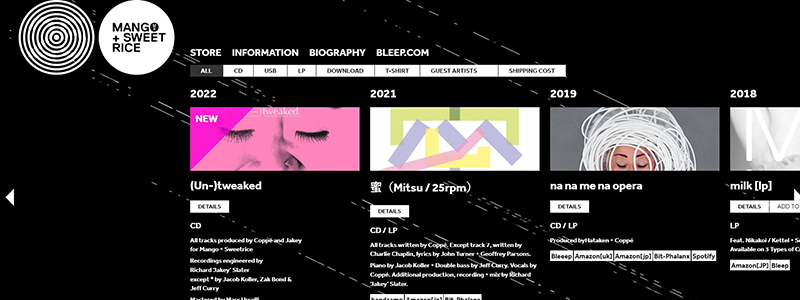
Explore Coppé’s inventive universe on the Mango + Sweet Rice label’s one-page website, which is both functional and beautiful. Featured in our “Top 10 One-Page Website Examples in 2024,” this site brilliantly showcases Coppé’s discography in a streamlined, effortlessly navigable format.
Key Highlights of the Website:
- Chronological Layout: Albums are presented in a timeline format, making it easy to browse through years of creativity.
- Minimalistic Design: The use of black and white with strategic splashes of color focuses the user’s attention on album art and essential details.
- Efficient Navigation: The intuitive scrolling mechanism allows fans and new visitors to glide from one album to the next without any hassle.
This one-page website brilliantly encapsulates the essence of Coppé’s music career:
- Albums are displayed with vital details like release year, collaborators, and available formats.
- Direct links for purchasing or streaming albums ensure that fans can easily access the music right from the website.
- Aesthetic elements such as the background’s subtle animations enhance user engagement without overwhelming the content.
Mango + Sweet Rice’s one-page website offers a seamless experience that keeps the focus on what matters most—the music. It is an ideal digital music model since it combines flair and substance.
Genesis

The Genesis website is a compelling example of one-page website design, brilliantly encapsulating the essence of their plant-based restaurant concept. Highlighted in our article, this website effectively merges artistic visuals with essential business information, creating a seamless user experience.
What makes Genesis’ one-page website stand out:
- Striking Visuals: The site uses intricate illustrations that reflect the organic and mystical ethos of the restaurant.
- Clear Segmentation: Despite being a one-page layout, sections like ‘Who We Are,’ ‘What We Offer,’ and ‘Opening Hours’ are distinctly defined, making navigation intuitive.
- Interactive Elements: Interactive links like a downloaded menu and a reservation system provide usefulness without leaving the page.
This one-page website successfully conveys all necessary information in a streamlined manner:
- Visitors can immediately grasp the nature of Genesis as a 100% plant-based eatery.
- The menu is easily accessible, inviting users to explore their offerings with just a click.
- Essential contact details and social media links are neatly positioned at the bottom, ensuring they are unobtrusive yet accessible.
Genesis’ website is educational and aesthetically reflecting their brand, making it a great one-page website that engages visitors.
The Rafael. The Julian
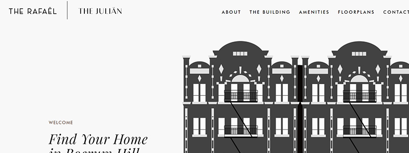
Welcome to The Rafael and The Julian, showcased brilliantly in our “Top 10 One-Page Website Examples.” This elegantly designed one-page website provides prospective residents with a seamless journey through the charms of Boerum Hill’s finest residences.
Efficiently organized into key sections, the website features:
- Welcome Overview: Introducing the chic, village-like appeal of Boerum Hill, inviting users to explore further.
- Detailed Descriptions: From neighborhood allure to building histories and renovations, each segment is concisely detailed, ensuring visitors understand the unique offerings of both The Rafael and The Julian.
- Interactive Elements: Prospective residents can effortlessly navigate through amenities, floorplans, and a stunning photo gallery—all without leaving the homepage.
This one-page website excels in delivering a comprehensive view of the property:
- Amenities: Showcases essential and luxury amenities such as a gym, bike room, and wine cooler.
- Floorplans: Offers potential buyers and renters a peek at various unit layouts.
- Gallery: Provides a visually appealing tour of the interiors, capturing the essence of modern living.
Strategically positioned contact details encourage direct engagement, making inquiries simple and direct. By maintaining all essential information on a single page, The Rafael and The Julian’s website not only retains visitor interest but also streamlines the user experience, reflecting the sophistication and modernity of its residences. Effective design improves user interaction and happiness, as seen by this one-page website.
Peppa Sauce
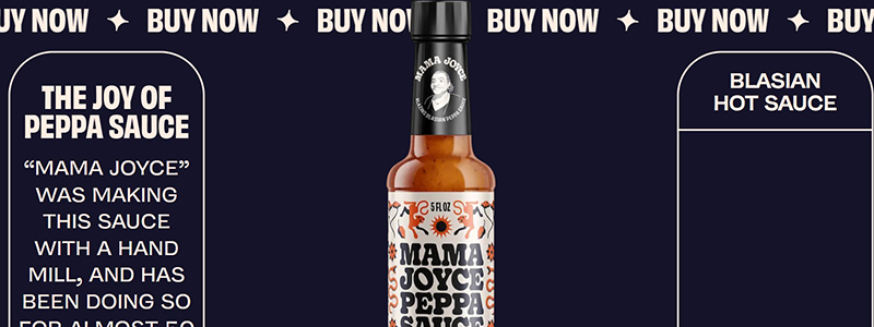
Dive into the bold and vibrant world of Mama Joyce’s Peppa Sauce through their one-page website, a standout addition to our “Top 10 One-Page Website Examples in 2024.” This website masterfully combines engaging design with seamless navigation, presenting everything you need to know about this unique culinary treasure on a single page.
Features that make the Peppa Sauce website exceptional include:
- Dynamic Design: Utilizes eye-catching graphics and typography to draw users into the story of Mama Joyce’s Blasian (Black and Asian) heritage and the sauce’s roots.
- Ease of Access: Strategically placed “Buy Now” buttons ensure that purchasing the sauce is as straightforward as browsing the website.
- Informative Sections: From the sauce’s spicy characteristics to its versatile use with various foods, each segment delivers valuable insights.
The one-page website effectively captures the essence of Peppa Sauce:
- Introduces the product with a captivating backstory.
- Outlines potential food pairings, enhancing its appeal.
- Highlights user testimonials to build trust and credibility.
Besides selling, the Peppa Sauce website invites visitors to experience Mama Joyce’s family tradition with its smart layout and rich storytelling. This one-page website sells a product and promotes a culture, demonstrating how one-page websites can captivate and convert users.
Conclusion
As we wrap up our journey through the “Top 10 One-Page Website Examples in 2024,” it’s clear that mastering the art of one-page website design is more than just understanding the basics—it’s about pioneering new frontiers in usability and aesthetics. These examples not only showcase the pinnacle of one-page design but also serve as a beacon for what is possible when creativity meets functionality in the digital space.
- Each website stands out with its unique blend of visuals and storytelling, ensuring that key messages are not just seen but felt.
- The use of cutting-edge design techniques and technologies transforms each website into a dynamic user experience that captivates and engages.
- From minimalistic portfolios to vibrant landing pages, these websites exemplify how diverse industries can effectively leverage one-page designs to their advantage.
These concepts can help anyone improve their online presence create a one-page website that is practical, attractive, and customized to their business needs. Let these top examples inspire your next web project, ensuring your one-page site is both a marvel of design and a cornerstone of your digital strategy.
