Have you ever repeatedly ⚡ clicked on a button out of frustration because it doesn’t work? If so, you may have experienced what is commonly known as a “rage click.” As a UX expert, it’s my job to understand why users resort to rage-clicking and how to prevent it. With online businesses relying heavily on data-driven insights, tools like Plerdy are used to analyze user behavior and improve website UX. By optimizing website design and functionality, businesses can increase their chances of improving both micro and macro conversions. In this article, we’ll explore the phenomenon of rage clicks and provide tips on reducing them for a better ⚡? user experience (UX).
What are Rage Clicks?

Rage clicks are defined as rapid, repetitive clicks that are often used to express frustration. These ? clicks can be seen as an expression of anger and often result in the user feeling more frustrated. Rage clicking is a common website problem that can decrease user engagement and even crashes.
Various issues, including slow loading times, confusing navigation, and poor UX web design, often cause rage clicks. As users struggle to complete a task, they can become increasingly frustrated and begin clicking rapidly to force the element (button, checkbox, etc.) to do what they want.
These clicks can have various effects, from minor annoyances to major issues. Minor annoyances include page reloads and the inability to complete an order process.
Why Users Rage Click?
Many users rage-click when encountering issues while using websites or applications. Rage clicking is when users repeatedly click on a button or link out of frustration, hoping to get the desired outcome. There are various reasons why users resort to rage-clicking:
- Poorly designed user interface: If the website’s interface is not intuitive, users may find it challenging to navigate, leading to frustration and rage clicks.
- Slow-loading pages: Slow-loading pages can cause users to lose patience and resort to rage-clicking, hoping the website will respond.
- Broken links or buttons: Users may encounter broken links or buttons that do not work correctly, leading to rage clicks.
- Unresponsive website: An unresponsive website can frustrate users, leading them to rage-clicking.
To prevent users from rage-clicking, optimize the website’s user interface and ensure that all links and buttons work correctly and that the website loads quickly. Addressing these issues makes users less likely to resort to rage-clicking, leading to a better user experience.
Understanding the Psychology Behind Rage Clicks

We’ve all been there—we’re scrolling through the internet, minding our own business, and then something appears that causes us to become so angry we have no other option but to click away at it in a fury wildly. But, of course, we are talking about rage clicks—the uncontrollable urge to press on something to make it disappear. This often irrational behavior is driven by a psychological phenomenon known as “anger-based decision-making.”
Rage clicks can be triggered by anything from a pop-up advertisement to an online comment section. Still, regardless of the source, they all invoke a feeling of intense anger that leaves us wanting nothing more than to get rid of whatever caused this reaction. Sometimes, these clicks can lead to positive outcomes, such as closing an unwanted advertisement or blocking an annoying social media user.
If this happens on the website, there are other risks of losing a customer or angering a potential customer because something doesn’t work or there is an error in the interface.
Analyzing and Tracking Rage Clicks

Analyzing and tracking rage clicks is important to understanding user behavior and improving user experience. Many tools help to track and analyze anger clicks. For example, Plerdy is a powerful tool that can be used to track and analyze rage clicks in video sessions.
There are a few steps for you to follow:
- Create a Plerdy account
- Add the tracking code to your website
- Configure the rules for recording video sessions (in the account menu Session Replay > Set up Recording), preferably for all pages
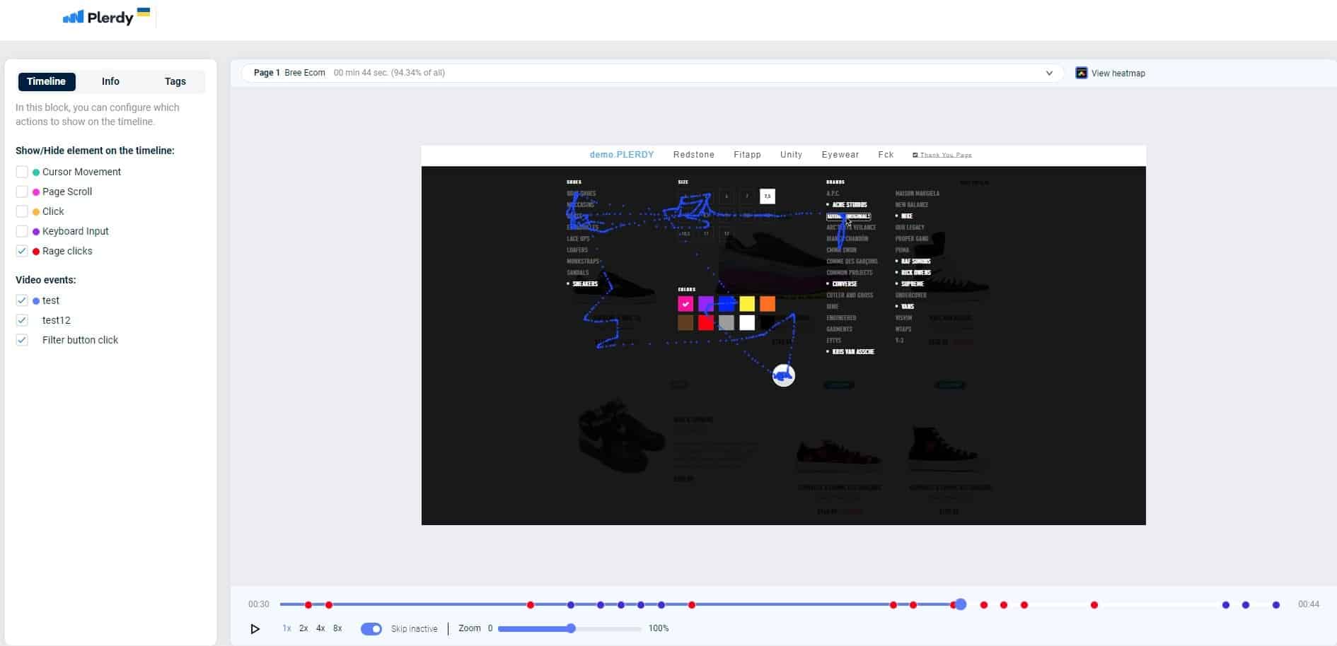
- Video sessions will start to appear in the report. Find the column in the table “Rage clicks.” If the value is greater than zero, such a click is recorded. In case there are several video sessions, the easiest way is to search for such videos in the filter
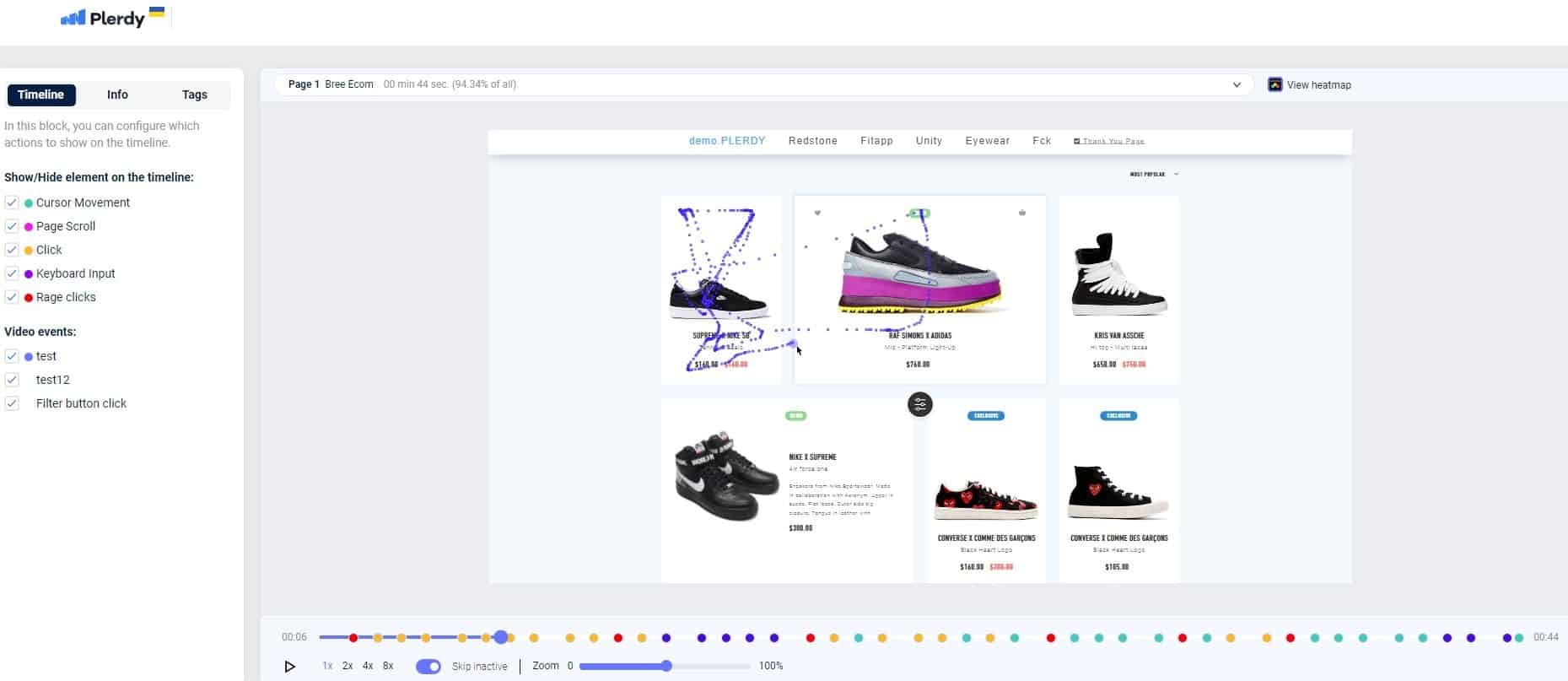
- Go to the video session to see in which element this click was detected. For example, you can see red dots on the timeline in the video. This means that the user clicked there many times in a row. In this case, the user is confused, it either doesn’t work, or they think it should work on the website page.
Try Plerdy for free and explore the powerful features it has to offer.
The Effects of Rage Clicks on User Engagement
Rage clicks have been an issue for years, and it’s becoming increasingly difficult for users to control their emotions when faced with a frustrating online experience. It has already been mentioned above what rage clicks on a website are. It’s when you’re so frustrated with something on the internet that you can’t help but click every button in sight. While it may feel satisfying, rage-clicking can do more harm than good.
Not only can it lead to poor user engagement due to page-loading delays or incorrect navigation, but it can also lead to permanent damage if your mouse pointer isn’t careful! If you’re looking for proof of how destructive these little moments of anger can be, look no further than your computer’s control panel. There are countless horror stories about users accidentally deleting entire folders after one too many clicks in frustration.
Strategies to Reduce Rage Clicks

Once rage clicks have been identified, they can be reduced by improving the user experience. Here are some strategies to reduce rage clicks:
- Improve page load time: you can check website load time with the Pingdom tool, GTmetrix. It will show you what slows down the site, images, JS, CSS or server.
- Simplify navigation and page design: based on this, you should analyze the heatmap and video sessions of Plerdy and look for anomalies in user behavior.
- Create clear and concise instructions: If there is no button or CTA on the button, then the user will not understand that it is possible to click there. Or vice versa, the design element looks like a button, but in fact, it is not a button 🙂
- User path: Online stores need to check the user’s path to purchase because there may be pitfalls in the process.
- QA testing: it happens that after updating the website or changing the design, something breaks (new Bug). You should test the site repeatedly to avoid HTML or backend errors.
By implementing these strategies, it’s possible to reduce user frustration and the number of rage clicks.
Conclusion
Rage clicks are a common problem that can impact the success of any online business. As we’ve seen, missed clicks and dead buttons can cause frustration and negatively impact user experience (UX). Fortunately, with the best use of analytics and analysis tools like Plerdy heatmaps and recordings, teams can identify specific areas causing problems and take action to solve them. Setting a specific goal and metrics is essential to tell whether your efforts to fix the issue are working as expected. The best approach is to keep it simple and take action today to minimize the impact of rage clicks on your website.

Rage clicks are like throwing a stone into water. It’s not the big splash that is so harmful. It is the subsequent waves that do the most damage. More often than not, rage clicks are found in bad content design with text formatted to look like a link yet isn’t or a call-to-action button that is not active on landing. Visitors will repeatedly click the text or button before leaving the content angry. This anger can be focused on the domain as a whole and is often shared with others or many individuals on social channels. The result can be visitors expecting friction instead of an excellent site experience.
Principal Consultant | Daedalus Information Systems