Welcome into the realm of website analytics! Optimizing your online presence and reaching your objectives as a digital marketer and owner of a website depend on knowing your audience. With so many people, though, how can you monitor who is visiting and what they are doing? Recording website visitors helps here! This page will provide ideas and illustrations of how you may log website visitors to obtain insightful information and propel success. Prepare to unleash your website analysis into even more advanced form!
10 Problems Solved by Recording Website Visitors
As said many times, Plerdy provides a complete solution for under-conversion problems at your location. Plerdy’s tools for tracking visitor reactions can be seen as a means to eliminate any obstacles from the buyer’s path since these issues directly follow from a lack of visitor happiness with your resource. These challenges what kind of ones? We enumerate a handful of them here:
Recording website visitors helps one to identify the top 10 issues resolved:
- The call to action must be clear and efficient if we want to raise the UX on the website by means of a banner or button. Recording visitor behavior will enable you to ascertain whether your present call to action (CTA) is successful or not and make required adjustments if not.
- When assessing the customer experience on your website, one should pay close attention to refusal to buy products placed in the basket. Recording visitor behavior helps you to explain why they decide not to buy goods they have included into their shopping lists. This data can guide your modifications to raise micro or macro conversions and improve usability.
- Problems interacting with the support team: The usefulness of a website depends much on effective communication with support personnel. By means of data analysis and visitor behavior recording, one can identify any communication process flaws and implement changes to improve the user experience.
- Problems reacting to interactive activities: On a website, visitors anticipate quick and responsive interactions; so, it is crucial to keep an eye on and examine visitor behavior to find any delays or problems (with a filter or search). By use of visitor activity recording and analysis, one can identify areas needing improvement and maximize the user experience.
- Lack of simple design for the whole website or pages: The UX of a website depends much on its intuitive design. Track visitor behavior to find out how users of pages of a website where the design may be more straightforward interact with them.
- Faster visitor adaption to the UI of the website: The user experience depends much on the way one can adapt to the UI of a website. Data on visitor behavior will enable you to determine aspects that require development to improve their experience and aid you to grasp how fast guests change to match your website.
- Target audience blurring in response to product or landing page positioning Success depends on properly orienting a product for the target market; else, the visitor runs the danger of leaving the page. Recording visitor behavior helps you to understand how well your landing page layout appeals to your target audience and guide any required improvements.
- Vague assurances for money or goods returns: The user experience depends much on clear, succinct guarantees or confidence.
- Short product description The good user experience of a website depends critically on thorough and accurate product descriptions.
- Absence of guest comments: Comments reveal a lot about how users of a website approach their usage. Recording visitor activity and evaluating website or online store data helps you to find whether guests actively remark.
Monitoring who visits your website will help you to learn a lot about how people use it and enable you to make the required adjustments to provide your clients with a seamless and easy travel. Gone are lost sales and guessing games. Having this knowledge at hand will enable you to transform your website into a well-oiled engine turning visitors into devoted consumers.
10 Best Practices for Visitors to Records on a Website
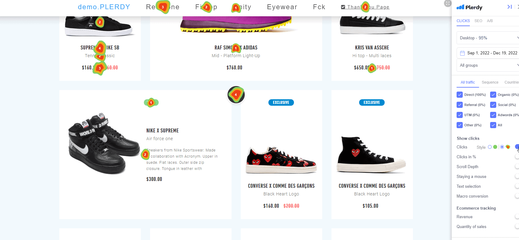
Heatmaps and other tools for visitor recording help to manage the vast universe of website analysis. These graphic displays provide insightful analysis of how users of your website interact—including where they click, scroll, and spend time. Heatmaps and analysis of them will help you to maximize your website for increased interaction and conversion.
10 Best Practices for Analyzing Website Visitors and Setting Up Heatmaps:
- Key Pages for Recording: Identify the most visited pages on your website, such as the home page, service pages, and product category pages, and set up heatmaps to track these pages.
- Understanding Recorded User Behavior: Use heatmaps to gain insights into how visitors interact with your website, such as where they click, how far they scroll, and how long they stay on each page.
- Sufficient Data: Ensure enough data is collected by selecting an appropriate time range when analyzing heatmaps.
- User Engagement Statistics: Monitor statistics to identify sessions without clicks or single-page sessions, which may indicate poor website traffic quality.
- Page-Level Heatmaps: Study heatmaps for individual pages to understand visitor behavior and interactions with specific elements.
- Mouse Movements and Scroll Depth: Analyze cursor movements and scroll reports to gain a deeper understanding of visitor behavior, show anomalies, and decide how to improve your content structure based on the data.
- Click Intensity: Observe the size of hot spots on heatmaps to understand the number of clicks each element receives.
- Sequence of Clicks: To understand the sequence of clicks and visitor behavior, look at the detailed information provided by hovering over hot spots.
- Screen Size: Visitors with larger screens may move their mouse more and not scroll as much, so consider this when analyzing mouse movements and scroll depth reports.
- Informed Decisions: Use the information from heatmaps and related reports to make informed decisions about optimizing your website and improving the visitor experience. By following these best practices, you can gain valuable insights into visitor behavior and take action to enhance their experience on your website.
Heatmaps tell you a lot about how people use your website and can help you make smart decisions about improving it and the user experience.
The key questions in these lists of records website visitors.
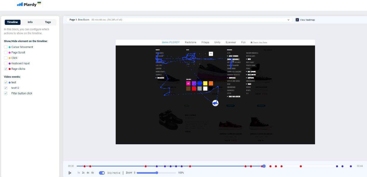
Internationally renowned UX design authorities Matt Isherwood, Rolf Molich, and Jakob Nielsen have come up with lists of rules that professional testers follow when analyzing the UX of website and landing page design.
- Clarity of the current state of a system or website. The design should allow the visitor to understand where he is, what actions brought him to this place, and what the result of his next steps will be. An example of the implementation of this principle is the icon “You are here now” on the maps of stores or other public places.
- The system must correspond to the real world. To navigate the site, words that are understandable to an untrained visitor should be used, not the professional jargon of programmers or experts in any other field. For instance, sections in an online store are named the same as in a regular supermarket, not as they are called in the code.
- User control over the consequences of his actions and the freedom to cancel them. A visitor can commit some action by mistake or due to a misunderstanding of the cause-and-effect relationship. He should be able to completely undo his actions and roll back to the starting point without consequences. For example, if you accidentally add the same item to the cart twice, the e-store interface should explicitly warn you about this and not deduct a double price from your account without your consent.
- Following familiar patterns. If on the nine sites out of 10 registration forms, the buttons for subscribing to newsletters and the shopping cart are located in similar places and act on a similar principle, this can be considered a certain standard recorded in a visitor’s subconsciousness. If the tenth site’s designers decide to be original and place the same elements, especially forcing visitors to spend time and effort searching for them, this website will likely lose the client. Jakob Nielsen formulated this principle: “Visitors spend most of their time not on your site, but on other resources. Therefore, when they come to you, they want everything to work like it came from.”
- Prevent errors. What do you prefer: to read a beautifully designed message that you made a mistake and instructions on how to fix it? Or, maybe, you’d like to know that even if you make a mistake through ignorance or inattention, the system will recognize the error in time, fix it and perform the operation you need. I think the answer is obvious. Imagine a dividing line on a highway. It would be best if you didn’t cross it. However, a low concrete barrier, just in case, prevents you from entering the oncoming lane.
- Not to remember, but to recognize. Turning your website navigation into a “Find the item” quest is unnecessary. You shouldn’t run a test for the amount of mental RAM for a visitor who fills out a form on your page. Everything a visitor to your website needs to surf successfully should be in front of his eyes or within direct reach. The main menu should be placed at the distance of the mouse movement to the edge of the screen. To hide it behind a dozen clicks on the “back” arrow on the way to the main page — is a crime against usability.
- Customization for each client. A basic set of required elements must be present on any site. All these buttons, banners, arrows, and shapes should be understandable even for the person who turned on the computer for the first time today, and your website is the first thing he sees. However, the experienced visitor needs to be able to customize the website for himself. Additional menus recorded as turned by default in his profile will be a good reward for an experienced internet surfer. A convenient route for a tourist is laid out on Google Maps. But locals can take a shortcut through the courtyards.
- Sniper Design: one shoot — one hit. The heuristic evaluation of UX design assumes that each of its elements carries not only an aesthetic but also a functional load. A jam of pretty bells and sparkling whistles scatters attention and takes the visitor away from the site’s main purpose. Have you seen ancient swords in museums? Their austere beauty lies in their embodied functionality. While richly ornamented samples of ceremonial weapons sometimes make it difficult to pick them up reliably.
- The error message should be as clear as possible and contain a practical guide to fix it. After making a mistake and causing a crash, you would rather see a clear explanation of exactly what you did wrong and a summary of how to restore the status quo. Road signs indicate the need for a turn or warn of danger and do not refer to a paragraph or a certain record from the traffic rules.
- Help and additional documentation. are Ideal for any website. The design is so intuitive and visitor-friendly that there is no need for additional explanations. However, if necessary, the certificate should be presented in the most accessible language, understandable to a person without special training.
Signs and announcements at airports and train stations are as clear as possible. But if you need more information, the help desk can provide it in an understandable form.
Plerdy Tools for Record Website Visitors
The Plerdy platform fully represents the tools that can analyze any website based on the above principles.
All Plerdy CRO & SEO tools focus on achieving tangible results in the shortest possible time. Their use allows us to guarantee the following key indicators:
- Website funnel optimization and conversion growth
- The increased average revenue per visitor
- Lower cart abandonment rate
- Decreased bounce rate
- Lower churn rate and increased customer lifetime value
- Increased customer retention rate
At the same time, the use of these tools guarantees an increase in your website’s conversion and allows you to save your marketers, analysts, SEO, and UX design specialists 10 to 30 hours per month, delivering them from unnecessary manual recordings.
Plerdy uses the main approaches of Heatmap and Session Replay.
Heatmap A tool from the Plerdy arsenal allows you to track a visitor’s movement around the website from the first click to the exit.

Heatmaps record where the visitor lingered, which spot or element he ignored, and where he tried to click on a picture or a word that was unclickable. The most important thing is that heatmaps give a clear idea of when and where the visitor left the site.
The analysis of such records shows how to correct the UX interface and guide the visitor from the first click on your header to the final checkout.
Using heatmaps to optimize your website allows you to achieve the necessary results in the shortest time:
- 99% data accuracy
- Clicks on dynamic elements
- Quick UX analysis
- Recording data from Single Page Application Measurement (SPAs)
- The records of real-time website tracking
- 10%+ growth of micro and macro conversions
Session Replay tool that allows you to see the website through the visitor’s eyes. Session Replay records all visitor actions, clearly recording the time spent at every point on the site, every visitor’s mouse click, movement, scrolling, etc. Analysts and SEO specialists can repeatedly review the records and see what attracts visitors and causes rejection. This approach is a direct path to converting a visitor into a customer.
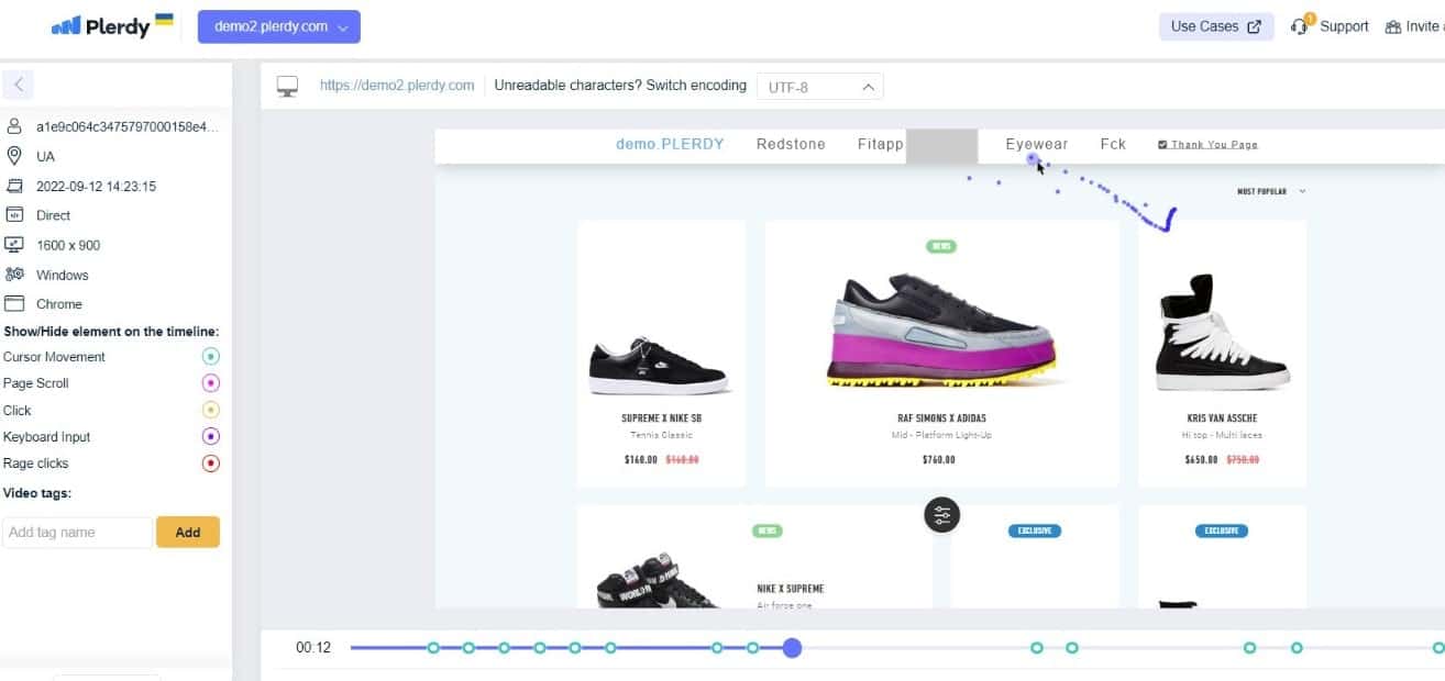
Session Replay provides deep and detailed visitor segmentation in recorded form. In particular, the analyst receives information:
- by the type of device from which the visitor logs to the site
- by visitor geolocation
- by typical behavior.
Session Replay independently divides visitors into groups according to specified criteria, records their activity, and analyzes each group separately.
A comprehensive analysis of the effectiveness of a website by recording visitor actions allows you to get the following benefits:
- Quick configuration
- Multiple filters
- More accurate data
- Ability to record all pages
- Recording data from SPA sites
- Guest access to specific videos
The tools that make up the comprehensive Plerdy platform make website conversion grow simultaneously in several ways. In addition, increasing the efficiency of sales through landing pages, in general, such an approach significantly affects the development of the business, its structure, and its priorities.
A Quick Overview of 10 Tools for Recording Visitors on Websites
Are you tired of guessing what your website visitors are doing and feeling? With so many tools available, choosing the right one for your business can be overwhelming. To help you, we’ve compiled a list of 10 popular visitor recording tools with their key features and a brief description.
- Contentsquare: A platform that goes beyond traditional analytics to provide a deep understanding of the customer experience (CX) and transform your business.
- Glassbox: An organization that empowers businesses to create frictionless digital journeys for their customers.
- Hotjar: A tool that provides product experience insights to show how users behave and what they feel strongly about.
- Smartlook: An analytics solution that answers the “whys” behind user actions.
- Mouseflow: A behavior analytics tool used by digital marketing, UX, product, startups, and enterprise clients.
- FullStory: A trusted digital experience intelligence platform that combines rich product analytics and robust session detail.
- Plerdy: CRO&SEO tools to achieve maximum conversion level and analyze important statistics.
- Lucky Orange: A tool that helps understand why website visitors aren’t converting into sales or leads.
- Quantum Metric: An AI-powered platform that delivers business insights and empowers data-driven decision-making.
- SessionCam: This tool provides session replay, conversion rate optimization, and heatmap analysis based on visitor recording.
These are just a few of the many visitor recording tools available on the market. Compare their G2 scores, user satisfaction, and other key metrics to choose the one that best suits your business needs. Happy hunting!
Record Website Visitors Help Business
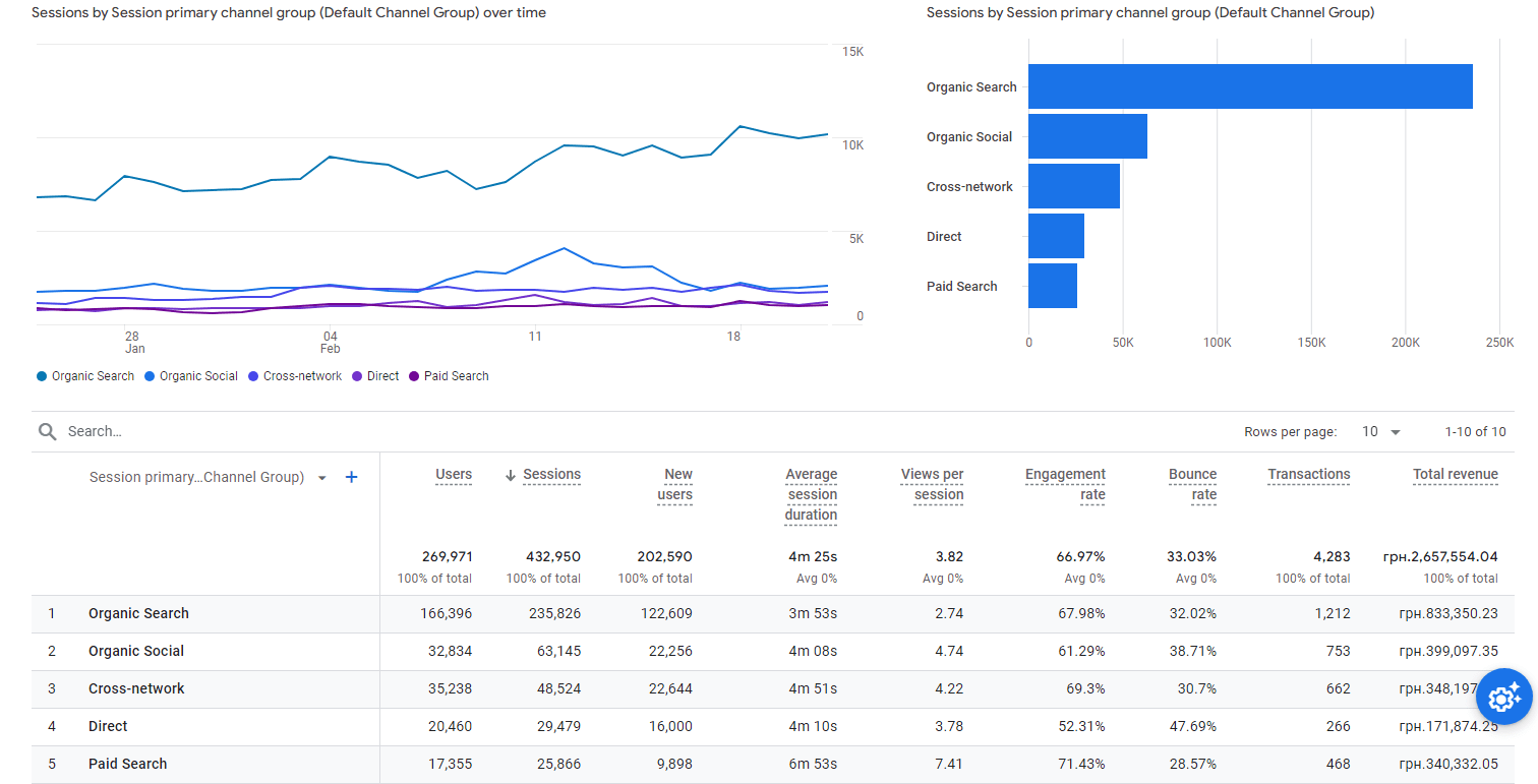
In the context of priorities, the analyst’s tasks determine the choice of certain filters for recording visitor actions on the website and fine-tuning the recording process itself.
The starting point for such a task is the data obtained using Google Analytics or similar services. These numbers show the percentage of conversions, the number of refusals from registrations or purchases, etc. However, a carefully configured record of the entire visitor’s stay on the website is necessary for an accurate and scientifically sound interpretation of these results. Moreover, these conclusions are the only way to apply the findings successfully.
The recording of the visitor’s actions is supposed to solve the two main tasks. They sound almost the same, but they actually work in two different directions.
- Improving the leading indicators of the website.
- Optimization of the essential pages of the website.
In the first case, we mainly discuss a comprehensive analysis of visitors’ interaction with UX design elements on your site. This concerns the content, ease of filling out forms, their general design, the time required for registration, and the ease of correcting errors. We study the elements that push the visitor to leave your website to reduce the bounce rate prematurely.
In this case, the records’ analysis allows a series of behavioral experiments to be carried out, correcting the detected errors. The ultimate measure of success is expanding your conversion funnel.
The second approach involves an in-depth study of the interaction of such pages on your website as:
- Homepage
- Product page
- Checkout page
- Landing page
A general resource page can contain reviews of the products presented on your site, expert recommendations, operating instructions, drivers, blogs, etc.
The main goal of this in-depth study of the website, which records visitor actions, is to study the ease of navigation, the readability of texts, the smoothness of transitions, and the general relevance and availability of information.
Recording Website Visitors importance
The uniqueness of such a tool as recording visitor sessions is that you can see the visitor’s actions and feel his mood. Looking through the entry several times, you can see a lot:
- where he scrolls the page in annoyance in search of the necessary button or section;
- where he stops to read the schedule carefully;
- he enters information into the form fields several times, but he gets the same error.
Thus, you can collect “disappointment statistics” and, conversely, mark successful design, content, and psychological approaches.
After rewatching the records and exploring the nuances of visitor behavior while sending products to the cart, you can understand why exactly he is doing this. Perhaps, in this manner, he is simply sorting out future purchases. Maybe this is a convenient way for him to compare the price. Or, quite possibly, he intends to buy it right away, but the rejection occurs at the checkout level.
Summing up
Finding the right software to record website visitors is crucial for businesses to optimize their websites and improve the user experience. Capturing user behavior data can provide valuable insights into how visitors interact with the site and identify pain points. Many options are free and paid, with varying features and pricing plans. When starting your search, it’s important to consider your specific needs and watch out for any onboarding fees or limitations. Comparing different packages can help you determine the best option for your business.
Additionally, considering quantitative and qualitative data, such as heatmaps and video recordings, can provide a more comprehensive understanding of visitor behavior. With the right software, you might find great potential to enable effective improvements to your website. Take advantage of this opportunity, try Plerdy for free today and see how it can take your website to the next level.
