Assuming UX mistakes, the consequence is straightforward. There will be low conversion on the site. Accordingly, I recommend analyzing the site and looking for UX mistakes. Based on this analysis, you can build the correct hypotheses of user behavior on the site’s pages.
Basically, the search for UX mistakes is based on data: heatmaps, scrolling depth, moving the mouse cursor, and recording video sessions. First, of course, you need to see what the bounce rate is in the Google Analytics report.
Before starting our overview of 20 typical UX design mistakes, we need to clarify the terminology and understand how UI and UX differ and why these abbreviations often go together.
We should note that attempts to define these terms often lead to debates and quarrels. On the web, one can find lots of articles about UX and UI. However, even well-known experts have different opinions on this question.
So UI (User Interface) is the look of certain elements. It includes the size of buttons and fonts, forms, colors, etc. If to draw an analogy with, for example, guitars, UI is the choice of the color and design of a guitar body.
So what is UI/UX?
UI/UX combines solutions designed to meet users’ goals on a web resource with maximum speed and efficiency. They are based on behavioral factors and a convenient visual environment. Although these are different terms at first glance, the experience shows that they create a perfect design if harmoniously combined.
Now, let’s take a look at 20 UX mistakes that lower conversion rates and make users leave forever.
1. Content location mistakes
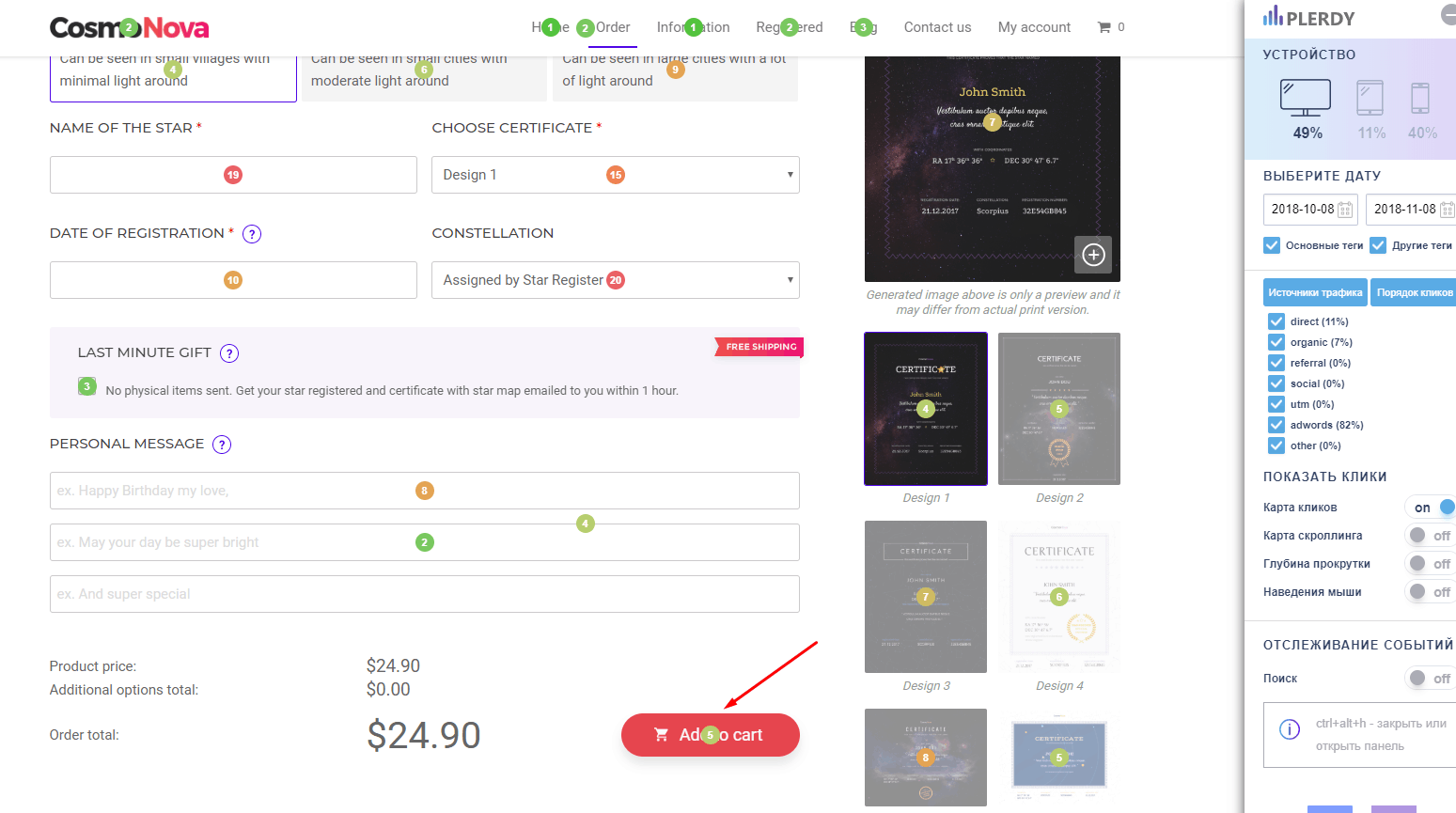
The location of the content on the site can play a nasty joke on you, becoming a UX error. The essence of this problem is that the posted content is difficult to access, and the average user cannot quickly find the information they need. As a result, the user who visited the site will not receive the information he needs, and their desire to cooperate with the site will drop to zero.
How to fix mistakes: To avoid this situation try heatmap on your website. It helps to improve your content and find design mistakes.
2. Categories that confuse visitors
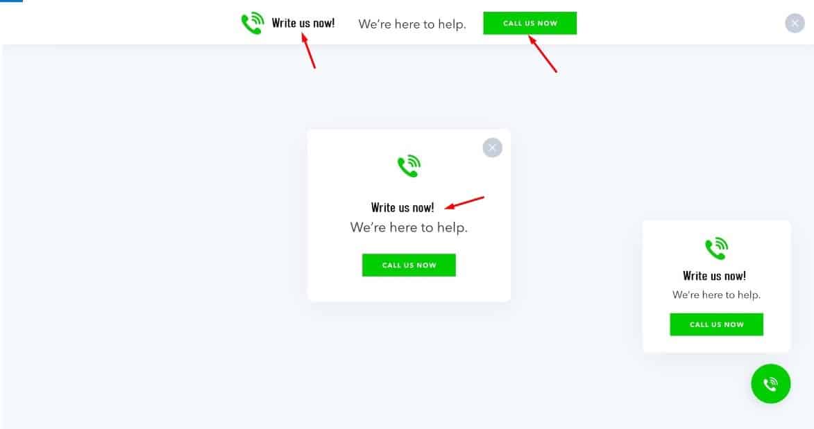
The visitor wants to get specific information or get acquainted with the service’s details. If the navigation on the site is not configured in the best way, this can become a UX mistakes, which in the future does not promise iridescent consequences.
After an unsuccessful attempt to find the necessary content, the potential customer will leave your site rather than use the search, so all the layouts on the site’s main page must be intuitive and straightforward.
How to fix mistakes: Set Plerdy tracking code to increase conversion rate.
3. Categories that confuse visitors

Content published not in a whole article but throughout the site pushes users away from further cooperation and becomes a UX mistake. For a customer to decide to order a service or read all the information provided by you, it must be in one place, without inconveniencing the user.
How to fix mistakes: Testing of the website. Find design UX mistakes.
4. Lack of logic in the transitions between stations
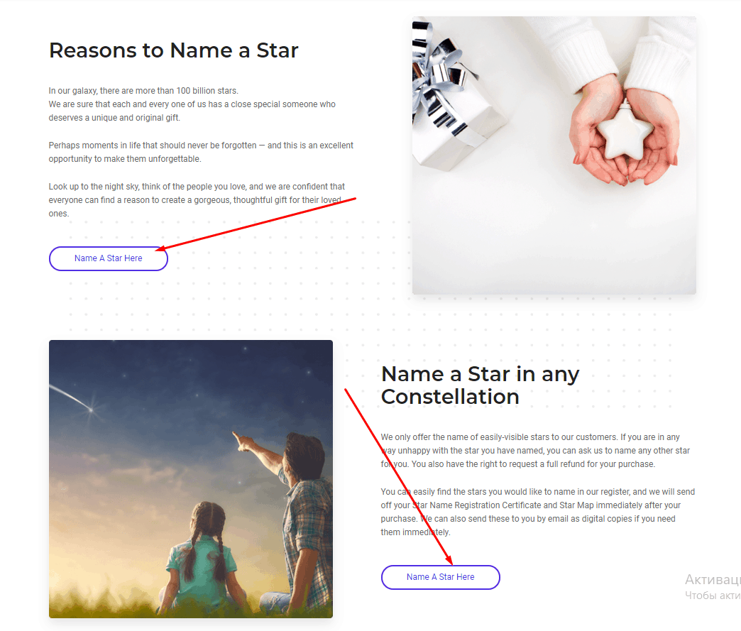
This is one of the most common UX mistakes. The consequences of placing links in an illogical manner may be the user’s refusal to get further acquainted with your site and go to the sites of your competitors.
How to fix mistakes: Set Plerdy tracking code for behavior analysis.
5. Covert integration with payment systems and attempts to charge customers

Such a situation can deprive you of the lion’s share of the target audience as, noticing something like this on the site, the shopper will perceive you as a scammer. Therefore, the appearance of a UX error of this type can put an end to the site.
How to fix mistakes: Record user sessions user sessions to see interaction with website elements.
6. Microsites and problems with their use
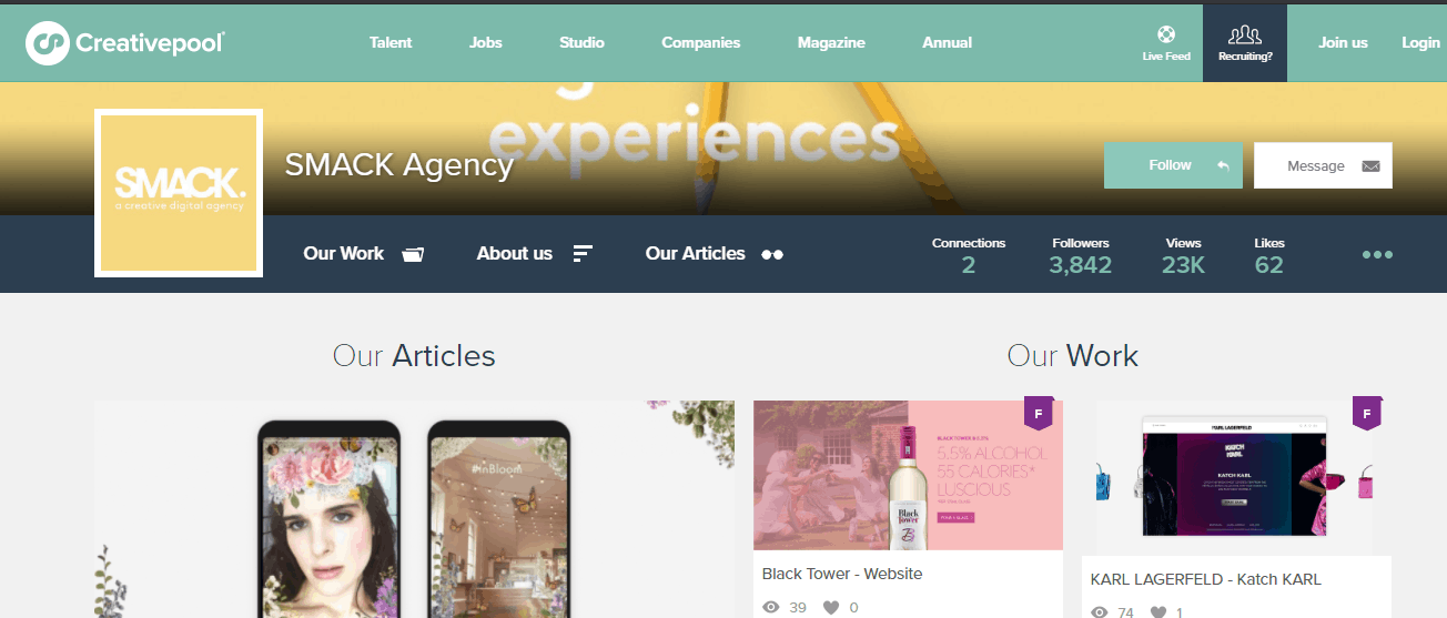
Developers often use microsites linked to the leading site to provide maximum comfort to users looking for specific content. However, the UX error in the top place is that the ability of the client to comfortably return to the main area has no rules.
How to fix mistakes: Set up a pop-up for collecting leads/contacts. It helps to return users to your website.
7. Search quality on the site

One of the most popular and, at the same time, weak functions of a site is searching its pages. Unfortunately, this feature often works incorrectly, and the information displayed has little to do with reality, forcing the user to leave the site and go to competitors’ sites.
How to fix mistakes: Auditing the website by heatmaps heatmaps and optimize internal linking and improve the content.
8.Filters and related mistakes
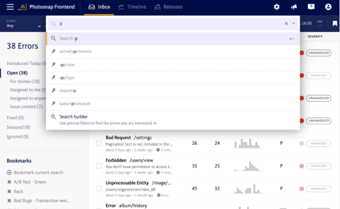
The primary function of filters is to improve the usability of the site. Unfortunately, UX mistakes with filters are among the most common. Filters are helpful for UX, but incorrect settings and attempts to please everyone at once can lead to the fact that the filter, instead of improving, will start to affect the situation negatively.
How to fix mistakes: Set Plerdy tracking code for consumer behavior analysis. It helps analyze the sequence of clicks on a web page.
9.Long articles and descriptions
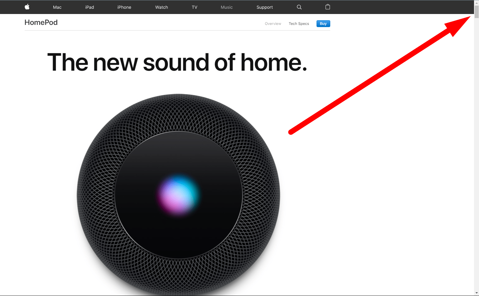
Despite a comprehensive discussion of the issue and a comfortably submitted solution, an enormous article can scare the user and become a UX mistake. Do not forget that users often do not read the entire article searching for the necessary information but rather quickly scan the text for their needs.
How to fix mistakes: Try a heatmap to analyze the sequence of clicks on a web page.
10.Incorrect link design issue
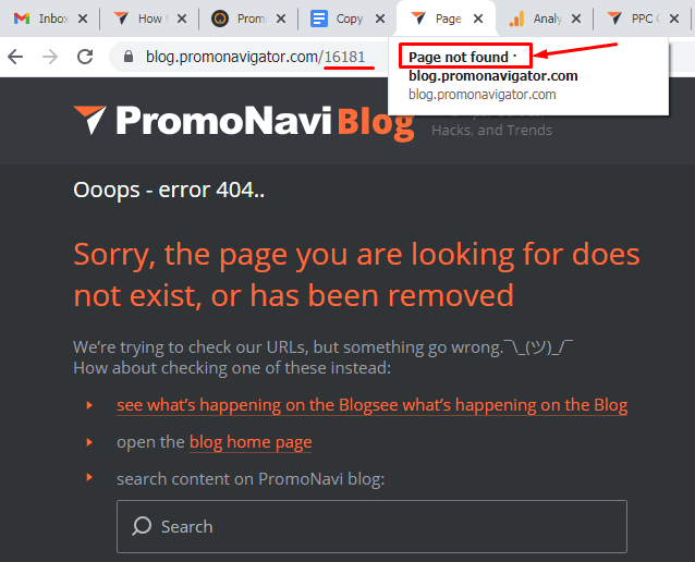
Website owners often try to draw users’ attention to the links by decorating them. However, over the years of using the Internet, users have learned to filter out advertising information, and therefore such an attempt to attract the customer’s attention will only irritate them.
How to fix mistakes: Try SEO checker to analyze Google ranking factors on the website.
11. Neglecting the needs of your target audience

This is a crucial issue that will definitely create problems with UI/UX. Ideally, you should consider the needs, perceptions, and previous experience of the target audience during the planning and development of a web resource. You must have a good understanding of what exactly your buyers want, why they visit the website, and what can make them leave too soon. For this purpose, professional design agencies often create the “portrait” of a potential visitor. It’s also a good idea to test the ready concept on a focus group before the development. All this stuff should be predicted since different people can perceive the same things in very different ways. When you develop a web product to your liking, this increases the risk of getting unsatisfied customers.
How to fix mistakes: Try pop-up forms pop-up forms to informing visitors about marketing activities (discounts, promotions, etc.).
12. Audio/video autoplay

The moment the video and audio autoplay appeared, it raised a lot of UX-related questions. For some time, the Flash technology was a monopolist on the multimedia content market, but the appearance of HTML5 changed the situation.
Why is this important? HTML5 allows importing video and audio much more easily, so developers more and more often opt for simple solutions. However, behind a wonderful (at first sight) idea, a great evil lurked. Users should blame such attributes as autoplay and loop for loud videos and sounds that automatically, without our consent, start playing immediately once a certain page is opened. In his book “HTML5 for Web Designers”, Jeremy Keith writes: “Suppose there’s an evil bastard out there who hates the web and all who sail her. This person probably doesn’t care that it’s insulting and stupid to embed an audio file that plays automatically…When an auto-playing audio file isn’t evil enough, you can inflict even more misery by having the audio loop forever. ”
Of course, the author speaks ironically, but people often harm their UX design with this technology. In most cases, it’s better to allow users to choose whether they want to play something. If you still insist on autoplay, consider a few nuances that will save your customers from frustration. Firstly, warn users that now the audio or video will start playing. Secondly, let them manage the process. HTML5 allows doing this.
Don’t overuse the loop attribute for endless replay. This can repulse your buyers and even make them leave the website. Nobody likes losing control over the situation. For example, you can add an equalizer with a range of settings to manage the media content.
How to fix mistakes: Try video sessions video sessions Plerdy and record user behavior to provide quality customer support.
13. Redundancy

Redundancy is the exact opposite of one of the key principles of good UX design: simplicity. There is nothing bad in the very idea of adding maximum useful information to one page. On the other hand, there are two things you should pay attention to. First of all, the information must be really relevant (definitely not bright, blinking, animated banners, or GIFs).
The second thing is that the very implementation of this idea is quite difficult and requires good designing skills. Otherwise, you risk getting the result like in the screenshot above. Would you stay on a website after seeing such UI design of the main page?
How to fix mistakes: To avoid this situation try heatmap on your website. Analyze dynamic website elements and reduce the bounce rate.
14. Wrong forms
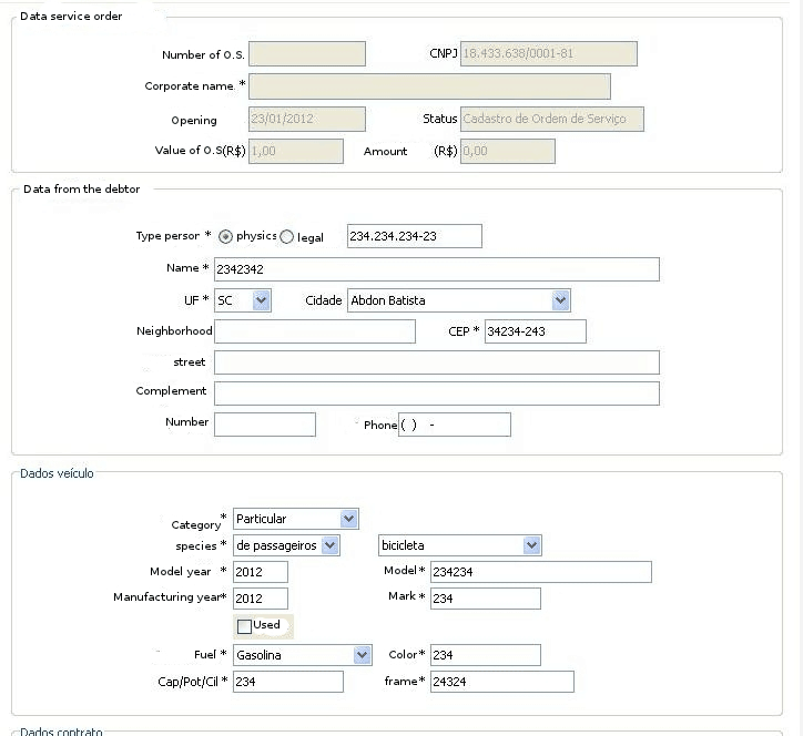
Web forms are very widely used. Providing contact information, registration, authorization…the list of possible usages is far from exhaustive. Yet even with such a simple element as forms, you can make a whole series of UX mistakes.
Here are the most common problems:
- Too many questions;
- Too many mandatory fields;
- Incorrectly configured validation.
An excessive number of questions can make shoppers close the form before filling it. You should have a good understanding of the form’s purpose and know the optimum number of questions. A conspicuous example is a startup selling used cars. Despite good technical solutions, buyers still didn’t register and purchase on the website because of its poor UX design. The thing is that for registration, they needed to fill out a terribly long form with several pages. The buyers reacted predictably and went to competitors.
Validation (in terms of the UX design of web forms) is when the accuracy of the corresponding fields is checked. A too complex or strange validation is the most common UX mistake. For example, if you keep a small forum about microelectronics, it’s quite strange to ask consumers for a complex password with 12 symbols and different registers. There is a chance that consumers want to comment on something or get a reply. They won’t make up a password to fit some special requirements. It is also worth noting that such a UI/UX approach may be justified for solutions related to medicine or finances.
How to fix mistakes: Try heatmap on your website to understand clicks and mouse hovering heatmap.
15. Sign in/out issues

A poorly thought-out registration/authorization and sign out procedure is another popular UX design mistake. The most common issues: the absence of social media sign in, too much data for registration, and complex sign out from a personal dashboard.
How to fix mistakes: Try an SEO checker to increase your website traffic and speed up your website optimization.
16. Mobile devices
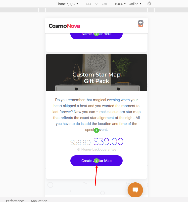
It might seem that in 2018 nobody would be surprised by the fact that a mobile or responsive version of a website is a must. However, based on our experience and available data, we can state that some website owners still haven’t taken care of their mobile users. Therefore, remember that the UI design should be adapted for mobile devices and the UX. The thing is that the behavioral patterns of users on mobile devices will significantly differ. That’s why you have to think about ensuring the best impression from using your resource on mobiles.
How to fix mistakes: Set Plerdy tracking code and measure how effective your pop-ups are.
17. Three-click rule

The three-click rule is a fairly popular belief that every user must make no more than three clicks to get to any page of a website. We want to clarify right away that this rule can be sacrificed on some portals or special resources. Though in other cases, the offense of this approach is a UX design mistake.
How to fix mistakes: Try heatmap heatmap on your website to understand what issues make website visitors leave your page.
18. Non-intuitive design issue

Intuitive design. It means the simplicity, ease of use, and clearness of a web resource for most users. An attempt to create a cool design often turns into searching for a happy medium between something simple/understandable and sophisticated/creative. The ability to create perfectly intuitive and, at the same time, stylish design is a real benchmark of the professionalism of a designer.
There is a saying that “A user interface is like a joke. If you have to explain it, it’s not that good.” That’s absolutely true. From the UX perspective, creating a website that potential clients cannot understand is a huge mistake. You need to take a good account of your target audience.
How to fix mistakes: To avoid this situation, try heatmap on your website. Analyze dynamic website elements and reduce the bounce rate.
19. Color palette

The impact of color on people has long been known. Marketers have successfully used it for the last few decades. According to the US research, buying a product 85% of purchasers choose something because of its color. So you need to note that a proper selection of a color palette is an important UX/UI factor.
Wrong color contrast, generally unsuitable colors and disregard for the peculiarities of a target audience is the most common mistakes. Always match colors that complement each other and don’t create eye discomfort. Depending on a website’s theme, you should also understand that a certain palette can be more appropriate from the UI perspective. For example, the websites of financial and insurance institutions are often made in shades of blue.
How to fix mistakes: Watch video sessions on how users behave on your website. Discover why people are leaving the website.
20. Technical optimization issue

Despite being a purely technical factor, this position on our list has a big and direct impact on UI/UX. The first technical issue worth mentioning is website load speed. According to the research, the standard average load speed is 2 seconds. The longer it takes to load the website, the higher chances that a customer will leave to a competitor.
Subscribe to our newsletter to stay updated on the latest news and be the first to receive useful publications!
Conclusion
Reading this article, you got acquainted with the most common UX mistakes and learned some tips on eliminating them. User experience needs constant attention and continuous improvement. Always take into account the interests of your target audience and design the website to make it as convenient for consumers as possible.
We hope that this article was interesting and informative. Visit our blog to read more on UI/UX and other topics.
