Discover a treasure mine of research methods to deepen your grasp of participant behavior. Although every technique on this list has a different purpose, their main objective is to simplify your website for best user interface.
Important responsibilities of these user testing strategies consist in:
- Finding and fixing user navigation obstacles in spot bottlenecks is part of navigating.
- Examining participant responses will help you to adjust your website to meet their expectations.
- Using testing data, create an easy and interesting website layout.
Plerdy, a strong UX and SEO analysis tool, for instance uses Heatmaps and Session Replays to uncover user behavior data. These instruments are the bread and butter of effective user testing; they will turn your website into a user-friendly paradise that drives conversion and engagement skyward. So be ready and explore the future of user testing using our all-inclusive guide, the road map for your success story on your website!
The Importance of User Testing
User testing is a major process of development in the digital era. Examining a product from the perspective of the user helps engineers to have important understanding of its usability. Furthermore, this approach offers a road map for improving the user experience, therefore beyond mere illumination of issue areas.
You recently started a website without first running user tests. Users so find it difficult to negotiate, which leads to quick abandonment of it. Your app’s user-friendly layout and flawless performance help it to rise in popularity after being tested and improved upon depending on user comments.
User testing gives you vital information to help you:
- Find usability problems before they affect user happiness.
- Recognise user activities to enable you to customise your product to meet needs.
- Evaluate the user experience generally to provide insight on what is working and what requires development.
Adopting user testing techniques lets you take a proactive approach, therefore elevating users in your development cycle. It enables you to design simpler, user-centric products that enthrall consumers and inspire return visits. Better goods, happier users, and a more robust market presence follow from putting usability and user pleasure first in your approach.
Evolution of User Testing Methods
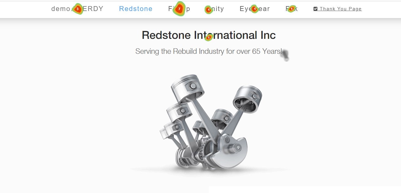
User testing techniques have gone on a transforming trip in their terrain. Simple usability studies, in which engineers watched consumers engage with a product, began it and developed into sophisticated, data-driven approaches.
Early days, it was about tracking user activity and gathering subjective comments. Still simple, these techniques gave insightful analysis of the user experience. Our method of user testing changed along with technology.
User testing today provides a rainbow of advanced techniques that probe user behavior and experience more deeply. From simple observation, we have progressed to sophisticated eye-tracking and biometric analysis tools. Techniques of today comprise:
- Remote usability testing lets consumers evaluate items from the comfort of their homes.
- A/B testing lets developers evaluate two versions of a product to find which works better.
- Clickstream analysis—tracking user clicks to expose their navigational paths—allows one to
These developments in user testing techniques all seek to maximize usability, therefore guaranteeing that goods satisfy user expectations. Moreover, the development of these techniques has turned the attention to a user-centered design concept, therefore guaranteeing that the experience of the end user always comes first. Therefore, the development in user testing technique highlights the industry’s dedication to provide appealing and useful goods.
List Of 20 User Testing Methods
Examining the “20 Top User Testing Methods” reveals modern tools to better grasp your audience. From the classic trusty polls to the creative session replays, these techniques open the path for original user research. Equipped with these strategies, you will be interpreting participant behavior and quickly transforming your website into a user-centric refuge.
1. Think-Aloud Protocol
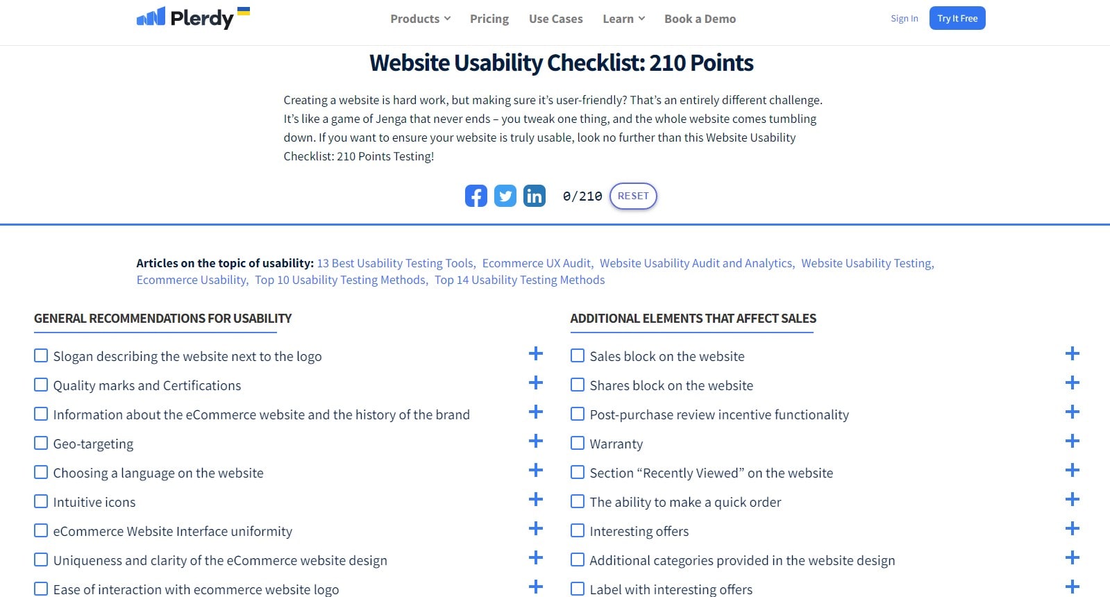
User testing techniques revolve mostly on Think-Aloud Protocol. It’s all about consumers clearly expressing their ideas when using a product. Unmatched insights into the user’s viewpoint provided by this real-time storytelling help engineers identify usability issues.
Imagine a user negotiating your website while expressing their experience. “I’m clicking on the menu, but it’s not responding,” or “I can’t find the checkout button,” for instance. This input emphasizes possible problems that can affect user happiness.
The Think-Aloud Protocol has obviously clear advantages:
- It reveals obstacles in the user experience, so improving the product usability.
- It gives first-hand user experience input, so offering insightful analysis of user behavior.
- It reveals user expectations, thereby guiding choices on design and development.
The Think-Aloud Protocol is beautiful in simplicity and efficacy. It’s like walking a mile in your user’s shoes—a chance to observe your offering from their perspective. It’s a live feed of the user experience that helps you create answers your user base will find relevant.
Thus, keep in mind that the Think-Aloud Protocol gives your consumers a voice even while you work toward usability perfection. This approach can enable a flawless user experience, therefore transforming your product into an easy, intuitive, user-centric delight.
2. Remote Usability Testing
Using technology to its full potential, Remote Usability Testing has transformed user testing methodology. This approach allows users of houses assess items for more honest comments.
Imagine a New York user testing your recently created website and you, sitting miles away, watching their interaction in real-time. Though the distance is crossed, the insights you get are as deep as they ever have been. This helps you to grasp the experience of your user free from geographical limitations.
Including Remote Usability Testing into your approach will help you to acquire the following:
- Frank user comments free from the effects of a controlled testing setting
- A larger testing user population free from regional constraints
- Practical use situations that offer priceless understanding about usability
This approach allows you to interact with people all around the world, therefore overcoming geographical distances. It finds real, unfiltered user interactions, therefore bringing the testing ground right to the user. Looking into the user’s reality helps one to grasp their experience more fully.
Remote usability testing opens a realm of usability insights without sacrificing user comfort or convenience. It shows the potential of technology, which will help us move toward a society where individual requirements take front stage and shape user testing.
3. Heatmaps
Release the potential of heatmaps, the underappreciated hero in user testing and research. This approach enables you see how your participants engage with your website, therefore peering into their mental worlds.
- Heatmaps help to vividly depict user behavior, hence transforming data into insights. They show places low in activity in cool colors and great involvement in warm ones.
- Using this information will help you to enhance site layouts, user interfaces, and general user experience.
Imagine Jane, the owner of a website, having to find out about the low conversion rates even with excellent content. Now arrive heatmaps. They expose an unanticipated pattern that accentuates the feature and causes her conversion rates to explode. Heatmaps enable you to develop online experiences catered for success by turning abstract data into practical solutions. Heatmaps are a potent, flexible tool for user testing that inspire confidence.
4. Session Replays
Use session replays, a creative user testing tool meant to probe participant behavior closely. Replaying a user’s interaction with your website, session replays serve as a time machine providing insightful analysis.
- Session replays translate unprocessed data into a graphic timeline, therefore bridging the gap between statistics and user experience.
- Using this approach can help you to lower bounce rates and improve user navigation.
Allow me to present Alex, a website administrator trying to understand user behavior on his creation. He turns on session replays and, like magic, finds a front-row view of the user trip. He finds obstacles that discourage consumers from finishing their purchases. Reacting quickly, he fixes the troublesome areas, and in no time conversion rates explode. The magnifying glass for your research is session replays, which let you enlarge on user behavior and maximize website interactions. Consult session replays; the secret to the success narrative of your website is here.
5. Surveys and Polls
Learn the value of polls and questionnaires; a classic user testing tool still central in research. This simple method lets users express their impressions about your website.
- Polls and surveys help to create two-way communication, hence enhancing user involvement and loyalty.
- Improving User Experience: By means of this feedback-driven approach, areas of development are found, so enabling user-centric site enhancements.
Visual image Sam, an online merchant keen to improve the user experience of its website. He conducts a basic poll asking his guests about their preferred shopping destinations. Using this input, he improves personalizing the shopping experience and product listings. Not unexpectedly, he finds increases in consumer happiness and sales. Like Sam’s, surveys and polls highlight user sentiment, therefore motivating adjustments that meet demand. Use polls and surveys; your direct path to user intelligence and the engine behind the development narrative of your website.
6. First Click Testing
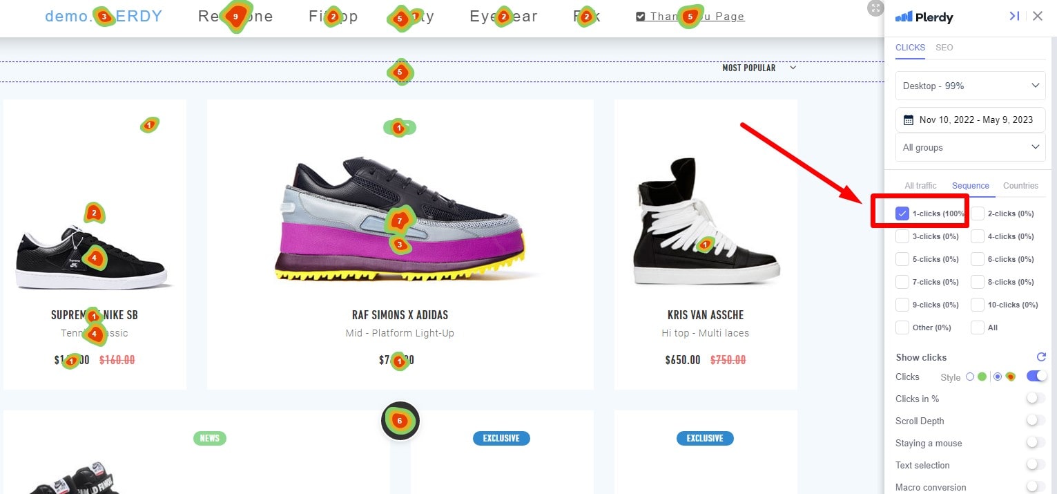
Discover the beauty of First Click Testing—a snappy user testing tool meant to highlight how well your website navigation works. This study instrument logs participants’ first click, therefore illuminating their natural path on your website.
- First Click Testing reveals user patterns, therefore guiding your site design to complement your instincts.
- This approach helps to streamline user paths, therefore lowering frustration and increasing pleasure.
Consider Laura, the owner of an e-commerce shop who finds great bounce rates on her website confusing. She chooses First Click Testing. Laura notes that users require assistance finding the top-selling product line for her store. She quickly changes her site navigation such that the sought-after category stands out. Bounce rates start to drop almost right away, and her sales explode. Laura uses first click testing to get an inside view of user behavior, thereby enabling you to simplify website navigation for success. Accept First Click Testing as your road map for simple and effective website architecture.
7. Five Second Tests
Welcome to Five Second Tests, a lightning-fast user testing tool based on first impressions of your website. This study instrument evaluates your site’s content and design immediately.
- Five Second Tests track user reactions right away to provide information on the attraction of your site.
- Improving First Views: Use these tests to control your landing page and grab user interest.
Take Bob, a blog owner eager to increase user interaction. Using Five Second Tests, he rapidly discovers that the homepage of his blog has to clearly convey its niche. Bob considers this input carefully, changes the home page, and produces rather remarkable results. Users begin hanging around longer and reading more of his material. Like Bob’s, five second tests are your pass to a strong first impression that guarantees your website speaks volumes in those pivotal first seconds. Bank on Five Second Tests; your key to an arresting website that catches users right away.
8. Eye Tracking

A radical user testing technique called eye tracking brings science into the field of usability. It uses technology to track customers’ eye movements, therefore revealing their visual path of interaction with a product.
Imagine yourself able to view what your user views. The user looks at a brilliantly created graphic but ignores your precisely positioned call-to- action button. These revelations can be revolutionary since they let you see the visual priorities of your user.
Including eye tracking into your testing plan offers a number of benefits.
- Knowing the regions of concentration of the user helps to maximize the design layout.
- Finding possible distractions meant to compromise the user’s experience.
- Developing understanding of visual behavior, improving user interaction techniques
Eye tracking emphasizes visual interaction. By seeing and knowing your user’s eye motions, you access their subconscious responses. Revealing your users’ preferences, behaviors, and reactions, this is a nonverbal interaction with them.
In the always changing user testing arena, Eye Tracking is a shining example of invention. It gives usability testing a scientific touch, therefore changing our knowledge of user interactions. Harnessing Eye Tracking’s ability, you go closer to designing an engaging, simple, and joyful user interface.
9. A/B Testing
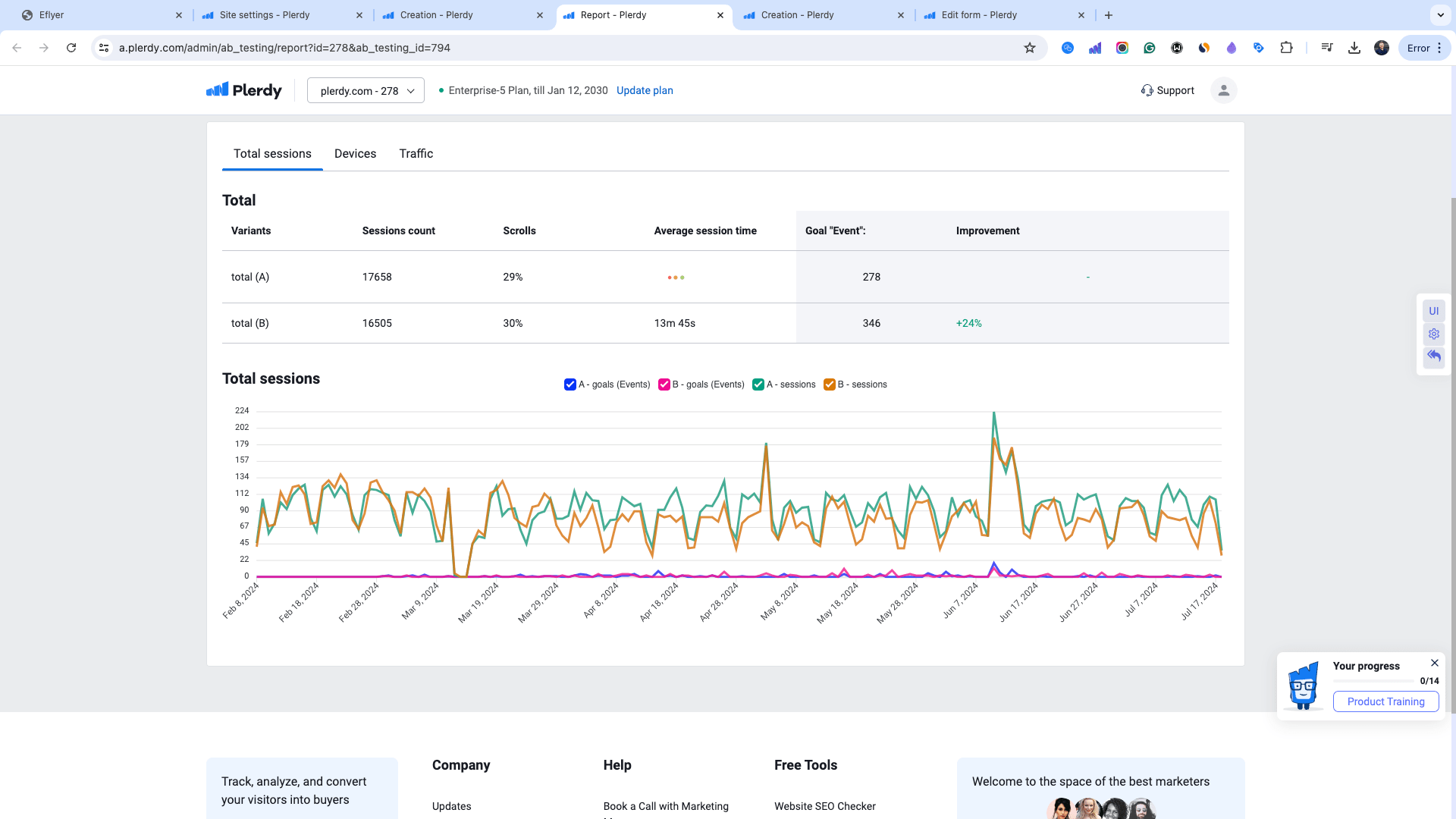
Examining A/B testing reveals a technique based on empirical data that drives decision-making directly. It’s about showing people two product versions, A and B, and monitoring their interactions to find which connects more strongly.
Say you are at a crossroads choosing between two homepage layouts. A/B testing helps you to test both designs using real consumers. It converts personal tastes into objective facts, therefore directing design decisions with insights supported by users.
Adopting A/B testing opens many advantages:
- Based on user preference, informed decisions avoid only gut emotion.
- Less chance of design failure since testing helps to validate modifications.
- Improved usability since enhanced design elements result from user comments.
A/B testing eliminates user testing’s guessing component. It finds the winning design by allowing users vote with their interactions. It supports the user-centered design strategy by directly reflecting user inclination.
A/B testing turns out to be a great friend on the road toward usability perfection. It ties the consumer’s voice into the design process so that your product satisfies and beyond user expectations. A/B testing is, all things considered, your portal to a really user-centric product.
10. Hallway Testing

Revealing the utility of Hallway Testing, we find a user testing approach anchored in spontaneity and authenticity. The idea is as simple as its name suggests: just ask someone walking past in the corridor to test your goods.
Imagine this: recently you created a fresh sign-up system for your app. Choose a rapid Hallway Test before devoting funds to a full-scale user study. You invite a few random people—not familiar with your product—to test the new function. Their new viewpoint highlights usability problems that could have escaped your team’s trained view.
Hallway testing has several benefits:
- For early-stage prototypes, quick, cheap comments
- Finding obvious usability problems before they ever get to the end user
- Unbiased observations from testers not familiar with the product
In usability testing, hallway testing is the epitense of simplicity. It veers toward the power of random sampling and gathers fresh ideas from unanticipated places. It’s about nipping usability problems early on and using initial impressions to mold a product that appeals to consumers right away.
Hallway Testing shows its mettle in the struggle for usability since it is a flexible, adaptable user testing technique. A step towards usability excellence is to escape echo chambers and hear the user’s voice loud and unambiguous.
11. Guerilla Testing
Entering guerilla testing, we come upon a user testing technique bursting with spontaneity and agility. Often carried out in public venues, this method delivers usability testing to where the users are, therefore obtaining rapid feedback with little effort.
Assume you wish to confirm the usability of your simple e-commerce website. Equipped with your prototype, you visit the neighborhood coffee shop and include eager consumers in a brief usability session. Their objective, honest comments are a treasure of knowledge that will help you to improve the customer experience.
Among the important benefits is guerilla testing:
- Quick, on-demand comments free of planned meetings.
- Instant insights resulting from real-time user interaction
- Start-ups and companies on a strict budget would find the low-cost strategy perfect.
Guerilla testing’s essence is its improvisational character. Stepping outside the testing lab and into the user’s world helps you to gather unvarnished user viewpoints. It returns usability testing to its roots—that of understanding the user in their natural surroundings.
The proverb “simply is the ultimate sophistication” is best illustrated via guerilla testing. It is evidence of the need of maintaining user testing flexible and user-oriented. The approach is a shining example of user-oriented design, clearing the road toward improved usability and higher user satisfaction.
12. Card Sorting
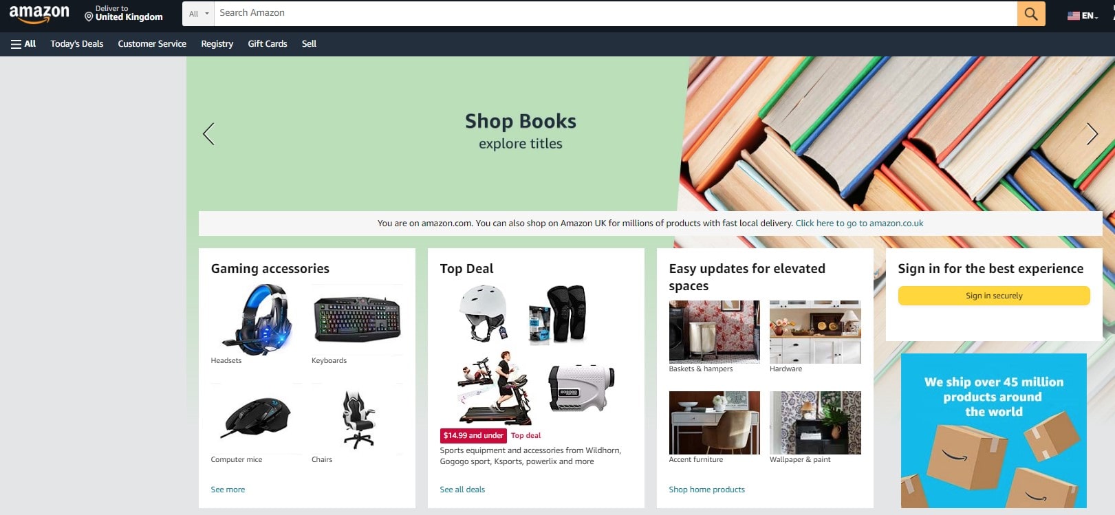
Within the field of user experience, Card Sorting is a powerful tool—a user-centered testing approach designed to break the code of website navigation. Imagine wishing the categories to be user-defined and building an online bookshop. Now enter your top player, Card Sorting.
Participants get cards bearing information from websites. They then group these cards according to logical categories that fit them, therefore illuminating their mental view of the information architecture of your website. You seem to have flipped on a switch, lighting the road toward easy travel.
Among the many advantages Card Sorting presents are:
- Finding consumers’ cognitive framework for your material can help to direct simple navigation design.
- Pointing up vague or unclear labeling, providing chances for clarity
- Encouragement of user co-design will help to build ownership and involvement.
Card Sorting invites users to participate in the design process therefore breaking the barrier between user and designer. It’s like stepping back and giving your people control so their ideas might define the usability of your digital platform.
Adopting Card Sorting releases user insights and drives toward even better usability. It’s a portal to user-driven design, not only a testing tool that results in a flawless and interesting user path.
13. Clickstream Analysis
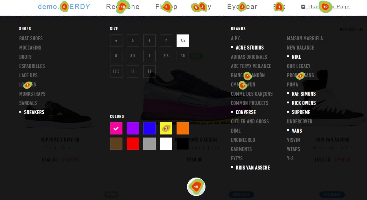
Let’s enter the interesting field of Clickstream Analysis, a dynamic user testing tool that vividly shows user activity on your website. See footprints left in the digital sand—clickstream data, the breadcrumbs exposing the user’s route around your digital environment.
Clickstream Analysis lets you track every mouse click, page scroll, pausing on an image—all of these user behaviors help to reveal user behavior, preferences, and even possible trip hazards.
Clickstream Analysis’s main advantages are:
- Finding common paths will enable you to grasp user navigation trends.
- Spotting underused places and exposing regions needing work.
- Finding exit points and unmasking possible frustrations causing user leaving
A click, a heartbeat, a scroll, a breath, tells you about the rhythm of user interaction, thereby helping you to pull back the curtain and provide insights into how users interact with your platform.
Clickstream Analysis lets you trace your user’s digital path, thereby guiding your design approach and not only assesses usability. This approach puts you in the passenger seat so you may travel the user’s path and learn so much. It’s a great instrument that opens the path toward a well tuned, user-oriented digital experience.
14. Multivariate Testing
Explore the potent tool for optimizing the user experience—multivariate testing. It allows you to simultaneously experiment with several variables, hence revealing the effects of minute design modifications on usability. It’s like conducting, adjusting every instrument to produce a harmonic symphony of user interface.
Multi-variable testing lets you:
- Try many things at once to multiply your findings.
- Calculate how each factor affects user interaction, therefore arming you with hard data.
- Review adjustments in pairs to find the ideal blend for maximum usability.
Imagine juggling changes to the size, color, and text of your call-to- action button. Running a multivariate test will then help you to determine how these changes together affect click-through rates.
Equipped with multivariate testing, you have a great weapon for iterative development—analyzing, adjusting, and forward-looking. You are using actual facts to create a more interesting user experience instead of guessing about what works best.
Pursuing user-centric design allows Multivariate Testing to help you to turn every stone, so neglecting no possible improvement. But it’s not only about testing; it’s also about grasping the subtleties of user behavior and let these revelations guide your design choices.
15. Tree Testing

A pillar of usability, tree testing opens the way for easy web navigation. By removing the visual components from this testing approach, you focus on the bare-bones structure of your website—that of the information architecture.
Tree testing has as its core the following:
- Looking at the hierarchical layout of your website to guarantee easy user navigation.
- Verifying whether visitors may locate information independent of page content or visual signals.
- Optimizing the tree-like framework of your website to simplify the user path.
Imagine evaluating the framework of a digital library. Users should quickly move among categories including “Fiction,” “Non-Fiction,” “Children’s Books,” and so on. Should they search for “Historical Fiction,” it’s time to review your information hierarchy.
Tree testing gives you a special toolkit to maximize user navigation. It clarifies possible obstacles and assists you to open the road for a flawless user experience. It’s about reorienting the whole navigation experience, not only about finding issues.
Tree Testing helps you create an understandable, easy-to-use website in the broad sense of usability testing. It’s about building a basis that directs every user so their path is as simple as it might be. Let Tree Testing lead your improvements in usability.
16. Benchmark Testing
Benchmark testing helps one to clearly grasp user experiences. This approach compares your digital product against standards or competitors, therefore stressing usability performance criteria. It’s about quantifying user interactions, not only about seeing them.
Benchmark testing’s main lessons are:
- It shows how well your product performs in line with rivals in the same market.
- It follows changes in usability over time, pointing up areas that call for work.
- It points up any performance flaws likely to compromise the user experience.
Think of an e-commerce website regularly scoring high rates of checkout page abandonment. Benchmark testing could enable one to determine whether this is a problem specific to this website or a trend observed among rivals too.
Benchmark testing provides you with the whole market picture outside of your product. It offers the required information to raise user experience and develop your game. This testing approach keeps you alert and pushes you to grow and change with market trends always.
One strong approach in the field of user experience is benchmark testing. It challenges you to not only satisfy industry norms but also to aim higher than they are. Benchmark testing can help you to guarantee that your users have the finest experience and to keep in line with the market pulse. With it, you are aiming for perfection rather than only for fit.
17. Heuristic Evaluation
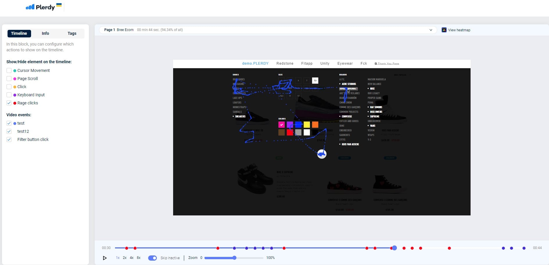
When evaluating a product’s usability, heuristic evaluation is the most often used technique. Driven by expertise, it compares interfaces against accepted usability guidelines—known as heuristics—to identify possible user-experience hazards.
Heuristic Evaluation’s main characteristics are:
- Finding early in the design process usability problems
- Flexibility can be applied either separately or in concert with other testing techniques.
- Reasonably cheap since user interaction is less.
Let us now consider a mobile banking app. A heuristic evaluation could find as main challenges to a flawless user experience unduly complicated navigation or inconsistent language.
Still, the magic of Heuristic Evaluation is more general than it is problem solving. It offers a road map to turn user obstacles into seamless channels of engagement and a means of progress.
Within the domain of usability testing, Heuristic Evaluation is a quite useful technique. By aggressively tackling possible bottlenecks, it creates space for user-centric architecture. Apply Heuristic Evaluation to design a setting in which your consumers experience valued, heard, and most importantly understood surroundings. This approach is opening the path for better user experiences in your testing toolkit. Recall that it’s about enhancing the user experience to become an art form, not about crossing off lists.
18. Cognitive Walkthrough
At the height of user testing techniques, Cognitive Walkthrough demystizes the path a user will probably follow when using an interface. This approach looks at user goals and decisions step-by-step, therefore illuminating usability problems before they become obstacles.
A Cognitive Walkthrough consists in:
- Spotting chores a user will do
- Stressing the exact method for every chore.
- Assessing whether the user will be able to negotiate each step
Imagine a flight booking page. The user’s choreis buying a round-trip flight from New York to London. A Cognitive Walkthrough might find that the design of the site directs consumers into rental cars or hotel bookings, therefore diluting their main goal and generating dissatisfaction.
Doing a cognitive walkthrough before launch is like putting a lighthouse in thick fog. It makes sure the user follows their chosen route and guarantees their trip is free of unplanned stops.
In usability testing, this strong approach is a champion. It not only reveals possible user navigation mistakes but also helps you to confidently course-correct. Use Cognitive Walkthroughs to empower your consumers to feel successful in their contacts with your product, understood, valued, and most importantly successful. Improve your product usability; use Cognitive Walkthroughs to guide your path.
19. Biometric User Testing

One innovative usability testing tool that provides great information on a user’s emotional journey is biometric user testing. Through measuring physiological reactions, it offers a close-up view of user experience and reveals subconscious reactions that conventional approaches would miss.
Biometric user testing entails observation:
- Variability in heart rate for stress level assessment
- Skin conductance: evaluating emotional arousal
- Eye tracking to ascertain this: One novel checkout mechanism used on an online shopping platform is Standard tests reveal a seamless username. But when customers get to the last payment stage, biometric user testing shows higher heart rates. Uncoverable by other means, this increase calls attention.
Using biometric user testing is like having a direct connection into your user’s emotions—finding the invisible, the overlooked, and the unsaid. It enables you to customize your interface depending on emotional reactions, therefore transcending usability testing from surface encounters to more intimate relationships.
Every heartbeat, every eye movement, every skin response—all of which becomes a whisper of truth about your user’s experience—using biometric user testing. It’s not only about removing bugs—building an emotionally relevant user experience. Get away from the norm and enter the remarkable field of biometrics. Use biometric user testing to transform every user interaction into an empathy and understanding symphony.
20. Continuous User Experience Testing

Discover the potential of Continuous User Experience Testing, a revolutionary development in the field of usability testing that side-by-side with your consumers transforms your product in real-time. It’s not a one-and-done strategy. Rather, it’s a constant dedication to quality that keeps your finger on user mood.
Constant user experience testing centers on the following:
- Organizing and using user comments methodically
- Constant improvement of the user-experience
- Maintaining speed with changing consumer wants and tendencies
Consider an e-book app that runs frequent upgrades; each one is more user-friendly than the last. Every swipe, every tap, every scroll is evidence of the power of ongoing testing—that which turns every user into a quiet co-creator.
This approach is never-ending dialog with your users, not only a routine check-in. It develops on every contact to produce an always improved offering that appeals to your user base. It’s about developing a dynamic relationship that supports usability and puts the user at the center of every decision, not about running toward a finish line.
Choose Continuous User Experience Testing, in which every improvement represents a fresh promise of dedication to your users and each one is a stepping-stone to unmatched user happiness. Turn usability into a live, breathing creature that develops and changes with your audience, therefore reinforcing your role as a user-oriented innovator.
Importance of Choosing the Right User Testing Method
Choosing the right User Testing Method is like choosing the ideal pair of glasses; it sharpens focus, improves clarity, and raises user understanding. This important choice determines the user experience and guides your product towards best usability.
Imagine starting a fitness website devoid of usability testing. Users struggle with difficult menus, unreliable tools, and confusing interfaces, therefore transforming their wellness path into an unpleasant hurdle race. Now picture the launch, but this time armed with the correct testing approach. User frustrations become smooth interactions that produce a fun, easy workout. This is the power of the proper user testing approach, not magic.
Selecting the best strategy entails:
- Knowing your people and their requirements
- Match testing strategies to project objectives.
- Examining timelines and resource limitations
Both Heuristic Evaluation for a rapid usability scan and Cognitive Walkthroughs to replicate user interactions provide special insights that add to a whole knowledge of your user.
Choosing the correct User Testing Method enhances your product and the user experience generally. Turn customer challenges into success stories and help your users easily and happily negotiate your product. The correct testing technique is an investment in the future of your product, so opening the path for unparalleled customer pleasure and long-lasting success rather than only a decision.
Final Thought
Alright, people, in this hectic year we have descended deeply into the world of user testing techniques. From the beginning, we have pried up the lids on several ways, examined these techniques from several viewpoints, and highlighted their possibilities. Along with us, you have traveled through this maze of information and grown close to terms such quantitative, qualitative, unmoderated, and more.
Recall how we sank ourselves into knowledge of the typical user’s path, compiling a wealth of material from movies and other gathered data. Alternatively, when we went above and above to get understanding of privacy issues related to handling user personal experiences? Every tiny bit of knowledge we have provided has special worth in this field of study, from knowing the goal of a user’s path to instructing how to traverse the heat maps.
We have savored the chance to highlight actual user experiences and have talked about the function of the facilitator as a necessary connection connecting the participants with the organizational objectives. We looked at many subjects, from the typical cost of usability testing to promoting your results, and shot at demystifying analytics.
Plerdy tools shine out as the lighthouse of help in this demanding and fascinating environment of user testing. Whether you’re a greenhorn, experienced professional, or someone in between, Plerdy’s training courses are meant to provide you the tools and knowledge needed to run and oversee user testing like an expert. So let’s start – roll up your sleeves and welcome the path to becoming a user-testing ninja with Plerdy. Spin our free trial around; it’s worth a try!
Let’s keep widening our knowledge, ask the appropriate questions, and really appreciate the users who are the core of every website while we focus on fresh vistas. Thus, stay around for more interesting forthcoming pieces. Till then, keep testing, keep learning, and keep stretching limits. Thus, keep adventurous and inquisitive!
