Welcome to the ?️? world of eCommerce UX audit! As an online store owner, you want to ensure customers have the best possible experience when visiting your website. A UX audit can give you and your team incredible insights into customer problems, needs, and obstacles. It’s an evaluation of your website’s usability and user experience. The main goals of an eCommerce UX audit are to identify issues hindering customer satisfaction, improve website functionality and design, and ultimately increase sales. By conducting a UX audit, you’ll better understand how to optimize your website and create a seamless shopping experience for your customers.

UX Audit Plan for an Ecommerce
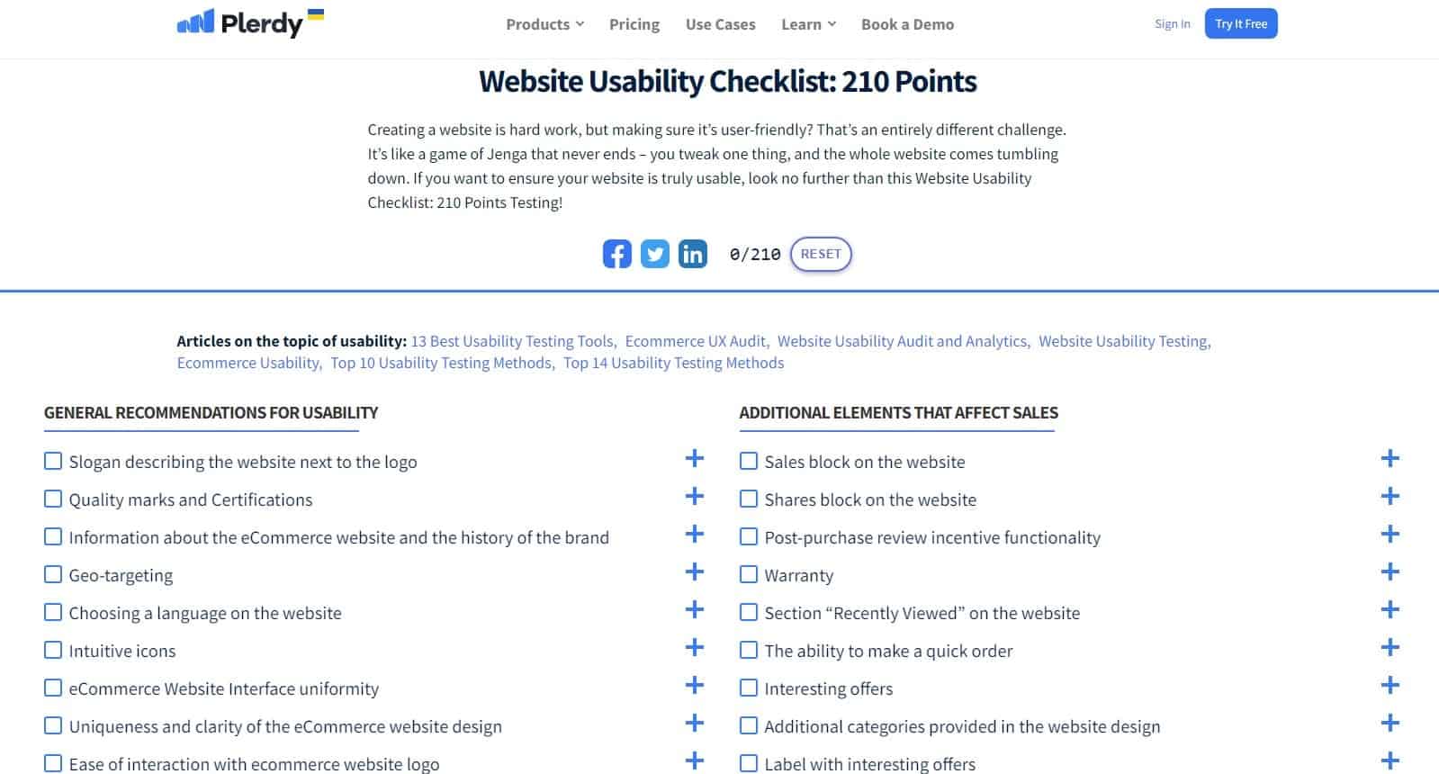
Creating a website is tough, but making it user-friendly is a different challenge. It’s like a game of Jenga that never ends. With so many aspects to consider, such as design, content, and functionality, knowing where to start can take a lot of work. That’s where a UX audit plan comes in. By conducting a thorough audit of your online store, you can identify areas for improvement and create a more user-friendly experience for your customers. Here’s a Website Usability Checklist: 210 Points to help you get started. The checklist covers everything from testing tools and eCommerce UX audits to website usability and analytics. Some key areas to focus on include the usability of the product page, user registration, the buying process, website structure, and internal linking. By analyzing these areas and making improvements where necessary, you can enhance the overall user experience of your online store and improve conversion rates. Remember that a user-friendly website can help build customer loyalty, increase sales, and drive business growth.
How to Improve Ecommerce Sales Performance?
You’re always looking for ways to increase your conversion rates and sales as an online seller. One of the best ways to do this is by tracking and analyzing key eCommerce indicators for your website. In this guide, we’ll show you how to use eCommerce tracking to learn what website elements buyers interact with before making a purchase and which ones don’t affect sales.
Using our special eCommerce tracking report, you’ll get even more accurate data than what Google Analytics provides and unique data for UX analysis. For example, each element on your website is assigned a price, so you’ll know which elements bring in the most value. You’ll save time on UX analysis and prioritization with real-time data collection and analysis.
To get started, follow our detailed setup instructions and implement the script on the pages informing the user about ordering success. Once set up, you’ll have access to a report that provides valuable insights about elements clicked before purchase and which produced conversions.
By analyzing the impact of website elements on sales by traffic channel and device and segmenting users into groups, you can make informed decisions about which website elements to keep, change, or remove to improve your eCommerce sales performance. With this information, you’ll be able to increase your revenue, grow your business, and improve the user experience for your customers.
Example UX audit as an Ecommerce Website flaska.es
Let me tell you a story about an eCommerce website called flaska.es and how we audited their UX to improve their sales performance. We reviewed the website and found several issues affecting their conversion rates. Here are some of our recommendations:
- Move the video to the first slide on the page for better visibility.
- Remove the non-functional shop button on the shop page and relocate it with a down arrow to indicate that users need to scroll down.
- Redesign the email subscription form and place it at the top of the page or a pop-up form.
- Rename the “Advanced Search” button to “Bottle” and change its design and color to improve click-through rates.
- Optimize the website for 1440 resolution.
- Sort products on the product page by popularity and add a search button for users who know what they want.
- Add a shipping and return policy page to inform customers of your policies.
We also analyzed the website’s traffic and found that only 36% of visitors went to the second block on the website. Therefore, we recommended that the “Go to Shop” button be located on the first block for users to find it easily. Additionally, we suggested lowering the distance between the first block and product recommendations on the product page. We also found issues with the mobile version of the website, and we recommended changes such as adding a “Go to Shop” button and removing non-functional buttons. We also reviewed the SEO of the website. We suggested adding descriptions and H1 content with relevant keywords to increase organic traffic. Finally, we analyzed the conversion rates and recommended redesigning the email subscription form, optimizing the video sessions, and adding conversions to the heat maps. With our recommendations, flaska.es can optimize its UX and improve its sales performance.
Shopify UX audit
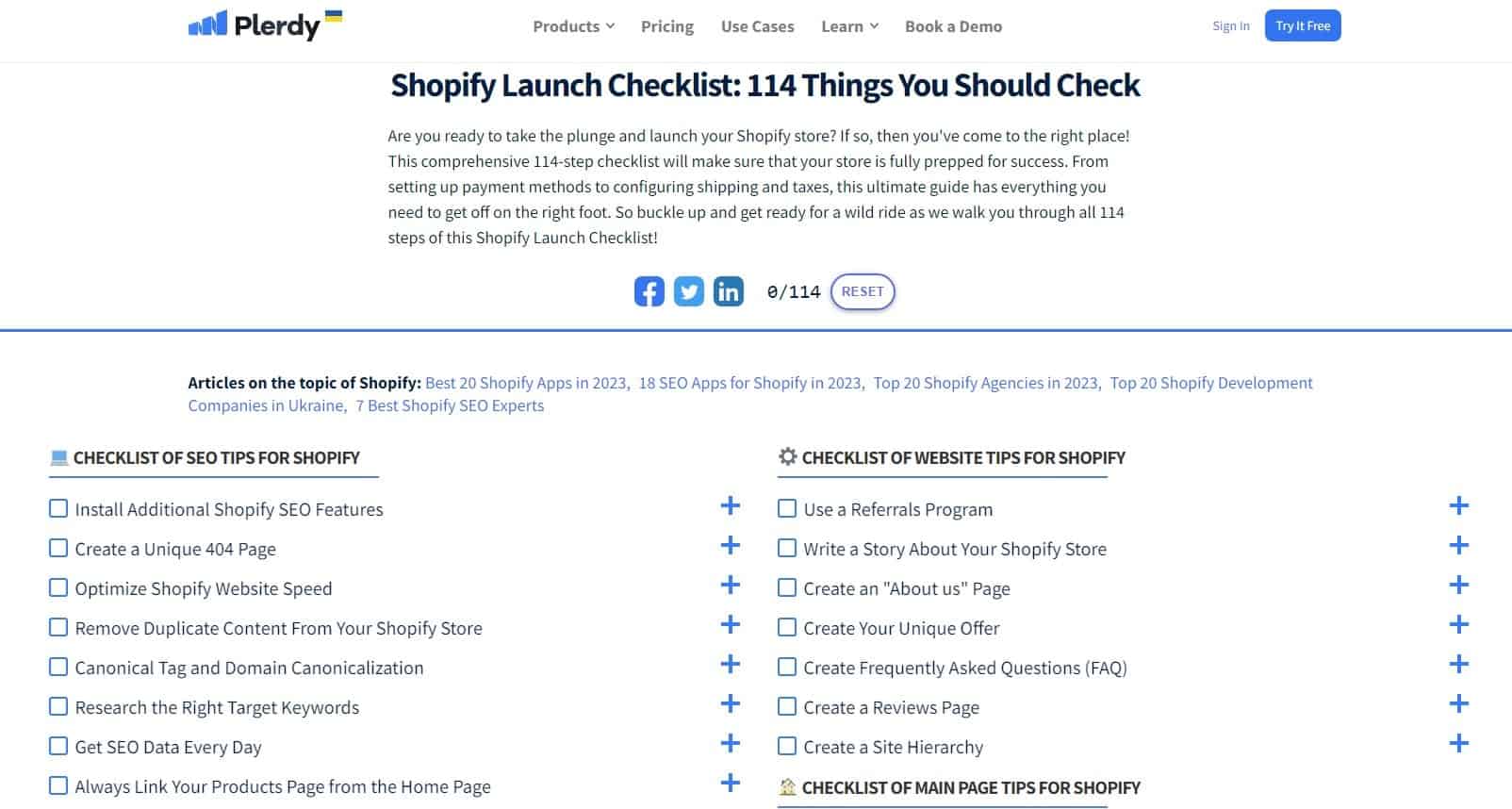
A Shopify UX audit is an effective way to identify problem areas and opportunities for improvement. One tool that can help you conduct a comprehensive audit is Plerdy, an Shopify app that offers heatmap, session replay, SEO, popup survey, and eCommerce tracking features.
Using Plerdy, you can track your store’s clicks, cursor moves, and scroll depth through its heatmap feature. The session replay feature lets you view what each visitor does in your store. In contrast, the popup feature helps you collect emails, survey customers, and increase sales through exit intent. Plerdy also offers an SEO feature that analyzes titles, descriptions, and keywords daily and integrates with Google Search Console and Google Analytics.
Plerdy is available in nine languages and can be used directly in your Shopify admin. It offers a free plan with a 14-day free trial and three pricing options depending on your needs. With Plerdy, you can easily identify and address UX issues and optimize your Shopify store for improved conversion rates. Try it out today!
UX Audit With Full-page Screenshots and Comments

Do you ever need help effectively communicating design and development feedback with your team? Plerdy UX Checker provides an easy solution. With the Full Page Screen Capture & Visual Feedback, Chrome extension, you can take a screenshot of a full page of the browser screen and add new comments. The extension captures every part of the site page and takes a URL screenshot, which you can upload as an image, tag new team members, share a link, and add new comments. The Plerdy UX checker makes it easy for teams to share design and development feedback. The five main features of the tool include communication, installation without code, site page analysis, management, and ease to use. Thousands of teams worldwide have used this tool to manage projects more efficiently. By simply taking a full-page screenshot of a website, prototype, or browser image, teams can quickly communicate and collaborate to improve UX. The Full Page Screen Capture & Visual Feedback extension is perfect for marketers and designers who want to easily and quickly get a screenshot or capture of the required page in Chrome. It’s easy to use and requires no technical knowledge, making it accessible to anyone who wants to improve their workflow.
Example Steps of Ecommerce UX Audit
Our task was to find ineffective elements in the eCommerce website design and offer how to improve them.
To analyze the behavior of users on the pages of the site, many top companies: TemplateMonster, SoftServ, Hafele, Kyivstar – use Plerdy tools.
Ecommerce UX Audit: Heatmap Analysis
1. The element that draws our attention has no practical use for visitors:
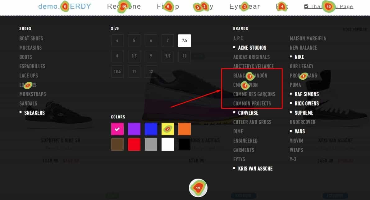
They changed the look of this page on the eCommerce website only a few times. It is better to use these pop-up forms.
Ecommerce UX Audit: Analyzing the scroll map
2. After analyzing the scroll map, we can conclude that 80% of users do not see this banner.
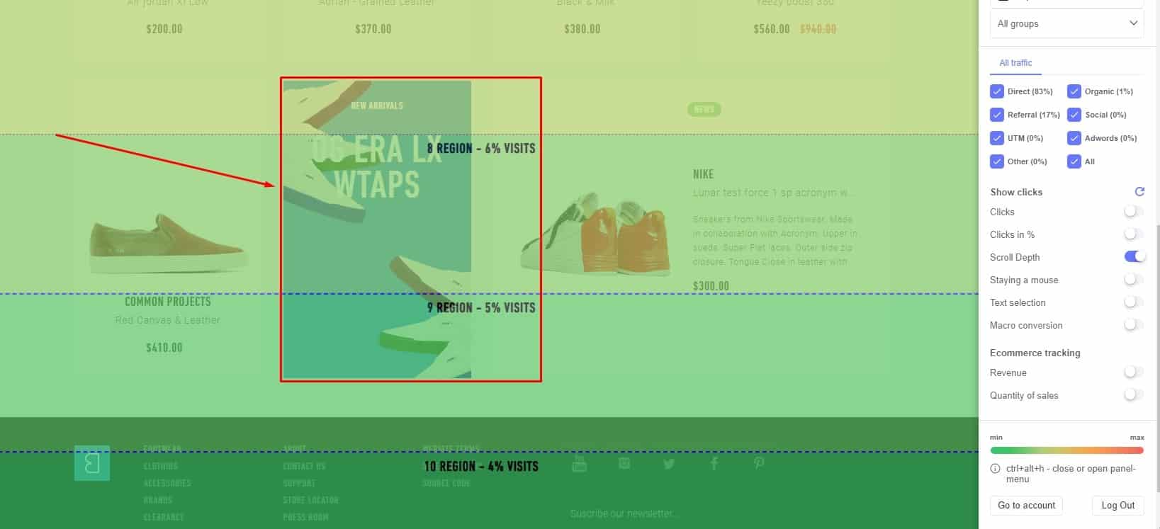
If the banners on the eCommerce website have important information, it is better to show it to the user using pop-up forms.
Features:
- Find the first click on the page and view the sequence of clicks.
- Filter clicks by device type and traffic channel.
- Segment users into groups and analyze their behavior separately.
- Determine which elements of an eCommerce website are least effective.
Benefits for eCommerce:
- 99% data accuracy.
- Clicks on dynamic elements.
- Quick UX analysis.
- Recording data from SPAs.
- Real-time website tracking.
- 10%+ growth of micro and macro conversions.
Ecommerce UX Audit: Analyzing Conversion
3. As you can see, these products do not impact sales. Therefore, these blocks need to be improved on the eCommerce website.
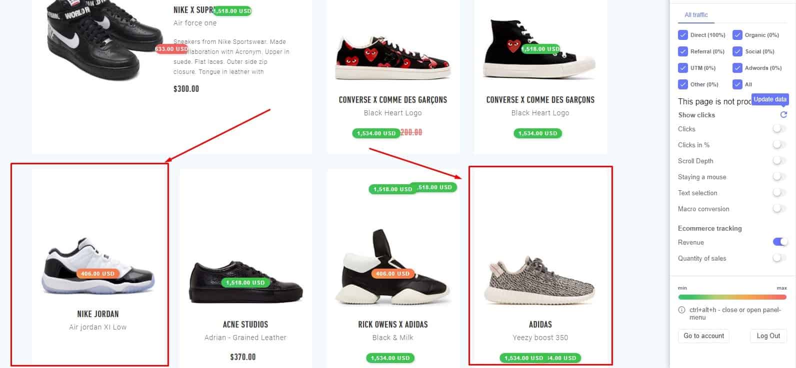
It is worth analyzing these products and possibly placing more relevant products here.
Features:
- Analyze the key eCommerce indicators for the selected period.
- Find out what elements buyers interact with before the purchase.
- Learn what eCommerce website elements don’t affect sales at all.
- Analyze the impact of eCommerce website elements on sales by traffic channel and device.
Benefits of eCommerce:
- More accurate eCommerce data than Google Analytics.
- Unique data for UX analysis.
- Each element is assigned a price.
- Saved time on UX analysis and prioritization.
- Real-time data collection and analysis.
- Works with all websites.
Ecommerce UX Audit: Session replay Analysis
4. According to the analysis of the recording of user sessions, we see that users came to the page but did not interact with it.
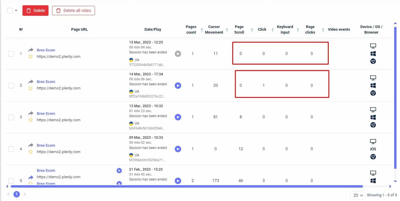
After a detailed review of each video, we can conclude what exactly needs to be changed on the page.
Features:
- Choose which URL to record.
- Configure the visitors from which countries to record.
- Segment videos by event type (clicks, scrolling, input, and cursor movement).
- Filter videos by traffic channel.
- Analyze mobile and desktop eCommerce website versions separately.
Benefits:
- Quick configuration.
- Multiple filters.
- Add custom events.
- Guest access to specific videos.
Based on this example of the user experience (UX) audit we have discovered several elements of the site that can and should be optimized. In particular, it’s necessary to:
- Replace the Callback button with smart forms;
- Remove the Banner block because it is less useful, place it using pop-up forms;
- Change products and first screen to more relevant after UX audit;
- Analyze each user why he left the page eCommerce website.
Based on this data, build the right hypotheses to improve the eCommerce site.
How to choose agency for ecommerce UX audit
Do you need help with low sales or high bounce rates on your online store? Do you find it challenging to identify what is driving your customers away? If so, conducting a UX audit can give you and your team incredible insights into customer problems, needs, and obstacles. A UX audit thoroughly analyzes your online store, examining the entire user experience. It can help you answer questions like, “Is something frustrating them?” and “How can you make their experience more rewarding?” A successful UX audit will drive every business, marketing, and UX decision.
But how do you choose the right agency for the job? There are many factors to consider, and it can be challenging to know where to start. That’s why we’ve put together a comprehensive guide to help you choose the best agency for your eCommerce UX audit. Here are some main benefits of conducting a UX audit:
- You get competitor analysis
- You find out what is easy to fix issues
- You can prioritize the urgency of issues
- You have insight into what problems with each screen are
- Increase user satisfaction
- Increase brand competitiveness
When choosing an agency, looking for a proven process for conducting a thorough CX audit is important. At agencies, the CX audit process includes analyzing brand strategy, defining core brand value assets, customer segmentation, research on competition, customer journey mapping, refining critical touchpoints, prototyping, and design. The audit process typically takes 1-4 months, and our pricing starts at $5,000.
When the agency finishes the audit, your team must continuously measure and improve CX. Your internal CX team can cooperate with an external CX agency for the best results. While internal teams can be costly, external consultant agency prices start at USD 100 per hour. Ultimately, choosing an agency for your UX audit can help you identify critical user-flow problems, catch any apparent tweaks and improvements, and benchmark your UX against competitors. So don’t hesitate to invest in a UX audit to provide your online store with the best possible user experience.
Bottom line
An eCommerce UX audit is an excellent practice for identifying areas for improvement in your digital store’s consumer experience. By validating and implementing findings from an audit, you can try layout, navigation, and service variations to find the best positioning for your product categories and checkout flow. The audit’s scope should cover all aspects of the website, from the drop-down menu to the order placement and checkout process. Using professional methods such as heuristic evaluation, a good UX audit will provide actionable suggestions to improve your eCommerce store’s interface and ultimately improve your company’s bottom line. If you’re looking for a tool to help with your eCommerce UX audit, try Plerdy for free today and get inspiration for optimization.
