About ready to improve the usability of your website? You only need look at these “8 Usability Testing Examples to Improve Your Website’s” performance! This thorough tutorial will walk you through tested usability techniques that will make your website a user-friendly powerhouse. We’ll cover:
- Real-life situations to mimic visitor encounters
- Task-based tests exposing latent pain issues
- Heuristic assessments aiming toward methodical enhancements
We will also provide tales and first-hand knowledge along the road to show the force of these models in use. We also will discuss the value of technologies like Plerdy CR analysis, which provides priceless understanding of user behavior, usability, and conversion rate optimization.
Knowing this will help you to make data-driven decisions that improve the usability and interface of your website. So be ready and travel with us on this fascinating journey to produce a digital environment that fascinates and interacts with your target market!
What Is Usability Testing?
A vital stage in web development, usability testing differentiates the pros from the beginners. This technique guarantees the UX of a website is seamless, interesting, and quick. Consider it as looking for flaws in your website under a microscope, therefore guiding a user’s path.
During usability testing, you examine many facets, including
- Navigation
- Design
- Responsiveness
- Content
Text Imagine, for example, evaluating the registration system of a site. You would look at how easily the form loads, how quickly it loads, and whether it fits perfectly on several devices. This practical technique enables developers to identify problems, correct oddities, and raise usability standards.
In a world when digital ability is supreme, usability testing can be the difference that drives a website from within its niche to the top. Encouragement of a user-centric approach can help you build an online environment that attracts returning users, so ensuring a definite path for success.
Why Do You Need Usability Testing?

A great UX is created in great part by usability testing, the unsung hero of web development. This is the ace you have on hand since it offers insightful analysis of user interactions, therefore distinguishing you from the competitors. Fundamentally, usability testing is necessary for numerous purposes:
- Enhancing user satisfaction
- Boosting conversion rates
- Uncovering pain points
- Streamlining navigation
- Reducing bounce rates
Imagine starting an e-commerce site without doing usability studies. For instance, visitors require assistance with a complex checkout system, which results in lost revenue and abandoned baskets. Using usability testing and designing a flawless experience that keeps users coming back for more would have helped you to identify these problems.
Usability problems can either ruin or enhance the success of your website depending on how beautiful its design is or how interesting its content is. A compass, usability testing leads you toward improvements that meet the needs of your target market. This is a proactive technique that helps you avoid traps and squarely address issues.
Ultimately, usability testing is your constant friend in quest of digital greatness. Investing in this process helps you to improve the UX of your website and create close relationships with your audience—a winning mix in the very competitive online scene of today.
Key Usability Testing Takeaways
![]()
Starting the usability testing process will provide a wealth of ideas that might completely transform your website. These important lessons underline the relevance of this process:
- Find and remove impediments preventing user navigation to provide a seamless-sailing experience.
- Sort usability enhancement first. Emphasize high-impact improvements to make sure you use resources wisely.
- Simplify user interactions to see increases in your conversion rates.
- Encourage delight: A flawless experience results in contentment of users, therefore transforming guests into devoted users.
- Outcompete the rivals: Using a user-centric approach, you’ll beat rivals who ignore usability testing.
To the wise, never undervalue the influence of usability testing. It’s the cornerstone for designing a website that excites users and propels success on the digital sphere. Appreciating these important lessons will help you to address any usability issues that arise and enable your website to reach unprecedented degrees of quality.
Usability Testing Questions

Getting practical insights from usability testing depends mostly on posing appropriate questions. These provocative questions will enable you to examine closely the UX of your website:
- Navigating ease: Can guests locate necessary information without much effort?
- Effectiveness of design: Does the arrangement direct visitors’ focus on important components?
- Clearly and succinctly are your messages delivered.
- Do your CTAs stand out and inspire participation? Call-to- action effectiveness
- Is the site compatible for several devices therefore guaranteeing a constant experience?
Use real-life situations that inspire visitors to finish particular tasks on your website in order to support usability testing. Ask a subject, for instance, to find a product, register for a newsletter, and finish a transaction. Then, as visitors negotiate your website, track their activities and offer comments. This can assist you to spot possible problematic usability spots and bottlenecks.
Combining these probing questions with practical testing can reveal priceless understanding about the usability of your website.
How To Find People Or Agency For Usability Testing?

Starting the journey towards help with usability testing? Look no further; here are great techniques to enable you to find the appropriate people or agencies:
- Referrals: Ask your professional network for suggestions; word-of-mouth might highlight uniscovered treasures.
- Online research: Search for respectable names in usability testing by browsing industry-specific forums, websites, or social media sites.
- Websites like Upwork or Freelancer feature a wealth of experts in this subject on freelancing sites.
- Consult specialized agencies providing thorough usability testing capabilities.
After you have reduced your choices, review case studies, client endorsements, and project portfolios to evaluate their knowledge and ability. This due care will guarantee that you collaborate with experts who can address the particular difficulties of your website, so providing insights that improve usability.
By following these guidelines, you will soon be working with usability testing professionals who can assist find and fix any flaws in the visitors path of your website.
List Of The 8 Usability Testing Examples
There are many more examples available from usability testing to help your website be user-friendly. These ten tried-and-true techniques are like lighthouse of inspiration, pointing you toward a digital realm that enthralls and transforms. Having every example in your arsenal will help you discover the secrets to a great UX, thereby confirming the ranking of your website as a strong competitor in the internet market.
1. Guerrilla Usability Testing
Fast-paced, affordable method of website usability testing, Guerrilla Usability Testing provides insightful analysis of user experience without costing the earth. Using actual users in regular environments—such as coffee shops, parks, or public transit hubs—this agile approach entails doing impromptu tests. Feedback should be gathered quickly to help to enhance the design and usability of the website and provide visitors with a better experience.
Guerrilla usability testing is beautiful in simplicity and versatility. Teams with limited time to acquire user comments or tight budgets will find this ideal solution. Startups and small companies should always refer to this resource since short, informal tests in the field provide essential information on user interaction and the usability of your website.
These guidelines will help you maximize Guerrilla Usability Testing:
- Usually running no more than 10 to 15 minutes, keep testing brief and targeted.
- Choose sites where your target market is probably to be found.
- Clearly list the particular chores you wish volunteers to finish.
- To inspire involvement, be ready to provide gift cards or little snacks.
- Note results and observations for later study.
Important advantages of guerilla usability testing include in:
- Low cost: This approach calls for less resources and equipment expenditure.
- Results quickly: Testing in actual environments helps you to gather comments in a few hours.
- adaptability: Guerrilla fighting usability One can quickly modify testing to examine certain facets of your website.
- Real-world understanding: Seeing users in their natural surroundings helps one spot problems that would not show up in a controlled context.
Guerrilla Usability Testing is, all things considered, a great utility for developers and designers of websites trying to maximize UX. So get ready, go on the streets, and begin usability testing; your users will thank you!
2. First Click Testing
Mastery of usability may either make or destroy the success of a website. One excellent test of UX optimization for your site is first click testing. This method offers insightful analysis of how easy customers could locate what they want and negotiate your website.
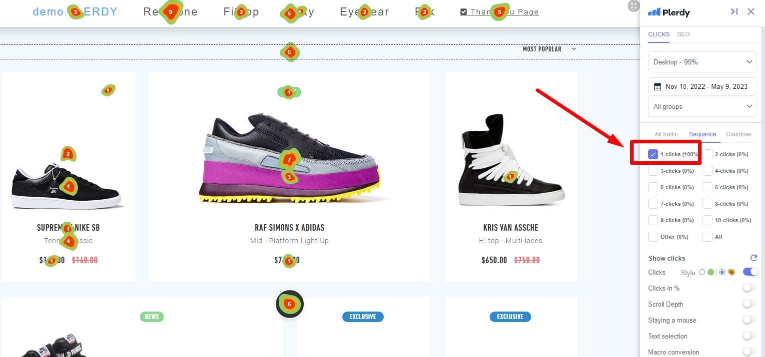
First Click Testing tracks users’ first clicks upon landing on your website. By examining these clicks, you can find any problems with the style, design, and content of your site. This material helps you decide what to do to improve the usability of your website.
Think about the following advantages of doing First Click Testing:
- Identifying navigation issues
- revealing perplexing labels or calls to action
- Learning about users’ mental processes
Refer to following rules to maximize First Click Testing:
- Choose assignments reflecting the main objectives of your website.
- Keep the test under five to ten activities.
- Get people that match your intended target market profile.
- For a larger audience and objective results, use remote testing tools.
You changed the homepage of your online clothing store, for example. First Click Testing can help customers locate the shopping basket faster or the “New Arrivals” area. This information helps to enhance the design of your usability website.
First Click Testing is ultimately a useful instrument for assessing the usability of your website. Understanding users’ first actions helps you to identify areas needing work and provide your guests with a more seamless, simpler experience. Thus, don’t hesitate to start usability testing with Plerdy right now and see how great your website turns out.
3. A/B Testing
As a potent usability testing tool, A/B testing dominates website optimization. Using two versions of a web page or element, this method—also called split testing—determines which produces superior results. A/B testing can help you to enhance the usability and UX of your website.
A/B testing is essentially about producing two variations with a difference. This may be a color change, copy layout modification, or any other element you use on your website. Random assignments to either version let visitors engage under tight observation. You can spot the variation surpassing the other.
These usability best practices help you to maximize A/B testing:
- To precisely gauge one variable at a time, concentrate on only that one.
- Test high-traffic pages for more statistical relevance.
- Run the test for enough time to gather a representative sample from your audience.
For example, you have an online fitness platform and want to raise memberships. You might therefore design two red and blue versions of the “Sign Up” button. Tracking user responses to every version can help you determine which color generates more sign-ups and apply it to your website.
4. Heatmap Usability Analysis
One great usability testing tool for finding hidden treasures in your website’s UX is heat map analysis. Using this data-driven method will help you to see your users’ interactions from a bird’s-eye perspective, thereby helping you to spot areas needing optimization and produce a visually appealing website with long-lasting effect.
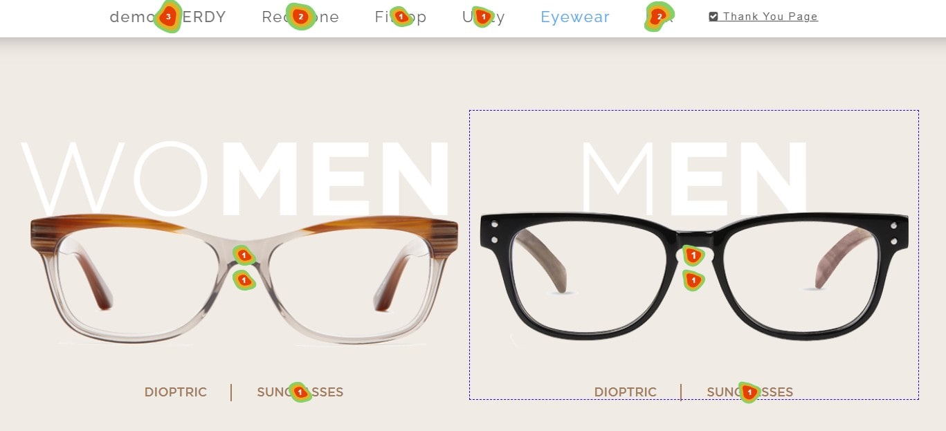
On your web sites, a heatmap is a graphic depiction of visitor involvement. Warm hues such as red and orange point to areas of great activity; cool tones such as blue and green represent reduced interactions. This color-coded method lets you quickly see which areas of your site draw users in and which require some more maintenance.
Remember these essential strategies to maximize Plerdy heat map analysis:
- Pay particular attention to high-traffic sites that most significantly affect the performance of your website.
- Combine heat map research with other usability testing techniques for a comprehensive assessment.
- Review your heatmaps often to evaluate your attempts at optimization’s success.
Run a travel blog including multiple destination entries. Studies on usability and heatmaps reveal readers of reasonably priced travel blogs ignore costly locations. This knowledge helps you concentrate your content strategy on themes related to the audience.
Additionally showing you where your call-to- action buttons are and whether customers need assistance locating navigation elements are heatmaps. This information can help you maximize your site’s layout for user-friendliness and return traffic.
Any owner of a website trying to maximize the usability of their site will find Heatmap analysis to be absolutely essential. Seeing user interactions helps you make data-driven decisions that increase website usability and involvement. Thus, avoid waiting; instead, start heatmap analysis and see how brilliantly your site performs.
5. Task Completion Testing
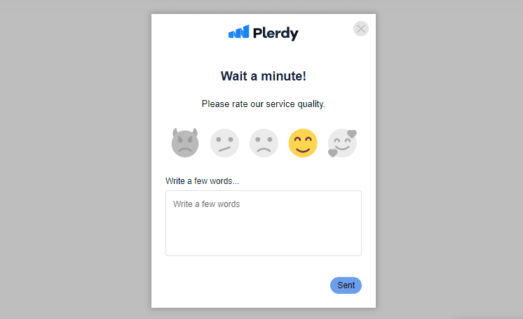
Task Completion Testing is an absolutely essential usability testing tool for optimizing your website’s UX. Focusing on how effectively users can do particular tasks will help you to find obstacles and implement changes that result in a more flawless and interesting experience for your guests.
Job Finish Testing involves assigning users of your usability website pre-defined activities as product discovery, subscription registration, or appointment booking. Closely observing their path will help you identify places where they might falter, get lost, or give up on the work entirely.
These best techniques help to guarantee successful Task Completion Testing:
- Choose work related to the main goals of your website.
- Get a varied group of volunteers reflecting your target market.
- Combine numerical and qualitative information to get balanced understanding.
Task Completion Testing lets you watch the process and find any problems such confusing pricing, difficult registration forms, and twisted navigation. This allows you to implement usability enhancements guaranteeing a flawless booking experience.
6. Card Sorting

One tried-and-true usability testing tool that could help you maximize the UX of your website is card sorting. Focused on enhancing the information architecture of your site, this method helps you to better understand how visitors view and classify your content, so guiding the structure of your website to their expectations.
Participants in a Card Sorting session are given cards with each symbolizing a piece of content or capability on your website. After that, they are requested to classify these cards according to logical groups for them. This technique can offer insightful analysis of how users mentally arrange your material, therefore guiding a more natural navigation system and improving the user experience.
These suggested practices will help you maximize Card Sorting:
- On your cards, label clearly and succinctly to prevent ambiguity.
- Different participants let for diverse points of view.
- Combine Card Sorting with several techniques for an all-encompassing usability test.
Learning how users classify household items on your online store will benefit you from card sorting. Examining how people mix furniture, cookware, and décor might help you create a more natural navigation menu fit for their way of thinking.
Additionally revealing information gaps and repetitions, card sorting helps you simplify your website for improved user experience. Users will thus find content faster, hence increasing engagement, conversion, usability, and customer happiness.
7. User Interviews
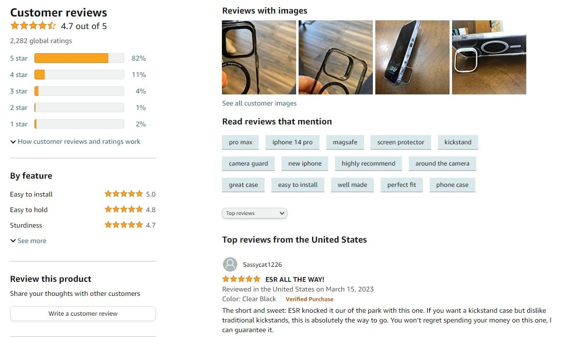
One of the key usability testing tools available to expose the user experience of your website are user interviews. One-on-one conversations with your target audience using statistics will help you to enhance the performance of your website.
Focusing on their issues, triumphs, and suggestions for usability enhancement, you will open-ended questions participants about their experience with your website during user interviews. By means of this qualitative data, you can spot possible pain points and chances for site improvement, so enabling a more user-friendly and interesting experience.
- Create a disciplined interview guide covering all pertinent subjects.
- assemble a large group reflecting your target market.
- Pay close attention and inspire candidates to provide candid comments.
Say you run a trip booking website and wish to find out how people use your search and booking tools. User interviews could discover that some people enjoy the options while others find the operation challenging or time-consuming. Resolving these problems and stressing the advantages will help to increase usability.
Additionally useful for comments on the usability, design, and content of your website are user interviews This user-centric approach can help your site to be simpler and more appealing, thereby motivating visitors to explore, participate, and return.
At last, user interviews can aid to raise the usability of your website. Talking with your audience will help you to surpass user expectations and enhance your website.
8. Accessibility Testing
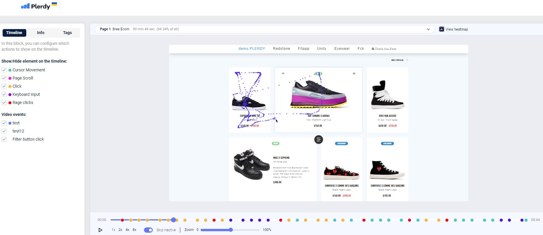
By means of accessibility testing, you can guarantee that the usability of your website satisfies the needs of every user—including those with impairments. Making your website more easily navigable will let a larger audience pass through, so supporting diversity and a good user experience for all.
Accessibility Testing explores the several facets of a website to ensure that all users may browse, understand, and interact with the content of any website, hence include a vital component of any strategy for usability testing of any website. Eliminating possible accessibility issues guarantees that none of the users falls behind.
Emphasize the following fundamental elements if you want to do successful accessibility testing:
- Visual: Make sure your page offers alternative text for pictures and is screen reader compatible.
- Auditory: include transcripts or subtitles to assist users with hearing problems.
- Cognitive: Keep the layout and design straightforward and consistent to prevent user misunderstanding stemming from cognitive disabilities.
- Motor: Provide individuals with limited dexterity or mobility keyboard navigation choices.
Think of these key stages while doing accessibility testing:
- Compatibility with assistive technologies including text-to—speech devices and screen readers.
- Headings, labels, and directions—clear, succinct material overall
- Appropriate application of HTML components and ARIA (Accessible Rich Internet Applications) parts
- Enough color contrast to assist those with vision problems
Remember to consider these rules:
- For best practices follow the Web Content Accessibility Guidelines (WCAG).
- Perform regular audits of accessibility to keep current with evolving criteria.
- Incorporate actual disabled users within your testing process for honest comments.
Any effort at usability testing on a website depends on accessibility testing. Making sure your website runs for everyone helps you to demonstrate diversity and foster a friendly online community.
In essence
At last, the “8 Usability Testing Examples” could increase your CR and income. Using these professional tested techniques will help you to invest in the future of your website and, hence, the success of your brand.
User experience is vital in the competitive digital scene of today, hence doing usability tests will help you find areas needing work. These tests span real-life situations, user interactions with your website, task-based assessments revealing latent pain areas likely to discourage possible visitors. Recall, it’s crucial to:
- Apply several testing strategies including mobile-optimized tests, comparison analysis, and heuristic evaluations.
- Support your marketing initiatives with the newest technologies and integrations—Plerdy usability, CRO, and Hubspot.
- Verify your assumptions often and iterate depending on user comments.
If you are still unable to decide where to begin, feel free to see a professional. Many organizations and consultants can assist you through the testing process; many specialize in website usability. Spending time and energy on improving your website will lay a strong basis for expansion and long-term success.
Are you ready to give your website the facelift it so richly merits and enhance usability? Start with Plerdy for a thorough CRO study and appreciate the advantages of a user-friendly website keeping guests coming for more. Change your digital landscape right now to ride the success tsunami!
