
You probably heard many times that A/B Testing is the best thing ever invented in marketing, right? Big brands and smart marketers use it daily. Netflix experiments with thumbnails, Amazon tweaks their buttons about every two seconds, and even Elon Musk did some funky A/B testing at Tesla to boost conversions. So if you’re not doing A/B Testing yet, come on—it’s already 2025, wake up!
But here’s a secret—if you run A/B Tests without proper insights, you’re basically throwing darts blindfolded. You can guess, sure, but why guess when you have Plerdy’s heatmaps to show exactly what visitors are doing on your site?
Now let’s jump right into the meat of it: How exactly do Plerdy heatmaps guide your A/B testing?
Step 1: Figure Out the Real Problem with Heatmaps from Plerdy

Okay, you have this awesome landing page, and you believe it’s perfect. But why then only 2% of visitors click on your shiny red CTA button? Well, before you freak out and redesign everything, check heatmaps first.
Plerdy heatmaps visually highlight where your visitors click most often—and where they don’t. For instance, let’s say your pricing button is in the middle of the page, but Plerdy shows only 5% of clicks there, while 45% of clicks go instead to your footer links. Weird? Absolutely.
With that info, you already have a solid hypothesis for an A/B test. Move your pricing button down or maybe create a secondary button in the footer. Boom, easy win.
Plerdy’s heatmaps offer even deeper reports, including Scroll Depth—which reveals if visitors even reach your main offer—or Macro Conversion reports showing exactly which elements visitors clicked before making a purchase. Imagine finding out your “free demo” banner triggered $1200 in sales last week alone! Or discovering through the Revenue heatmap that 72% of your sales came from clicks in a specific product area. Now that’s powerful data you can immediately use for smarter A/B testing. So before making blind changes, trust Plerdy’s detailed heatmaps to clearly identify your real issues and best opportunities.
How to Choose the Best A/B Testing Idea Using Plerdy Heatmaps
Now, let’s talk strategy. When heatmaps give you a bunch of confusing data, what should you test first?
Simple rule: always prioritize changes that could significantly affect conversions or user experience.
Here’s a practical example. Imagine your homepage gets a decent amount of traffic but very low conversions. You open your heatmap report in Plerdy, and surprise-surprise, visitors ignore your fancy video and focus mostly on text testimonials.
Your A/B test could then compare a version of the page without video, emphasizing more customer quotes instead. The beauty here is that you don’t randomly pick what to test—you choose based on what your visitors actually tell you through their clicks (or non-clicks).
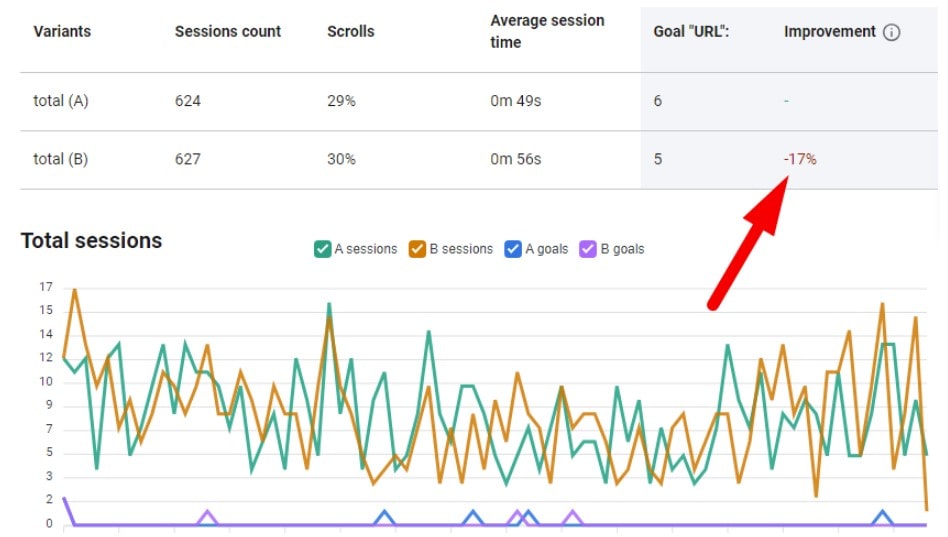
When you run your test, Plerdy’s free A/B testing tool gives you clear, real-time data about what’s working better. Just create a simple test by tweaking elements—maybe changing your CTA button color or text. Plerdy helps track exactly how these small adjustments impact your chosen goals, like increased clicks or higher conversions. For instance, if variant B’s “Subscribe” button boosted signups by 20%, you know exactly which idea works best. No more guessing—just data-driven decisions. Combine Plerdy’s heatmaps with its intuitive A/B testing reports, and suddenly you’re not just hoping for success; you’re creating it step-by-step.
Quick Table: How Plerdy Heatmaps Help with A/B Testing Decisions
Here’s a handy table summarizing how heatmaps from Plerdy simplify your A/B testing process:
| What Heatmaps Show You | What to Do in Your A/B Test |
|---|---|
| Users ignore main CTA | Test different CTA placements or texts |
| Visitors click unclickable areas | Test adding links/buttons in those areas |
| Users pay attention to text, ignore images | Test reducing images, increasing texts |
| Scroll depth reveals abandonment | Test shortening or rearranging sections |
Real-Life Examples of Heatmap-Driven A/B Tests with Plerdy

Alright, enough theory—let’s dive into real-world action. A friend working at a SaaS startup recently saw that their trial signups dropped 12% overnight. Panic ensued.
Instead of random tweaks, they used Plerdy’s heatmaps and noticed that after a recent redesign, users mostly clicked on non-interactive elements—a bunch of icons that just looked clickable but weren’t.
So, they ran an A/B test: version A had clickable icons with tooltips; version B left the icons as decorative only. Results? Clickable icons won big-time—trial signups rose 18%. Crisis avoided, all thanks to simple Plerdy heatmap insights.
Another quick one: an e-commerce brand used heatmaps from Plerdy and discovered users scrolled 80% down the product page before exiting. They decided to move their “Add to Cart” button from the top of the page closer to that 80% scroll mark. Guess what? Their conversion rate jumped by 25%. Magic? No, just good old heatmaps and common sense A/B testing.
Common Mistakes You Can Avoid Using Plerdy Heatmaps
If you’re still not convinced why heatmaps are necessary for A/B testing, think about this. According to a recent report by HubSpot, about 35% of marketers admit their A/B tests fail due to poor hypothesis. Basically, they’re guessing wildly.
Plerdy heatmaps save you from these embarrassing blunders:
- Running tests based purely on gut feelings. (Yeah, even Steve Jobs got things wrong sometimes.)
- Ignoring real user behavior. (Come on, even Google tests their homepage.)
- Making unnecessary big changes. (Why break something working perfectly?)
The beauty of Plerdy is its simplicity: you literally see what’s working and what’s not. That’s your strongest advantage when choosing your A/B testing hypotheses.
Heatmaps from Plerdy vs. Traditional Analytics Tools (Short Comparison)
You might ask—why heatmaps and not just Google Analytics or Hotjar? Good question! Here’s a quick breakdown:
Sure, Google Analytics tells you a visitor spent 3 minutes on your page. But what exactly did they do? Did they hover anxiously around your CTA or read your FAQ five times? Traditional analytics won’t tell you that clearly.
Plerdy heatmaps, however, reveal precise visitor interactions: clicks, scrolls, and hovers. You know exactly what users engage with or ignore, making your A/B tests precise, targeted, and effective. Tools like Hotjar also offer heatmaps, but Plerdy goes deeper with faster load times and easy integration into funnels. Plus, Plerdy is super marketer-friendly—no headache, just actionable insights.
Practical Tips to Get the Most from Plerdy’s Heatmaps in Your A/B Testing
Ready for some final actionable tips? Great!
- Check heatmaps regularly: A quick daily glance can uncover emerging issues early.
- Compare before and after: Run heatmaps before and after changes—makes results clear as day.
- Segment your audience: Plerdy lets you segment heatmaps by traffic source or device type—maybe mobile users behave differently than desktop ones?
- Don’t trust heatmaps blindly: Heatmaps guide you, but combine them with other metrics for the best outcomes.
Heatmaps are powerful, but they’re part of a bigger puzzle. Pair them with session recordings or event tracking from Plerdy to get the full story behind your visitors’ clicks.
Wrapping It All Up
Here’s the truth—without heatmaps, your A/B tests might work by chance. But when you pair them with the actionable insights from Plerdy, your chances to nail it go way up. You’ll save time, stop guessing blindly, and most importantly, make more money. (Who doesn’t want that?)
So don’t waste another minute: fire up Plerdy, check those heatmaps, and start testing smartly today. Your users—and your conversions—will thank you.