

 300+ G2 reviews
If your website isn’t converting visitors into customers, it’s probably not your product. It’s your UX design. Poor user experience (UX) is like a leaky bucket—you pour traffic in, but conversions drip away.
Don’t worry, though. We’re about to uncover the biggest UX design mistakes that are tanking your conversions and how Plerdy can stop the bleeding.

1. Slow Load Time: The Ultimate Conversion Killer
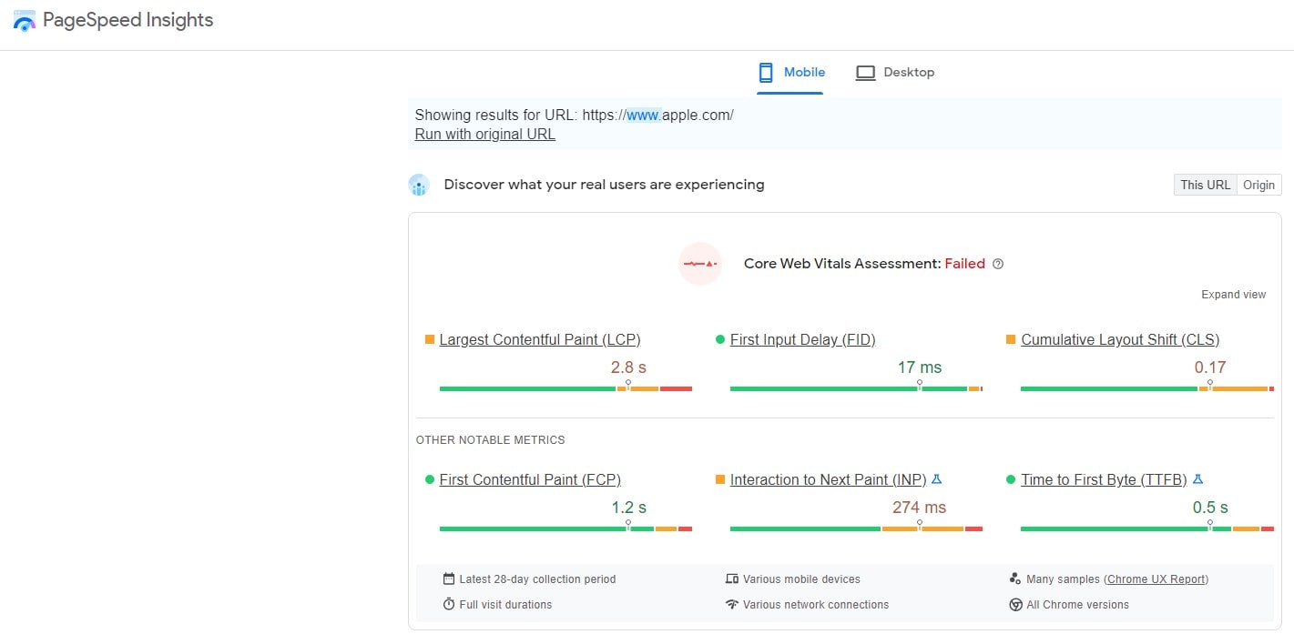
People hate waiting. If your site takes longer than 3 seconds to load, 40% of visitors will bounce. That’s almost half of your traffic—gone. And it gets worse. Google’s data shows that a 1-second delay can cause a 7% drop in conversions.
Why This Happens:
- Oversized images that take forever to load.
- Messy, unoptimized JavaScript slowing things down.
- A server that moves at the speed of a snail.
Plerdy’s Fix:
- Chrome SEO Analyzer scans your site for speed issues.
- Heatmaps show where users drop off due to slow elements.
- Session recordings help track the exact moment visitors give up.
👉 Fact: Amazon calculated that a 100-millisecond delay could cost them $1.6 billion annually. Imagine what it’s doing to your revenue.
2. Bad Navigation: Lost Visitors Don’t Convert
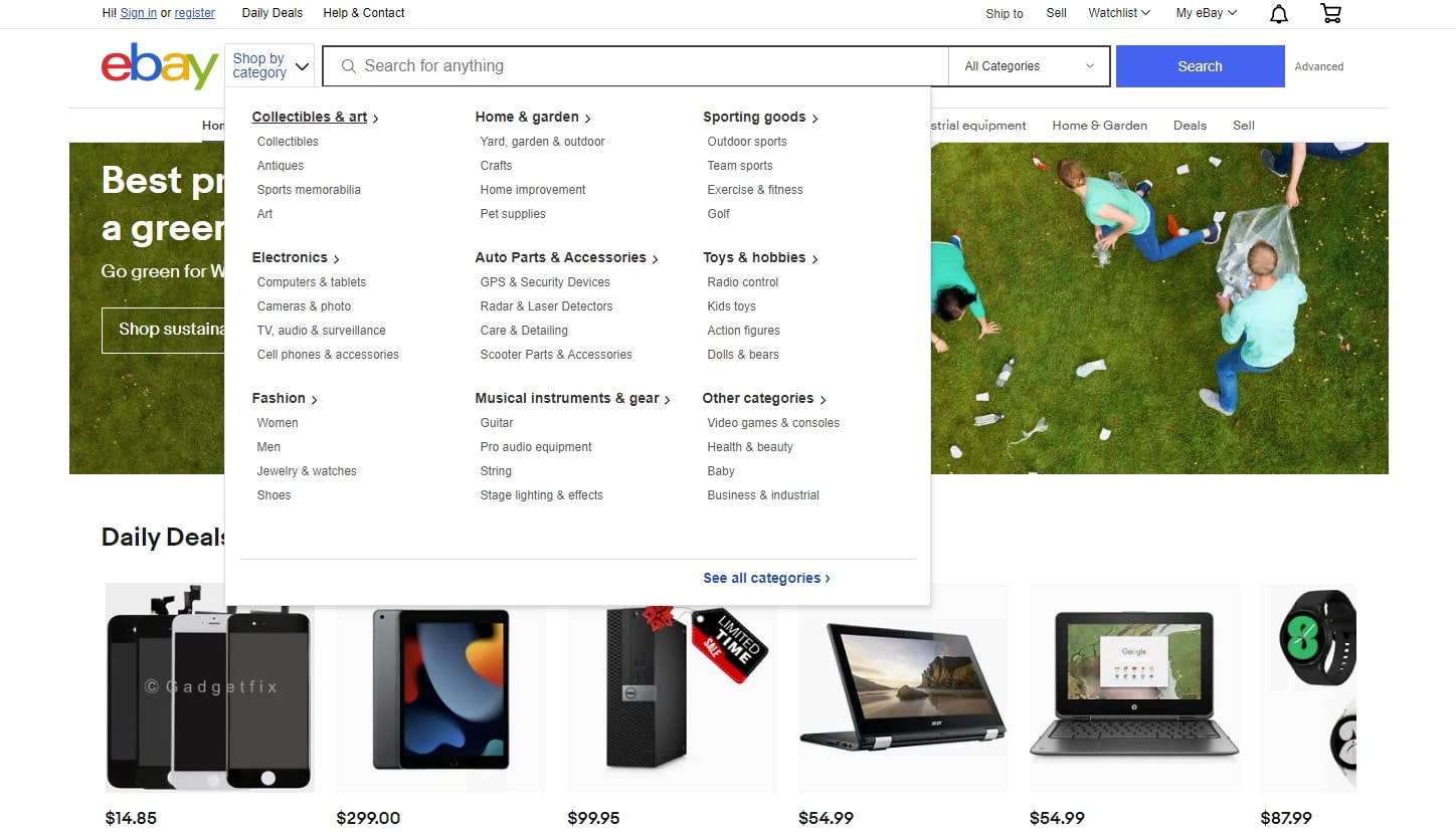
Ever walked into a store where nothing makes sense? No signs, no logic—just a confusing mess? That’s what a poor UX design does to your website.
Signs Your Navigation Sucks:
- Visitors struggle to find key pages.
- Your bounce rate is sky-high.
- Heatmap data shows people clicking random places in frustration.
How Plerdy Helps:
- Click maps show which menu items attract clicks (and which don’t).
- Funnel analysis reveals where users get lost in the journey.
- Session replays let you experience user frustration firsthand.
👉 Pro Tip: If visitors take more than 3 clicks to find what they need, you’ve already lost them.
3. Poor Mobile UX: You Can’t Afford to Ignore It

Over 58% of global web traffic comes from mobile. Yet, so many sites are still built for desktops. If your mobile UX design is frustrating, users will bounce without a second thought.
Mobile UX Mistakes That Kill Conversions:
- Buttons so tiny they require surgical precision.
- Pop-ups that hijack the screen.
- Text that needs a magnifying glass.
How Plerdy Saves the Day:
- Mobile heatmaps reveal how users interact with your site.
- Scroll depth tracking shows if visitors reach key content.
- A/B testing lets you optimize your design for real-world users.
👉 Fact: 57% of users say they won’t recommend a business with a bad mobile experience.
4. Weak CTAs: If You Don’t Ask, You Don’t Get

Your Call-to-Action (CTA) should be clear, compelling, and impossible to miss. Yet, so many websites settle for weak, uninspiring CTAs.
CTA Mistakes That Kill Conversions:
- Vague text (Learn More—about what?).
- Weak contrast that makes buttons disappear.
- CTAs buried in places no one sees.
Plerdy’s Fix:
- Heatmaps reveal whether users even see your CTA.
- Scroll tracking ensures CTAs are placed in the right spots.
- Funnel analysis confirms which CTAs actually work.
👉 Data Speaks: Changing CTA color from green to red boosted conversions by 21% in a test by HubSpot.
5. Long, Overcomplicated Forms: People Don’t Want to Work
Imagine you’re ready to buy, but then you get slapped with a 10-field form demanding your name, phone number, email, birthdate, and… your pet’s maiden name? Nope.
Why This is Killing Conversions:
- Visitors abandon checkout out of frustration.
- Unnecessary fields make people question your intentions.
- It feels like too much effort.
How Plerdy Helps:
- UX insights highlight which fields create friction.
- Session recordings let you see exactly where users struggle.
👉 Fact: Reducing form fields from 6 to 3 can boost conversions by 20%.
6. Using Fake Stock Images: Trust Killer #1
Nothing screams “this is fake” louder than those cheesy, overused stock photos. If your team page has models with perfect teeth pretending to brainstorm—users won’t buy it.
Why This Hurts UX:
- Feels impersonal and untrustworthy.
- People can tell when a photo is staged.
- Doesn’t reflect your actual brand.
Plerdy’s Fix:
- A/B testing shows whether real photos improve engagement.
- Heatmaps reveal if users ignore or interact with images.
- Session replays track visual engagement.
👉 Pro Tip: Authentic images of real customers and employees build 3x more trust than stock photos.
7. No Social Proof: People Trust People
If your site lacks reviews, testimonials, or case studies, you’re leaving money on the table. 88% of users trust online reviews as much as personal recommendations.
Social Proof Mistakes:
- No visible testimonials or user reviews.
- Generic, fake-sounding reviews that nobody believes.
- No trust badges or certifications.
Plerdy’s Solution:
- Heatmaps show if users engage with social proof.
- A/B testing helps find the best placement for reviews.
- Funnel analysis reveals if social proof boosts conversions.
👉 Fact: Adding reviews can increase conversions by 34%.
8. Ignoring Data: UX Isn’t Guesswork

If you’re making UX design decisions based on gut feeling, you’re gambling with conversions. The best companies—Netflix, Shopify, Airbnb—rely on data-driven UX.
Why Guessing is a Bad Idea:
- You might optimize the wrong things.
- Wasted money on ineffective redesigns.
- No way to track real pain points.
Plerdy’s Data-Driven Approach:
- Heatmaps, session recordings, and A/B testing remove the guesswork.
- Event tracking measures user interactions.
- Website funnel analysis pinpoints where visitors drop off.
Fact: Data-backed UX design changes lead to 400% better conversion rates.
UX Mistakes & How Plerdy Fixes Them
| UX Mistake | Why It Kills Conversions | Plerdy’s Solution |
|---|---|---|
| Slow Load Time | Higher bounce rates | SEO Checker, Heatmaps |
| Bad Navigation | Users get lost | Click maps, Funnel analysis |
| Poor Mobile UX | Mobile users leave | Mobile heatmaps, A/B testing |
| Weak CTAs | No action taken | Scroll depth tracking, UX analysis |
| Long Forms | Checkout abandonment | Form analytics, Session recordings |
| Stock Images | Trust issues | A/B testing, UX insights |
| Lack of Social Proof | No credibility | Heatmaps, Conversion tracking |
| Ignoring Data | Bad design choices | Event tracking, Website funnel analysis |
Final Thoughts: Time to Stop Losing Conversions
Bad UX design isn’t just frustrating—it’s expensive. Plerdy helps you analyze, optimize, and fix UX mistakes before they drain your revenue.
So, are you ready to boost conversions instead of watching them disappear? Time to let Plerdy do the heavy lifting while you focus on scaling your business.