The correct Conversion Rate Optimization (CRO) approach can drive your mobile website to hitherto unheard-of success in the busy terrain of online sales. Optimizing website conversion for this particular traffic is not a choice given the increasing tsunami of mobile visitors; it is a need. We will explore these here:
- Tailor UX Design: Engage consumers with easy-to-use interfaces, like those found in the travel and hotel sectors.
- Responsive layouts: Like leading fashion companies, give a simple buying experience.
- Leverage analytics: As successful tech businesses show, leverage insights to improve user involvement.
Using Plerdy, a remarkable solution meant to improve your CRO & UX, all these techniques can be enhanced. Plerdy guarantees a seamless and effective optimization process by means of real-time statistics, heatmap tracking, and mobile-friendly changes – exactly as your website should be. Focusing on mobile conversion can help your online company to advance on the digital market. Count among the successful businesspeople who have already used this strategy. Click to tour Plerdy now and start the process of raising website conversion for mobile traffic!
Importance of Mobile CRO
Driving effective conversions on your website now requires this must-have approach rather than a nice-to-have one. Given that almost half of the world’s online traffic is mobile, companies which ignore mobile CRO run the danger of losing possible consumers to rivals who have improved their mobile experience.
Mobile CRO is vital for the following reasons:
- Mobile-optimized websites grab users’ attention longer because to their easy design and navigation, therefore promoting increased engagement.
- A mobile-friendly website greatly improves the user experience, therefore facilitating visitors’ conversion process.
- Users that visit websites with flawless mobile experiences generally return, therefore guaranteeing consumer loyalty.
Consider the e-commerce sector here. Simplified mobile shopping can dramatically raise conversion rates. Imagine buying on an e-commerce site where, on your smartphone, checkout is simple, product photographs are perfect, and condensed explanations are brief. Today, that’s a winning mobile CRO approach!
Ultimately, mobile CRO is not optional in a digital environment when the mobile user rules; it is rather a necessary component of every effective online strategy. It’s time to welcome mobile CRO and see exponential increase in website conversion.
Elevating Mobile CRO: Innovative Techniques for Enhanced Conversions
Knowing the nuances of mobile conversion helps one to negotiate the always changing digital terrain like learning a difficult math. By cracking this code, the top agencies have raised mobile CRO above standard. They provide the art of conversion fresh elegance by combining smart gadgets and easy dashboards. For example, Gymnex, a trailblazer in the sector, redefines the user experience, therefore weakening the competing sites.
Think through these effective tactics:
- Utilizing Advanced Devices: Tracking user interactions with modern devices guarantees that every swipe and tap results in useful data.
- Smart Dashboard Integration: Create dashboards on smart dashboard integration that view conversion statistics, so transforming perplexing data into practical insights.
- Adopting Gymnex Standards: Using Gymnex’s creative approach—that which emphasizes user-centric design—you can make your mobile site stand out.
- Team Coordination: Motivational teams should inspire others to develop ideas and carry out plans that appeal to many groups, therefore avoiding user alienation.
- Customizing for Phone Dynamics: Knowing that every device provides a different portal to user involvement, maximize for different phone types.
These techniques turn a simple idea into a real, profitable result for mobile CRO. Using these instruments, turning clicks into consumers becomes a goal with quantifiable actuality.
Understanding Mobile User Behavior
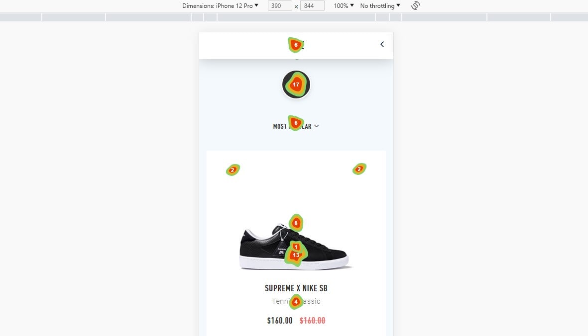
Within the vast field of digital marketing, a good CRO approach depends mostly on knowledge of mobile user behavior. Businesses may greatly increase the website conversion rates by spotting trends and preferences of mobile users.
Mobile users have special qualities:
- Quick Decisions: Mobile users usually want information right at hand, fast. In the travel business especially, this quality is really important. Someone should instantly verify airline or hotel availability; so, a fast-loading, readily navigable website is absolutely vital for conversion.
- Multitasking: Mobile users regularly browse while engaged in other activities, such as TV watching, commuting, or line waiting. For instance, a watcher of a culinary show might concurrently order goods from an app. Websites able to accommodate this “divided attention” phenomena will shine in the CRO game.
- Local Searches: Many smartphone searches turn up local companies or services. A gym goer can look for a nearby protein supplement store. Websites geared at local searches will probably get more conversions.
Businesses can improve their mobile CRO strategy by using these user behaviors, therefore producing better results. Enter mobile user behavior analysis, hone your CRO strategies, and see how your online conversion rates rise.
12 Steps to Improve Mobile CRO Conversion
1. Mobile-Friendly Website Design
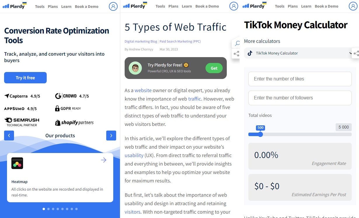
Effective conversion rate optimization (CRO) depends first on a mobile-friendly website design. It’s about providing on your website an interesting, flawless, and simple experience that quickly guides your mobile consumers towards conversion.
A few important factors come out clearly in mobile-friendly design:
- Responsive design: Guarantees that the layout of your website adaptably fits different screen sizes, thereby providing the best view whether customers are on a desktop, tablet, or smartphone. One such a perfect example is Netflix; their platform offers a similarly fun experience regardless of the gadget used.
- Simple navigation: Should allow one to get from landing on the website to conversion without any difficulty. The Domino’s Pizza mobile website shows this; just a few clicks will make ordering pizza simple.
- Easily readable material: Font type and scale influence. Content should not require users to enlarge in order to view. Popular blogging tool Medium shines in providing a great mobile reading experience.
- Touch-friendly Elements: Large enough buttons, forms, and links should allow one to tap without mistake. The great touch-friendly design of Airbnb’s website simplifies property choosing and booking process.
And last, mobile-friendly website design increases CRO. By concentrating on the elements above, you can design a website that draws mobile visitors and gently guides them toward conversion.
2. Speed Up Your Mobile Site
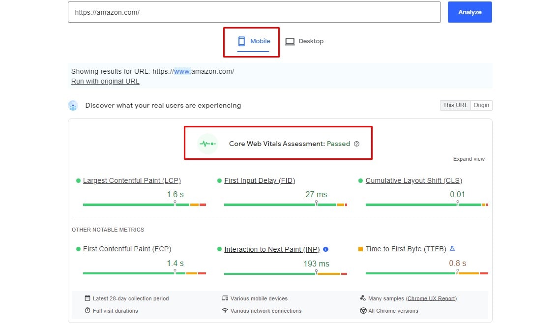
Your CRO performance might be much improved by increasing the speed of your mobile site. Captivating mobile users and guiding them to conversion depend on a quick, flawless browsing experience. Just a few seconds can cause users to leave your website, so affecting your conversion rate.
Here’s how you might increase the speed of your mobile website:
- Optimize Images: High-resolution photos can slow down a device. Optimize photos to make sure they load faster without sacrificing quality by compressions. With clear, fast loading visuals, Amazon’s mobile website epitribes this.
- Minify Code: Eliminate comments, whitespace, and extraneous characters from your website’s coding. Google uses this method to help to produce shorter load times.
- Content Distribution Network (CDN): To guarantee faster content delivery, CDNs save cached versions of your website on servers located all around. Spotify uses this approach and provides fast music streaming all around.
- Eliminate Redirects: Every redirect slows down the time your page loads. Reducing clicks on the user journey speeds things along, as LinkedIn’s flawless sign-in system shows.
Improving the performance of your mobile website increases user experience, maintains visitor engagement, and propels them into conversion. Here the lesson is straightforward: increase speed and convert more. It’s time to start your mobile CRO trip on acceleration.
3. Optimize Mobile Navigation
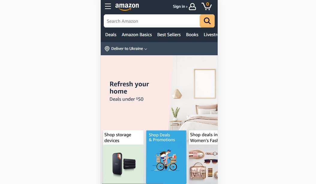
Navigating in mobile CRO can either increase or reduce your conversion rates. Improved mobile navigation drives consumers toward conversion by helping them to travel a seamless, hassle-free path.
Let’s investigate main elements of successful mobile navigation:
- Clear and Simple Menu: Keep your mobile navigation menu straightforward and easy-to use. Don’t let users have too many choices overwhelm them. Uber’s mobile app masterfully captures this with a simple, understated menu that guides consumers to intended actions quickly.
- Visible Call-to-Action (CTA): CTAs should be clear, appealing to drive users to click. At the top of their mobile page, Netflix brilliantly displays a bold, red “Sign In” button.
- Logical Flow: From arrival to conversion the user path should be flawless. Spotify’s seamless sign-up journey helps them to reach this since it facilitates visitor user acquisition.
- Easy Back and Forth: Users should be able to readily backtrack without becoming lost. Here the IKEA mobile site shines, with a straightforward back feature and a “Home” button.
Optimizing mobile navigation can help your visitors to travel quickly to conversion and create a smooth road. Your website should be a well-marked trail leading users to their intended location; it is not a maze. In mobile CRO, well-crafted navigation is a hidden hero that guides customers to conversions as they enjoy the trip.
4. Clear and Compelling Call-To-Actions (CTAs)

Mobile CRO mostly depends on clear and appealing call-to- action (CTA) buttons. They are the stepping stones guiding your users toward conversion on your website, thereby turning surfing into buying or curiosity into dedication.
These are some ideal CTAs:
- Visibility: CTAs should be deliberately positioned and obviously visible. Amazon shines at this, proudly and clearly positioning its “Add to Cart” button.
- Action-Oriented Text: A good CTA employs verbs that inspire action or excitement. One great example—direct and appealing—is Spotify’s “Get Spotify Free.”
- Color and Size: The CTA button’s color and size should help it to be distinctive. Against a white background, Dropbox’s blue “Sign up for free” button is really striking.
- Context: The CTA has to clearly offer a value proposition and fit the page’s setting. With its “Explore nearby stays,” Airbnb addresses the intention of a guest by offering background and motivating action.
Clear, strong CTAs on your mobile website are like road signs on a highway; they direct your guests, maintain their course, and straight-forwardly propel them to conversion. CTAs are your co-drivers on the road to conversion while you travel mobile CRO. Perfect your CTAs and see how your conversion rates start to rise.
5. Simplify Forms
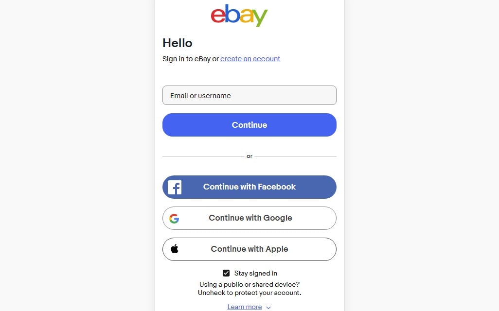
One very effective way to improve mobile CRO is to simplify forms. Long forms and clutter could discourage mobile consumers, therefore affecting your conversion rates. Conversely, simplified, user-friendly forms can open the road for a seamless user trip toward conversion.
Now let’s explore how to streamline forms for a mobile CRO plan that works.
- Reduce Fields: Less scary the form is the fewer the fields. Learn from Instagram’s sign-up form—just full name, email, and password.
- Auto-Fill and Predictive Text: Providing auto-fill or predictive text choices can help consumers find things simpler. Google makes sure a quick user experience by using this function in its search bar.
- Responsive Error Messaging: When mistakes happen, quick and unambiguous warnings can help users to fix them. Twitter’s login form achieves this quite effectively, immediately pointing up mistakes.
- Smart Keyboard: Use the correct keyboard depending on the needed input. Like Uber uses, a numerical keypad for phone numbers helps to simplify user input.
In the context of mobile CRO, form simplicity is the craft of user-friendliness. It’s about removing extraneous obstacles and offering a seamless road of conversion. So cut, simplify, and observe how much better your mobile website converts.
6. Optimize Product Images and Descriptions
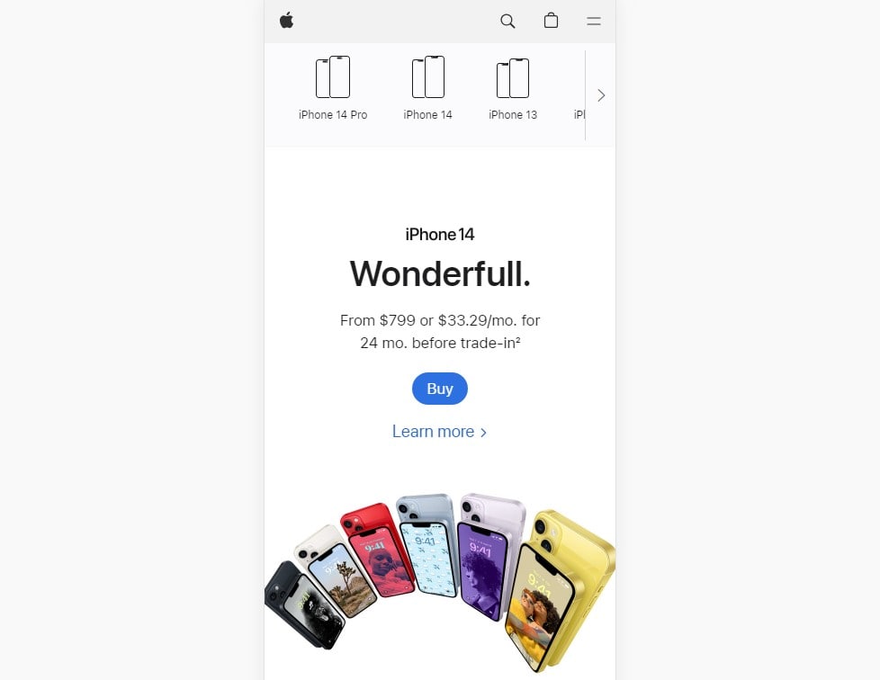
Improving product photos and descriptions can help mobile CRO run even better. On your mobile website, sharp, high-quality photographs and concise, convincing product descriptions motivate customers to move from exploring to purchase.
Use these best standards for best optimization of product photos and descriptions:
- High-Quality Images: Show items with sharp, high-definition photos. IKEA achieves this flawlessly, presenting their items with high-quality photos allowing consumers to view every element.
- Zoom Function: Let users zoom in for a closer-up view. ASOS uses this tool to offer a closer look at their textiles and garment details.
- 360-degree View: Present a 360-degree picture to offer a complete knowledge of the good. For their shoes, Zappos provides this functionality to guarantee consumers have a whole picture before making a purchase.
- Clear Descriptions: Product descriptions should be succinct, straightforward, and instructive. Patagonia masters this with succinct, thorough product descriptions stressing their special qualities and advantages.
- In-Context Images: Show items in context to enable consumers see them. With furniture, West Elm presents each piece in a coordinated room environment.
Your products will display clearly and attractively if you maximize your product photographs and descriptions. This can finally increase conversions, transforming casual browsing into committed purchase behavior. Maintaining clear descriptions and appealing pictures, see how your mobile CRO numbers rise.
7. Provide Social Proof
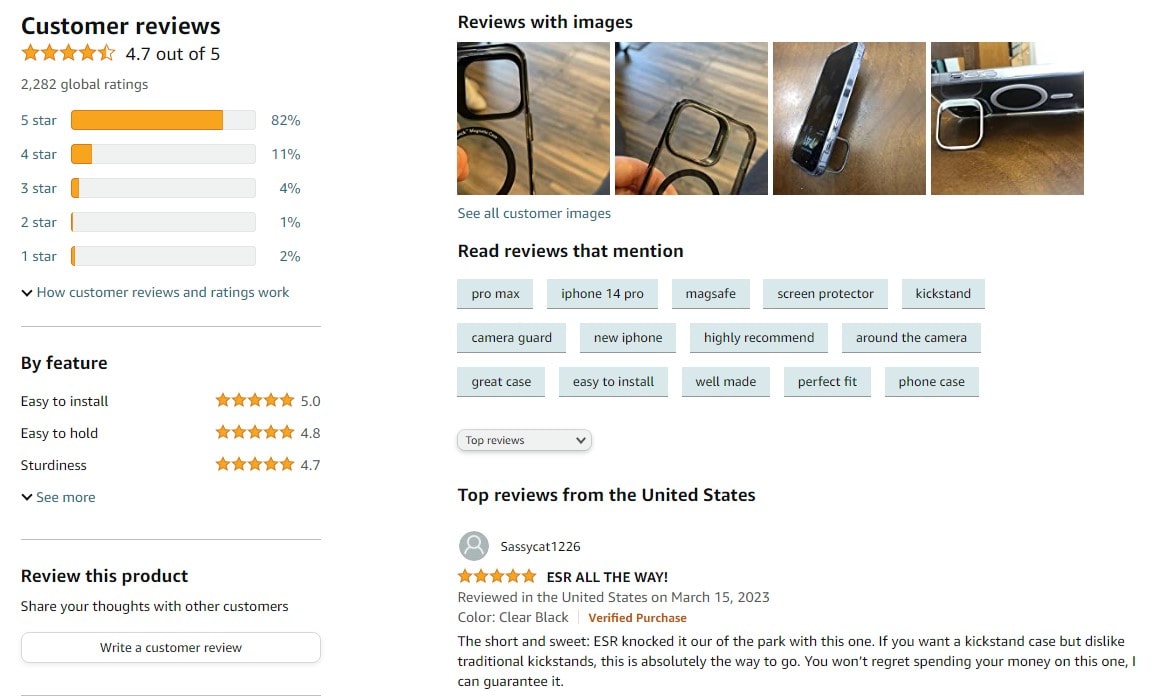
Turning up CRO for mobile websites depends on social evidence. It uses peer influence to create influence purchase habit and confidence. Visitors are more likely to convert when they find endorsements from other patrons.
Think about these effective strategies for including social proof:
- Customer Reviews: Amazon depends on including customer feedback into its product pages to survive. These honest assessments help prospective customers decide with knowledge.
- Testimonials: Companies like Slack show client endorsements on their site, therefore highlighting the confidence users have in their tool.
- Case Studies: HubSpot skillfully highlights how its products have enabled other companies to succeed using thorough case studies.
- Influencer Endorsements: Gymshark adds even more legitimacy to their products by using endorsements from fitness bloggers.
- User-Generated Content: Coca-Cola’s “Share a Coke” campaign made advantage of user-generated content to create a viral sensation presenting their product in a customized way.
Including social proof on your mobile website will help to greatly increase conversion rates. You show your products as validated decisions by sharing real experiences from happy consumers. This builds confidence as well as encourages guests to start shopping. Use social proof deliberately and notice how much your mobile conversion jumps.
8. Implement Live Chat or Chatbots
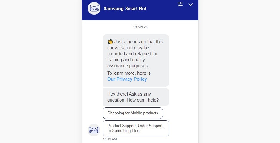
A big step toward maximizing conversion on your mobile page is including chatbots or live chat. Acting as a direct line of contact, these digital assistants help users in real-time and clear a more straight road to conversion. They answer questions, help consumers through their purchase process, or offer quick, on-demand support addressing problems.
Think about the following industry titans that have used chat technology to boost conversions:
- Zappos: Handling questions quickly and improving user experience, their live chat system sets the standard in customer support.
- Sephora: On its mobile site, this beauty guru uses chatbots to provide visitors tailored product recommendations.
- Duolingo: Using chatbots for interactive language exercises, the language-learning tool personalizes and makes learning interesting.
- Spotify: The massive music company’s Facebook Messenger bot recommends playlists depending on mood, activities, or genres, therefore enhancing user experience and supporting subscriptions.
- H&M: The chatbot on Kik of the clothes company offers outfit inspiration and tailored style recommendations, therefore encouraging purchase intention.
Live chat or chatbots enhance the customer experience and help to shape the buyer’s path, therefore speeding CRO. Their quick response lowers bounce rates, fixes consumer problems, and motivates them to finish their path from guest to converted customer. Using these digital tools to their best advantage will help you greatly increase your conversion.
9. Streamline Checkout Process
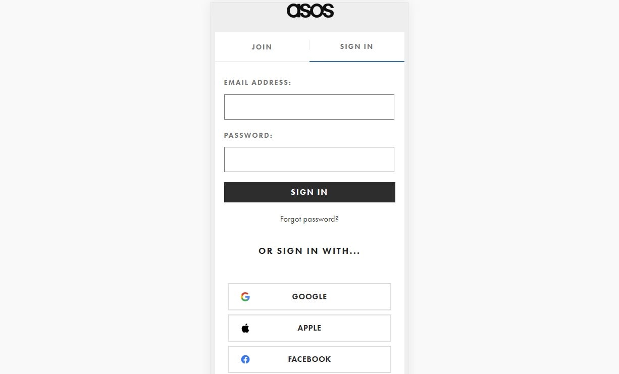
Regarding e-commerce, conversion depends on a simple checkout experience on your mobile site. Nobody wants to run a marathon in order to buy; the simpler the procedure, the more likely conversion is. Ease and quickness are critical; a flawless path from cart to completion can sharply increase your CRO.
Notable instances consist of:
- Amazon: Using a one-click purchasing option, the massive online retailer greatly streamlines the checkout experience.
- ASOS: To let consumers see their proximity to purchase fulfillment, this apparel shop includes a progress indicator at checkout.
- Warby Parker: The eyewear shop speeds the procedure and removes the requirement for account creation by providing a guest checkout choice.
- Apple: The behemoth of technology greatly expedites the checkout process by allowing auto-fill for returning consumers.
- Dominos: The simple order system of the pizza company lets consumers make an order in a few clicks, therefore increasing instantaneous conversion.
To really boost your mobile CRO, concentrate on streamlining the checkout experience. Cut extraneous processes, reduce form filling, provide guest checkout choices, and retain consumer information for next purchases.
10. Use Mobile Specific Features

Including mobile-specific elements into your website will help your CRO get much-needed momentum to drive mobile conversion. Let us explore how business leaders are implementing this approach:
- Uber: Uses geolocation to rapidly identify a user’s location, therefore streamlining the booking process and improving user experience.
- Instagram: Great usage of mobile cameras by this social media behemoth for direct content uploading simplification of user-generated content generation.
- Starbucks: Their mobile app gives consumers a flawless, rewarding experience by including digital payments and loyalty points.
- Zillow: Using augmented reality for virtual house tours, Zillow—a real estate marketplace—offers prospective purchasers a whole perspective of a property.
- Snapchat: This platform has created an interesting and interactive user interface by optimizing the usage of smartphone gestures including swipes and pinching for navigation.
Businesses may provide a richer, more interesting mobile user experience by including geolocation, augmented reality, camera access, touch gestures, and mobile payments—all of which are particular to mobile devices. A website that really embraces mobile’s possibilities may communicate with users on a deeper level, simplify interactions, and finally increase conversion. In the digital terrain, where customer experience rules, a mobile-first strategy that makes full use of these special qualities can be a major difference that drives higher interaction and conversion.
11. Personalize User Experience
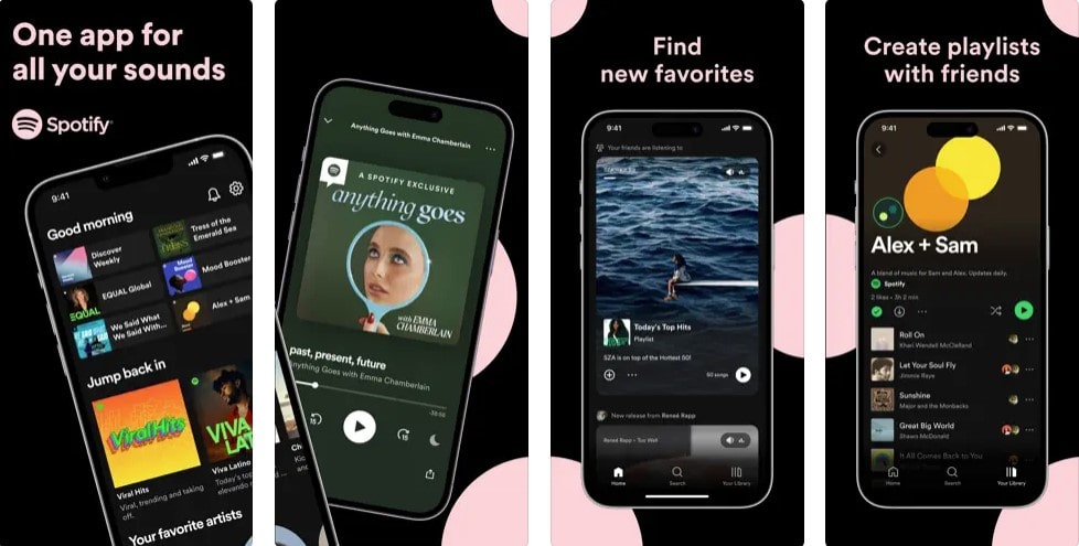
Improving conversion rates on mobile and online platforms mostly depends on personalizing user experience. Companies are leveraging personalizing to improve CRO by customizing interactions depending on user behavior, preferences, and data.
Among businesses using this approach are:
- Spotify: Delivering tailored playlists and song recommendations to fit individual tastes and interaction patterns, the music streaming behemoth caters to
- Amazon: Using past purchase information and browsing behavior, the online marketplace provides customised product recommendations to increase relevance and hence influence sales.
- Netflix: To offer tailored movie and show suggestions based on viewing patterns, the streaming service increases customer involvement and retention by means of this.
Moreover, customization closely relates with mobile optimization. Location, device kind, or even use time—mobile-specific data—can help to customize the user experience. Superior user experience derived from personalizing and mobile optimizing drives loyalty, involvement, and conversion. For CRO, this is a win-win strategy: companies experience rising conversion rates while people feel appreciated and understood.
12. Analyze and Optimize
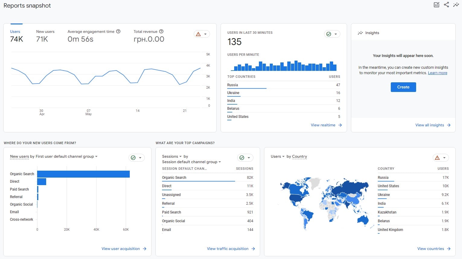
Successful CRO, mobile, and website conversion is based mostly on analyzing and improving the user experience. The approach of evaluate and optimize is akin to sculptural sculpting. Starting with a base, work on the details, check the work, and polish until the masterwork is ready.
Regarding digital platforms, this approach relates as follows:
- Google keeps changing its algorithms depending on user behavior and data. Its first concern is producing the most pertinent and superior output.
- Instagram: The social media network often releases updates depending on user comments and analytical data, therefore enhancing user experience and engagement.
- Uber: Uber guarantees flawless user experience by continuously improving its app depending on user ratings and in-app activity data.
These illustrations show in the digital terrain the force of analysis and optimization. They also emphasizes the need of a customer-centric strategy.
Your lighthouse on this path is data. It provides understanding of user behavior, points up possible issues, and guides efforts toward optimization. The emphasis still is the same for mobile or web: improve user experience to increase conversion rates.
There is not a straight line road to best conversion. This adaptable yet strong strategy helps companies flourish online.
Finish
The road to raise the conversion rate of your mobile website can be interesting and easy. You have perused a comprehensive guide on mobile CRO including popups, cookies, funnel optimization, and client interaction.
You have to keep current in a time when cellphones rule and consumer expectations are always changing. Your ROI will be much improved if you target mobile conversion with a well-considered strategy and technological grace. Think on these main lessons:
- Optimize popups: Minimise departure points and provide interesting calls to action in pop-up form.
- Improve funnel development: Lead customers toward alternative paths to meet critical objectives.
- Use devices like Smartlook: Get heat maps and session recordings for really great insight.
- Accept UXCam and other options. Reach a better knowledge of user interactions.
Set plans, but also actively try to carry them out. Your guide on this road is the Plerdy tool for SEO and UX analysis, which provides capabilities to improve the conversion rates of your mobile website. Click to discover Plerdy now and let’s start the next generation of mobile conversion excellence right alongside!
