You once ordered a burger and turned out to have a salad. Some websites feel that way about their menus. You come upon a clean homepage, but BOOM! The choices you need are lying behind three little lines: yeah, the well-known hamburger menu. Using your navigation is like playing hide-and-seek.
But let me clear things: there are supporters for this menu. Notables include Amazon, Spotify, and even LinkedIn swear by it. Explain why. It feels current, preserves simple design, and saves space. Ideal for mobile devices, right? Still, not everyone is in love. Some argue that hiding important links and forcing visitors to work harder compromises user experience.
I’ll dissect it for you in this post—what drives the hamburger menu, when it’s a hero, and when it’s merely more baggage? We’ll look at some great examples and discuss design ideas to make your website avoid feeling like a guessing game. All set to change the game on menus? Let’s roll now!
What is a Hamburger Menu?
A menu including hamburgers? Not your preferred fast food, but those three stacked lines buried in webpage corners. You have seen them all around, on websites like Amazon and Facebook apps. Designed for the Xerox Star workstation, Norm Cox created this small emblem back in 1981. Now also. In web design, she is a rockstar!
What then is the matter with this icon? Basic. It hides your navigation in a tidy little drawer that slides out with a tap. Handy, correct? Particularly on mobile displays, where every pixel counts. You want not clunky menus consuming all the space.
For mobile apps, hamburger menus are life-saving since they provide a simple, understated look that keeps your choices easily available. Consider it: Spotify, Airbnb—they all rely on it. But it goes beyond phones as well. This design approach is also used in responsive websites to keep things neat on all platforms.
Saving space rules in the UI/UX scene of today. A clutter-free design makes users delighted and your site more easily navigable. Therefore, even if some would refer to it as old school, the hamburger menu still has great impact on contemporary web design. Three small lines could accomplish so much, who knew?
Advantages and Disadvantages of Hamburger Menus
Advantages
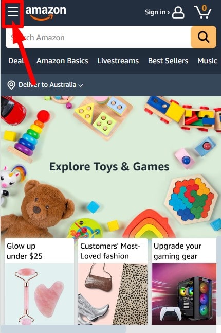
For designers seeking a simple and understated attitude, the hamburger menu is a lifesaver. Nobody loves messy pages—especially on a small screen, right? This design presents your website with a sleek, modern look by hiding everything orderly behind those three lines. It’s used by companies like Airbnb and Spotify; they’re not doing so terrible, either.
The degree of mobile friendliness of this menu is among its best features. Most of us are definitely hooked to our phones, hence the hamburger menu maintains navigation simple without consuming screen area. Your users pay more attention on content than on a sea of buttons.
And hunch over what? That’s familiar. That small emblem is now as identifiable as a shopping cart or a search magnifying glass. Your grandmother is aware as well that tapping those three lines creates a menu. It is ubiquitous, which makes it quite user-friendly.
Basically, if you want a streamlined, concentrated design that spans several devices, this is the ideal solution.
Disadvantages
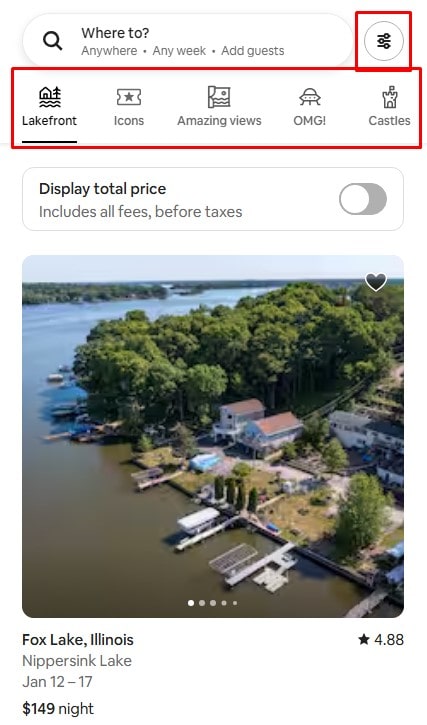
To be honest, though—none is flawless. A major drawback is The hamburger menu covers some crucial information. Users may overlook something absolutely vital since they cannot immediately see all their possibilities. Should simple navigation be a pillar of your website, this could be detrimental.
Extra clicks bother me as well. Imagine looking for contact information and then having to open a secret menu first. Known as “interaction cost,” this can irritate your guests. On desktop sites, when space is not a concern, it seems superfluous. People desire not a guessing game but fast access.
Finally, it could reduce involvement. Visible navigation beats concealed menus, according a Nielsen Norman Group study. Users of hidden alternatives engaged 27% less overall. You might thus wish to reconsider the hamburger if you aim to increase clicks.
Finally, Though it’s elegant and compact, user experience—especially on larger screens—is not always the best.
When to Use a Hamburger Menu
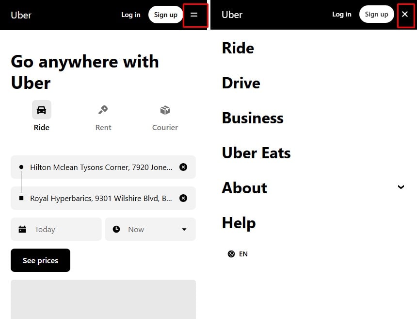
To be honest, the hamburger menu is a no-brainer if the aim of your website is simplicity and use on smaller displays. On mobile-first websites, when screen area is as valuable as gold, it shines most. Consider utilities like Uber or Instagram. Their whole interface radiates simplicity, and the hamburger menu keeps it that way without sacrificing navigation.
Still another area it suits is Apps or websites with little space yet tons of information. Imagine yourself creating a travel app where your users must access all in one tap flights, hotels, and vacation itineraries. BOOM! Menu for hamburgers comes to save. It maintains systems of organization and simple navigation.
And this menu looks great if you enjoy sleek, contemporary style. It covers the noise, so presenting your site in a neat, polished appearance. There is no clutter; concentrate on the information.
When to Avoid Hamburger Menus

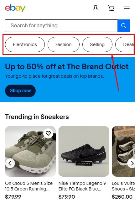
But avoid spreading a hamburger menu everywhere. On websites with interactive aims, like those of e-commerce behemoths like eBay, it might slow consumers down. Imagine searching for a good while important connections are hidden. Complicating, right?
Another no-go is platforms where fundamental elements have to remain visible. Take Netflix, for instance. For good reason, their “Play” or “Continue Watching” buttons occupy front stage.
Finally, skip it if your readers are mostly desktop-oriented. On bigger TVs, a classic top menu performs well. When everything would fit in plain sight, nobody wants additional clicks.
Finally, Make calculated use of the hamburger menu. It’s a tool; it’s not a universal fix.
Design Principles and Best Practices
Key Principles
Designing a hamburger menu calls for simplicity as your friend. Keep the emblem simple and free of flashy images confusing consumers. You already lost points if they do not instantly identify it as a menu. Clearly also is important. Keep to what’s essential; avoid stuffing your menu with too many choices. also consistency? Oh, that’s revolutionary. Make sure your menu appears and functions the same on every page. Ever seen a place where the menu leaps about? Quite frustrating, right?
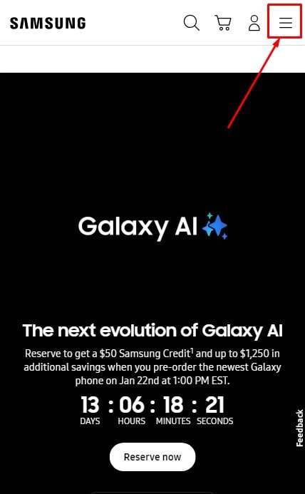
Another main concern is placement. Your users probably find the menu in the upper left or right corner. Keeping it somewhere else is like stowing the TV remote in the refrigerator. They will simply vanish.
Remember responsive design last as well. On every device, either the smallest smartphone or a large desktop screen, your hamburger menu should run without problems. Nobody wants to pinch and zoom only for menu clicking.
UX Tips for Hamburger Menus
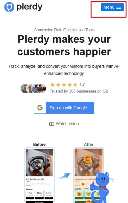
Want your menu to pop? Add a label! Even a tiny “Menu” under the icon helps with discoverability. Not everyone is a design genius who instantly knows what those three lines mean.
Microinteractions are another secret weapon. A subtle animation when the menu opens or a slight hover effect can make the experience feel smooth and intuitive. It’s the small things that show users you care.
And here’s a pro tip: try hybrid navigation. Combine a hamburger menu with visible links for key actions. Google Drive does this brilliantly, keeping core features upfront while tucking secondary options away. It’s a win-win for usability and design.
Test, tweak, repeat. Your audience will thank you!
Alternatives to Hamburger Menus
Popular Alternatives
Want your menu to flash? Create a label! Discovery is aided even by a small “Menu” under the icon. Not every person is a design genius with immediate understanding of those three lines.
An other secret weapon are microinteractions. A small hover effect or a minor animation upon menu opening will help to create a seamless and understandable experience. The little things that show users you concern.
Here is a good tip as well: try hybrid navigation. Combine a menu with hamburgers with obvious links for important steps. Google Drive does this excellently, burying secondary options away behind main functions. Design and usability gain from this as well.
Test, alter, then repeat. Your readers will appreciate you!
Choosing the Right Navigation Style
How therefore should one choose which to employ? All of it is about context. On an e-commerce behemoth, what works for a small blog could fail. Try many designs and get user comments. Tools like Hotjar or Plerdy can provide areas of most visitor clicking. Analyze not guess! A few changes will increase user conversion and pleasure.
Top Examples of Well-Designed Hamburger Menus
Mobile App Examples
- Let’s discuss several apps mastering the game of hamburger menu. Consider Telegram, for instance. Its menu keeps everything neat and is subdued at the top left. You tap it, and boom—right there are choices like “Saved Messages” and “New Group.” Simple, fluid, and free of distractions.
- Then we have Amazon. They arrange a huge catalog of categories using their hamburger menu. From “Today’s Deals” to “Your Orders,” one tap away covers all you need. For a site with a lot of products, it’s ideal; picture stuffing all that onto a conventional top bar!
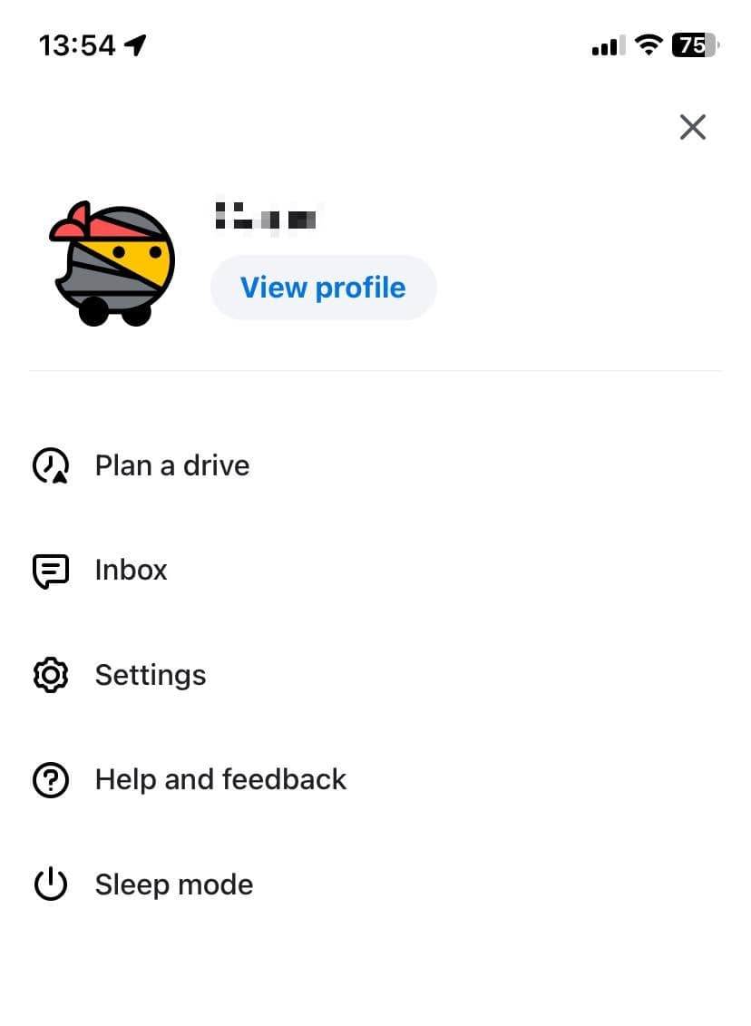
- And who else would overlook Waze? Their hamburger menu is quite simple. It opens fast and allows you to view “Routes,” “Settings,” even “Report Traffic.” While the map remains in focus—which is vital when driving because you cannot afford to muck about with clumsy navigation.
Website Examples
- Shopify demonstrates on the desktop side how to combine a clean design with a hamburger menu. Their navigation keeps the emphasis on the “Start Free Trial” button by hiding auxiliary choices. Ideal for helping consumers to go forward.
- GitHub keeps everything straightforward and useful. Their hamburger menu lets developers concentrate on building repositories by stowing away items like “Marketplace,” “Issue,” It combines simplicity and usefulness quite nicely.
- And then there is Starbucks. Their menu on mobile covers everything from “Rewards” to “Find a Store,” so allowing the homepage to highlight their most recent creations. It’s wise; users avoid sorting through clutter and go right to what matters to them.
These illustrations show that a well-designed hamburger menu is not only handy but also very necessary for a flawless user experience.
In summary
Though some people adore them and some detest them, hamburger menus are here to stay. For mobile apps, they are fantastic; they keep the design simple and help to clear small screens. Well-known companies like Spotify and Amazon show they are successful when used properly. Remember, though, not every website calls for one. On desktop or interaction-heavy systems, a visible menu could be a wiser choice.
The secret lies in Test your design. Track user interaction with your site using Plerdy or Hotjar technologies. Change depending on actual data, not speculation. Whether or not hamburger, a decent menu should make navigation simple and user-friendly. Making your guests happy and ensuring they will return constantly is everything!
