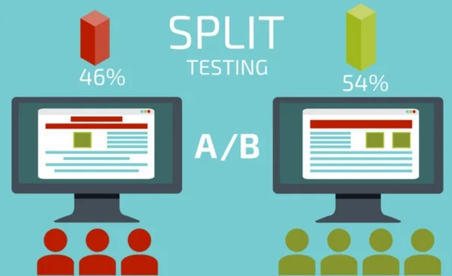
A/B testing is a key instrument in the dynamic field of digital marketing that sharpens decision-making. Often known as “split testing,” A/B testing breaks apart two versions of a webpage or campaign to find which converts more. Here’s what you should know about A/B testing for individuals delving deeply into marketing techniques:
- A two-version comparison used to improve performance.
- Data-driven choices in marketing initiatives.
- Constant improvement aiming at maximum return on investment.
Should your goal be to improve your marketing initiatives, think about learning the art and science of A/B testing. And don’t miss the chance to investigate Plerdy, an ace tool designed especially for Conversion Rate Optimization (CRO) and User Experience (UX), as you travel this road. Set ready to maximize? Dive in, grab A/B testing, and let your marketing initiatives sparkle more than they have ever done.
Introduction to A/B Testing
Businesses in the digital era never stop trying to be optimal. A/B testing—a straightforward but effective approach to evaluate two web pages, apps, or adverts—is driving this effort. A/B testing is essentially basic:
- Version A: The first, either current, version.
- Version B: The changed version meant to yield better outcomes.
By use of A/B testing, businesses acquire direct knowledge about customer preferences and behaviors. An e-commerce store might, for instance, adjust the color of a call-to- action button or a product display layout. Driving half of the traffic to every version allows the company to determine which design attracts more user purchases.
It goes beyond appearance, though as well. A/B testing is used even by content providers such as bloggers or video producers. To find which headlines or thumbnail photos attract more user interaction, they could play about with several ones.
A/B testing is really the compass for the digital marketer. It guarantees that companies and artists avoid flying blind in their quest of optimization since it shows the road most likely taken by the user. The outcomes are More conversions, higher user satisfaction, and a well calibrated online presence. It is impossible to overestimate the value of A/B testing; it is the link that links companies to their user base, thereby promoting a deeper knowledge and digital landscape success.
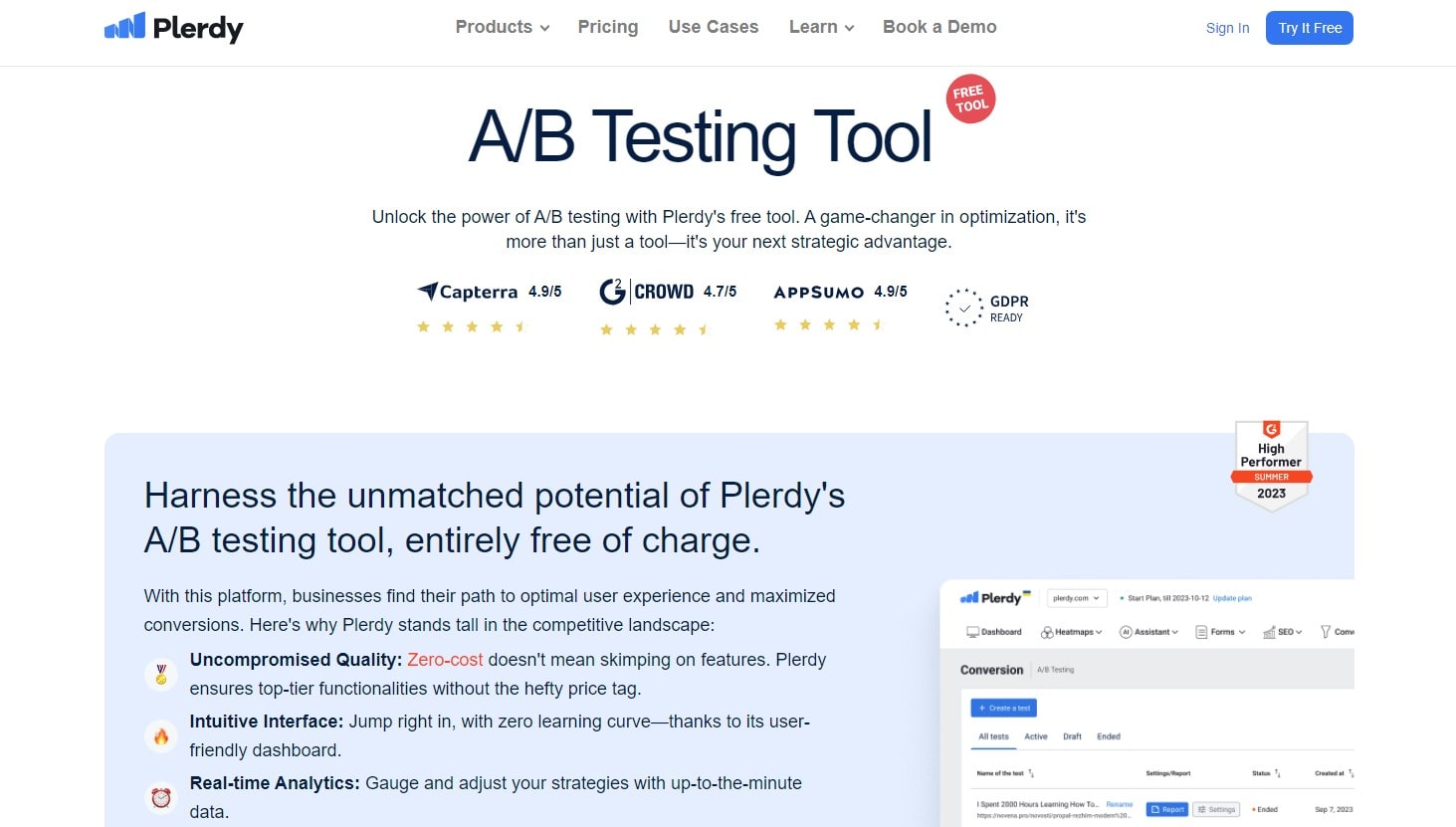
Plerdy’s A/B Testing Tool

Among the busy terrain of digital marketing, Plerdy’s A/B testing tool is a lighthouse of creativity. This tool goes deep into the subtleties of user experience and conversion maximizing, not only tests the waters with its free access point. Whether it’s e-commerce behemoths changing checkout pages or SaaS startups streamlining their onboarding routines, this simple platform encourages marketers from every niche to maximize its full potential independent of industry jargon or technical constraints. Plerdy helps you to empower your marketing movements by:
- Effortless Setup: Slide into A/B testing with an easy interface written in your language.
- Unmatched Customizing: Perfect every test by precisely changing even the smallest details to fit your vision.
- Real-time statistics that never skip a beat will help you to keep a pulse on your campaigns.
- Marketing Mastery: Make sure every marketing action is deliberate and unambiguous by driving decisions with facts instead of guesses.
Plerdy’s A/B testing gives marketing plans life by providing:
- Start tests quickly to make sure marketing initiatives remain agile and sensitive.
- Cut through the clutter with performance-based reports that translate data into practical insights.
- Marketing Synergy: A/B testing is a tool expansion from your current toolset that fits quite well.
- Never stop learning; improve your strategy, increase user involvement, and drive soaring conversion rates from every test.
Plerdy A/B testing tool provides results, not only data, therefore arming marketers with all they need to negotiate the always changing waves of online trends. So board with Plerdy and start towards marketing success.
Fundamentals of A/B Testing
A/B testing is at the core of digital optimization since it is a strong approach that divides complicated user behaviors into useful knowledge. Dealing with its fundamental ideas provides an insight into how profoundly A/B testing shapes online user experience and decision-making.
Fundamental Ideas
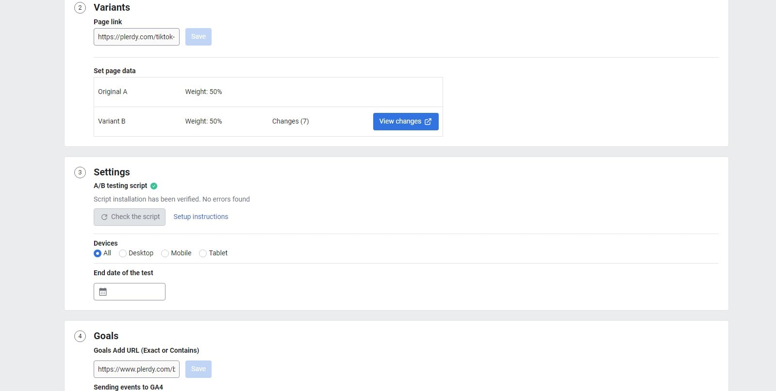
- Variants: A/B testing always involves two versions: ‘A’ stands for the present design and ‘B’ highlights the improvements.
- Users of the two versions are split haphazardly to guarantee a fair distribution and valid test results.
- This statistic, Conversion Rate, illustrates the proportion of users that register for a newsletter or purchase something.
Think about the world of internet shopping. An e-commerce behemoth might release two separate product page designs. One version stresses product reviews, while the other places front and center visually appealing product photos. Running an A/B test can help the business identify which design increases user engagement longer term and generates more sales.
Email marketing depends much on A/B testing as well. Companies may send their user base two distinct email forms, one with an animated header and another with a still image. Monitoring which edition gets more hits offers priceless information for next projects.
A/B testing is ultimately really about the user. This approach keeps changing and improving depending on user comments to make sure websites, applications, and online advertising appeal to their target market. It’s not only a technique; it’s a dynamic approach that shapes the digital terrain to more suit consumer tastes and demands. Understanding its fundamental ideas helps companies and artists to position themselves for more digital success.
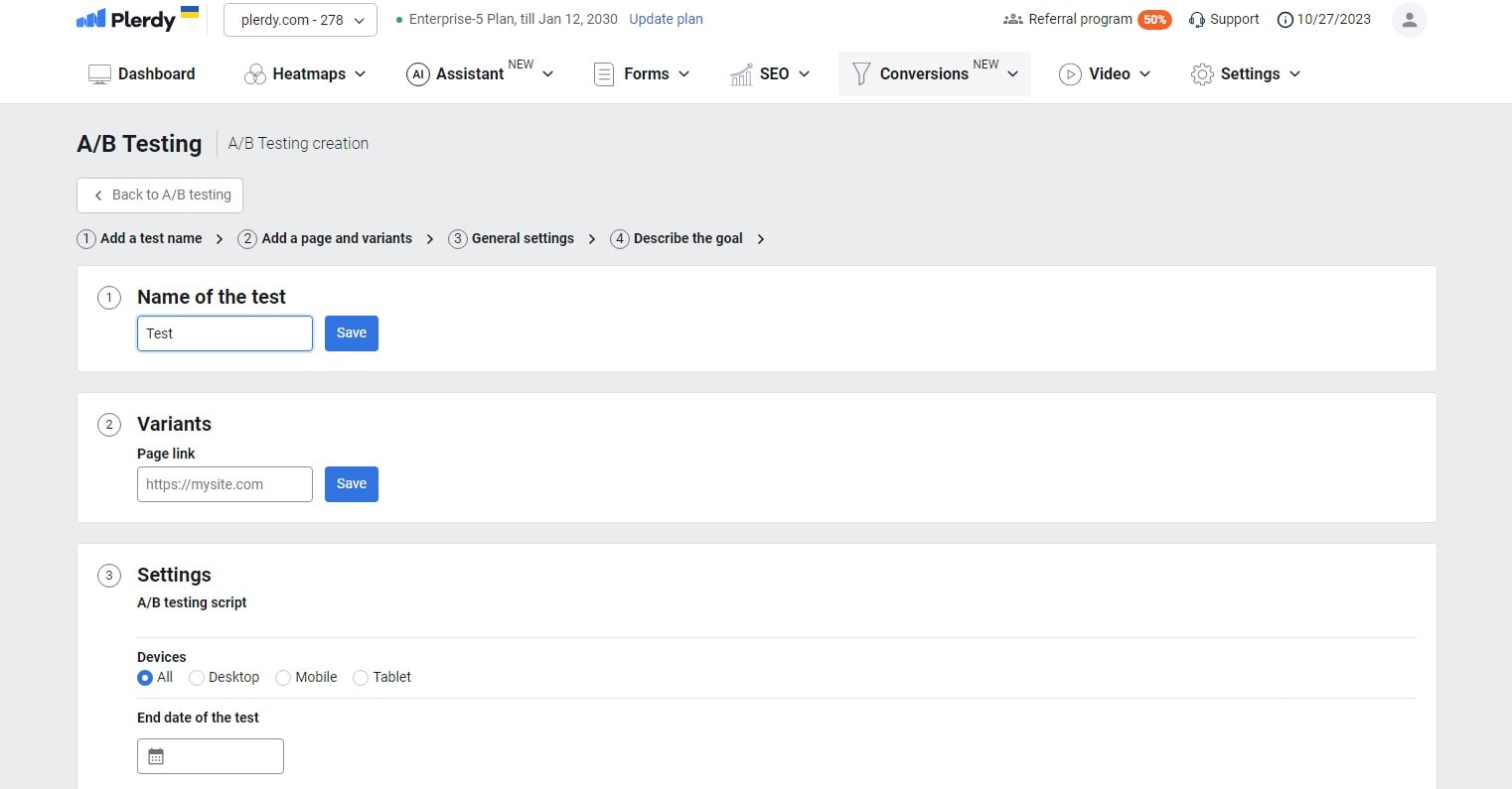
Setting Up Your A/B Test

Starting an A/B test calls for careful preparation to guarantee the findings provide useful insights for action. It goes beyond just releasing two versions and waiting for user interaction numbers to start to show. Rather, a methodical strategy determines whether any A/B testing project is successful.
Initial Steps:
- Clearly state your goals and what you want to get at. For a music streaming service, it could be increasing user created playlist or song saves.
- List Key Variables: Choose the elements you will change. An online magazine might center on picture arrangement or article head designs.
- Configure the metrics: Decide what you want measured. An app maker might focus on in-app purchases or user session length.
- Verify enough traffic. Make sure your user base is large enough to divide between the versions so optimizing the dependability of the test.
Think about the field of online learning. A platform providing courses could play about with their course preview’s organization. One approach might start with instructor introductions and then delve right into content snippets. By use of A/B testing, they may identify which strategy appeals more to possible students, so increasing course enrollment.
Creating a road map before starting A/B testing guarantees you are not flying blind. It’s about building the foundation for success, knowing user behavior, and implementing deliberate adjustments that really increase involvement. When set up with research and foresight, A/B testing becomes a great friend for digital platforms, guiding light that highlights the road to user-centric optimization and improved digital experiences.
Choosing Your Variables
Starting an A/B testing road calls for a strong attention to the variables you intend to change. Selecting the appropriate components to test will help to define the user-centric character of your digital optimization.
Important components sometimes tested:
- Product placements may be rearranged on an e-commerce site to find which layout increases most sales.
- A subscription business could play about with the size, color, or text of their sign-up button to further engage users.
- Images & Graphics: A vacation blog might alternate highlighted images to see which ones draw more user clicks.
- Testing shorter rather than lengthier pieces or various writing styles for a news portal helps to highlight consumer preferences.
To have a better picture, delve into the fitness app market. A/B testing could thus involve experimenting with workout plans. One version would display a week’s schedule at a glance, while another might dig into a thorough daily breakdown. Tracking user interaction with every layout allows the software to customize its presentation to fit very well with user workout preferences.
Finding the correct variables is like preparing the stage for a great performance. You are creating the environment for a user experience precisely tuned to excellence. When done with accuracy, A/B testing becomes more than just a testing method. It becomes a means of harmonizing digital environments with human needs so that every interaction a user encounters is both enjoyable and intentional. Choosing the correct steps, or in this case variables, makes all the difference in this dance of digital excellence.
Designing Control and Variant Versions

Creating good versions for A/B testing calls for more than simply haphazard alterations. Understanding user behavior is both an art and a science, then methodically changing parts to improve involvement.
Foundations for Strong Versions:
- Design Consistency: Make sure the general look of a call-to- action on a beauty website stays brand-wise authentic.
- In an online bookshop, avoid changing colour schemes at the same time while evaluating title font sizes. One modification at a time guarantees results with clarity.
- User-Centric Adjustments: Think about how a user of a financial app handles things. Not complicate processes; rather, adjustments should streamline them.
- Data-Based Decisions: Guide your version changes with past analytics. A perfect place for testing is if a music streaming company detects high user drop-off at a given screen.
Imagine a gourmet coffee subscription company trying to increase user registrations. They could create a variation stressing freshly ground beans delivered to the user’s door and a control version keeping their current layout. They can see if this specific emphasis influences user decisions by keeping other elements constant and concentrating on this unique selling factor.
Building and evaluating versions in A/B testing is like cooking; chefs never change every component in a dish all at once. They change one thing and see what results. In the same vein, brands open the path for informed decisions by carefully designing their control and alternative versions, thereby maximizing user experience. Purposeful A/B testing helps one to negotiate the digital terrain and transform casual browsers into devoted consumers.
Tools and Platforms for A/B Testing
Companies delve far into the field of A/B testing in the fast-paced digital era in order to perfect their user experiences. Still, choosing the correct instrument is crucial if we are to start this process. Having a variety of platforms at their hands, companies can quickly target user preferences and change.
Excellent A/B Testing Systems:
- Optimizeably: Leading A/B testing player, this tool distinguishes itself with real-time data insights and easy UI. Many times depending on Optimizely, e-commerce sites change product page design for best user interaction.
- Combining A/B testing with multivariate testing, VWO—Visual Website Optimizer—allows brands to evaluate many factors. Travel portals use VWO, for example, to improve search result displays.
- Mostly utilized by advertisers, Unbounce focuses in landing page optimization. Imagine a fitness company launching an ad campaign; Unbounce makes sure the landing page naturally grabs user attention.
- Renowned for its in-depth analysis, Convert dissects user actions to help companies create data-driven changes. Magazines use Convert to improve their systems for sign-up for subscriptions.
- Designed mostly for creators of mobile apps, SplitMetrics excels in app store optimization. With an eye toward increasing downloads, game creators use this platform to perfect app descriptions.
Using these platforms helps companies position themselves to negotiate the difficulties of digital contacts. They probe user preferences closely, apply A/B testing techniques, and change interfaces for best performance. Brands and consumers discover harmony in this digital dance, hence creating enhanced experiences and ongoing interactions. And at the core of it all—modern A/B testing tools driving the change.
Running the A/B Test
While doing an A/B test seems simple, plunging into it without a plan is like sailing without a compass. Making sure your A/B testing produces useful insights calls both constant monitoring and careful preparation.
Effective A/B Test Execution: Foundations
- Set your objectives before you begin. While a blog might give improving visitor dwell time on items top priority, an e-commerce site could wish to concentrate on raising checkout completion rates.
- Divide your user base exactly between the control and variant. This guarantees objective exposure for both variants, hence clarifying user preferences.
- Avoid Simultaneous Examining: Running several A/B tests at once clouds outcomes. If a SaaS platform simultaneously changes its sign-up form and pricing page style, it can be difficult to tell which change affected user behavior.
- Never set and forget; always monitor. routinely delve into the facts. Eager to increase membership rates, a digital magazine would monitor daily user interactions and adjust quickly as needed.
- Avoid stretching your A/B test too long or shorting it. Maintaining consistency in the testing period guarantees accurate, practical information even if an online fitness portal evaluates a webpage makeover.
Focusing on the consumer and using a methodical approach to A/B testing, companies may maximize the data. Making data-based changes comes naturally as they leverage user habits and preferences, therefore promoting improved interactions and enduring brand loyalty. Recall that in the dance of A/B testing, accuracy and awareness rule.
Understanding Test Results

Once one has descended into the depths of A/B testing, the next essential phase is interpreting the tidal surge of data. This is about discriminating patterns, subtleties, and insights that map the road forward, not about pecking statistics.
Break It Down: The Elements of Transparency
- Statistical Significance: Make sure the data carries enough weight. For example, if one variant performs better in just one day, a travel app evaluating two landing page designs shouldn’t be taken at whole. Wait for a reasonable user interaction distribution over a continuous period.
- Outside the Surface: Dive further to find patterns. When an online bookshop improves its checkout system, sales rise do not only indicate the success of the improvement. Explore user actions, time spent, and navigation flow.
- Manage outside variables: Seasons, holidays, or outside events can skew findings. Independent of A/B test variances, an outdoor gear shop could notice more user interactions during hiking season.
- Benchmark with Baselines: Always compare to past performance. Comparatively, if a streaming platform introduces a new user interface, it provides more clear understanding by comparing user engagement rates prior and subsequent.
- Allow iterations to be open. A/B testing is like dancing adaptably. Users of a gourmet recipe blog could find they prefer written recipes over audiovisual material. Still, keep testing video lengths, styles, and presenting techniques. Not stop there.
Reading A/B test results transforms unprocessed data into a useful tool. It’s about creating a tapestry of insights that results in educated, powerful judgments by linking user behavior to test variants. Recall, in the A/B testing symphony, knowledge of the notes defines the song.
Statistical Significance in A/B Testing
Negotiating the large sea of A/B testing results, statistical significance is one lighthouse. It’s the compass guiding marketers toward data-driven decisions, so guaranteeing they are not merely surfing waves but rather precisely mapping their path.
Important Points to Perfect the Art of Significance:
- Imagine a fitness brand testing its exercise video thumbnails with a robust sample size. Not enough is a surge in user involvement from a handful. For consistent results, try for a wide and varied user base.
- Dive into P-Values: Many times, testers want a p-value less than 0.05, indicating a substantial probability the results aren’t by coincidence. For example, an e-commerce site that finds consumers leaning more toward one color scheme can link this to their A/B test rather than chance.
- Think about the confidence level: If a skincare brand’s A/B test results show 95 outcomes, a 95% confidence level indicates that, should the test run 100 times, 95 outcomes would reflect the starting results.
- Steer clear of cherry-picking: A streaming service might find several consumer preference revelations. Although it’s tempting to focus just on positive numbers, embracing the whole range shows a better picture.
- Remain alert with variation. There will be natural swings. Imagine a music app trying two playlist systems. Always consider natural variances since user behavior may vary depending on current hits.
By using statistical significance, A/B testing becomes a strategic deep dive from a casual swim. For individuals dedicated to comprehending user behavior and preferences, this toolbox turns insights into informed tactics, therefore improving the user experience at all levels.
Common A/B Testing Pitfalls

A/B testing sails digital efforts toward educated tactics, but stormy waters lie underfoot. Without appropriate understanding, one finds detours instead of destinations. Understanding user behavior and preferences will go more smoothly if one recognizes these traps.
Errors You Could Trip You Up With
- Rushing the Process: A travel blog testing headline cannot fairly represent actual user responses over night. Let the A/B test run to compile sufficient information for useful insights.
- A coffee manufacturer trying to redesign its homepage might change font, color, and photos all at once overloading with variables. Too many adjustments can complicate results. For clarity, stay with one thing at a time.
- Denying Outside Influences: There are seasonal fluctuations involved. The coolness in the air can lead customer preferences in an apparel store to veer toward warm coats in winter rather than A/B testing improvements.
- Ignoring Mobile customers: Any A/B testing plan for an online bookshop that ignores mobile responsiveness will miss a substantial portion of its audience given customers often search on the go.
- After first findings, some businesses push modifications live without retesting, bypassing the follow-up. A/B testing should be done iteratively. User tastes may change online; constant testing catches those changes.
Stay close to details, use patience, and never settle after only one round of tests to avoid these traps. Remember as you negotiate the A/B testing waters: knowledge of user demands and reactions calls for time, dexterity, and relentless devotion to excellence. Avoiding typical mistakes helps you to position yourself to maximize the actual potential of A/B testing.
Advanced A/B Testing Techniques
A/B testing provides the basis; but, employ more sophisticated approaches to really find user insights. Negotiating the subtleties of multivariate testing and other advanced techniques drives your approach from fundamental to genius.
Improving Your Test Skills:
- Multivariate testing goes beyond A/B to include A, B, C, and occasionally D. An online plant store might concurrently evaluate price policies, plant descriptions, and pot designs at once. It analyzes how changes in combination affect user interaction.
- Segmentation: Attend to details. A streaming site might separate its A/B tests based on observations of behavior between action-movie buffs and rom-com aficionados, therefore ensuring that material appeals to every user group.
- Analyze retrospectively rather than focusing just on test preparation. By examining past months and subsequently optimizing their content arrangement, an e-magazine could find trends about user reading behavior.
- Using artificial intelligence, predictive A/B testing can help one project how modifications might work out. Before launching a live test, a tech website might utilize machine learning to forecast which headline would most grab user attention.
A/B testing’s terrain runs best on creativity. Including these cutting-edge technologies helps digital projects soar and precisely and stylishly capture consumer interests. Recall that even if A/B testing opens the path, the road towards knowledge of user behavior never stops. Beyond the fundamentals reveals a wealth of ideas that open the road for polished plans that actually appeal to the user base.
Real-world Case Studies
Magic comes when A/B testing aligns with real-world events. Let’s explore closely real stories of user behavior discoveries and how companies turned to create winning ads. Emphasize success stories:
Online Fashion Retailer:
- Situation: An online retailer of clothes saw surges in cart abandonment.
- Two checkout systems were squared against one another in an A/B test. Version B presented a simplified single-page method whereas Version A kept its multi-page checkout.
- Result: User taste was mostly in favor of Version B, which raised completed transactions by 15%.
Subscription to Gourmet Coffee:Situation:
- A gourmet coffee delivery company sought to increase user renewals of subscriptions.
- While Version B positioned user testimonials front and center, Version A kept the original homepage design.
- Result: Version B, driven by real user compliments, raised subscription renewals by an amazing 25%.
App for mobile fitness:
- Situation: A health app aimed to maximize the lengths of user exercising sessions.
- Version A maintained the traditional UI in an A/B test. Version B debuted gamified user benchmarks.
- Result: Users of Version B spent 10% more time sweating it out, demonstrating how much a little drive goes toward.
These stories highlight the indisputable ability of A/B testing. Companies changed their approaches and improved their digital experiences by knowing user preferences. Managing the complex tango between user needs and corporate objectives can be difficult. Still, brands regularly find the appropriate chord using strong A/B testing tools in their toolkit, thereby attaining harmony in user involvement and corporate success.
In conclusion
Negotiating the maze of digital marketing needs for empirical facts and practical ideas, not only intuition. A/B testing then comes in handy as a consistent way for businesses to create strategies that really appeal. By means of A/B testing, we improve and hone every marketing initiative, therefore guaranteeing strong statistical support for every decision. Important lessons learned from our A/B testing expedition consist in:
- A/B testing is the pillar of successful marketing campaigns.
- Detailed insights driving marketing initiatives.
- The combination of marketing and technology producing results never seen before.
Let us also highlight Plerdy, a platform that offers thorough SEO and UX research going beyond A/B testing, before we call to finish. Use its power to completely realize your marketing plans. Dive in, welcome the beauty of A/B testing, and let’s ignite the digital scene right now!

