
The user interface (UI) is the area on which interactions between users and a website or application take place. E-commerce depends on a well-designed UI since it guarantees seamless navigation, which is fundamental for customer satisfaction and more sales. Users who find it simple to search for products, browse goods, and finish transactions are more inclined to come back and suggest the store. One of the largest online stores, Nike presents a sophisticated interface and is interesting to examine how their design decisions affect the general shopping experience. We will look at Nike’s online store’s UI in this post, noting areas where it shines and areas needing development. Understanding Nike’s UI’s strengths and shortcomings will help companies to get important knowledge on how to design efficient, user-friendly interfaces for their own e-commerce systems.
What is Website User Interface (UI) Analysis?
Analysis of the user interface (UI) of a website is a thorough examination of how successfully user interaction is supported by its design. UI analysis is essential for e-commerce sites such as Nike’s to grasp how effectively consumers may navigate, search for products, and finish transactions. A well-executed UI study concentrates on pointing up areas of strength and weakness in several design components influencing the general user experience.
Key elements of UI analysis include:
- Navigating the site is simple. Can people easily visit several parts of the website? Keeping users interested depends much on good navigation.
- Does the website have a visually pleasing design? Do the images support the brand’s character and help to create a flawless user experience?
- Interference: How user-friendly the UI is? With little effort, can consumers do important tasks as product filtering or purchase completion?
- Are all of the intended functional aspects of a website working? Exist any flaws in the user’s experience that might be broken buttons or non-working links?
Businesses must pay great attention to UI since it directly affects user involvement, retention, and sales. Regular UI analysis helps companies to find areas for development and maximize their websites therefore providing a better user experience. For businesses like Nike, a well-designed UI may imply better conversion rates and more contented consumers. Thus, in the e-commerce environment, UI analysis is an essential phase towards maintaining a competitive edge.
Why Analyze the UI of E-Commerce Websites?
Given the intense competitiveness in the online retail market, e-commerce website UI analysis is absolutely vital. Maintaining user satisfaction and raising conversions depend on a flawless and easy interface. In e-commerce, a well-designed UI can distinguish a user either finishing a purchase or leaving the site.
The user interface has to be functionally sound, aesthetically pleasing, and intuitive to use. Users are more likely to return and suggest the site if they can quickly locate items, peruse categories, and finish purchases. Large companies like Nike have significantly more stakes since user expectations are raised. Even a devoted customer could depart if the design is difficult or unclear.
Nike’s website has UI merits as well as weaknesses. For instance, attractive images and easy navigation draw customers; nevertheless, little problems like slow animations or unclear menu behavior might compromise the experience. Frequent examination guarantees that the website keeps running as it helps to find these problems.
Finally, by customizing their design to fit consumer expectations, constant UI study helps e-commerce companies remain competitive. A practical and user-friendly UI increases satisfaction, therefore promoting conversions and client loyalty.
Analysis of Nike’s User Interface (UI)
1. Menu Navigation and Animation
The menu of Nike’s website has a major problem: the navigation flickers and the animation speed is too quick, hence lacking seamless transitions. The interface flickers and produces a startling experience as a user moves over categories, say from “Women” to “Kids.” The jagged transitions between the menu items throw off the browsing flow and cause consumers’ confusion. This design defect compromises the user experience, therefore giving the interface less polished and refined feel.
Users who anticipate a flawless and responsive experience on an e-commerce platform especially may find the flickering and abrupt animations annoying. This issue can drive consumers away in online buying, where simplicity of use is crucial, thereby perhaps reducing conversion rates. Further compromising the whole purchasing experience is the uneven animation pace, which makes it challenging to fast browse between several categories.
Given a platform the size of Nike’s, the interface must be as flawless as feasible. A flawless menu makes sure users may quickly go across several parts of the website free from interruptions. When consumers move between categories, an enhanced design can include fade-in effects or smoother transitions. This will enable consumers to engage more fluidly and enjoyably, allowing them to concentrate on browsing goods instead of UI problems.
To raise the general user experience on Nike’s website, the flickering and quick animation problems in the menu navigation must first be resolved. Nike may guarantee a competitive edge in the e-commerce market by optimizing the transitions and making sure the interface is more understandable, therefore raising customer satisfaction, retention of users for longer, and maybe conversion rise.
2. Search Functionality
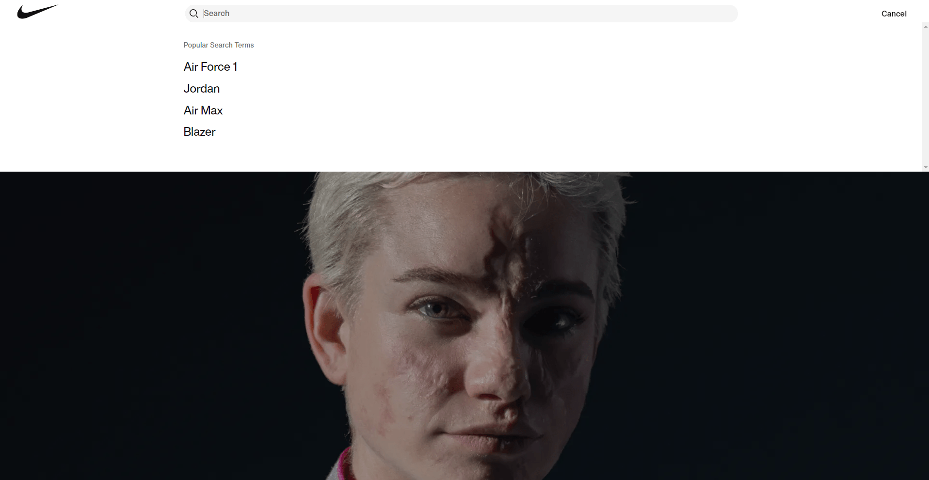
Nike’s website’s search system suffers various design flaws that compromise the user experience. Users might be confused by the too long search bar. Most customers do not write long searches into search bars, particularly on e-commerce sites, hence the design seems disproportionate and pointless. Furthermore poorly labeled is the “Cancel” button, supposed to close the search engine. Users who demand simplicity and clarity in their interactions with the user interface (UI) will find this improper labeling to readily irritate them.
An online retailer like Nike depends critically on a well-designed search experience. Search features enable users to rapidly locate particular products, so any conflict in this process might cause annoyance and reduced interaction. Users of an unclear search system may completely exit the site, thereby generating missed revenue possibilities. By interfering with the user’s normal flow of engagement with the site, the “Cancel” button’s perplexing location and labeling compound this difficulty. It makes consumers consider twice what they are doing, which is detrimental in a flawless e-commerce system.
The search interface should be rebuilt with more simplicity in order to get this better. The search bar should be small yet useful since its length should be ideal for usual search query behavior. More importantly, the “Cancel” button should be relabeled to fit the user’s expectations, such “Close” or “Exit,” with a clear icon to symbolize its operation. These little adjustments will greatly improve the general usability of the website.
In essence, improving the user experience on Nike’s website depends on addressing the search capability. Nike can lower user annoyance by making the search bar more proportionate and clearly marking the “Cancel” button, so enabling customers to find the things they wish and so increase their satisfaction and maybe result in more sales.
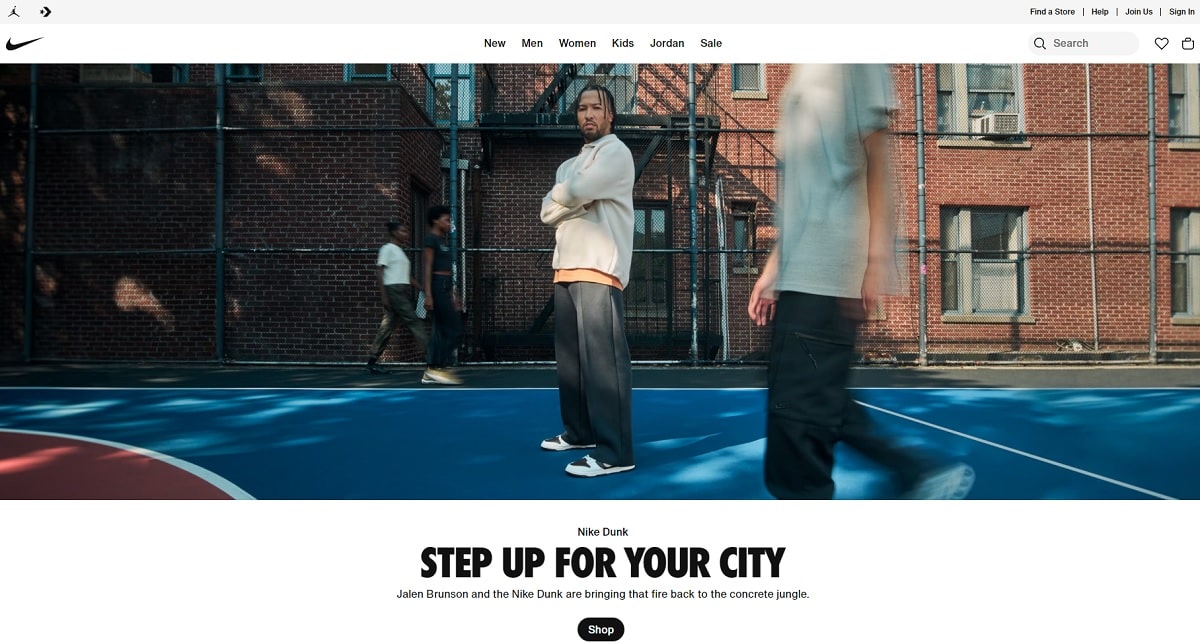
3. Slider and Visual Presentation
Nike’s website’s slider has a major problem: it is non-cyclic, therefore after customers reach the conclusion of the product photographs, they are obliged to manually scroll back to the starting. The book also sometimes shows itself between slides, producing an unrefined visual experience. These issues compromise the general design and give the interface less smoothness, therefore upsetting user browsing flow.
Product exhibiting on an e-commerce site is much enhanced by the slider interface. Users are less likely to remain involved if it is badly designed or does not run as expected. Because users of the slider expect a flawless, continuous experience while browsing through several photos or items, their non-cyclic character makes product discovery annoying. Once they get to the last piece, they must so manually restart the cycle, so stopping the flow.
Furthermore aggravating the problem is the somewhat visible text during slide changes. This incomplete text display reduces the general interface’s trust by seeming to be a design error. This could be seen by users as an indication of insufficient attention to detail, which would lead to bad opinions of the professionalism and care in building a premium user experience of the business.
Nike should employ a cyclic slider to improve the user experience by letting consumers constantly browse across items without pauses. Furthermore necessary to produce a more seamless, aesthetically pleasing transition between presentations is addressing the text rendering problem.
To improve user interaction, a well-designed slider with smoothly cyclic scrolling and correctly rendered text is ultimately indispensable. Nike can make the interface more user-friendly, aesthetically appealing, and finally more successful in keeping consumers interested and concentrated on items by fixing these defects.
4. Filter Options and Hidden Products
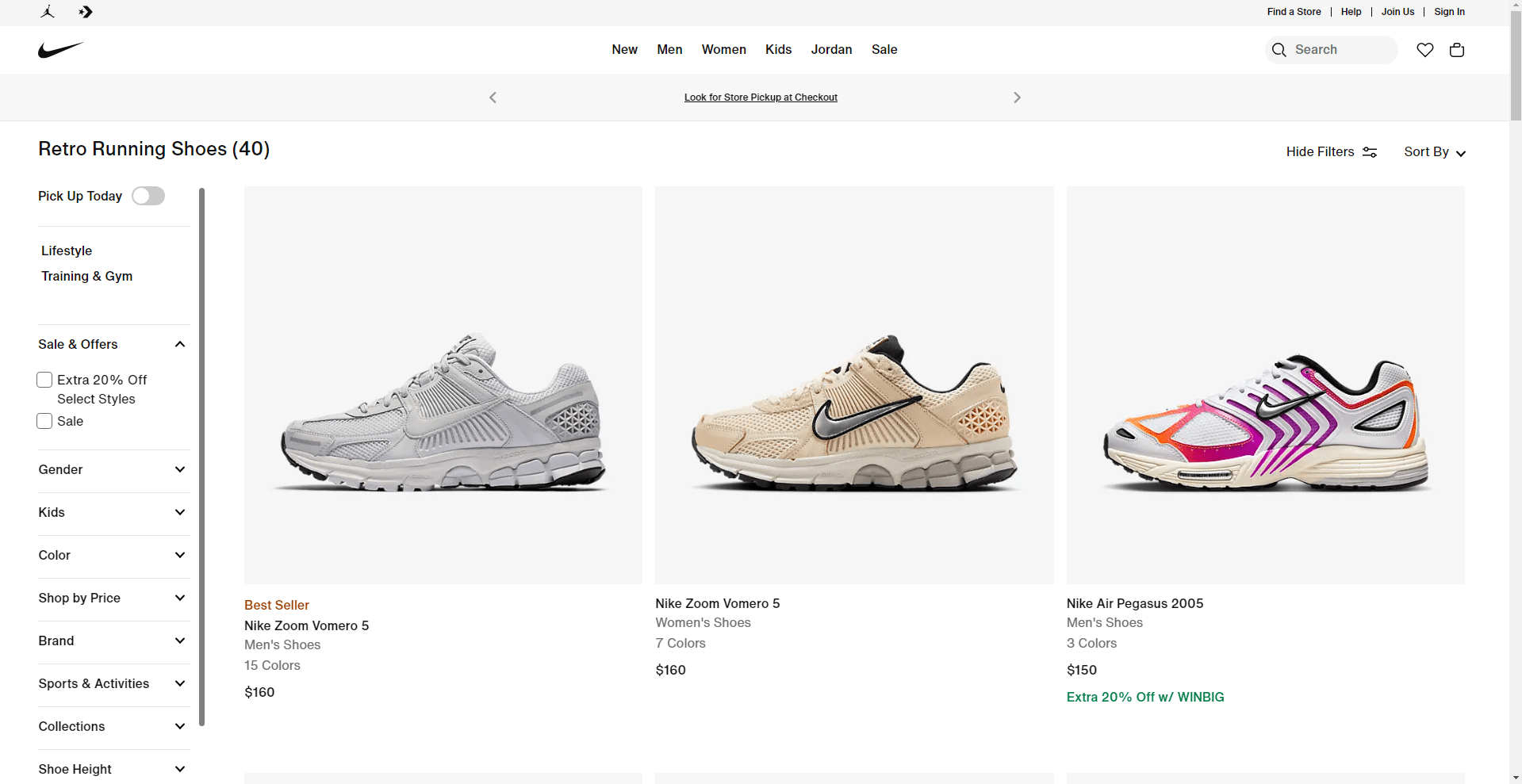
Nike’s filter choices on their website are seriously problematic. Though it is not readily apparent, the filter function has a scrolling fault that makes interaction challenging even when discovered. Any e-commerce user interface (UI) depends critically on filters since they let consumers effectively limit down their product search. Hiding or malfunctioning filters can cause annoyance and deter consumers from finishing their buying trip.
A well-designed filter interface ought to be clear and simple for use. On Nike’s website, the filter’s concealed nature adds pointless complication. Users may find it difficult to find this necessary instrument, which would complicate their ability to arrange goods according to price, color, or size. The scrolling problem makes this process much more difficult by restricting the usability of the filter and so prohibiting users from selecting their preferred criteria with fluidity. This bad design affects the general usability of the interface, therefore aggravating consumers and lowering their pleasure.
Users may leave the site in search of a competitor with a more simplified experience when filters fail to live up. Every element of the UI has to be flawless in a very competitive e-commerce sector to keep consumers. Reduced conversion rates can directly result from the irritation hidden filters and scrolling problems bring.
Nike should: help to solve this problem by:
- Put filters in a clear, conspicuous part of the page to make them more approachable.
- Correct the scrolling glitch so users may easily interact with the filter choices.
All things considered, a good user experience depends on filter capability. Nike can improve its interface by raising the visibility and functionality of filters, so facilitating the search for products and complete transactions and therefore improved customer happiness and more sales.
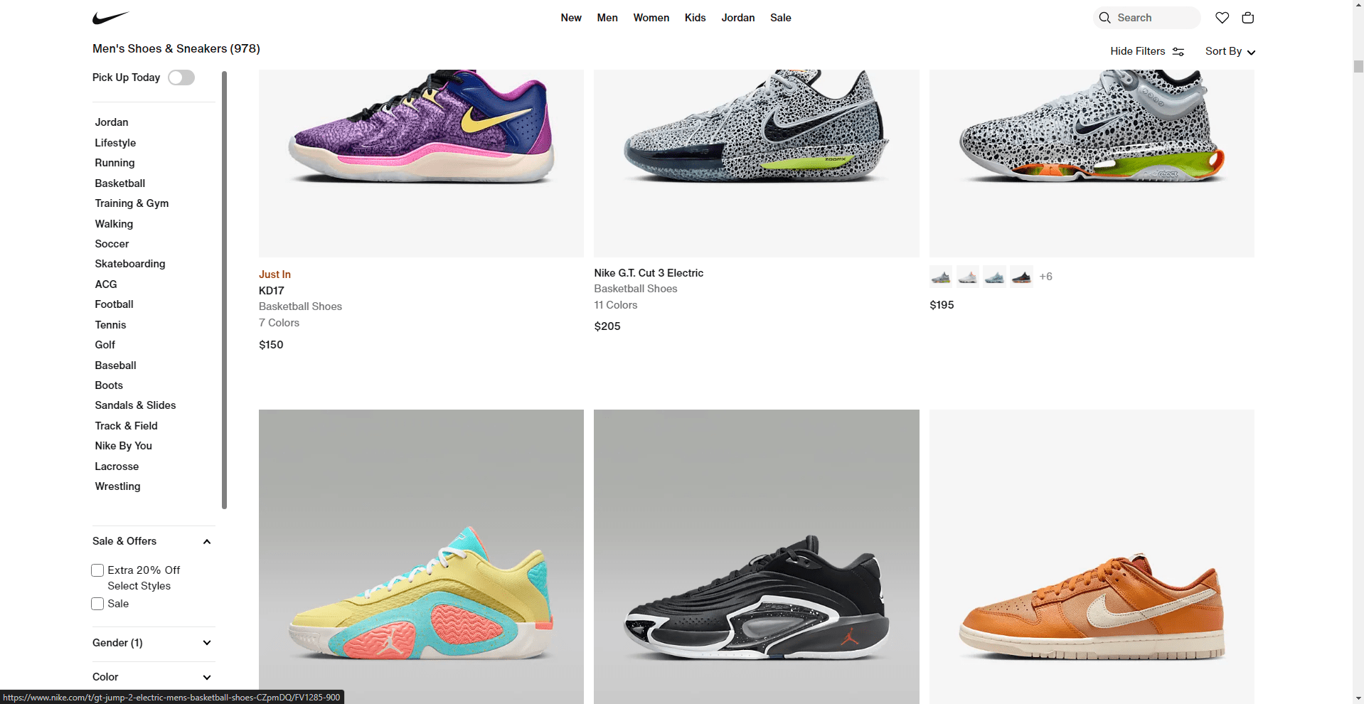
5. Product Out-of-Stock Display
Nike’s website has a flaw whereby out-of-stock items show at the top of product listings. Users who are exploring and clicking on products just to discover they are not available can find this irritating. Time is crucial in e-commerce. Users expect an easy-to-use interface allowing them to rapidly locate and buy products. Starting their search and finding unavailability of products is a poor user interface (UI) design decision that wastes their time and reduces general happiness.
Consistent unavailability of products not only disturbs customers’ shopping flow but also could cause annoyance. In worst-case events, they might completely abandon the website in search of a more quick buying experience elsewhere. This affects conversion rates directly and might cause missed sales possibilities. The efficacy of the site suffers when an interface shows out-of-stock items conspicuously in listings without providing alternatives or fixes.
Better still would be to let consumers choose to either preorder the good or get a warning when it becomes available once more. This keeps consumers interested in the goods and offers a cause to return to the website, therefore promoting long-term client loyalty. These choices also demonstrate that the brand values satisfying consumer expectations by offering practical substitutes instead of merely showing an item that is not available.
Nike should: enhance the customer experience by:
- Mark plainly as unavailable or move out-of-stock products to the bottom of the list.
- Give consumers choices for preordering or let them get alerts when supplies run low.
Ultimately, fixing the out-of-stock product problem would greatly improve the UI of the Nike website’s usability. Nike can keep customer involvement, raise happiness, and finally increase conversion rates by providing options such preorders and alerts.
6. Product Badges
Nike’s website’s irregular positioning and misuse of product badges compromise the user interface (UI) generally. Product badges, such “Bestseller” or “Limited Edition,” are used to draw attention to important products and direct consumers toward special or popular things. But the efficacy of items is reduced when too many of them bear badges. A badge serves to stand out, but overuse causes uncertainty and makes it challenging for consumers to find very significant products.
Furthermore confusing the browsing experience is the uneven placement of badges on several product listings. Sometimes products may be touted as bestsellers in one part but lack the same emblem in another, which would make consumers doubt the accuracy of the material. This discrepancy makes the user interface (UI) seem unorganized and erodes faith in the design and functionality of the site.
Users will be greatly affected. Users are less likely to interact with the featured products when badges are abused or positioned inconsistently. The abundance of badges could overwhelm them, and the lack of clarity on which things are really significant might perplex them. This reduces the general user experience and can cause a decline in conversions as consumers battle to properly browse and make purchase selections.
Nike should: increase this by:
- Use badges sparingly to highlight just the most crucial items, including limited editions or best-sellers.
- To prevent user misunderstanding, guarantee constant badge placement over the whole site.
In essence, product badges should be applied deliberately to keep their efficiency in directing consumers. Nike can build a more orderly and understandable interface by restricting their use and guaranteeing consistent placement, therefore enhancing the user experience and enabling consumers to make better buying decisions.
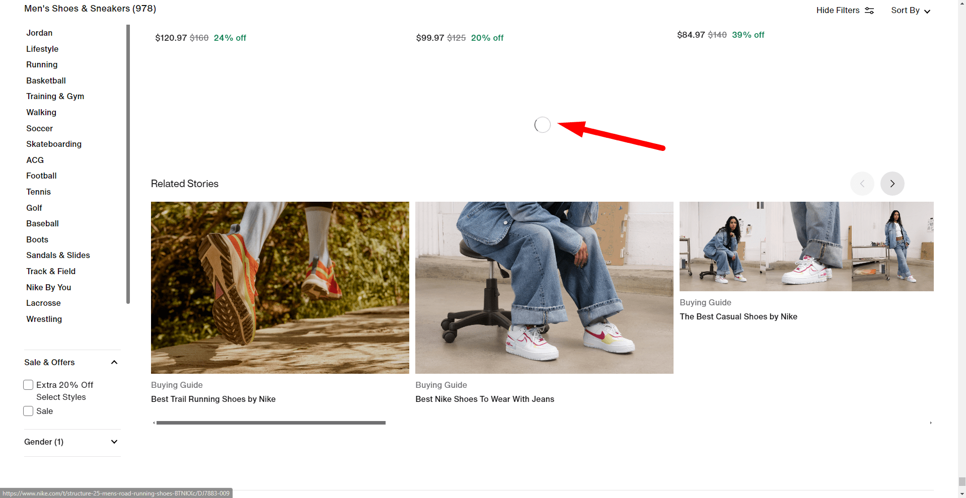
7. Bottom of Product Page Recommendations
Nike’s website has a major problem since the product recommendations at the bottom of each product page lack relevance. Often times, the user interface (UI) presents recommendations that contradict their tastes or the product category they are now browsing. When customers anticipate to find products linked to their present interests, this mismatch disturbs the user experience and causes uncertainty and annoyance.
Relevant product recommendations are absolutely crucial in e-commerce to keep consumers interested and raise the possibility of more purchases. The UI loses its capacity to provide a customized purchasing experience when it shows unrelated recommendations. This discrepancy between the suggested things and the current offering lowers consumers’ confidence in the recommendations, therefore less likely they are to investigate more or depend on the advice given by the interface.
User impact is rather notable. Not well tailored recommendations waste users’ time and lower their interface pleasure. Users who believe the site does not meet their needs could leave the website and hence lower their chances of returning. Inconsistent advice also compromise the general UI design, which should give users’ demands first priority by providing pertinent and concentrated material.
Nike could: fix this by:
- Tailor advice depending on user behavior: Examine browsing and purchasing behavior to show items matched for the user’s interests.
- Make sure contextual relevance exists: Show product recommendations appropriate for the type or category of item the user is now looking at.
Nike can improve the user interface by means of better recommendation system performance, therefore increasing personalization and simplicity. This would raise user happiness, inspire visitors to remain on the site longer, and boost sales.
8. Language and Accessibility Issues
Language and accessibility issues on Nike’s website compromise the user interface (UI) generally. Users of the slow and ineffective language-switching function must wait while the UI changes. Furthermore difficult to access are product categories since high scrolling times prevent customers from quickly browsing through listings. For consumers, these problems cause a disagreeable experience particularly on a worldwide platform like Nike where fast and effective browsing is anticipated.
Users will be greatly impacted. Slow language change makes the site difficult to use for international clients, especially for those who regularly mix between languages. Users want quick access to products in their native tongue, hence slow reaction of the UI could lead to discontent. Likewise, limited access to product categories—made worse by extended scrolling—makes browsing challenging. Users that run into such difficulties are more likely to leave the website and look for substitutes, therefore lowering Nike’s conversion rates.
Nike should concentrate on following to enhance the user interface:
- Improving language-switching speed: Work on backend technologies to permit faster language updates, thereby improving UI responsiveness and user friendliness.
- Increasing product listing accessibility: To reduce too much scrolling and enhance navigation, include better filtering choices or shortcuts.
Improving Nike’s online interface calls for addressing linguistic and accessibility problems. Nike can provide a more seamless experience by guaranteeing faster language transitions and simpler product navigation, therefore reaching a larger audience and motivating greater involvement and sales.
Ultimately
Nike’s website has numerous main UI problems overall: flickering menus, non-cyclic sliders, unclear search capability, buried filter choices, and uneven product badges. Less intuitive and annoying user experience results from these issues. Further reducing the whole browsing experience are delayed language switching and inadequate access in product categories.
E-commerce systems must remain competitive by means of consistent UI analysis. Frequent examination and enhancement of the user interface guarantees a seamless, fulfilling shopping experience and helps companies remain sensitive to user needs.
Businesses should give constant development in their UI design top priority in order to stay competitive. Companies like Nike can raise user satisfaction, increase conversion rates, and build an interesting platform that attracts consumers returning by fixing UI problems.