Ever wondered how to explain UX to your Grandma in her language? Let’s embark on this creative journey, making the concept of UX as comfy as her favorite armchair! ⚡
Think of UX as a friendly guide for users on their digital ventures. Like helping Grandma find her favorite baking recipes on a cooking app with absolute ease. Here’s how we can break it down:
- ‘User’: Grandma, engaged in her cooking spree.
- ‘Experience’: The thrill and ease she feels navigating the app.
- ‘Design’: The user-friendly layout and eye-catching images stimulating her culinary curiosity.
UX is like the secret ingredient in Grandma’s well-loved recipes—making the user’s journey flavorful and satisfying.
Want to whip up such enticing UX for your website? Check out Plerdy! An outstanding tool for Conversion Rate Optimization (CRO) and UX, it’s the master-chef guiding you to cook up mesmerizing digital experiences. Stay tuned for more scrumptious UX insights! ⚡
Plerdy team has come up with several simple ideas, ways to help your grandma understand what user experience is.
What is UX with Lauren Solomon?
In the last 100 years, evolution has accelerated so much that some scientists even detect changes in our physical appearance. As a result, what seemed so familiar for ages has changed. Needless to say that if something so stable has been modified, the gap between the worldviews of different generations has become huge.
A German sociologist Karl Mannheim even conducted a study to show how people born in different decades differ. His approach is called the Theory of proves that historical context considerably affects our values, way of thinking, worldview.
Theoretical studies are great. Still, they don’t solve the problems of ordinary people without a University degree in sociology or other fancy fields.
Lauren Solomon – UX Designer at PayPal, CEO and Founder of VoxPopin. VoxPopin is bringing order to the disorder of social media.
Especially when you visit your grandparents, they offer you tea with your favorite pie and ask where you work if you are a team lead, lucky you! Finally, after a brief but painful story about your job, grandparents will understand that you’re leading a team, and someone pays you for that. Congrats! Now you’re on the same page. Your family is proud of you.
But what to do if you are a UX specialist? Back in their youth, grandparents couldn’t even imagine user experience architecture or something as basic as websites in their wildest dreams. That’s why you need to explain UX in simple terms and use lots of metaphors. To save your creative resources, we did this for you in our article.
UX in Grandma’s Terms
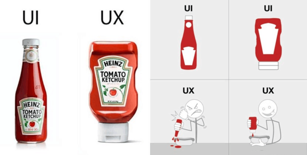
Let’s demystify User Experience (UX) using something your Grandma knows and loves — her favorite flower garden. Like a well-kept garden that’s easy to navigate and visually pleasing, UX is about providing a similarly delightful, seamless, and intuitive journey for digital product users.
Here’s how we break it down:
- ‘User’: Like Grandma strolling through her garden, it’s you interacting with a digital product.
- ‘Experience’: Just as Grandma feels joy navigating her well-arranged flower beds, it’s your journey and emotions as you interact with the digital interface.
- ‘Design’: It’s the beautiful layout of Grandma’s garden, which is comparable to the structure and aesthetics of the digital platform.
Take a digital photo gallery, for example. Imagine Grandma scrolling through her collection of garden pictures just as she would flip through a physical album. With a straightforward interface, large, easy-to-see thumbnails, and a smooth swipe function, Grandma can effortlessly relive her favorite garden moments. That’s stellar UX — no confusion, no getting lost, only pure enjoyment.
UX makes digital users feel at home. It involves understanding user behaviors, needs, and values. Then, it crafts an interactive design that’s easy to navigate and pleasing to the eye — just like Grandma’s blooming flower garden.
UX isn’t about mind-bending technological complexities. Instead, it’s about transforming every interaction into an enjoyable experience, just like Grandma’s pleasurable stroll in her favorite garden. Understanding UX isn’t about decoding alien concepts. It’s about embracing the same principles Grandma employs when she designs her garden — planning, understanding, and creating for enjoyment. That, in essence, is UX. It’s all about making digital products as inviting, intuitive, and enjoyable as a walk through Grandma’s well-loved garden.
User Experience as Building a House

To help your grandma understand user experience, compare your work with the work of an architect. By the way, construction projects are often similar to UX ones. Some designs are just ok, others are stunning, but some are confusing, look strange.
The good user experience of a house or flat is when deciding to have a bite at night, you can go directly to the kitchen without going through someone’s bedroom 🙂
This may be a great way to start explaining what UX is.
In some houses, it’s hard to understand the logic behind doors, partition walls, utilities. In other – you feel like everything is easily accessible regardless of how large the room is.

As you can see, this restroom is extremely high. What a horrible case, right?
To make the most of the free space, house owners decided to install two small vertical cabinets, a large horizontal one. But there is something UX-related they didn’t take into account. They will be forced to climb the toilet each time they need to get something from the upper shelf. This is very uncomfortable, and the toilet may break. Even if they bring a chair to open the cabinet, it’s unlikely to fit there.

Walk-through rooms are the most common cause of poor user experience in interior design. Let’s admit that it’s never pleasant when someone enters your room on their way to the bathroom or kitchen at night while you’re sleeping.
At this point, you can draw a parallel between construction and UX. Tell your grandma that the only difference is that UX is about how easily someone finds the necessary information. Or about how fast people figure out how something works and performs its functions.

At first glance, it looks like they open both ways. In reality, you will need to try both pushings and pull to understand how these doors work. The same relates to website user experience. Yet, whereas with the doors, people are likely to make the second attempt and enter the room, website visitors are less patient. 50% of users who don’t reach the desired result after clicking a specific button or element immediately leave the web resource.
Think Like Your Grandma
User Experience is a part of marketing efforts taken to launch a new business or optimize an existing one. UX helps to improve client experience, increase customer satisfaction. Marketing is something simpler – it existed long before websites, the Internet just looked different.
You don’t need to develop a complex user experience allegory to convey the essence of online marketing or use confusing UX terminology. However, a marketer who works with client experience or any other product should have one essential quality. They must be able to understand others. They should understand how this person lives and perceives the world. This skill lets you see what matters for potential customers and which product features can convince them to choose you when you promote products.
The emerging and gaining popularity customer-oriented approach means that customer relationships start not when people reach your sales counter. – You need to build them before the store even opens. To do that, interviewers run surveys studying what consumers need while marketers do their best to step into customers’ shoes. This information enables them to ensure the right user experience, realize how other people see this world. That’s actually what you just did when you tried to think about UX like your grandma.
Website User Experience as a Landline Phone

At the start of the 20th century, landlines were a luxury. Yet very soon, they turned into a necessity. It was very convenient to have a phone. Grannies could call their neighbors or family members instead of going to the post office, sending letters. That’s much more time-saving.
Today, a landline phone is rarely used. Many people even don’t have it. Grandchildren taught their grandmothers how to use smartphones. Some of them even managed to teach grannies how to use social media, shoot stories. This way of communication is faster.
UX as a Toilet Seat Lid
Has your grandma ever been mad at your granddad or father because they always leave a toilet lid up? This probably happens occasionally.
The grandma had to put the toilet lid down each time the males in her house misbehaved. Her advice never worked. Such a situation annoyed the grandma.
Quality user experience eliminates all extra steps in the way of a customer. People visit a website, quickly complete the necessary action, leave satisfied.
It may seem unimportant, but the more unnecessary details your website has, the fewer completed purchases you will get.
Usability in User Experience as a Trash Bin
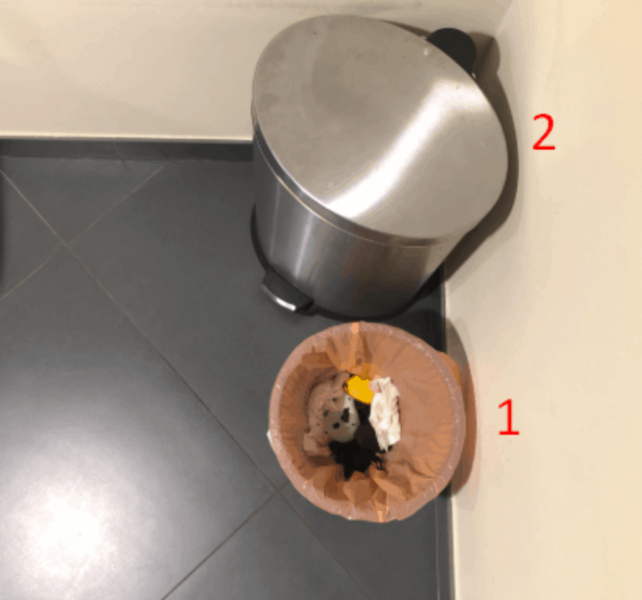
A strange comparison, right? Yet, if you look at it differently, you’ll understand that many trash bins have an inconvenient button at the bottom, like the second one in the picture above. It would help if you pressed it, then can you throw rubbish. But, unfortunately, although such a bin looks fancy, most people hate it. So instead of just throwing what you need to throw, you stand there for a minute trying to open the lid.
Working on web design, you need to ensure users can complete the necessary actions with minimum clicks. Eliminate everything that can prevent them from converting. For example, a banner or a link distracts the attention and harms usability.
UX as an Old TV set Without a Remote
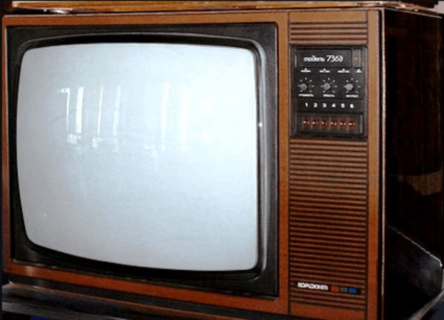
Remember such TV sets? You’re lucky if you are not the youngest kid who was always sent to switch the channels instead of a remote. How great it was when the manufacturers started to produce TVs with remote controls. You finally could settle yourself in a bed, switch channels without any hassle. With the appearance of smart TVs, life became too good to be true. Simply put, UX in digital marketing should be like a smart TV.
To explain to your grandma, ask her what makes modern TVs better. She will mention convenient navigation, more vivid colors, better sound, pictures.
UX as a Lawn Mower vs. a Scythe
Comparing a lawnmower with a scythe should be an effective way to tell someone what user experience means. Even though the youth doesn’t use a scythe, they’ve definitely seen it (at least in the pictures).
If your grandma is old enough or grew up in a village, she knows that cutting grass with a scythe is difficult as hell. So a lawnmower is a huge relief.
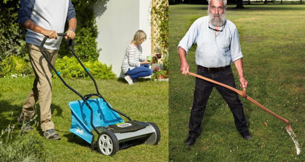
If the grandma switches from the old tool to a more advanced one, she will get things done faster and cook a delicious dinner. Optimizing a website’s UX is like the transition from a scythe to a lawnmower.
Interaction Design in User Experience as a Pan of Hot Water

Even though most millennials cannot imagine living without hot water, our grannies faced such a problem when they were young. Hence, a pot of hot water is a great allegory of user experience.
When a user needs to buy something (=wants to take a bath), they expect to find the necessary product immediately (=open the tap), add it to the cart (=fill the bathtub), place the order. UX helps ensure the user won’t waste any time or get irritated during their customer journey.
UX as Online Music Streaming Services vs. Vinyl Records

Our grannies listened to their favorite songs on vinyl records, cassettes, CDs. Unfortunately, vinyl records were easily damaged because of overheating. Cassettes needed rewinding. CDs were too fragile. Moreover, it would help if you had a vinyl player or tape recorder.
Today, you don’t need to worry about bulky devices since all music is stored online. You can find any song or video anytime, play it right from a smartphone.
Conclusion User Experience
In wrapping up our delightful chat on UX – like savoring the last slice of Grandma’s homemade pie – we’ve dived into a fulfilling exploration of User Experience, turning complex tech concepts into homely, digestible nuggets. UX isn’t a perplexing sign in an immigrant’s journey through a digital landscape. It’s the heartwarming answer that makes users feel at home, smoothing their way with an understanding design that speaks their language.⚡
We’ve traveled from our grandmother’s garden to a bustling digital bookstore, spotlighting UX as the unseen hand that makes the ride smoother, easier, and more enjoyable. This journey underlines that UX is an ongoing conversation between the user and the system, wherein empathy is the common language and satisfying user needs is the endgame. ⚡
Ready to spark this dialogue on your platform? Plerdy is your expert co-pilot! Harness the power of Plerdy’s SEO & UX analysis tools to ensure your users’ journey is as comforting as Grandma’s welcoming embrace. Let’s continue weaving these UX tales, making digital spaces more human, one interaction at a time. ⚡
