Jul 03, 2026
Hello and welcome to our brand guidelines! These guidelines will help you correctly make use of our brand.
 4.9/5
4.9/5
 4.7/5
4.7/5


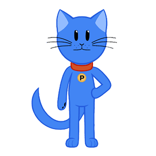
A distinctive combination of an icon and a name that reflects our brand's identity and vision
We based it on our first product—the Heat Map—which represents user interaction with websites. Then, we combined this concept with the shape of our mascot, a cat, symbolizing flexibility, curiosity, and continuous growth. The result is a unique icon that will now be an essential part of our visual identity.
The name Plerdy comes from "Planning every day," reflecting our mission to help businesses improve their digital products daily.
The face of our brand, bringing energy and emotion to life


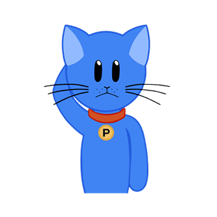

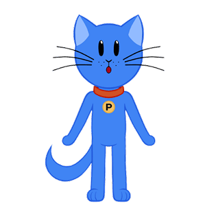


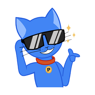


Jim is the heart of our brand and one of its most recognizable elements. His journey began with the very first version of Plerdy when we used a GIF of Jim Carrey—long before we had a mascot of our own. Over time, Jim became an integral part of our identity.
People love him, which is why he often takes center stage in our marketing and promotional materials. Whether it's expressing excitement, showcasing emotions, or marking special occasions, Jim brings personality and energy to everything we do.
Different versions of our logo for various applications
The main version of our logo, representing the core identity of our brand, should be used in most contexts in its original form.
A version of the primary logo with reversed colors, ideal for use on dark or contrasting backgrounds to maintain visibility and brand consistency.
Used on light or bright backgrounds to provide contrast and clarity.
Used on dark or rich backgrounds to ensure a clean and stylish look.
Here’s a few examples of what we should absolutely avoid when using the logo.
Don’t use the old logo
Don’t use the wordmark alone
Don't stretch or squeeze it
Don’t rotate it
Don’t use busy backgrounds
Don’t use against low-contrast
Don’t use gradients or shadows
Don’t stack the logo
Don’t create your own version
Content for UX designers, SEO specialists, and business owners